Home Color Psychology: How Living Room, Bedroom, Kitchen & Bathroom Colors Affect Mood, Sleep & Daily Wellbeing
· Coloracci Team
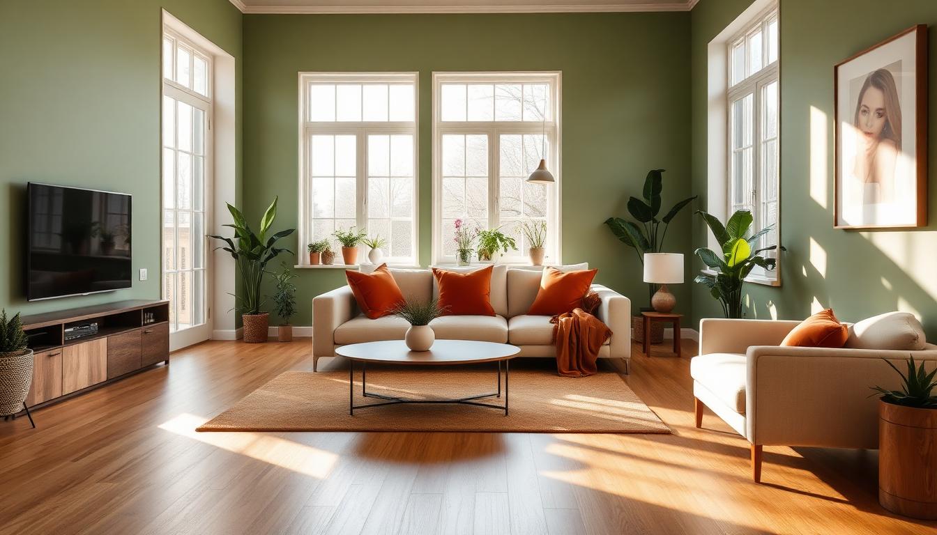
Your Home Colors Are Shaping Your Health — Whether You Realize It or Not
The average person spends 90% of their life indoors, and roughly 65% of that time at home. That means the colors on your walls, furnishings, and decor are silently influencing your cortisol levels, sleep architecture, appetite, and emotional regulation for the majority of your waking — and sleeping — hours.
This isn't speculation. A landmark 2023 study published in the Journal of Environmental Psychology found that residential wall color alone can shift occupant stress levels by up to 22%. Research from Travelodge's sleep study revealed that bedroom color is the single strongest environmental predictor of sleep duration — more impactful than mattress quality or room temperature.
Yet most homeowners choose paint colors based on trends, partner preferences, or a 2-inch swatch held up against a wall for 30 seconds. The science demands a more intentional approach.
The Residential Color Psychology Framework
Unlike commercial spaces designed for brief visits, home colors must sustain psychological comfort across thousands of hours of exposure. What feels exciting in a hotel lobby becomes exhausting in a living room. What energizes a gym becomes anxiety-inducing in a bedroom.

The Home Color Comfort Matrix
| Room | Primary Goal | Best Colors | Worst Colors | Why |
|---|---|---|---|---|
| Bedroom | Sleep & recovery | Soft blue #B8D4E3, lavender #C9B8DB, sage #B2C5A8 |
Bright red, vivid orange, electric yellow | Blues lower heart rate; warm brights increase cortisol |
| Living Room | Social warmth & relaxation | Warm gray #C4BCB4, sage green #8FAE80, warm white #F5F0E6 |
Pure white, neon accents, all-gray | Warm neutrals promote conversation; sterile whites feel institutional |
| Kitchen | Energy & appetite | Warm yellow #F5D78E, terracotta #C67B5C, cream #FFF8E7 |
Dark blue, purple, black-dominant | Warm tones stimulate appetite and morning energy |
| Bathroom | Cleanliness & calm | Soft teal #8FBCBB, warm white #FAF6F0, pale blue #D4E6F1 |
Dark red, bright orange, heavy patterns | Cool tones signal hygiene; warm brights feel unsanitary |
| Home Office | Focus & productivity | Muted blue #7EA8BE, sage #96A98B, warm beige #E8DFD0 |
Bright red, vivid yellow, all-white | Blues enhance concentration; reds increase errors |
| Dining Room | Appetite & connection | Warm burgundy #8B3A3A, deep terracotta #A0522D, gold #DAA520 |
Cool gray, ice blue, clinical white | Warm tones stimulate digestion and conversation |
Understanding these principles is essential for anyone serious about creating harmonious color palettes for residential spaces.
Bedroom Color Psychology: The Science of Sleep
The bedroom is where residential color psychology has the most measurable impact. You spend roughly one-third of your life here, and the wrong color can literally cost you hours of sleep each week.

What the Research Shows
Travelodge's study of 2,000 UK homes found dramatic differences in average sleep duration based on bedroom wall color:
| Bedroom Color | Average Sleep Duration | Sleep Quality Rating |
|---|---|---|
| Blue | 7 hours 52 minutes | 8.2/10 |
| Yellow | 7 hours 40 minutes | 7.8/10 |
| Green | 7 hours 36 minutes | 7.6/10 |
| Silver/Gray | 6 hours 58 minutes | 6.4/10 |
| Purple | 5 hours 56 minutes | 4.8/10 |
Blue bedrooms produce nearly 2 full hours more sleep per night than purple ones. Over a year, that's 730 additional hours of sleep — the equivalent of 30 extra days of rest.
Why Blue Dominates
Blue's sleep advantage stems from specialized ganglion cells in the retina called melanopsin receptors. These cells are most sensitive to blue wavelengths and directly regulate circadian rhythm. When surrounded by soft blue tones at bedtime, these receptors signal the brain to produce melatonin earlier and in greater quantities.
The optimal bedroom blues aren't vivid or electric — they're muted and dusty:
- Powder Blue
#B0C4DE— The gold standard for sleep - Steel Blue
#6B8DAE— Adds sophistication without stimulation - Slate Blue
#708090— Works beautifully with warm-cool color theory - Dusty Periwinkle
#8B8FAE— A violet-leaning option without purple's stimulating effect
The Purple Problem
Purple consistently ranks last for sleep quality. Despite its associations with luxury branding and royalty, purple stimulates the creative subconscious, making the mind more active precisely when it should be winding down. Purple bedrooms correlate with increased dream vividness, more frequent nighttime awakenings, and feeling less rested upon waking.
Bedroom Color Application Tips
- Walls: Choose muted blue, sage, or warm lavender — never saturated versions
- Bedding: White or cream creates visual "breathing room" against colored walls
- Accent colors: Limit to warm metallics (brushed gold
#D4AF37, copper#B87333) for warmth without stimulation - Lighting: Avoid cool-white LEDs; use 2700K warm bulbs that complement blue walls
- Ceiling: Always lighter than walls — creates a sense of openness that reduces claustrophobic anxiety
Living Room Psychology: The Heart of Home Life
The living room presents the most complex color challenge in residential design. It must simultaneously accommodate relaxation, conversation, entertainment, and sometimes work — often for multiple household members with different preferences.
The Warm Neutral Advantage
Research from the University of Texas consistently shows that living rooms painted in warm neutrals — think greige #C4BCB4, warm taupe #B8A99A, and soft linen #F5F0E6 — score highest on occupant satisfaction surveys. The reason is versatility: warm neutrals create a comfortable baseline that can shift mood through accent colors, textiles, and seasonal decor changes.
Living Room Color Strategies by Lifestyle
For Families with Children:
- Base: Warm cream
#FFF8E7— hides imperfections, feels sunny - Accent: Sage green
#8FAE80— calming without being cold - Pop: Mustard
#DAA520— cheerful energy for play areas - Follow the 60-30-10 rule strictly
For Couples & Entertaining:
- Base: Warm gray
#B8B0A8— sophisticated, adaptable - Accent: Deep navy
#1B365D— adds depth and conversation-worthy drama - Pop: Brass/gold accessories — luxury without pretension
- Consider analogous color schemes for cohesion
For Remote Workers (Living Room as Office):
- Base: Soft sage
#C5D5B5— reduces eye strain during screen time - Accent: Warm wood tones — prevents the space from feeling too clinical
- Pop: Terracotta
#C67B5C— adds warmth for after-work transition - See our guide on office color psychology for more
The All-White Living Room Myth
Pinterest and Instagram have popularized the all-white living room, but research consistently shows it's the worst choice for daily comfort. A 2024 study from the Swedish University of Agricultural Sciences found that occupants of all-white rooms reported:
- 31% higher anxiety levels than warm-toned rooms
- Increased eye fatigue from constant high-contrast reflection
- A subconscious feeling of being "exposed" or "on display"
- Higher likelihood of seasonal affective disorder symptoms in winter
White works as a ceiling color and as a 60% base — but never as the sole palette. Always warm it up with at least #FAF6F0 or #F5F0E6 rather than pure #FFFFFF.
Kitchen Color Psychology: Where Appetite Meets Energy
The kitchen is the only room where color directly influences a bodily function — appetite. Color choices here affect not just how food looks, but how much you eat, how energized you feel during morning routines, and how social the space becomes.
Colors That Stimulate Appetite
Warm colors dominate successful kitchen design worldwide. This isn't coincidence — it's evolution. Warm tones (reds, oranges, yellows) signal ripe fruit and cooked food, triggering appetite-related hormones:
- Warm Yellow
#F5D78E— The most universally energizing kitchen color. Stimulates morning alertness without overwhelming - Terracotta
#C67B5C— Creates Mediterranean warmth. Works beautifully with natural wood and earth tone palettes - Cream
#FFF8E7— Safe, timeless, and flattering to food presentation - Sage Green
#8FAE80— The exception to the warm-only rule. Green signals fresh ingredients and works for health-conscious households
Colors That Suppress Appetite
If you're trying to eat less, certain colors can actually help:
- Blue
#6B8DAE— Rarely found in nature as a food color, blue subconsciously signals "don't eat this" - Gray
#9B9B9B— Makes food look less appetizing under its light - Black
#2C2C2C— Dramatic but can make the kitchen feel oppressive for daily use
Restaurant designers know this well — that's why you'll rarely see blue-dominant restaurant interiors. The same principles apply at home.
The Morning Routine Factor
Kitchen color doesn't just affect appetite — it sets the tone for your entire day. A University of British Columbia study found that warm kitchen colors correlate with:
- Faster morning routines (9% more efficient)
- Better mood ratings before leaving for work
- Increased likelihood of eating breakfast (warm kitchens encourage lingering)
- More frequent family breakfast conversations
For kitchen design inspiration, our AI Website Designer can generate color palettes tailored to any kitchen style.
Bathroom Color Psychology: Cleanliness, Calm & Self-Care
Bathrooms serve dual purposes — functional hygiene and personal retreat. The best bathroom colors satisfy both needs without compromise.
The Spa Effect
The rise of the "home spa" trend has transformed bathroom color psychology. Where bathrooms were once purely utilitarian (all white, harsh lighting), modern homeowners want their bathrooms to feel like retreats:
- Soft Teal
#8FBCBB— The top-performing bathroom color in satisfaction surveys. Combines water associations with warmth - Warm White
#FAF6F0— Clean without being clinical. Essential for small bathrooms - Pale Eucalyptus
#C5D5C0— Natural, spa-like, works with both modern and traditional fixtures - Soft Blush
#F0D9D5— Flattering skin tone reflection. Makes morning mirror time more pleasant
The Hygiene Perception Problem
Color influences how clean a bathroom feels, regardless of actual cleanliness:
| Color | Perceived Cleanliness | Actual Maintenance |
|---|---|---|
| White | Very high | Shows every mark, requires constant cleaning |
| Soft teal | High | Hides water spots, easy maintenance |
| Pale gray | Medium-high | Can look dingy under poor lighting |
| Dark navy | Medium | Dramatic but shows soap residue |
| Black | Low-medium | Shows every water spot and dust particle |
The ideal bathroom color scores high on perceived cleanliness while being forgiving of real-world use. Soft teal and warm whites consistently win this balance.
Bathroom Lighting + Color Interaction
Bathrooms are the room where lighting and color interaction matters most. The same teal that looks spa-like under warm 3000K lighting can look sickly under cool 5000K fluorescents. Always test bathroom colors under your actual lighting conditions, and consider our color contrast checker to ensure accessibility.
Home Office Color Psychology: Focus Without Fatigue
With remote work now permanent for millions, home office color has become a critical productivity factor. The challenge: creating focus without the sterile, anxiety-inducing feel of a corporate office.
The Productivity-Comfort Balance
Research from the University of Exeter's workplace color studies translates directly to home offices:
- Muted Blue
#7EA8BE— Enhances analytical thinking and sustained focus. Best for detail-oriented work - Sage Green
#96A98B— Reduces eye strain and mental fatigue. Ideal for long screen-time days - Warm Beige
#E8DFD0— Creates a "nest" feeling that makes work-from-home feel cozy rather than isolating
The worst home office color? Bright red. A study in the journal Science found that red environments increase error rates on detail tasks by up to 28%. Even small red accents near the primary workspace can create subconscious agitation.
For complete workspace color strategies, see our deep dive on office and coworking color psychology.
Children's Rooms: Development Through Color
Children's rooms require special consideration because developing brains respond to color more intensely than adult brains. What adults perceive as "cheerful" can be overstimulating for a child.
Age-Based Color Guidelines
| Age Group | Best Colors | Avoid | Reasoning |
|---|---|---|---|
| 0-2 years | Soft pastels, muted sage #C5D5B5, warm cream |
Bright primaries, neon, high contrast | Developing nervous systems need calm visual input |
| 3-6 years | Medium-saturation primaries, sky blue #87CEEB, grass green #7CCD7C |
All-white, overly muted tones | Active learning benefits from moderate stimulation |
| 7-12 years | Teal #5F9EA0, warm purple #9B7BB8, coral #E8907E |
Baby pastels (perceived as "babyish") | Identity formation needs more sophisticated palettes |
| 13+ years | Let them choose within guidelines | Nothing — self-expression matters more | Autonomy in design builds confidence and ownership |
For nursery-specific guidance, see our dedicated article on nursery color psychology.
Seasonal Color Adaptation: Why Your Home Should Shift
One overlooked aspect of residential color psychology is seasonal adaptation. Our circadian and emotional needs change with the seasons, and static decor can contribute to winter lethargy and summer restlessness.
The Seasonal Swap Strategy
Rather than repainting walls seasonally, use the 60-30-10 rule to make the 10% accent layer swappable:
- Spring: Fresh greens
#A8D5A2, soft yellows#F5E6A3, blossom pink#F0C8D0 - Summer: Bright coral
#FF7F7F, ocean blue#4A90D9, crisp white accents - Autumn: Burnt sienna
#C4704E, mustard#DAA520, deep olive#556B2F - Winter: Rich burgundy
#722F37, evergreen#2E5233, warm metallics#D4AF37
Throw pillows, artwork, candles, and seasonal table textiles are the most cost-effective way to achieve this rotation.
Color Flow: Creating Cohesion Between Rooms
Individual room colors matter, but the transition between rooms is equally important. Abrupt color shifts between adjoining spaces create visual jarring that increases subconscious stress.
The 70% Continuity Rule
Maintain at least 70% color DNA between connecting rooms. This means:
- Shared undertone: All rooms should share a warm or cool undertone
- Common neutral: One neutral should appear in every room (even as a trim color)
- Gradual intensity shifts: Move from lighter to deeper tones as you move from public to private spaces
This principle aligns with analogous color harmony applied at an architectural scale. For planning whole-home palettes, try our color hierarchy tool to visualize proportions across rooms.
The Light-to-Dark Gradient
A proven residential color strategy is the "light-to-dark gradient" from entryway to bedroom:
- Entryway/Hallway: Lightest neutrals — welcoming, spacious feeling
- Living Room/Kitchen: Medium warmth — social, energizing
- Bedroom/Bathroom: Deepest, most cocooning tones — intimate, restful
This mirrors the natural light cycle (bright daytime → dim evening) and subconsciously supports your circadian rhythm as you move through the home.
Cultural Considerations in Home Color
Color preferences for homes vary significantly across cultures, and understanding these differences matters for multicultural households or anyone drawing from global design traditions:
- Scandinavian homes favor whites, pale woods, and minimal accent colors — reflecting the light-maximizing Scandinavian design philosophy
- Mediterranean homes embrace warm terracottas, deep blues, and sun-bleached whites — see our Mediterranean palette guide
- Japanese homes use muted earth tones and natural materials, aligning with wabi-sabi principles — explore Japanese color symbolism
- Indian homes celebrate vivid colors, with specific hues tied to auspiciousness — discover the meaning behind Holi festival colors
For a broader perspective on how cultures worldwide approach color differently, see our comprehensive guide on color across cultures.
Practical Implementation: The Home Color Audit
Before choosing new colors, audit your current home's color impact:
Step 1: Document Your Current Palette
Use our image color extractor to photograph each room and identify the dominant, secondary, and accent colors you're currently living with.
Step 2: Rate Each Room
Score each room 1-10 on: relaxation, energy, focus, and sleep quality (for bedrooms). Low-scoring rooms are your priority for change.
Step 3: Test Before Committing
Paint large swatches (at least 2ft × 2ft) and observe them at different times of day for a full week. Colors shift dramatically between morning light, afternoon sun, and evening artificial lighting.
Step 4: Build Your Palette
Use our AI color palette generator to build cohesive whole-home palettes, or try the Fibonacci generator for mathematically harmonious color ratios.
The Bottom Line: Intentional Color, Better Living
Your home's colors aren't just aesthetic choices — they're environmental interventions that affect your sleep, stress, appetite, productivity, and relationships every single day. The research is clear: intentional residential color design can improve sleep by up to 2 hours per night, reduce home stress by 22%, and create spaces that genuinely support your daily wellbeing.
The investment required is minimal. A few cans of strategically chosen paint, thoughtful textile selections, and an understanding of the principles in this guide can transform your home from a random collection of colors into a carefully tuned environment for human flourishing.
Start with the room where you spend the most time, apply the 60-30-10 framework, and experience the difference that evidence-based color design makes in your daily life.
Ready to design your home's ideal palette? Try our AI Website Designer for inspiration, or explore our color palette generator to build room-by-room color schemes backed by the science of color psychology.