Warm vs Cool Colors: Complete Theory and Examples
· Coloracci Team
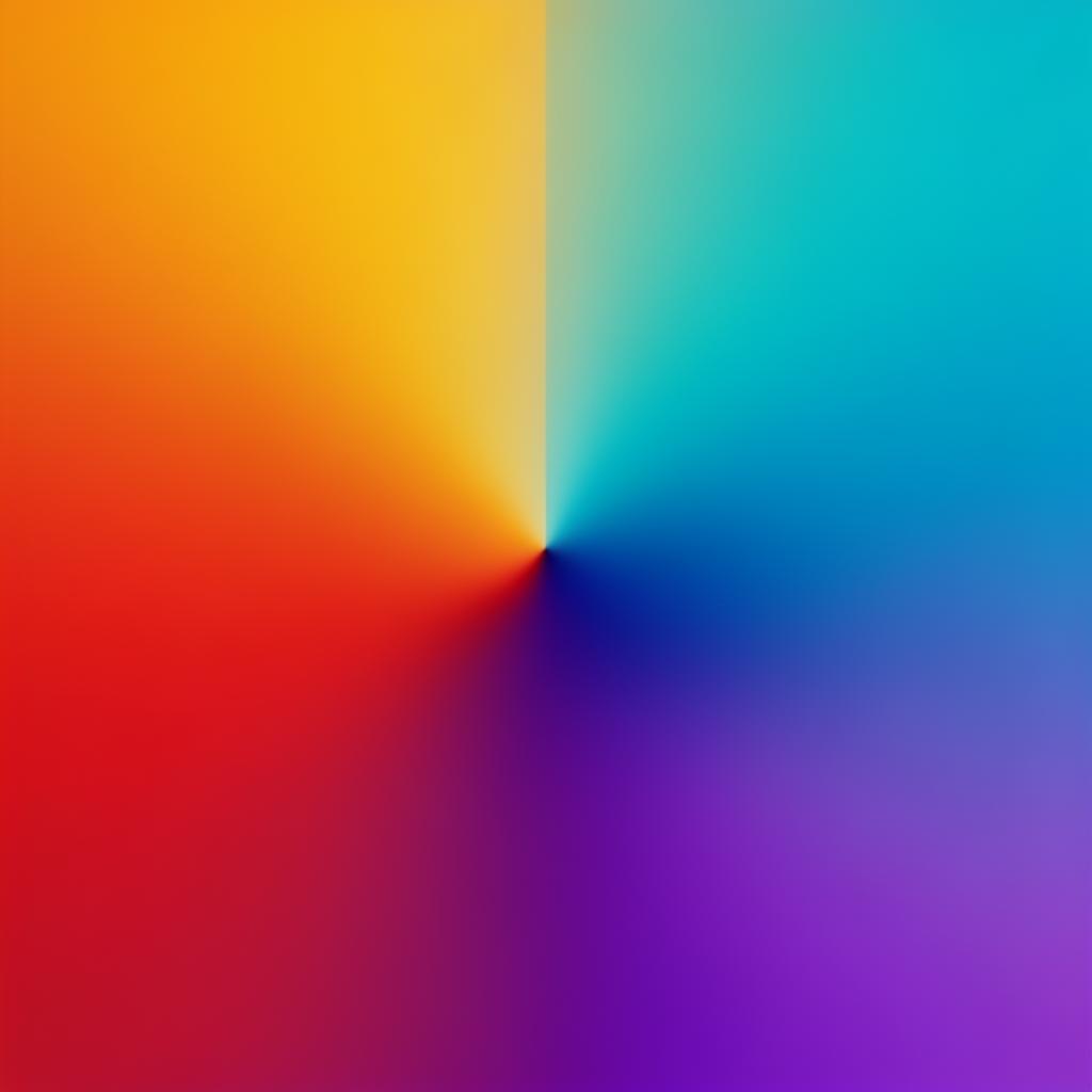
Every color has a temperature. Not a literal one — red paint is not physically warmer than blue paint — but a psychological one so consistent and so deeply rooted in human perception that it functions as a design law. Warm colors advance, excite, and energize. Cool colors recede, calm, and stabilize. Understanding this temperature division is not just academic color theory — it is the foundation of every effective color decision a designer makes, from choosing a hero section background to balancing a complex data dashboard.
This guide covers color temperature from first principles through advanced application: the science behind why we perceive colors as warm or cool, the specific effects of each temperature group, and the techniques professionals use to mix warm and cool colors into harmonious, purposeful palettes.
Color Temperature Theory: The Science
The warm-cool divide originates from our most basic environmental associations. Warm colors — reds, oranges, and yellows — are the colors of fire, sunlight, and heated surfaces. Cool colors — blues, greens, and purples — are the colors of water, ice, shade, and twilight. These associations are not arbitrary cultural constructs; they reflect hundreds of thousands of years of human experience with the physical world.
The color wheel divides neatly along a temperature axis. Draw a line from yellow-green (#9ACD32) through the center to red-violet (#C71585), and you split the wheel in half. Everything on the red-orange-yellow side is warm; everything on the blue-green-violet side is cool.
But temperature is relative, not absolute. A yellow-green (#9ACD32) is cool compared to pure orange (#FF8C00) but warm compared to pure blue (#0066CC). Even within a single hue family, temperature shifts: a blue with red undertones (ultramarine, #3F51B5) feels warmer than a blue with green undertones (cerulean, #00BCD4). This relativity is what makes color temperature such a nuanced and powerful design tool.
Research in environmental psychology has demonstrated measurable effects of color temperature on human perception:
- Warm-colored rooms are perceived as 2-3°F warmer than cool-colored rooms at identical temperatures
- Warm colors in retail increase browsing time and impulse purchases
- Cool colors in medical settings lower reported anxiety levels and reduce perceived wait times
- Warm-toned food photography increases appetite ratings by 15-20% compared to cool-toned images
These effects are consistent across cultures, suggesting a biological basis rather than a learned association.
Warm Colors: Red, Orange, Yellow
Warm colors are the extroverts of the color spectrum. They push forward, demand attention, and generate emotional intensity. In design, they are the colors of action — calls to action, warnings, celebrations, and urgency.
Red: The Most Intense Warm Color
Red (#E53935) is the warmest and most psychologically intense color. It increases heart rate, raises blood pressure, and creates a sense of urgency. In design, red is the ultimate attention-grabber:
- Bright Red
#E53935— CTAs, sale badges, error states, urgent notifications - Dark Red / Crimson
#B71C1C— Premium warmth, wine brands, sophisticated urgency - Warm Red
#FF5722— Energetic, youthful, less aggressive than pure red - Muted Red / Terracotta
#A1553A— Earthy warmth, artisanal brands, rustic aesthetics
Red's warmth makes spaces feel smaller and closer — a property that works for intimate restaurants but against spacious, airy interfaces. Use red sparingly in UI design: as accent colors, interactive states, and focal points rather than as backgrounds or dominant surface colors.
Orange: Warmth Without Urgency
Orange (#FF8C00) occupies the sweet spot of warm colors — energetic enough to attract attention but not so intense that it creates stress. Orange is the color of enthusiasm, creativity, and accessible warmth:
- Vivid Orange
#FF6D00— Maximum energy, sports brands, entertainment CTAs - Standard Orange
#FF9800— Friendly, approachable, community-oriented brands - Amber
#FFB300— Warm and sophisticated, bridges orange and yellow - Burnt Orange
#E65100— Autumnal warmth, craft brands, premium yet approachable - Peach
#FFAB91— Soft warmth, wellness brands, feminine-leaning design
Orange is particularly effective for brands that want to feel warm and human without the aggression of red or the childishness that yellow can sometimes convey. It is the dominant warm color in tech startups (Amazon, Fanta, Nickelodeon, Etsy) precisely because it communicates approachability and enthusiasm.
Yellow: Optimism and Caution
Yellow (#FDD835) is the lightest warm color and the most visible in the spectrum. It communicates optimism, clarity, and energy, but it demands the most careful handling of any warm color:
- Bright Yellow
#FFEB3B— Maximum visibility, caution signals, highlight markers - Golden Yellow
#FFC107— Warmth with sophistication, food brands, premium accents - Pale Yellow
#FFF9C4— Subtle warmth for backgrounds, notes, highlights - Mustard
#F9A825— Retro warmth, fashion-forward, design-conscious brands
Yellow's greatest liability is legibility. Yellow text on white backgrounds is essentially invisible, and even yellow on light gray struggles. Always pair yellow elements with dark text (#1A1A1A) or use yellow exclusively for non-text elements like backgrounds, borders, and icons.
Cool Colors: Blue, Green, Purple
Cool colors are the introverts of the spectrum. They recede into the background, create depth, and generate feelings of calm, trust, and stability. In design, they are the colors of structure — navigation, containers, backgrounds, and information-dense layouts.
Blue: The Foundation of Digital Design
Blue (#1565C0) is the most used color in digital design, and its dominance is not a coincidence. Blue communicates trust, professionalism, and calm — the exact qualities that technology companies, financial institutions, and healthcare organizations need to project:
- Corporate Blue
#0066CC— The default professional blue, used by LinkedIn, PayPal, Intel - Navy Blue
#0D1B2A— Authority, depth, premium positioning - Sky Blue
#4FC3F7— Lightness, openness, approachability - Electric Blue
#2979FF— Modern, energetic, tech-forward - Slate Blue
#546E7A— Sophisticated neutral, pairs with everything
Blue's coolness creates a sense of spaciousness and depth in interfaces. Blue backgrounds feel open and expansive, which is why so many dashboards, email clients, and productivity tools use blue as their primary color. The cool temperature calms users working with complex information, reducing cognitive stress.
Green: Balance Between Warm and Cool
Green (#43A047) sits at the boundary between warm and cool, making it the most balanced color in the spectrum. Yellow-greens feel warm and energetic; blue-greens feel cool and serene. This versatility makes green useful across an exceptionally wide range of applications:
- True Green
#4CAF50— Success states, confirmations, positive feedback - Forest Green
#2E7D32— Nature, sustainability, premium organic brands - Mint Green
#80CBC4— Fresh, modern, health and wellness - Lime Green
#AEEA00— Energetic, youthful, attention-grabbing (warm-leaning) - Teal
#00897B— Sophisticated, contemporary, balanced cool-warm feel
Green's dual nature means you must pay attention to its temperature when building palettes. A warm yellow-green (#AEEA00) will clash with a cool blue palette, while a cool teal (#00897B) will harmonize perfectly.
Purple: The Cool Color with Warm Undertones
Purple (#7B1FA2) is technically a cool color, but its red content gives it warmth that pure blue lacks. This makes purple the most emotionally complex cool color — simultaneously calming and stimulating:
- Deep Purple
#4A148C— Luxury, mystery, premium brands - Royal Purple
#7B1FA2— Creativity, innovation, tech companies - Lavender
#CE93D8— Gentle, calming, feminine wellness - Violet
#9C27B0— Bold, energetic, entertainment and gaming
Purple bridges the warm-cool divide, making it uniquely versatile for brands that want to feel both innovative (cool) and passionate (warm). This is why creative technology companies — Twitch, Yahoo, Figma — gravitate toward purple.
Mixing Warm and Cool: Advanced Techniques
The most sophisticated color palettes do not choose warm or cool — they strategically combine both. The tension between warm and cool colors creates visual interest, guides hierarchy, and produces the dynamic energy that purely warm or purely cool palettes lack.
Technique 1: Cool Base + Warm Accent
The most reliable approach is a cool-dominant palette with warm accents. Use blues and grays for 80-90% of your interface (backgrounds, text, containers, navigation), then deploy warm accents (orange #FF6D00, amber #FFB300, coral #FF6F61) for CTAs, active states, and elements that need attention. The warm accents feel more vibrant against the cool base because of temperature contrast.
Technique 2: Warm Base + Cool Accent
Less common but highly effective for brands wanting warmth and approachability. A warm beige (#F5E6D3) or cream (#FFFDE7) background with cool blue (#1565C0) or teal (#00897B) accents creates a welcoming, personal feel while maintaining professionalism. This approach works well for hospitality, wellness, and lifestyle brands.
Technique 3: Temperature Gradients
Gradients that transition from warm to cool (or vice versa) create visual depth and movement. A gradient from coral (#FF6F61) to purple (#7B1FA2) or from amber (#FFB300) to teal (#00897B) generates energy that monochromatic gradients cannot match. These work exceptionally well for hero sections, backgrounds, and feature illustrations.
Technique 4: The 60-30-10 Temperature Rule
Apply the classic proportion rule with temperature awareness:
- 60% neutral (white
#FFFFFF, light gray#F5F5F5, or warm off-white#FAFAF5) - 30% cool primary (blue
#1565C0, teal#00897B, or slate#546E7A) - 10% warm accent (orange
#FF6D00, coral#FF6F61, or amber#FFB300)
This ratio ensures visual hierarchy through temperature contrast: the warm 10% immediately draws the eye because it contrasts with both the neutral majority and the cool minority.
Practical Tips
Warm colors for action, cool colors for content. Buttons, CTAs, and interactive elements benefit from warm tones. Reading areas, data tables, and long-form content benefit from cool or neutral backgrounds.
Adjust temperature for time of day. If your product is used heavily at night, lean cooler and darker. If it is a morning-use product (email, news, productivity), slightly warm backgrounds (
#FFFDE7instead of#FFFFFF) reduce eye strain.Test temperature in both modes. A warm accent that looks inviting in light mode may look harsh in dark mode. Build temperature-aware palettes for both contexts.
Use temperature to create depth. Warm colors advance; cool colors recede. Place warm elements in front of cool backgrounds to create a natural sense of layering and depth without shadows or elevation.
Balance emotional temperature with your brand. A meditation app should lean cool (calming). A food delivery app should lean warm (appetizing). A financial dashboard should be cool-dominant with warm accents for alerts. Let your product's emotional purpose guide the temperature balance.
Understanding color temperature transforms design from a series of aesthetic guesses into a system of intentional decisions. Warm and cool are not just labels — they are tools that shape how users feel, where they look, and what they do. Master the temperature dial, and you master the emotional architecture of every interface you build.