Mediterranean Color Palettes: Architecture and Design
· Coloracci Team
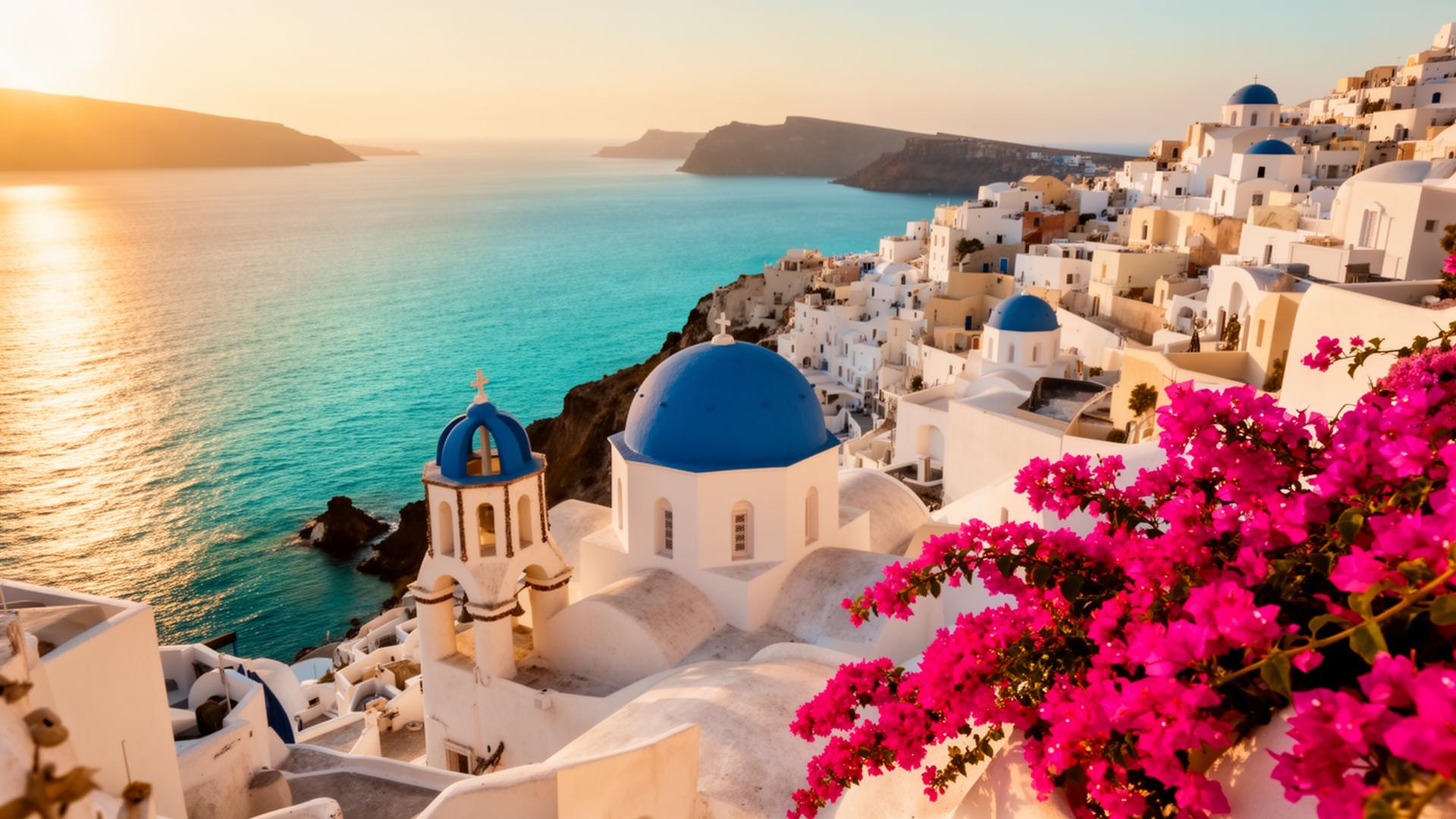
The Mediterranean basin has produced some of the most enduring and universally admired color palettes in architectural history. From the Aegean coast of Greece to the hilltop villages of Tuscany to the sun-baked plazas of Andalusia, the colors of the Mediterranean are not arbitrary aesthetic choices — they are the result of climate, geology, available materials, cultural philosophy, and centuries of refinement by cultures that understood how light, surface, and color interact in ways that many modern designers have forgotten.
What makes Mediterranean color palettes uniquely powerful is their relationship to the environment. Every significant Mediterranean color was originally derived from locally available materials — the limestone and lime wash of Greek villages, the iron-rich clay soils of Tuscany, the ceramic tile traditions of Moorish Spain. These palettes feel "right" because they evolved from the land itself, creating an organic harmony between built environment and natural landscape that synthetic color selection rarely achieves.
This guide examines the three most distinctive Mediterranean color traditions, provides exact hex codes for each palette, and offers practical guidance for translating these time-tested combinations into contemporary design.
Greek Blue and White: Clarity Against the Infinite
The blue and white palette of the Greek islands — particularly the Cycladic islands of Santorini, Mykonos, and Paros — is the most recognizable color combination in Mediterranean architecture. Brilliant white walls topped with vivid blue domes, set against the deep blue of the Aegean Sea and the pale blue of a cloudless sky, create a visual experience of extraordinary clarity and calm.
Why white: Greek island architecture is white because of lime wash — a coating of slaked lime (calcium hydroxide) applied to stone and plaster surfaces. Lime wash was cheap, locally produced, antibacterial, reflective of the intense summer sun, and could be reapplied annually. The practice became law in the early 20th century when Greek authorities mandated whitewashing as a public health measure during cholera outbreaks. What began as practicality became identity.
Why blue: The specific blue of Greek churches and doors has multiple origin stories. One traces it to the belief that blue wards off evil spirits. Another notes that the earliest blue pigments were made from a mixture of lime wash and loulaki (a blue laundry whitening agent), making it the cheapest available color after white. A third, more romantic explanation holds that blue was chosen to mirror the sea and sky, blurring the boundary between architecture and nature.
The Greek island palette:
- Santorini Blue
#1565C0— The defining blue of Greek island architecture. This is a warm, slightly red-leaning blue that reads as both deep and luminous. It is richer than sky blue but less severe than navy, creating the specific quality of a blue that glows in Mediterranean sunlight. - Aegean Sea
#0D47A1— The deeper blue of the sea itself, used on boat hulls, fishing equipment, and the lower portions of harbor buildings. This blue anchors the lighter architectural blues to the maritime landscape. - Cycladic White
#FAFAFA— Not pure white but the faintly warm, textured white of lime-washed plaster. Under Mediterranean light, this white takes on a quality that pure#FFFFFFnever achieves — it glows rather than glares. - Volcanic Stone
#5D4037— The dark brown-black of Santorini's volcanic rock, which appears as foundations, pathways, and natural outcroppings among the white buildings. This earth tone grounds the blue-and-white palette. - Bougainvillea Magenta
#C2185B— The vivid pink-magenta of bougainvillea vines, which cascade over white walls throughout the Greek islands. This is the accent color that prevents the blue-and-white palette from feeling cold or sterile. - Olive Green
#6B8E23— The silver-green of olive trees, which dot the island landscapes. This muted green provides natural relief from the intensity of the blue-white-magenta combination.
Design application: The Greek palette works through extreme contrast — the whitest whites against saturated blues, with strategic magenta accents. In digital design, this translates to generous white space, a single strong blue for primary actions and branding, and a warm accent color used sparingly. The ratio is approximately 70% white, 20% blue, 10% accent.
Tuscan Earth Tones: Warmth from the Ground
The Tuscan palette is the opposite of the Greek in almost every way. Where Greek colors are high-contrast and mineral, Tuscan colors are low-contrast and organic. Where Greek architecture fights the landscape with brilliant white, Tuscan architecture embraces it — the buildings seem to grow from the ochre and sienna earth, blending into the rolling hills rather than standing against the sky.
Material origins: Tuscan colors come directly from the region's geology. The iron-rich clay soils produce pigments ranging from pale yellow ochre to deep burnt sienna — the famous terre naturali (natural earths) that supplied artists from Giotto to the Renaissance masters. These pigments were ground from local earth and mixed directly into lime plaster, creating the characteristic warm surfaces that have weathered into the mottled, sun-faded textures admired worldwide.
The Tuscan palette:
- Tuscan Sun Yellow
#F0C040— The warm golden yellow of late afternoon light on plaster walls. This is not a bright, lemony yellow but a deep, honeyed tone that suggests warmth, age, and abundance. It is the color of sunflower fields and wheat at harvest. - Sienna (Terra di Siena 土黄)
#A0522D— Named literally after the city of Siena, this rich red-brown is the quintessential Tuscan earth tone. Raw sienna#C49A6Cis lighter and yellower; burnt sienna#A0522Dis deeper and redder. Both appear on Tuscan facades. - Ochre (Ocra)
#CC7722— The warm orange-brown of iron oxide pigment, which appears on walls, roof tiles, and the earth itself. Ochre is the most versatile Tuscan color — it harmonizes with every other tone in the palette. - Terracotta
#C67B5C— The warm orange-pink of fired clay tiles, flower pots, and floor surfaces. Terracotta connects the built environment to domestic life — the same material forms roofs, floors, and the pots that hold kitchen herbs. - Olive Grove Green
#6B7B3A— The muted, silvery green of olive foliage, which covers the Tuscan hillsides. This green is never bright — it carries a dusty, gray quality that prevents it from competing with the warm earth tones. - Cypress Dark
#2E4A2E— The deep, almost black green of Italian cypress trees (Cupressus sempervirens), which punctuate the Tuscan landscape like vertical exclamation marks. This deep green provides the palette's only high-contrast element. - Cream Stucco
#F5E6CC— The pale, warm neutral of sun-bleached plaster. This cream serves as the Tuscan equivalent of white — a background tone that is never cold or stark.
Design application: The Tuscan palette is inherently warm and low-contrast, making it ideal for designs that need to feel inviting, established, and trustworthy without the corporate coldness of blue-gray palettes. Use #F5E6CC as your background, #A0522D or #CC7722 as primary tones, and #6B7B3A olive as a natural complement. This palette excels in hospitality, food and wine, lifestyle, and luxury residential contexts.
Spanish Vibrant Colors: Moorish Legacy and Solar Energy
The Spanish Mediterranean palette is the most chromatic of the three traditions, reflecting eight centuries of Moorish cultural influence that left Spain with a design vocabulary far more colorful than the rest of Western Europe. Where Greek architecture is austere and Tuscan architecture is earthy, Spanish architecture celebrates pattern, contrast, and saturated color — the visual language of cultures that understood how color performs under intense sunlight.
The Moorish inheritance: When the Moors (North African Muslim rulers) controlled much of the Iberian Peninsula from 711 to 1492 CE, they brought with them the Islamic tradition of geometric decoration and vibrant glazed ceramics (azulejos). These tiles — in cobalt blue, emerald green, saffron yellow, and burnt orange — covered walls, fountains, and floors, creating the chromatic intensity that still defines Andalusian architecture. The Alhambra in Granada, with its red walls and blue-and-gold interiors, is the supreme example.
The Spanish palette:
- Alhambra Red
#B22222— The warm, earthy red of the Alhambra's exterior walls, made from local red clay mixed with lime plaster. This red is not the bright vermillion of Chinese architecture or the cool crimson of English brick — it is a dusty, sun-warmed red that glows at sunset. - Azulejo Blue
#1E3A8A— The deep cobalt blue of Spanish and Portuguese ceramic tiles. This blue is intense and slightly warm, created traditionally from cobalt oxide glazes. It appears on tile work, painted wooden doors, and ceramic accents throughout Andalusia and the Algarve. - Seville Orange
#FF8C00— Named after the bitter orange trees that line Seville's streets, this warm, vivid orange appears on building facades, roof tiles, and the fruit itself. It is the most energetic color in the Spanish palette, representing solar intensity and citrus abundance. - Flamenco Red
#DC143C— A brighter, more dramatic red associated with flamenco dress, roses, and passion. This red appears as an accent — on doors, window frames, and the ruffled traje de flamenca. - Moorish Green
#006B3C— The deep green of Islamic art and Spanish garden design. This green appears on tiles, painted ironwork, and the dense foliage of orange and lemon groves. It carries associations of paradise gardens (the Islamic concept of jannah) and abundance. - Saffron Yellow
#F4C430— The golden yellow of saffron, Spain's most precious spice. This warm yellow appears on church facades, palace interiors, and the walls of Andalusian patios. - Whitewash (Cal Blanca)
#FFF8F0— Spanish whitewash is warmer than Greek lime wash, carrying a slight cream tone that softens the contrast between white walls and colored accents.
Design application: The Spanish palette allows more color complexity than the Greek or Tuscan approaches. Use #FFF8F0 as the base, then build a palette around two or three of the saturated tones — #1E3A8A blue with #FF8C00 orange creates the classic Seville combination, while #B22222 red with #006B3C green evokes the Alhambra's interiors. The key is allowing each color sufficient breathing room — Spanish architecture achieves its vibrancy through contrast, not through coverage.
Using Mediterranean Palettes in Modern Design
The principles that make Mediterranean color palettes work in architecture translate directly into digital and graphic design, but they require adaptation rather than literal copying.
1. Respect the light. Mediterranean colors were designed for Mediterranean light — intense, warm, and direct. Under the cool, diffused light of a computer screen, these colors need adjustment. Warm tones like Tuscan ochre #CC7722 may need slight desaturation for digital contexts. Cool tones like Santorini Blue #1565C0 may need slight warming.
2. Use white space as the Mediterranean uses plaster. The white walls of Greek villages and Spanish pueblos blancos serve the same function as white space in design — they create breathing room that makes colors more vivid by contrast. A website using the Greek palette should be predominantly white, with blue appearing in navigation, buttons, and key accents.
3. Build palettes from one tradition, not all three. Greek, Tuscan, and Spanish palettes are each internally coherent but don't mix well. Santorini Blue #1565C0 clashes with Tuscan Sienna #A0522D. Choose one tradition and commit to it, or create a transitional palette by identifying the overlapping tones — warm whites, olive greens, and terracotta appear across all three.
4. Let texture do the work. Mediterranean surfaces are never flat — they are textured, weathered, and variable. In digital design, subtle gradient variations, grain overlays, and shadow depth recreate this organic quality. A flat fill of #C67B5C reads as a paint swatch; the same color with a subtle radial gradient and fine grain overlay reads as a sun-warmed terracotta wall.
5. Design for warmth. Every Mediterranean palette prioritizes warmth — even the Greek palette, which is predominantly cool blue, achieves warmth through the golden quality of its light and the magenta of its bougainvillea accents. In digital contexts, ensure your background whites lean warm (#FAFAFA or #FFF8F0) rather than cool (#F0F0F0).
6. Consider the hospitality context. Mediterranean palettes are inherently welcoming — they evolved in cultures that prize hospitality as a core value. These palettes work exceptionally well for restaurants, hotels, travel companies, lifestyle brands, and any product where making people feel welcome and comfortable is the primary objective.
7. Study the ratios. Mediterranean architecture succeeds because of proportion, not just color choice. The Cycladic palette is 70% white, 20% blue, 10% accent. The Tuscan palette distributes color more evenly but maintains warm neutrals as the dominant surface. The Spanish palette allows the most color variety but still uses whitewash as the unifying backdrop. Identify the ratios in the tradition you're drawing from and maintain them.
The Mediterranean teaches us that the most timeless palettes are not invented — they are discovered. They emerge from the relationship between a culture and its landscape, refined over centuries until every color earns its place. For designers, this is the deepest lesson: the best colors are not the trendiest or the most novel. They are the ones that belong.