Analogous Colors Examples: The Complete Guide to Harmonious Color Neighbors
· Lion Dada
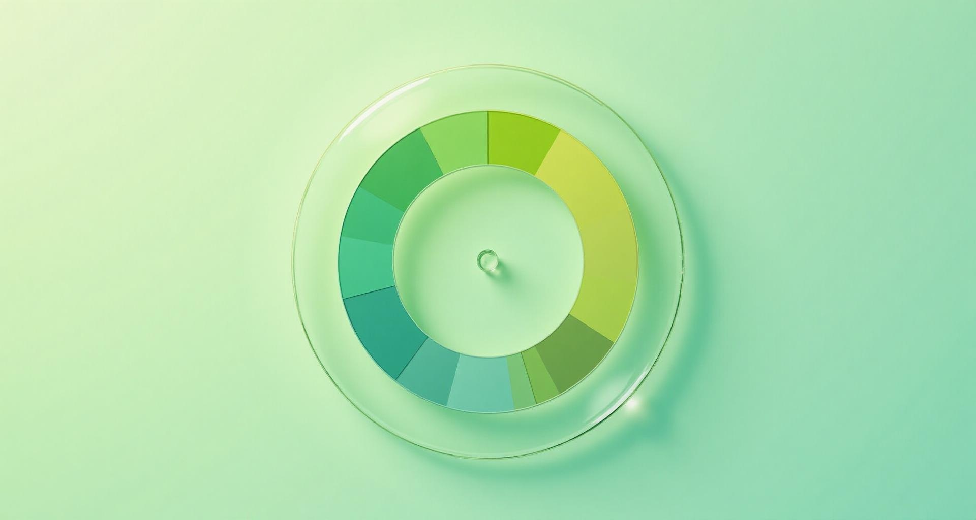
The Japanese Garden That Changed How I See Color
I was walking through a Japanese garden in Kyoto when it hit me. Every green was different—the blue-green moss creeping over ancient stones, the deep emerald of the manicured pines, the lime-yellow of new bamboo shoots, the sage of the ornamental grasses.
Yet somehow, it all worked. Perfectly.
No discord. No clash. Just this seamless, breathing harmony that made me want to sit on that stone bench forever.
That's when I really got analogous colors. Not from a design textbook. From nature doing what it's done for millions of years—placing colors next to each other and creating magic.
Let me show you how to capture that same magic in your designs.
What Are Analogous Colors?
Analogous colors are colors that sit next to each other on the color wheel, typically spanning about 30-60 degrees. They share underlying hues, which is why they feel so naturally harmonious.
Think of it like musical notes that are close together on a scale. They blend smoothly because they're related—like family members who share certain features.
The classic formula:
- Primary color (your main hue)
- Two neighbors (colors on either side)
For example, if your primary is blue, your analogous neighbors would be blue-green and blue-violet.
But here's what most design guides won't tell you: the best analogous schemes use 4-5 colors spanning about 60 degrees, with varying saturation and lightness. That's where the magic happens.
For the complete fundamentals of how colors relate, check out our color wheel theory guide.
Analogous vs Complementary: The Yin and Yang of Color
If complementary colors are bold opposites that create tension and energy, analogous colors are gentle neighbors that create calm and cohesion.
| Aspect | Analogous | Complementary |
|---|---|---|
| Feeling | Calm, harmonious, unified | Bold, energetic, vibrant |
| Contrast | Low to moderate | High |
| Best for | Backgrounds, long-form content, serene spaces | CTAs, accents, attention-grabbing moments |
| Risk | Can feel monotonous | Can feel jarring |
| Nature analogy | Forest canopy | Sunset sky |
Neither is "better"—they serve different purposes. The best designs often use analogous schemes as the foundation with complementary accents for emphasis.
The Science: Why Adjacent Colors Feel Harmonious
There's actual science behind why analogous colors work so well together.
Color wavelengths: Colors next to each other on the spectrum have similar wavelengths. Your eyes can process them together without the "work" required to reconcile opposites.
Cone receptors: Our eyes have three types of cone cells (red, green, blue). Analogous colors stimulate similar combinations of these cones, creating a smooth perceptual experience.
Evolutionary psychology: In nature, harmonious color transitions (like forest greens or sunset oranges) signal safety and abundance. Our brains are wired to find them pleasing.
This is why analogous schemes feel "easy"—they literally require less cognitive processing than high-contrast combinations.
6 Classic Analogous Color Schemes
Let's break down each scheme and when to use it:
1. Ocean Blues (Trust & Calm)
Range: Deep Navy → Royal Blue → Ocean Blue → Sky Blue → Teal
This is the corporate world's go-to. Banks, healthcare, tech—everyone loves blue because it communicates trust and competence without trying too hard.
Use for:
- Financial services websites
- Healthcare apps
- Professional portfolios
- Meditation and wellness brands
The key is varying the saturation. Don't just use five identical blues—let some be deeper, some brighter, some grayer. That's what creates visual interest.
See how blue affects perception in our deep dive on psychology of blue in design.
2. Forest Greens (Nature & Growth)
Range: Teal → Sea Green → Forest Green → Lime Green → Yellow-Green
Nothing says "sustainable" and "growth" like a well-executed green palette. But be careful—greens can easily look dated if you're not thoughtful about tone.
Use for:
- Eco-friendly brands
- Health and fitness apps
- Agricultural businesses
- Outdoor and adventure companies
Pro tip: Add warm undertones (more yellow-green) for energy, cool undertones (more teal) for sophistication.
Learn more about green's psychological impact in science of green in branding.
3. Sunset Oranges (Energy & Creativity)
Range: Golden Yellow → Amber → Deep Orange → Burnt Orange → Red-Orange
This is the palette of food, creativity, and urgency. It's warm, inviting, and impossible to ignore.
Use for:
- Restaurants and food brands
- Creative agencies
- Entertainment platforms
- E-commerce (especially during sales)
Warning: This scheme can feel overwhelming. Use generous white space and neutral backgrounds to let the warmth breathe.
For more on orange's power, see orange color in branding.
4. Twilight Purples (Luxury & Mystery)
Range: Deep Indigo → Deep Purple → Purple → Violet → Magenta
Purple has always been the color of royalty, and this analogous range captures that mystique beautifully. It's sophisticated without being cold.
Use for:
- Luxury brands
- Beauty and cosmetics
- Creative services
- Spiritual and wellness products
The key with purple analogous schemes is embracing the range from blue-purple to red-purple. That transition is where the magic lives.
Explore purple's luxury appeal in purple luxury branding.
5. Golden Hour (Optimism & Warmth)
Range: Olive → Lime → Yellow → Amber → Orange-Yellow
Named after that perfect photography lighting, this scheme radiates optimism. It's happy without being childish.
Use for:
- Children's brands (but sophisticated ones)
- Solar and renewable energy
- Happy-focused apps and services
- Summer campaigns
See also: psychology of mustard yellow for the deeper meanings behind these warm tones.
6. Autumn Reds (Passion & Comfort)
Range: Burnt Orange → Deep Orange → Red → Pink-Red → Deep Pink
This is the palette of passion tempered with warmth. It's bold but approachable—more "cozy fireplace" than "alarm siren."
Use for:
- Food and beverage (especially coffee and chocolate)
- Dating and social apps
- Home and lifestyle brands
- Holiday campaigns
The psychology of red deserves its own exploration—check out psychology of red logos.
Analogous Colors in Interior Design
This is where analogous schemes truly shine. Living spaces need to feel cohesive, and nothing achieves that better than colors that naturally belong together.
Living Rooms
The Forest Living Room: Imagine: sage green walls, a deeper olive sofa, emerald accent pillows, and brass (yellow-green's metallic cousin) fixtures. Add natural wood tones and you've got a space that feels like a sophisticated treehouse.
The Ocean Living Room: Navy feature wall, medium blue sofa, teal throw blanket, sky blue accessories. White trim keeps it from feeling too heavy. This scheme works in almost any space because blue's versatility is unmatched.
For more interior color guidance, explore our complete guide on how to add color to your home.
Bedrooms
Bedrooms need calm, and analogous schemes deliver.
The Twilight Bedroom: Soft lavender walls with deeper purple bedding and violet accents. Add metallic rose gold touches (which sits in the purple-pink range) for warmth. The result? A space that feels luxurious but restful.
The Sunset Bedroom: Warm terracotta walls (controversial, I know), peach bedding, coral accessories. It sounds bold, but when the values are kept soft and creamy, it's incredibly cozy. Think: Moroccan riad meets modern minimalism.
Kitchens
The Green Kitchen: White cabinets with sage green tile backsplash, deeper green plants on open shelving, brass hardware with green undertones. Fresh but sophisticated.
This is essentially earth tones meeting analogous color theory—nature's own palette applied to your space.
Analogous Colors in Branding
Instagram's Genius Gradient
Instagram's logo is one of the most successful analogous applications in modern branding. That gradient moves from yellow through orange to pink to purple—a full 150-degree sweep of warm analogous colors.
Why it works:
- Warmth signals creativity and connection
- Gradient suggests infinite possibilities
- Purple endpoints add a touch of luxury/creativity
- Memorable without being garish
Spotify's Green Range
Spotify doesn't just use "green"—it uses a carefully curated analogous green palette that spans from bright lime-green to deeper forest tones across their interface and marketing.
The result? A brand that feels energetic (bright green) and trustworthy (deeper greens) simultaneously.
Nature-Forward Brands
Look at any successful wellness, organic, or eco-brand. Chances are, they're using analogous greens, earth tones, or warm yellow-orange schemes.
Whole Foods, Patagonia, The Body Shop—all rely heavily on analogous color harmony to communicate their values before you read a word.
For creating your own brand palette, try our Fibonacci Generator which builds mathematically harmonious schemes.
Analogous Colors in Digital Design
Dashboard Color Coding
Here's a practical application: using analogous colors to indicate related data types in dashboards.
Example: A financial dashboard might use:
- Deep blue for overall portfolio value
- Royal blue for stocks
- Sky blue for bonds
- Teal for alternative investments
Users instantly understand these categories are related, even without reading labels.
Data Visualization
Heat maps, choropleth maps, and gradient scales all rely on analogous color principles. Moving from light to dark (or one hue to its neighbor) creates intuitive visual hierarchy.
For more digital design color strategies, see how to add color to digital design.
UI State Variations
Button states are a perfect micro-application of analogous colors:
- Default: Medium blue
- Hover: Slightly lighter/more saturated blue
- Active: Deeper blue with teal undertone
- Disabled: Desaturated gray-blue
The transitions feel natural because you're staying within the analogous family.
Always verify your color choices meet accessibility standards with our color contrast checker.
Fashion and Analogous Colors
Tonal Dressing
The "tonal dressing" trend is basically analogous color theory applied to outfits. Wearing multiple shades of the same color family (different blues, various greens) creates a sophisticated, editorial look.
Why it works: Your eye moves smoothly across the outfit without jarring interruptions. It elongates the silhouette and looks more expensive than it might actually be.
Seasonal Palettes
Fashion's seasonal color theory relies heavily on analogous groupings:
- Spring: Light, warm analogous (peach, coral, light orange)
- Summer: Cool, muted analogous (soft blue, lavender, pink)
- Autumn: Warm, rich analogous (rust, orange, golden brown)
- Winter: Cool, intense analogous (deep purple, blue, teal)
Earth Tones: Nature's Analogous Masterclass
Earth tones are essentially analogous colors with brown as the anchor. Terracotta, tan, olive, sand—they all sit within about 60 degrees on the color wheel (around the yellow-orange range).
This is why earth tone palettes feel so universally pleasing. They're following the same analogous principles that make forests and deserts and autumn leaves beautiful.
If you want "safe" and "sophisticated" without much risk, earth tones are your friend.
Common Mistakes (And How to Avoid Them)
1. Too Similar Values
The mistake: Using five colors that are all the same lightness/darkness.
The fix: Vary your values intentionally. Have a dark anchor, a light spacer, and medium tones in between.
2. No Neutral Anchor
The mistake: All analogous colors, all the time. No breathing room.
The fix: Use white, black, gray, or a very desaturated version of your scheme as negative space. The analogous colors need contrast to shine.
3. Ignoring Saturation
The mistake: Five fully saturated analogous colors fighting for attention.
The fix: Let 1-2 colors be fully saturated (your accents), and keep the rest muted. This creates hierarchy.
4. Fighting Natural Light
The mistake: Cool blue analogous scheme in a room with warm afternoon light.
The fix: Consider environmental lighting. Warm light spaces can handle cooler schemes (they'll balance out), but cool-lit spaces with cool schemes can feel sterile.
When to Choose Analogous Over Complementary
Choose analogous when:
- You want a calming, cohesive feel
- The content will be viewed for extended periods
- You're creating backgrounds or environments
- Professionalism and trust are priorities
- You want to suggest "premium" without bold moves
Choose complementary when:
- You need to grab attention immediately
- CTAs and conversion moments
- Short-form content (ads, headlines)
- Energy and excitement are the goals
- You want to stand out from competitors
The hybrid approach: Use analogous for your primary palette, and add a complementary accent for key moments.
Creating Your Analogous Palette
Ready to build your own? Here's my process:
Step 1: Start with Intention
What feeling do you want? Calm? Energetic? Luxurious? Your answer determines your starting point on the color wheel.
Step 2: Choose Your Base
Pick one color that embodies your brand/space/project. This is your anchor.
Step 3: Add Neighbors
Go 30 degrees in each direction. You now have three colors.
Step 4: Vary Values
Make one darker, one lighter, and keep one medium. Now you have depth.
Step 5: Test in Context
Apply to actual designs. Does it work? Adjust saturation and value as needed.
For instant palette generation, try our AI Website Designer which creates harmonious schemes automatically.
Tools for Perfect Analogous Schemes
Creating mathematically perfect analogous palettes used to require color theory expertise. Now you have options:
Fibonacci Generator — Uses the golden ratio to create naturally harmonious palettes. Start with any color and get scientifically balanced analogous variations.
Mood Board Generator — Input your keywords and get complete analogous palettes with font and texture recommendations. Perfect for establishing project direction.
Image Color Extractor — Found an image with an analogous scheme you love? Extract the exact palette and apply it to your work.
Pantone Finder — Need print-safe versions of your digital analogous palette? Find the closest Pantone matches instantly.
Before finalizing any palette, run it through our colorblind simulator to ensure it works for all users.
The Bottom Line
Analogous colors are nature's gift to designers who want harmony without the work. They're the safe choice that still looks sophisticated, the easy win that requires minimal expertise.
But don't mistake "safe" for "boring." The world's most successful brands, the most peaceful interiors, the most usable interfaces—they're built on analogous foundations.
That Japanese garden taught me something I use in every project now: harmony isn't about matching—it's about relationship. Colors that are neighbors on the wheel understand each other. They speak the same language. They work together without trying.
Your job is to listen to what they're saying and put them where they belong.
Related Reading:
- Triadic Colors Examples
- Complementary Colors Examples
- Color Wheel Theory Complete Guide
- Earth Tone Color Palette Guide
- How to Add Color to Your Home
- How to Add Color to Digital Design
- How to Create a Mood Board
- Psychology of Blue in Design
- Science of Green in Branding
- Orange Color in Branding
- Purple Luxury Branding
- Psychology of Red Logos
- Psychology of Mustard Yellow
- Color Accessibility WCAG Guide
- What Does the Color Black Mean
- What is the Color White
- What Makes Gray