Earth Tone Color Palette: The Designer's Guide to Nature's Most Timeless Colors
· Lion Dada
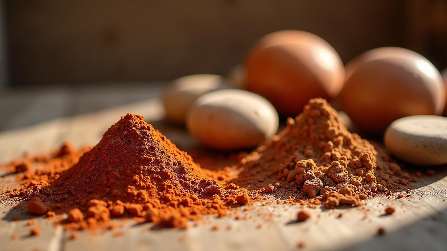
The Afternoon That Changed How I See Color
I was hiking through the Negev desert last spring—sunburned, slightly dehydrated, and about three hours into questioning my life choices—when something clicked.
The rocks weren't just "brown." The sand wasn't just "tan." I was surrounded by an orchestral symphony of color: burnt sienna dissolving into raw umber, ochre dancing with terracotta, olive shadows pooling in the canyon walls. Hundreds of colors, none of them fighting for attention, all of them working in perfect harmony.
That's when I understood why earth tones have captivated designers for literally tens of thousands of years.
They're not boring. They're the opposite of boring. They're nature's masterclass in sophisticated restraint.
What Actually Are Earth Tones? (It's More Than Just "Brown")
Let's clear up a misconception that drives me crazy: earth tones are NOT just browns and tans.
Earth tones are colors derived from soil, clay, minerals, and natural elements. They include:
- Warm browns: Sienna, umber, chocolate, espresso
- Terracotta family: From soft clay pink to deep burnt orange—learn more about this in our guide to what color is red clay
- Ochres and yellows: Mustard, gold, amber, raw sienna
- Olive and sage greens: From pale sage to deep moss—explore the science of green in branding
- Natural neutrals: Cream, beige, sand, taupe—similar to what we explore in what makes gray
- Mineral grays: Slate, stone, pewter
The key characteristic? Low saturation, warm undertones, and a grounded feeling that connects us to the natural world.
The Science: Why Earth Tones Feel So... Right
There's actual neuroscience behind why earth tones make us feel calm and grounded.
Evolutionary Psychology
For millions of years, earth tones signaled safety. Brown earth = stable ground. Green foliage = food and water nearby. Warm colors = shelter and fire. Our brains are literally wired to find these colors comforting.
Research from the University of British Columbia found that exposure to natural colors (including earth tones) reduced cortisol levels by an average of 21%. That's not marketing—that's biology.
Color Temperature and Emotion
Earth tones typically fall in the "warm" spectrum (even olive has warm undertones), which activates the parasympathetic nervous system. Translation: they help us relax.
Compare this to cool, high-saturation colors like electric blue or neon pink. Great for grabbing attention. Terrible for creating environments where people want to linger.
The History: 50,000 Years of Earth Tone Love
Cave Art to Cathedrals
The earliest human artwork—cave paintings from 40,000+ years ago—used exclusively earth tones. Not because our ancestors lacked creativity, but because these were the most stable, accessible pigments available:
- Red ochre from iron-rich clay
- Yellow ochre from goethite
- Umber from manganese-rich soil
- Charcoal black from fire
These same pigments built the visual language of medieval art, Renaissance masterpieces, and continue to appear in contemporary design.
The Mid-Century Modern Revival
In the 1950s-70s, earth tones exploded in interior design. Avocado green appliances, harvest gold shag carpets, burnt orange everything. (Yes, some of it was... questionable. We were young as a design culture.)
The 2020s Renaissance
After years of minimalist whites and grays, earth tones are experiencing their biggest comeback since the Carter administration—but smarter this time.
Pinterest reported a 340% increase in searches for "terracotta interior" since 2021. "Olive green aesthetic" is up 280%. We're craving warmth, authenticity, and connection to nature more than ever.
Earth Tone Palettes That Actually Work
Let me share five palettes I've developed that balance warmth with sophistication:
1. Desert Modern
Perfect for: Contemporary interiors, wellness brands, minimal websites
| Color | Hex | Role |
|---|---|---|
| Sand | #E3D4AD | Base |
| Terracotta | #E2725B | Accent |
| Sage | #9DC183 | Secondary |
| Raw Umber | #734A12 | Deep accent |
| Cream | #F4E4C9 | Highlight |
This palette feels like a Santa Fe sunset. The sage provides essential contrast without fighting the warm tones.
2. Forest Retreat
Perfect for: Eco brands, outdoor companies, sustainable products
| Color | Hex | Role |
|---|---|---|
| Dark Olive | #556B2F | Primary |
| Moss | #8A9A5B | Secondary |
| Tan | #D2B48C | Warm balance |
| Espresso | #4A3728 | Deep anchor |
| Linen | #FAF0E6 | Light neutral |
Heavy on greens but balanced with tan and linen to prevent feeling too cold.
3. Mediterranean Clay
Perfect for: Food brands, hospitality, artisanal products
| Color | Hex | Role |
|---|---|---|
| Terracotta | #E2725B | Hero color |
| Ochre | #CC7722 | Warm accent |
| Olive | #808000 | Cool balance |
| Cream | #F4E4C9 | Light base |
| Sienna | #A0522D | Deep accent |
This is the palette that says "hand-crafted with love." Perfect for brands wanting to communicate authenticity and craftsmanship—similar to red and orange in food branding psychology.
4. Scandinavian Earth
Perfect for: Minimal interiors, clean websites, modern brands
| Color | Hex | Role |
|---|---|---|
| Taupe | #B19678 | Sophisticated neutral |
| Beige | #F5F5DC | Light base |
| Warm Gray | #A59C94 | Cool neutral |
| Rust | #B7410E | Accent (use sparingly) |
| Sand | #E3D4AD | Transition color |
The Scandinavian approach: earth tones whispered, not shouted. That single rust accent does all the heavy lifting.
5. Bohemian Rich
Perfect for: Creative spaces, eclectic brands, maximalist interiors
| Color | Hex | Role |
|---|---|---|
| Burnt Sienna | #A0522D | Primary |
| Mustard | #FFDB58 | Bold accent |
| Olive | #808000 | Secondary |
| Burgundy | #800020 | Deep accent |
| Cream | #F4E4C9 | Balance |
This palette has energy. It's earth tones with attitude—perfect for spaces that need personality. The deep purple-tinged burgundy adds a touch of luxury.
Earth Tones in Interior Design: Room-by-Room Guide
Living Rooms
Earth tones excel in living spaces because they're inherently social colors. They create warmth without overwhelming, sophistication without coldness.
Pro tip: Layer multiple earth tones at different values. A terracotta accent wall, tan sofa, cream throw pillows, and olive plants create visual interest without chaos. For more inspiration, check out our complete guide on how to add color to your home, or create a mood board to visualize your earth tone scheme before committing.
Kitchens
The "terracotta kitchen" trend isn't going anywhere. Warm clay tiles, wooden countertops, and copper accents create spaces that feel like they've existed for generations.
Avoid: Going too dark. Kitchens need light to feel functional.
Bedrooms
This is where earth tones truly shine. Low-saturation colors promote better sleep (studies show this), and warm neutrals create cocoon-like comfort.
My recommendation: Sage green walls with cream bedding and terracotta accents. Peaceful but not sterile. The calming effect is similar to what we discuss in the psychology of blue, but warmer.
Bathrooms
Controversial opinion: earth tone bathrooms are better than white ones. Fight me.
Terracotta tiles, natural stone, wooden vanities—these create spa-like retreats instead of clinical spaces.
Earth Tones in Digital Design
Website Design
Earth tones work beautifully for brands wanting to communicate:
- Authenticity and craftsmanship
- Environmental consciousness
- Warmth and approachability
- Premium positioning (yes, really)
Examples that nail it:
- Airbnb uses warm neutrals to feel welcoming
- Patagonia layers earth tones for outdoor authenticity
- Many premium coffee brands use deep browns and cream
For a deeper dive into digital color strategy, see our guide on how to add color to digital design.
UI/UX Considerations
Earth tones present some unique challenges:
- Contrast: Ensure text is readable (use our Color Contrast Checker)
- Accessibility: Some earth tones can be hard for colorblind users to distinguish—test with our Colorblind Simulator
- Energy: For CTAs, you may need to push toward brighter terracotta or rust
The solution: Use earth tones for backgrounds and ambiance, but bring in higher-saturation versions (like bright terracotta or vivid olive) for buttons and interactive elements.
Earth Tones in Fashion: A Timeless Wardrobe
Earth tones are the backbone of the "capsule wardrobe" movement for good reason: they mix effortlessly.
The Foundation Pieces
- Camel coat
- Olive utility jacket
- Tan chinos
- Cream knit sweater
- Terracotta linen shirt
Why It Works
Every piece pairs with every other piece. No color clashing. No "what goes with what" anxiety. Just easy, sophisticated dressing. Unlike high-contrast combinations with black, earth tones create subtle harmony.
The 2025 Trend
Fashion is moving toward richer earth tones—less millennial pink-beige, more saturated ochre and deep olive. Think "1970s professor" meets "modern minimalist."
Combining Earth Tones With Other Colors
Earth tones don't have to live alone. Here's how to expand your palette:
Earth + Navy
Classic combination. Navy provides depth and formality while earth tones add warmth. Perfect for professional contexts that don't want to feel cold. Explore more about blue in design.
Earth + Black
Use sparingly. Black can overpower earth tones, but as an accent (typography, thin borders), it adds sophistication.
Earth + Blush Pink
Surprisingly beautiful. The warm undertones in both families create harmony, while the pink adds a touch of femininity without feeling juvenile.
Earth + Gold
Instant luxury. Gold metallics transform earth tones from "natural" to "premium natural." Think high-end skincare packaging or boutique hotel interiors. Similar to how purple creates luxury, but warmer.
What to Avoid
- Earth + Neon: The clash is jarring, not intentional
- Earth + Cool pastels: Undertone conflict creates visual confusion
- Too many saturated earth tones together: Choose one hero, support with neutrals
Creating Your Own Earth Tone Palette
Ready to build something custom? Here's my process:
Step 1: Choose Your Hero Color
Pick ONE earth tone that sets the mood:
- Terracotta = Warm, creative, artisanal (like red clay)
- Olive = Natural, sustainable, grounded
- Sienna = Rich, premium, sophisticated
- Sand = Minimal, clean, approachable
Step 2: Add Depth
Include a darker version of your hero or a complementary deep earth tone (umber, espresso, dark olive).
Step 3: Light Balance
Add cream, beige, or linen to provide breathing room and prevent heaviness.
Step 4: Accent Strategically
One accent color (could be a brighter earth tone like ochre, or a complementary like sage) for visual interest.
Step 5: Test in Context
Earth tones look different under different lighting. Test your palette in the actual environment where it'll live.
The Psychology of Specific Earth Tones
Terracotta
Associations: Warmth, craftsmanship, Mediterranean, creativity Best for: Food brands, artisanal products, hospitality, creative spaces
Olive
Associations: Nature, sustainability, military precision, earthiness Best for: Outdoor brands, eco-conscious products, masculine-leaning design
Sienna/Umber
Associations: Richness, age, tradition, luxury Best for: Premium brands, heritage products, sophisticated interiors
Ochre/Mustard
Associations: Energy within calm, vintage, optimism Best for: Accent walls, brand pops, creative industries
Taupe
Associations: Sophistication, neutrality, professionalism Best for: Corporate spaces, luxury fashion, minimal design—falls between gray and brown
Common Earth Tone Mistakes (And How to Avoid Them)
Mistake 1: Going Too Dark
All deep tones without light balance creates caves, not spaces. Fix: Maintain at least 30% of your palette in lighter values.
Mistake 2: Forgetting Contrast
Similar-value earth tones blend into mud. Fix: Ensure clear value distinction between adjacent colors.
Mistake 3: Ignoring Undertones
Not all earth tones play nice. Cool-undertone taupe fights warm-undertone terracotta. Fix: Stick to consistently warm or consistently neutral undertones.
Mistake 4: No Accent
Pure earth tone palettes can feel flat. Fix: Add one slightly more saturated color as a focal point.
Tools for Building Earth Tone Palettes
Coloracci's Fibonacci Generator
Our Fibonacci Color Generator creates mathematically harmonious earth tone palettes. Start with any earth tone as your base, and the algorithm generates complementary shades that feel naturally balanced.
Image Extraction
Found a photo with perfect earth tones? Use our Image Color Extractor to pull exact hex codes from nature photos, interior shots, or any inspiration image.
AI Palette Generation
Describe the mood you want—"cozy autumn cabin" or "minimalist desert retreat"—and our AI Website Designer generates custom earth tone palettes tailored to your vision.
Mood Board Creation
Use our Mood Board Generator to explore earth tone aesthetics with font pairings, textures, and design styles all in one place.
Earth Tones in 2025 and Beyond
The earth tone trend isn't slowing down. Here's what I'm seeing:
Deeper, Richer Tones
Moving away from the beige-pink neutrals of 2020, toward more saturated versions. Think chocolate instead of tan, forest instead of sage.
Terracotta Dominance
Terracotta has moved from "trend" to "classic." Expect to see it in every design discipline for years to come.
Green Earth Tones Rising
Olive and sage are having a moment, driven by sustainability consciousness and biophilic design trends. See our deep dive on green in branding.
Earth + Tech
Unexpected combinations of earth tones with tech-forward design. Think: terracotta gradients, olive in app interfaces, natural tones in digital products.
Final Thoughts: Why Earth Tones Endure
After 50,000 years, earth tones remain relevant because they speak to something fundamental in human experience: our connection to the natural world.
In an increasingly digital, artificial, disconnected age, earth tones offer visual grounding. They remind us of soil, stone, clay, and wood—materials we shaped with our hands for millennia.
That hiking trip in the Negev didn't just teach me about color. It taught me why certain palettes feel like home: because they're the colors of home. The actual, geological, planetary home we all share.
Use them wisely, and your designs will carry that same timeless resonance.
Ready to create your own earth tone palette? Try our Fibonacci Color Generator or explore AI-powered palette creation to build harmonious earth tone schemes in seconds.
Related Reading:
- What Color is Red Clay? The Complete Guide
- The Psychology of Mustard Yellow in Design
- The Science of Green in Branding
- What Makes Gray: The Complete Guide
- How to Add Color to Your Home
- How to Add Color to Digital Design
- The Psychology of Blue in Design
- Orange Color in Branding
- What Does the Color Black Mean?
- Pink Colour Benefits