Office & Coworking Color Psychology: How Workspace Colors Influence Productivity, Creativity & Employee Wellbeing
· Maya Richardson
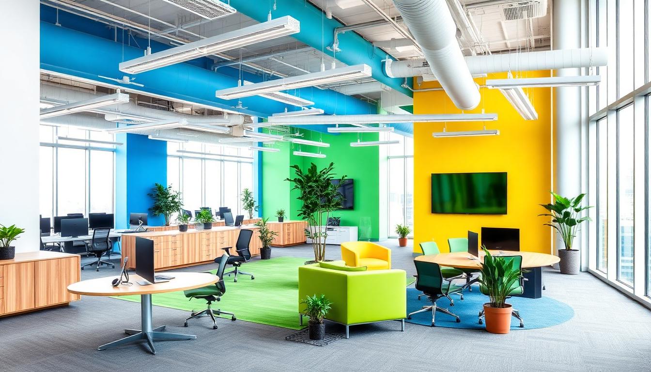
Your Office Walls Are Either Boosting Performance or Driving Talent Away
Here's a statistic that should stop every facilities manager in their tracks: research from the University of Texas found that white and beige offices increase error rates by up to 15% compared to strategically colored workspaces. In an era where companies spend over $15,000 per employee annually on workspace costs, the paint on the walls might be the cheapest performance upgrade available — or the most expensive oversight.
The global coworking industry alone is projected to exceed $40 billion by 2027, with over 40,000 flexible workspaces worldwide competing for the same pool of remote workers and enterprise clients. What separates a WeWork from a Industrious, a generic shared desk from a premium creative studio? Beyond amenities and location, office color psychology is the invisible differentiator that shapes whether people do their best work, stay longer, and renew their memberships.
Color in a workspace isn't decoration — it's infrastructure. It regulates circadian rhythms, modulates stress hormones, influences cognitive performance, and shapes how employees perceive company culture. In this comprehensive guide, we'll decode the complete science of workspace color psychology — mapping every major hue to its measurable impact on productivity, creativity, and wellbeing. Whether you're designing a Fortune 500 headquarters or a boutique coworking space, the color palette you choose is working alongside your team every single day.
The Neuroscience of Color in Workspaces
Before selecting a single swatch, understanding how color affects the working brain is essential. The relationship between color and cognitive performance operates through multiple biological pathways.
How Color Drives Cognitive Performance
The human visual system processes color before form, meaning wall colors influence mood and attention before an employee even sits down. Research published in the Journal of Experimental Psychology demonstrates that color exposure triggers measurable changes in three key systems:
- Autonomic nervous system: Warm colors (red, orange) increase heart rate and arousal; cool colors (blue, green) activate the parasympathetic "rest and digest" response
- Cortisol regulation: Overly stimulating environments elevate stress hormones, while appropriately calibrated colors maintain optimal cortisol levels for sustained focus
- Dopamine pathways: Novel and well-designed color environments stimulate dopamine release, the neurotransmitter responsible for motivation and reward-seeking behavior
A landmark 2009 study by Mehta and Zhu at the University of British Columbia found that blue environments enhanced creative performance by 20% on brainstorming tasks, while red environments improved detail-oriented accuracy by 31% on proofreading tasks. This single finding has profound implications for workspace design: no single color optimizes all types of work.
The Yerkes-Dodson Law in Office Design
The relationship between stimulation and performance follows an inverted U-curve. Too little stimulation (white, beige, gray-only environments) leads to understimulation, boredom, and attention drift. Too much stimulation (clashing bright colors everywhere) creates cognitive overload and anxiety. The sweet spot — where color harmonies are balanced — maximizes sustained performance.
The Office Color Zone Framework
The most effective modern workspaces use a zone-based color strategy where different areas are designed for different types of cognitive work. Here's the complete framework:
| Zone | Primary Color | Hex | Purpose | Optimal Lighting |
|---|---|---|---|---|
| Deep Focus | Soft Blue | #A8C4D9 | Concentration, analytical work | Cool white, 4000K |
| Creative Collaboration | Warm Yellow-Orange | #F4A261 | Brainstorming, ideation | Natural + warm, 3500K |
| Executive & Meeting | Navy + Charcoal | #1D3557 | Trust, decision-making | Layered, 3500K |
| Wellness & Recharge | Sage Green | #9DB5A0 | Recovery, stress reduction | Warm natural, 3000K |
| Social & Kitchen | Warm Coral | #E07A5F | Energy, social bonding | Bright warm, 3500K |
| Reception & Lobby | Brand Primary | — | First impressions, culture | Statement, mixed |
This zone-based approach means that the question is never "what color should my office be?" but rather "what types of work happen in each zone, and what colors support that work?"
Blue: The Productivity Powerhouse
Blue is the most universally effective color for workspaces — and the most extensively researched. Its dominance in corporate environments isn't arbitrary; it's physiologically justified.
Why Blue Dominates Knowledge Work
Blue light wavelengths (450-490nm) suppress melatonin production and enhance alertness. But it's not about brightness — it's about the psychological associations. Blue signals trust, stability, and competence. When employees work in blue environments, they report:
- Higher sustained attention during complex analytical tasks
- Reduced perception of time passing, leading to longer productive sessions
- Lower blood pressure compared to red or orange environments
- Increased willingness to take on challenging work
The sweet spot for office blue is in the muted, medium-tone range — think #457B9D or #6B98B5 rather than electric cobalt. LinkedIn, IBM, and Salesforce all use blue-dominant headquarters interiors, and it's no coincidence that these are companies built on sustained intellectual output.
Blue in Practice: The Focus Pod
For deep work pods, phone booths, and individual focus areas, a soft blue-gray palette creates optimal conditions. Pair #A8C4D9 walls with warm wood desks and 4000K task lighting. The contrast between cool walls and warm surfaces creates visual depth without distraction. Use our color hierarchy tool to balance the 60-30-10 proportion: 60% blue-gray, 30% warm neutral, 10% accent.
Green: The Biophilic Performance Enhancer
If blue is the brain's favorite color for focus, green is its favorite for endurance. Green environments reduce eye strain, lower anxiety, and sustain performance over longer periods.
The Science of Green in Offices
The evolutionary explanation is compelling: humans spent 99% of their existence in green environments. Our visual system is most sensitive to green wavelengths (520-565nm), processing them with less neural effort than any other color. In practical terms, this means:
- Reduced eye fatigue during long screen sessions — green walls provide the perfect rest point for eyes tired from monitors
- 14% improvement in creative output when green plants or green walls are present (University of Exeter, 2014)
- Lower cortisol levels throughout the workday, reducing burnout risk
- Enhanced reading comprehension and information retention
Green in Practice: The Biophilic Breakout Space
The most effective use of green in offices combines actual plants with green architectural elements. Sage green (#9DB5A0) or muted olive (#6B705C) walls, paired with living plant walls and natural wood, create breakout spaces that genuinely restore cognitive resources. Google's biophilic offices in Tel Aviv and Amazon's Spheres in Seattle are multi-million-dollar validations of this principle — but even a small coworking space can achieve similar effects with strategic green accent walls and curated plant displays.
For the wellness and recharge zone, consider a palette of sage green (#9DB5A0), warm cream (#FFF8E7), and natural wood tones. This combination triggers what environmental psychologists call "prospect and refuge" — a feeling of being both safe and connected to nature. Generate a complete biophilic palette with our AI color tool.
Yellow & Orange: The Creative Catalysts
While blue and green excel at sustained focus, creative work — brainstorming, design thinking, lateral problem-solving — requires a different neurological state. Yellow and warm orange activate that state.
How Warm Colors Spark Innovation
Yellow stimulates the production of serotonin, the neurotransmitter associated with optimism and idea generation. Orange combines yellow's mental stimulation with red's energy, creating an ideal environment for collaborative creative work. Research from the Creativity Research Journal shows:
- Yellow environments increase novel idea generation by 25% compared to neutral rooms
- Orange-accented spaces encourage more verbal participation in meetings and workshops
- Warm color palettes reduce social inhibition, making team members more willing to share unconventional ideas
However, there's a critical caveat: warm colors must be used strategically, not globally. An entire office in bright yellow would induce anxiety and headaches within hours. The research supports warm colors as accent and zone colors — the walls of a brainstorming room, the furniture in a collaborative area, or the accent wall behind a whiteboard.
Yellow & Orange in Practice: The Collaboration Hub
For creative collaboration zones, use warm yellow-orange (#F4A261) as a 30% accent against a neutral base of warm white (#FAFAF5) at 60%, with energetic accents like coral (#E07A5F) at 10%. This palette signals "ideas happen here" without overwhelming occupants. Install writable wall surfaces in these zones — the psychological link between a warm, inviting color environment and the permission to "mark up the walls" amplifies creative output.
WeWork's most successful locations consistently use this approach: neutral base palettes with warm pops of yellow and orange in communal areas, shifting to cooler tones in dedicated desks and private offices. The color transition itself — moving from warm social zones to cool focus zones — creates a psychological "mode switch" that helps members shift between collaborative and individual work.
Red: Strategic Energy, Not Global Application
Red in an office is like salt in cooking — essential in small doses, disastrous in excess. The psychology of red is well-documented: it increases heart rate, urgency, and physical energy. In an office, this makes it ideal for very specific applications.
Where Red Works in Offices
- Gym and fitness areas within offices — red walls in a corporate gym boost physical performance and perceived exertion
- Sales floors and high-energy call centers — where urgency and competitive drive are desirable
- Accent walls in lobbies — creating a bold, memorable first impression that communicates ambition
- Emergency and wayfinding elements — exit signs, safety equipment, and critical path markers
Where Red Fails in Offices
Red should never be the dominant color in areas requiring sustained analytical thinking, calm collaboration, or employee rest. Studies show that prolonged exposure to red environments increases anxiety, raises blood pressure, and accelerates burnout — the opposite of what knowledge workers need.
The most effective use of red in modern offices is as a 10% accent or less: a statement chair, a feature art piece, a branded element in the reception area. Let red communicate energy and brand personality without asking employees to marinate in it for eight hours.
Neutral Tones: The Backbone Done Right
Neutrals — whites, grays, beiges, and warm taupes — constitute the foundational 60% of most office palettes. But not all neutrals perform equally.
The Problem with Pure White
The classic "clean white office" is a design disaster hiding in plain sight. Pure white (#FFFFFF) walls create harsh glare, especially under fluorescent lighting, causing eye strain and headaches. More critically, pure white environments are psychologically "empty" — they lack the visual information the brain needs to feel grounded, leading to restlessness and an inability to concentrate.
Better Neutral Choices
- Warm white (#FAFAF5): Softens harsh lighting, feels welcoming without color distortion
- Light warm gray (#E8E4E0): Professional without being sterile, pairs well with any accent color
- Soft greige (#D5CDBC): The warmest professional neutral — ideal for law firms, financial services, and executive areas
- Charcoal (#2B2D42): Dramatic feature walls that add depth and sophistication, especially in meeting rooms paired with warm lighting
The key principle: warm neutrals over cool neutrals in office environments. Cool grays (#C0C0C0 range) can feel institutional and uninspiring — reminiscent of hospitals and government buildings. Warm neutrals feel curated, intentional, and human. Use the 60-30-10 rule to balance your neutral base with zone-appropriate accent colors.
Coworking-Specific Color Strategy
Coworking spaces face a unique challenge: they must appeal to diverse tenants — freelancers, startups, enterprise teams, creative agencies — while maintaining a cohesive brand identity. Color is the primary tool for solving this tension.
Zone Differentiation Through Color
The most successful coworking brands use color to communicate function without signage:
- Hot desk areas: Light, airy neutrals with natural materials — signaling flexibility and adaptability
- Dedicated desks: Slightly cooler tones (soft blue-gray) — signaling ownership and focus
- Meeting rooms: Each with a distinct accent color — aiding wayfinding and creating memorable bookable spaces ("Book the Blue Room," "Let's meet in the Coral Room")
- Phone booths: Dark, cocooning colors (deep navy, charcoal) — creating acoustic and visual privacy
- Community kitchen: Warm, energetic colors (terracotta, warm yellow) — encouraging social interaction and member networking
Color as Brand Differentiation
In the competitive coworking market, color palette is brand identity. Industrious uses sophisticated navy and cream to attract enterprise clients. The Wing (before closure) used millennial pink and burgundy to signal its community identity. Huckletree uses bold, eclectic color combinations to attract creative startups. Your brand color palette communicates who you're for before a prospective member reads a single word of copy.
Employee Wellbeing: The Colors of Mental Health
The most forward-thinking offices now include dedicated wellness spaces — meditation rooms, nap pods, quiet lounges — where color plays a therapeutic role.
Designing the Office Wellness Room
The ideal wellness room uses colors that activate the parasympathetic nervous system:
- Sage green (#9DB5A0) walls — grounding, natural, restorative
- Soft lavender (#C4B7CB) accents — calming without being cold, associated with stress reduction
- Warm wood tones — biophilic elements that signal safety and comfort
- Warm, dim lighting (2700-3000K) — mimicking golden hour to trigger relaxation responses
Avoid blue in wellness rooms — while blue is excellent for productive focus, it can feel too "alert" for genuine rest. Green and lavender create the psychological permission to actually disengage from work, which is the entire purpose of a wellness space.
Color and Circadian Rhythm in Offices
Progressive offices are now designing with the workday's natural rhythm in mind:
- Morning zones (reception, café): Warm, energizing colors with bright natural light — matching the body's cortisol awakening response
- Midday zones (focus areas): Cooler, productive colors with balanced lighting — supporting peak cognitive performance
- Afternoon zones (collaboration rooms): Moderately warm colors — counteracting the post-lunch dip
- Late-day zones (lounge, social): Warm, amber-toned lighting and colors — preparing the body for evening wind-down
This chronobiological approach to office color design represents the cutting edge of workplace wellness strategy.
Industry-Specific Office Palettes
Different industries benefit from different color strategies based on the type of work and the culture they want to cultivate:
Technology & Startups
- Primary: Cool blue-gray (#6B98B5) — trust, innovation
- Accent: Electric teal (#2EC4B6) — modernity, disruption
- Base: Warm white (#FAFAF5) — clean but not sterile
- Culture signal: "We're smart, modern, and human"
Law & Financial Services
- Primary: Deep navy (#1D3557) — authority, trust
- Accent: Muted gold (#B8860B) — heritage, value
- Base: Soft greige (#D5CDBC) — sophisticated warmth
- Culture signal: "We're established, trustworthy, and refined"
Creative Agencies & Design Studios
- Primary: Charcoal (#2B2D42) — gallery-like neutrality
- Accent: Bold rotating colors — showcasing creative range
- Base: Pure white (#F8F8F8) — clean canvas
- Culture signal: "Our work is the color here"
Healthcare & Wellness Companies
- Primary: Sage green (#9DB5A0) — healing, nature
- Accent: Soft coral (#E8A598) — warmth, empathy
- Base: Warm cream (#FFF8E7) — comfort, softness
- Culture signal: "We care about human wellbeing"
Generate a complete industry-specific palette with our AI website designer — enter your industry and brand values, and receive a production-ready color system.
The ROI of Strategic Office Color
Investing in strategic color design delivers measurable business outcomes:
Productivity Gains
- Blue focus environments: 12-20% improvement in sustained attention tasks
- Green biophilic spaces: 15% boost in creative output and 6% improvement in productivity (Human Spaces report, 2015)
- Zone-based color strategy: 23% reduction in "wrong zone" work — employees naturally migrate to the space that matches their current task
Talent Attraction & Retention
- 71% of employees say office design influences their decision to stay at a company (Gensler Workplace Survey)
- Aesthetically pleasing offices reduce absenteeism by up to 19%
- Biophilic design elements (green spaces, natural materials) correlate with 13% higher levels of wellbeing
Coworking Membership Retention
- Color-differentiated zones increase member satisfaction scores by 18-25%
- Wellness rooms with therapeutic colors reduce member churn — members who use these spaces are 34% more likely to renew
- Instagrammable color moments (feature walls, unique meeting rooms) generate free marketing through member social sharing
The cost of repainting a 10,000 sq ft office is approximately $15,000-30,000. The cost of replacing a single employee averages $20,000-50,000. Strategic color is one of the highest-ROI investments a company can make.
Implementation Guide: From Beige to Brilliant
Step 1: Audit Your Current Space
Walk through your office with our color extraction tool. Photograph each zone and extract the dominant colors. You'll likely discover that most of your space is an unstratified wash of the same neutral.
Step 2: Map Work Zones
Identify every distinct type of work that happens in your space: deep focus, collaborative brainstorming, client meetings, social interaction, rest and recovery. Map these to physical zones.
Step 3: Assign Colors to Zones
Use the Office Color Zone Framework table above to assign primary and accent colors to each zone. Check color contrast for any zones where text readability matters (signage, wayfinding, digital displays).
Step 4: Test with Accents First
Before committing to full wall colors, introduce zone colors through furniture, accessories, and removable elements. Observe how employees respond over 2-4 weeks. Then commit to architectural color.
Step 5: Maintain and Evolve
Colors fade, trends shift, and workstyles evolve. Plan to reassess your color strategy every 3-5 years, and refresh accent elements annually. Use trending color palettes to keep your space feeling current.
Conclusion: Color Is Your Silent Employee
Every surface in your office is communicating something. White walls say "we didn't think about this." Beige says "we gave up." But a strategically designed color environment says "we understand how people work, and we've built a space that supports them."
The companies winning the talent wars — Google, Airbnb, Slack, Salesforce — didn't stumble into great office design. They invested in understanding how physical environments shape cognitive performance, and they used color as a strategic tool rather than an afterthought.
Whether you're designing a 200,000 square foot headquarters or a 2,000 square foot coworking space, the principles are the same: match colors to cognitive tasks, use zones rather than uniform palettes, prioritize biophilic elements, and design for the full arc of the workday. The science is clear, the ROI is proven, and the implementation is surprisingly affordable. Your office walls are either your most productive employee or your most costly liability. Choose wisely.