Purple Color in Luxury Branding: The Psychology of Premium – Why Royalty Chose This Color (And Your Brand Should Too)
· Lion Dada
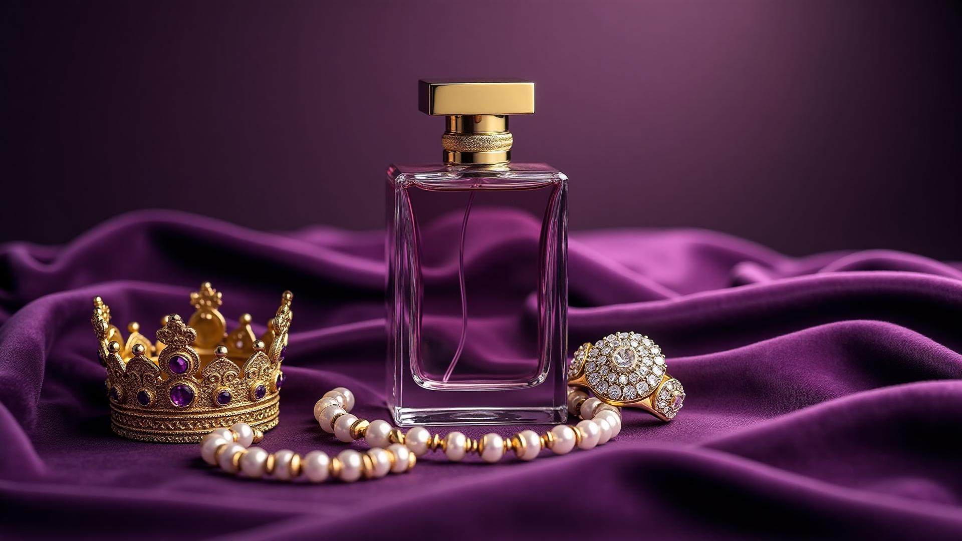
I'll never forget the day a client asked me to make their brand "feel more expensive" without changing anything except the color palette. They were selling artisanal chocolates at farmer's markets, and people kept thinking they were homemade gifts rather than a $45-per-box premium product.
I changed their packaging from brown kraft paper to deep purple with gold foil. Sales tripled within two months.
That's not magic. That's purple.
The $10,000 Pigment: Why Purple Means Luxury
Here's something they don't teach you in design school: purple used to be the most expensive color in the world. Not metaphorically expensive. Actually more valuable than gold.
Tyrian purple, the original "royal purple," came from sea snails. It took 12,000 snails to produce 1.4 grams of dye—enough to color the trim of a single toga. In today's money, that's roughly $10,000 per gram. Cocaine is cheaper.
So when Roman emperors wore purple, they weren't making a fashion statement. They were literally wearing the GDP of a small village.
And here's the kicker: we still associate purple with luxury because of snails that died 2,000 years ago.
That's the power of color psychology. It outlasts empires.

The Psychology of Purple: Red's Passion Meets Blue's Trust
Purple sits at a fascinating intersection on the color wheel. It's what happens when red's energy and passion collide with blue's calm and trustworthiness.
Research from the Institute for Color Research found that purple triggers associations with:
- Luxury (63% of respondents)
- Creativity (58% of respondents)
- Wisdom (51% of respondents)
- Royalty (71% of respondents—thanks, dead Roman snails!)
But here's what makes purple tricky: it's also associated with mystery and spirituality, which means it can feel either premium or gimmicky depending on how you use it.
The difference? The shade.
Want to understand how other colors affect branding psychology? Check out our guide on color psychology in marketing and branding.
The Purple Spectrum: From Lavender to Tyrian
Not all purples are created equal. The shade you choose completely changes your brand message.
Let me break down the spectrum:
Lavender & Lilac (#E6E6FA - #D8BFD8)
Message: Soft, feminine, calming, affordable luxury
Works for: Spa brands, feminine products, wellness, aromatherapy
Example: Bath & Body Works uses soft lavender to feel premium but accessible.
Pitfall: Can feel too feminine or weak for certain brands.
Orchid & Violet (#DA70D6 - #EE82EE)
Message: Playful, creative, youthful, vibrant
Works for: Children's premium products, creative services, events
Example: Cadbury's uses a vibrant purple that feels both playful AND premium (more on their trademark story later).
Pitfall: Too bright for serious luxury.

Royal Purple & Amethyst (#7851A9 - #9966CC)
Message: Classic luxury, wisdom, premium quality ⭐
Works for: Luxury goods, financial services, premium tech
Example: Crown Royal whiskey—the name literally tells you they picked the right purple.
Pitfall: Can feel dated if not executed with modern design.
Deep Purple & Tyrian (#4A148C - #66023C)
Message: Ultimate luxury, exclusivity, mystery, sophistication
Works for: Ultra-premium brands, exclusive services, high-end tech
Example: Asprey London (jewelers to the Queen) uses deep purple with gold.
Pitfall: So intense it can feel intimidating or unapproachable.
For another perspective on color psychology in branding, read about orange's journey from playful to professional.
Luxury Brands That Own Purple
Cadbury: The Purple They Literally Trademarked
Cadbury uses Pantone 2685C—a specific shade they successfully trademarked in the UK. They spent millions defending this color in court against competitors.
Why? Because Cadbury's purple (with its slight reddish undertone) hits the perfect balance: premium enough to feel special, vibrant enough to feel joyful, British enough to feel traditional.
Cadbury's founder chose purple in 1914 to honor Queen Victoria. A century later, that strategic color choice is worth an estimated £2 billion in brand equity.
Hallmark: Purple Makes Cards Feel Special
Hallmark's crown logo sits in a rich purple that says "this moment matters." They use purple because greeting cards are small luxuries—you're paying $6 for folded paper. Purple justifies that price emotionally.
Crown Royal: When Your Name Matches Your Color
Crown Royal nailed it. Deep purple bags with gold drawstrings. The color literally communicates "this whiskey is fit for a king" before you taste a drop.
Their purple is dark enough to feel masculine but rich enough to feel premium. It's premium spirits branding perfection.
Yahoo: Purple in Tech (The Unexpected Choice)
Yahoo's purple was unusual for a tech company in the 90s when everyone else went blue (read about blue in tech branding).
Their purple said "we're creative, not corporate." It worked—until they lost focus on what made them special. The lesson: purple can differentiate you in a sea of blue competitors, but color alone won't save you from strategic failure.
Purple in Modern Tech: Twitch, Roku & The New Premium
Something interesting happened in the 2010s: purple became the color of digital premium.
Twitch (#9146FF) uses bright purple to stand out in gaming and feel energetic but premium—you're not just watching YouTube, you're on Twitch.
Roku (#662D91) uses deep purple to feel more premium than generic streaming devices. It's the "purple makes it luxury" play applied to a $30 HDMI stick.
FedEx (the purple part) uses purple for overnight/express shipping. Regular ground shipping? Orange. Express? Purple. Higher price, higher urgency, premium color.
The pattern: when you want to signal "premium option" in a crowded digital market, purple cuts through.

Purple Color Combinations That Scream Luxury
Purple is powerful alone, but these combinations multiply the premium effect:
Purple + Gold (The Royal Classic)
Effect: Maximum luxury, traditional, royal, prestigious
Use for: Ultra-premium products, VIP services, luxury packaging
Example: Crown Royal, luxury jewelry brands, high-end chocolates
Ratio: 70% purple, 30% gold accents
This is the combination Roman emperors used. It still works 2,000 years later.
Purple + Silver (Modern Premium)
Effect: Contemporary luxury, tech-forward, sophisticated
Use for: Modern luxury brands, premium tech, high-end services
Example: High-end electronics packaging, premium apps
Ratio: 60% purple, 40% silver or white
Purple + Black (Dramatic Luxury)
Effect: Bold, mysterious, exclusive, fashion-forward
Use for: Fashion brands, nightlife, exclusive events, luxury cosmetics
Example: Urban Decay cosmetics, high-end fashion brands
Ratio: 50/50 or use purple as an accent on black
Purple + Cream (Accessible Premium)
Effect: Soft luxury, approachable elegance, refined warmth
Use for: Food brands, wellness, feminine luxury, artisanal products
Example: Milka chocolate, premium soap brands
Ratio: 65% cream, 35% purple
Purple + Teal (Creative Premium)
Effect: Innovative, creative luxury, modern, unexpected
Use for: Creative services, design agencies, innovative tech
Example: Creative studios, modern wellness brands
Ratio: 55% purple, 45% teal
Want to explore more color combination strategies? Try our Fibonacci color generator for mathematically harmonious palettes, or read about green's strategic role in branding.
The Purple Gender Problem (And How to Avoid It)
Here's an uncomfortable truth: purple has a gender perception problem in Western markets.
Studies show that 23% of women cite purple as their favorite color, while only 0-1% of men do. That's a massive gender skew—one of the largest for any color.
This means:
- For feminine products: Purple is safe and effective
- For masculine products: Purple needs careful shade selection (deeper = better)
- For neutral products: Choose your purple shade strategically
The solution? Go darker and richer. Deep purple (#4A148C) and Tyrian purple (#66023C) test better with male audiences than lighter shades.
Crown Royal figured this out. Their purple is dark enough that men feel comfortable buying whiskey in a purple bag.
Purple Accessibility: The Luxury Color That Actually Works
Here's the good news: purple, when chosen correctly, can meet WCAG accessibility standards.
Dark purple on white:
- #800080 (standard purple): 6.3:1 ratio ✅ (AA compliant)
- #4A148C (deep purple): 9.8:1 ratio ✅ (AAA compliant)
Light purple on dark backgrounds:
- #E6E6FA (lavender) on #1a1a1a: 8.2:1 ratio ✅ (AAA compliant)
Always test your specific purple shades with our color contrast checker before committing.
Colorblind considerations: Purple can be problematic for people with tritanopia (blue-yellow colorblindness), appearing more red. Test your designs with our colorblind simulator to ensure your message comes through.
For the full guide on color accessibility, read our WCAG accessibility guide.
When NOT to Use Purple
Purple isn't universal. Here's when to avoid it:
❌ Mass-Market Budget Brands
Purple signals premium pricing. If you're competing on low prices, purple creates cognitive dissonance. Customers will expect quality you might not deliver.
Exception: If you're a budget brand trying to feel MORE premium (like Milka chocolate), purple can elevate perception.
❌ Serious Financial Services
Purple's creative, mysterious associations can undermine trust in banking. Blue is safer for finance.
Exception: Fintech startups trying to disrupt traditional banking (purple says "we're different").
❌ Healthcare & Medical
Purple can feel too mystical or spiritual for serious healthcare. Patients want trust and competence, not mystery.
Exception: Wellness, alternative medicine, or mental health services where calm and spirituality are assets.
❌ Masculine-Focused Brands (with light purple)
Light purples (lavender, lilac) skew so feminine in Western markets that they'll alienate male customers.
Exception: Deep purple (#4A148C or darker) tests well with male audiences when paired with masculine imagery.
Purple in Different Industries: What Works
Let me break down by industry so you can steal what works:
Food & Beverage
Works: Premium chocolates, artisanal products, sophisticated sweets
Examples: Cadbury, Milka, Crown Royal
Shade: Medium to vibrant purple (#800080 - #8E4585)
Fashion & Beauty
Works: Luxury cosmetics, evening wear, accessories
Examples: Urban Decay, luxury perfumes
Shade: Entire spectrum depending on product
Tech & Digital
Works: Creative platforms, streaming, gaming
Examples: Twitch, Roku, Yahoo
Shade: Bright to royal purple (#9146FF - #7851A9)
Wellness & Spa
Works: Premium spas, meditation, aromatherapy
Examples: High-end spa brands, wellness apps
Shade: Lavender to medium purple (#E6E6FA - #800080)
The Taco Bell Exception: When Purple Goes Casual
Here's a weird one: Taco Bell uses purple in their branding.
This breaks every "purple = luxury" rule. They're fast food. They're cheap. They're definitely not premium.
But it works because Taco Bell uses purple to signal "we're FUN and DIFFERENT from other fast food." Their purple says "late-night adventure," not "luxury dining."
The lesson: purple is so strongly associated with luxury that using it for something NOT luxury immediately makes you stand out. It's a bold contrarian move—but it only works if you're intentionally breaking the rule.
Creating Your Purple Brand Palette
Here's my step-by-step process for incorporating purple into your brand:
Define your luxury position:
- Ultra-premium? Go deep purple (#4A148C) + gold
- Accessible luxury? Go medium purple (#800080) + cream
- Creative premium? Go bright purple (#9146FF) + teal
Choose your shade based on your gender target:
- Feminine audience: any purple shade works
- Male audience: stick to deep purples
- Neutral audience: royal purple (#7851A9) is safest
Test combinations with our AI Website Designer to see your purple palette in context
Verify accessibility with our contrast checker
Check colorblind perception with our colorblind simulator
Generate complementary shades using our Fibonacci generator
For exploring different aesthetic directions with purple, try our Mood Board Generator to visualize complete brand concepts.
The Science: Why Purple Actually Triggers "Premium"
Recent neuroscience research gives us clues about why purple makes us think "expensive."
A 2019 study from the University of British Columbia found that purple activates the same neural pathways as viewing luxury goods. The researchers theorized this is learned association—we've been trained for centuries that purple = rare = valuable.
But there's also a physiological component: purple is at the edge of the visible light spectrum. It's harder for our eyes to process than other colors, which makes it feel more special and mysterious. We literally have to work harder to see it.
This "perceptual effort" translates to higher perceived value. Your brain thinks: "This color is special to look at, therefore this product must be special."
Real Talk: Should YOUR Brand Use Purple?
Purple is a powerful tool, but it's not for everyone.
Use purple if:
- You're selling a premium product or service
- You want to stand out in a conservative/blue industry
- Your target audience values creativity and sophistication
- You can deliver on the luxury promise purple creates
Don't use purple if:
- You're competing on low prices
- Your audience is predominantly male AND you're using light shades
- You're in traditional finance/healthcare
- Your brand personality is minimalist/stripped-down
Purple demands confidence. It's a statement color. If you're going to use it, commit fully. A half-hearted purple looks confused, not premium.
The Cadbury Trademark Case: Can You Own a Color?
In 2008, Cadbury tried to trademark Pantone 2685C in the UK for chocolate packaging. Nestlé challenged them, arguing no company should monopolize a color.
The case went on for years. Cadbury won, then lost on appeal, then partially won again. As of 2024, they have limited trademark protection for their specific purple on chocolate products in certain markets.
The takeaway: if your purple becomes iconic enough, it's worth millions. Cadbury's decade-long legal battle wasn't about protecting a color—it was about protecting billions in brand equity.
That's how valuable the right purple can be.
Your Next Steps
Purple can transform your brand from "nice" to "premium"—but only if you use it strategically.
Here's what to do next:
- Experiment with shades using our color picker tool
- See your purple palette in context with our AI Website Designer
- Generate a full brand palette with our Fibonacci color generator
- Create a complete brand aesthetic with our Mood Board Generator
- Explore all our color tools on our tools page
Purple isn't just a color. It's 2,000 years of luxury psychology compressed into a wavelength of light.
Use it wisely—or watch your competitors use it against you.
Enjoyed this deep dive into purple? Check out our other color psychology guides: Orange in branding, Blue in design, Green in branding, and Pink's hidden benefits.