Scandinavian Design Colors: Minimalist Palette Guide
· Coloracci Team
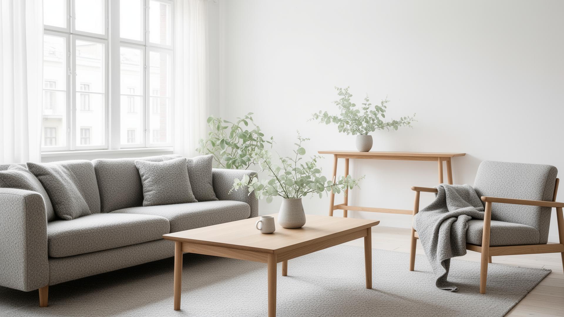
Scandinavian design is arguably the most influential aesthetic movement of the past century, and its approach to color is the foundation upon which everything else — the clean lines, the functional furniture, the reverence for natural materials — rests. The Scandinavian palette is not simply "lots of white with some gray." It is a carefully considered system built on the unique relationship between Nordic light, Nordic landscape, and the Nordic philosophy that beauty emerges from restraint, function, and connection to nature.
Understanding why Scandinavian colors work requires understanding the environment that produced them. The Nordic countries — Denmark, Sweden, Norway, Finland, and Iceland — share long, dark winters where daylight is scarce for months and the landscape reduces to a palette of snow, stone, bark, and muted evergreen. Every color decision in Scandinavian design serves a single primary goal: to maximize the feeling of light and warmth in spaces where both are naturally limited. This is not minimalism for aesthetic fashion — it is minimalism as survival strategy, refined over centuries into an art form.
White as Foundation: Light in the Darkness
White is the cornerstone of Scandinavian design, but the Scandinavian relationship with white is fundamentally different from the clinical whites of modernist architecture or the blank-canvas whites of minimalist galleries. Nordic white is warm, textured, and alive — it exists to amplify whatever natural light enters a space, bouncing it deeper into rooms and extending the psychological sense of daylight.
Why warm white, never cool white: Northern European light has a naturally cool, blue-gray quality, especially during the winter months when the sun sits low on the horizon. A cool white wall under cool Nordic light creates a space that feels icy and unwelcoming. Scandinavian designers learned centuries ago that warm whites — those with subtle yellow, pink, or cream undertones — counteract the coolness of the light, creating spaces that feel luminous rather than cold.
The Scandinavian white spectrum:
- Stockholm White
#F5F3EF— The quintessential Scandinavian white. Not pure white, but a warm, faintly yellow-pink tone that glows under Nordic light. This is the white of Swedish apartments, Danish studios, and Finnish homes — the white that makes small, dark-winter rooms feel spacious and welcoming. - Snowdrift
#FAFAF7— A slightly cooler Scandinavian white used in spaces with more natural light. It retains just enough warmth to avoid clinical coldness while providing maximum reflectivity. - Birch Bark White
#EDE8E2— A warmer, more pronounced off-white named after the silver birch that dominates Nordic forests. This tone works as a softer alternative to wall white, appearing on textiles, ceramics, and painted wood furniture. - Linen Natural
#E8E4DF— The warm gray-white of unbleached Scandinavian linen. This is the transitional tone between white and the muted earth palette — warm enough to feel like white, complex enough to feel like color.
The Jotun and Farrow & Ball influence: Scandinavian paint manufacturers like Jotun (Norway) and design-conscious brands like Farrow & Ball have built entire product lines around the nuances of Nordic white. Jotun's "Egghvit" (Egg White) and "Bomull" (Cotton) demonstrate the specificity of Scandinavian white selection — these are not generic whites but precisely formulated tones designed for specific light conditions.
Design principle: In Scandinavian design, white is never a default — it is a deliberate decision to maximize light. When using Scandinavian white in digital design, choose #F5F3EF or #FAFAF7 over pure #FFFFFF. The slight warmth prevents the sterile, clinical feeling that pure white creates on screens, especially in extended reading or working contexts.
Muted Earth Tones: Nature Brought Indoors
The secondary palette of Scandinavian design draws directly from the Nordic landscape — not the dramatic fjords and northern lights of tourism photography, but the everyday landscape of forests, stone, moss, and shore. These colors are universally muted, low in saturation, and grounded in the specific gray quality of northern light.
The logic of mutedness: Saturated colors under Nordic light can appear garish because the cool, diffused quality of the light strips them of the warmth that direct sunlight provides. A vivid orange that looks joyful in Mediterranean light can look alarming in Stockholm's winter gray. Scandinavian designers solved this by desaturating their earth tones to the point where they harmonize with the ambient light rather than fighting it.
The Scandinavian earth palette:
- Nordic Oak
#C4B098— The warm tan of light oak, the dominant wood in Scandinavian furniture. This color appears on floors, tables, shelving, and any surface where the warmth of natural wood is needed to balance the coolness of white walls and gray light. - Granite Gray
#8E8E8E— The medium gray of Scandinavian stone — not the dark gray of industrial contexts, but the soft, slightly warm gray of weathered granite and limestone. This is the most-used neutral after white in Nordic interiors. - Fjord Blue-Gray
#8BA5B5— A muted blue-gray that references the color of fjord water on overcast days. This is Scandinavia's signature non-neutral color — more interesting than pure gray, less committal than blue, and perfectly at home under Nordic light. - Forest Moss
#7D8471— The gray-green of lichen and moss on Nordic forest floors. This muted green is Scandinavia's primary connection to the natural world during winter, when actual green vegetation is dormant. It appears on textiles, ceramics, and accent walls. - Driftwood
#A89F91— The silvery gray-brown of weathered wood found on Nordic beaches. This tone carries the quality of age and natural process — wood that has been shaped by salt, wind, and time rather than by human design. - Slate
#6E6E6E— A slightly cooler, darker gray used for contrast elements — metal hardware, dark frames, and grounding accents. Even this darkest standard tone stays well short of black, maintaining the Scandinavian preference for contrast through subtlety rather than extremes. - Cloudberry
#D4A574— The warm amber of cloudberries (hjortron/molte), a prized Nordic wild fruit. This is the warmest tone in the standard Scandinavian palette, used sparingly to add golden warmth — a leather chair, a ceramic vase, a knitted throw.
Design principle: The Scandinavian earth palette teaches that color does not require saturation to be effective. A palette built from #F5F3EF, #C4B098, #8E8E8E, and #7D8471 creates a complete, harmonious system with more depth and interest than many saturated palettes. The key is variation in value (light to dark) and temperature (warm to cool) rather than variation in hue.
Hygge Colors: The Warmth Within
Hygge (pronounced "hoo-gah") — the Danish concept of cozy contentment — has become internationally recognized as a design philosophy, and its color implications extend beyond the muted earth palette into a specific subset of warm, enveloping tones designed to create the feeling of refuge during the darkest months.
The psychology of hygge color: Hygge is fundamentally about creating light and warmth in darkness and cold. The colors of hygge are therefore the colors of firelight, candlelight, warm drinks, and woolen blankets — tones that evoke the specific sensory experience of being safe and warm while winter presses against the windows.
The hygge palette:
- Candlelight Amber
#DEAE7B— The warm golden-orange of candlelight, which is the primary light source during Danish winter evenings. Denmark burns more candles per capita than any other nation, and the warm, flickering amber of candle flame is the defining color of hygge. In design, this tone adds warmth without the intensity of full orange. - Cinnamon Warm
#A0785A— The rich brown of cinnamon, cardamom, and the spiced drinks (glogg, chai) that accompany Nordic winter evenings. This tone is warmer and more saturated than standard Scandinavian browns, permitted by the hygge context where warmth is the explicit goal. - Wool Cream
#F0EBE0— The natural off-white of undyed Scandinavian wool — Icelandic lopapeysa, Norwegian lusekofte, Danish knitwear. This cream is warmer than standard Scandinavian white, carrying the soft yellow of lanolin-rich natural fiber. - Hearth Red
#A65D57— A deeply muted, brownish red that references the warmth of embers and the painted wooden interiors of traditional Nordic farmhouses (particularly the famous Falun red of Swedish barns, though darker and more interior-focused). This is the most saturated color in the hygge palette — still restrained by Mediterranean or South Asian standards, but bold by Nordic ones. - Berry Plum
#6D4C5E— The deep purple-brown of lingonberries and elderberries, which are foraged in Nordic autumn and preserved through winter. This tone adds depth and richness to hygge spaces without the coldness of pure purple. - Deep Evergreen
#3A4A3A— The dark green of spruce and pine, which are the only color in the Nordic winter landscape and therefore carry intense associations of resilience and life persisting through darkness. This green appears in hygge contexts as fresh greenery — evergreen branches, potted herbs, and the living wreaths that Scandinavians bring indoors during winter.
Design principle: Hygge colors are warmer and slightly more saturated than the standard Scandinavian palette, but they are still governed by restraint. The shift is from cool neutrals to warm neutrals, not from neutrals to vivid colors. A hygge-inspired digital palette might use #F0EBE0 as the background, #DEAE7B for warm accents, and #A0785A for secondary elements — achieving warmth without abandoning Scandinavian subtlety.
Applying Scandi Palettes to Digital Design
The Scandinavian approach to color offers specific, actionable principles for digital designers — but translating physical Scandinavian design to screen requires understanding what to preserve and what to adapt.
1. Treat white as your primary design material. In Scandinavian interiors, white walls occupy 60-70% of the visual field. In digital design, this translates to generous white space — wider margins, more padding, fewer elements per viewport. Use #F5F3EF rather than #FFFFFF to add the warmth that Scandinavian white demands. The space itself is the design; elements placed within it should feel intentional and necessary.
2. Build contrast through value, not hue. A typical Scandinavian palette might include four to five tones that differ primarily in lightness: #F5F3EF (background), #E8E4DF (card surfaces), #C4B098 (borders and subtle elements), #8E8E8E (secondary text), #3A3A3A (primary text). This value-based system creates clear hierarchy without the visual noise of multiple hues.
3. Introduce color as meaning, not decoration. In Scandinavian design, color appears when it has something to say. A single #8BA5B5 (Fjord Blue-Gray) button on an otherwise neutral page draws the eye precisely because it is the only chromatic element. A #DEAE7B (Candlelight Amber) accent on a notification means warmth and friendliness. Color is language, and every word should count.
4. Respect the single-accent rule. Scandinavian interiors rarely use more than one accent color at a time — a mustard yellow cushion, a forest green vase, or a terracotta pot, but seldom all three in the same room. In digital design, choose one accent color per page or section. #7D8471 (Forest Moss) for environmental themes, #8BA5B5 (Fjord Blue-Gray) for productivity tools, #DEAE7B (Candlelight Amber) for lifestyle and wellness products.
5. Use typography as a design element. Scandinavian design compensates for its restrained color palette with exceptional typography. Sans-serif typefaces with generous letter-spacing and line-height create a visual rhythm that provides interest without chromatic complexity. The absence of color forces typography to work harder — and in Scandinavian hands, it delivers.
6. Design for dark mode with hygge principles. Scandinavian dark mode is not the pure black of OLED optimization — it is the warm, enveloping darkness of a candlelit room. Use #1A1918 (a warm near-black) rather than #000000. Use #DEAE7B amber accents rather than cool blue. The dark mode experience should feel like settling into a warm space on a winter evening, not like staring into a void.
7. Test under low-contrast conditions. Scandinavian design must work under the flat, diffused light that characterizes Nordic countries for much of the year. Similarly, your digital Scandinavian palette must work under varied screen conditions — dim screens, f.lux/night-shift filters, and low-brightness settings. Ensure that your muted tones maintain sufficient contrast (WCAG AA minimum) even when conditions reduce their already-subtle differences.
The Scandinavian approach to color proves that restraint is not absence — it is precision. Every tone in the Nordic palette earns its place by serving a specific function: maximizing light, connecting to nature, creating warmth, or guiding attention. For designers drowning in a world of saturated palettes and chromatic excess, the Scandinavian tradition offers a profound alternative: the discovery that the most powerful design statement is often the quietest one.