Color Symbolism in Japanese Culture and Design
· Coloracci Team
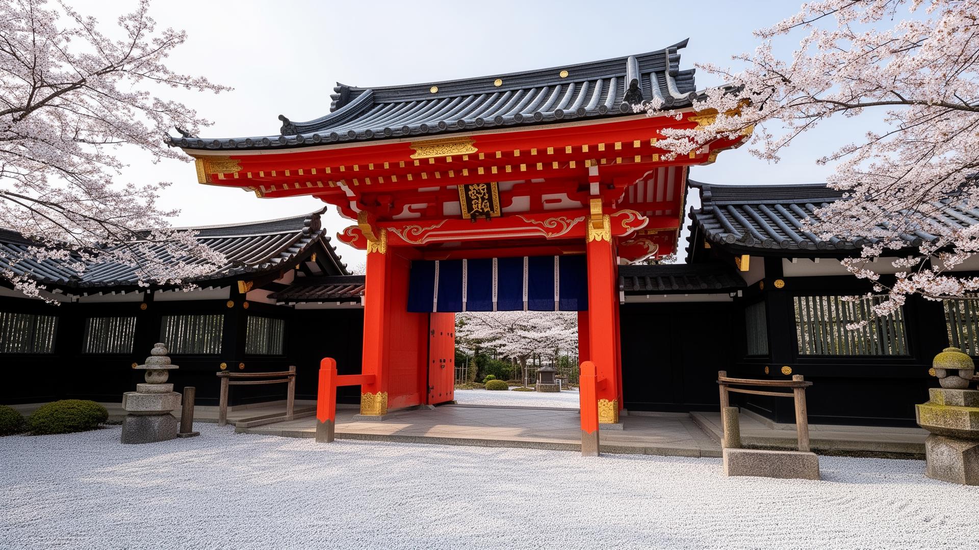
Japan has one of the most sophisticated and deeply codified color traditions in human history. Where Western design culture often treats color as an aesthetic choice — a matter of personal preference or market research — Japanese culture treats color as language. Each hue carries centuries of accumulated meaning, drawn from Shinto spirituality, Buddhist philosophy, imperial court protocol, seasonal awareness, and the material culture of everyday life. A color is never just a color in Japan; it is a statement about status, season, emotion, and intention.
Understanding Japanese color symbolism is essential for any designer working with Japanese clients, creating products for Japanese markets, or drawing inspiration from Japanese aesthetic traditions. This guide examines the five most significant colors in Japanese culture, provides their traditional hex values, explains their cultural and spiritual meanings, and offers practical guidance for incorporating these principles into contemporary design.
Red (Aka 赤): Vitality, Protection, and Sacred Power
Red is the most symbolically charged color in Japanese culture. It represents life force, vitality, protection against evil, and the boundary between the sacred and the profane. The signature Japanese red is not the cool crimson of Western heraldry or the orange-red of Chinese tradition — it is a warm, slightly vermillion tone that carries the specific quality of lacquerware, torii gates, and daruma dolls.
Traditional Japanese reds:
- Torii Vermillion (Shu-iro 朱色)
#D72631— The iconic red-orange of Shinto shrine gates. This is the most recognizable Japanese red in the world, seen at Fushimi Inari and thousands of shrines across the country. It is created traditionally from cinnabar (mercuric sulfide) and carries associations of divine protection and the boundary between human and spiritual worlds. - Deep Red (Aka 赤)
#BE0032— A purer, deeper red used in formal contexts — lacquerware, ceremonial garments, and festival decorations. This red signals celebration, auspiciousness, and vital energy. - Crimson (Kurenai 紅)
#D7003A— The red of safflower dye, historically one of the most expensive colorants in Japan. Kurenai was reserved for the highest-ranking court ladies and carries associations of femininity, beauty, and refined luxury. - Persimmon Red (Kaki-iro 柿色)
#C66B27— A warm, earthy red-orange named after the persimmon fruit. This tone appears in autumn kimono designs and represents the harvest season.
Cultural applications: Red and white together (kouhaku 紅白) form the most auspicious color combination in Japan. This pairing appears at weddings, New Year celebrations, and any event marking a joyful beginning. The Japanese flag itself — a red circle on white — embodies this combination at the national level.
Design insight: When designing for Japanese audiences, vermillion red #D72631 communicates energy, tradition, and celebration simultaneously. It works as an accent color for brands that want to signal Japanese heritage or cultural awareness. However, red used excessively or carelessly can read as aggressive — the Japanese aesthetic favors restraint, even with powerful colors.
White (Shiro 白): Purity, Death, and Sacred Emptiness
White in Japanese culture occupies a paradox that Western designers must understand: it represents both supreme purity and death. This duality is not contradictory within the Japanese worldview — death is understood as a purification, a return to the essential emptiness from which all things emerge.
Traditional Japanese whites:
- Pure White (Shiro 白)
#FFFFFF— Absolute white, representing purity in its most abstract form. Used in Shinto rituals, wedding kimono (shiromuku), and sacred offerings. - Off-White (Shironeri 白練)
#F3F3F2— The white of unbleached silk, carrying the warmth and imperfection that Japanese aesthetics prize. This is the white of wabi-sabi — beautiful because it is not perfect. - Eggshell (Gofun-iro 胡粉色)
#FFFFFB— Named after the crushed oyster shell pigment used in traditional Japanese painting (nihonga). A faintly warm white with extraordinary depth when applied in multiple thin layers.
Cultural significance: In Shinto belief, white is the color of the gods. Shrine maidens (miko) wear white to signify their role as intermediaries between human and divine realms. Mourning garments in traditional Japan are white, not black — a practice that predates the Western influence on Japanese funeral customs. The concept of ma (間) — the meaningful emptiness that defines Japanese spatial design — finds its visual expression in white space.
Design insight: Japanese-inspired design uses white not as absence but as presence. The white space in a Japanese layout is as intentional and meaningful as any element placed upon it. When creating designs influenced by Japanese aesthetics, increase your white space by 30-40% compared to Western conventions. Use #F3F3F2 (Shironeri) rather than pure #FFFFFF to introduce the warmth and humanity that Japanese aesthetics demand.
Black (Kuro 黒): Formality, Mystery, and Mastery
Black in Japan carries associations of formality, dignity, experience, and the unknown. Unlike Western culture, where black often signals rebellion or mourning, Japanese black communicates mastery and the depth that comes from long practice. The concept is embodied in the black belt of martial arts — kuro obi — where black represents the highest level of skill.
Traditional Japanese blacks:
- Lacquer Black (Roiro 蝋色)
#0D0D0D— The deepest, most lustrous black achievable in urushi lacquerware. This is not a flat black but a black with depth, created through dozens of polishing layers. It is the black of formal tea ceremony utensils and imperial lacquerware. - Ink Black (Sumi-iro 墨色)
#27292B— The black of Japanese calligraphy ink (sumi). Slightly warm and gray-leaning, this tone carries associations of artistic practice, meditation, and scholarly refinement. - Crow Black (Karasu-iro 烏色)
#180614— Named after the plumage of crows, which in Japanese mythology are messengers of the gods. This black has a faint purple undertone, giving it a richness that pure black lacks.
Cultural applications: The most formal kimono for men is solid black with family crests (kuro montsuki). Black ceramic tea bowls (kuro-raku) are prized in tea ceremony for their ability to make the green of matcha luminous by contrast. In kabuki theater, black-clad stagehands (kuroko) are considered invisible — their black garments signal that they are not part of the narrative world.
Design insight: Japanese black is never harsh. The tradition of lacquerwork teaches that black should have depth and warmth — use #0D0D0D or #27292B rather than pure #000000. When pairing black with other colors, the Japanese palette favors black with gold for prestige, black with red for drama, and black with white for spiritual clarity.
Gold (Kin 金): Prestige, Impermanence, and Illumination
Gold in Japanese culture represents divine radiance, supreme authority, and — paradoxically — the beauty of impermanence. The most famous expression of gold in Japan is Kinkaku-ji (the Golden Pavilion) in Kyoto, where gold leaf covers an entire temple building, creating a structure that shimmers between the material and the transcendent.
Traditional Japanese golds:
- Gold Leaf (Kin-iro 金色)
#E6B422— The specific gold of Japanese gold leaf (kinpaku), which has a warmer, more yellow tone than European golds. This is the gold of Buddhist temple interiors, folding screens (byobu), and imperial regalia. - Pale Gold (Kinsusutake 金煤竹)
#C4A55B— A more muted, aged gold that suggests the patina of centuries. This tone appears in antique screens and aging temple surfaces, where the gold has softened with time. - Champagne Gold (Konjiki 金色)
#C9A94E— A lighter, more accessible gold used in contemporary Japanese luxury branding. It carries the prestige of traditional gold without the weight of religious or imperial associations.
The art of kintsugi (金継ぎ): Perhaps the most profound expression of gold in Japanese culture is kintsugi — the practice of repairing broken pottery with gold lacquer. Rather than hiding damage, kintsugi celebrates it, transforming breakage into a golden seam that makes the object more beautiful than before. The gold line #D4A017 becomes a visual record of the object's history, embodying the wabi-sabi acceptance of impermanence and imperfection.
Design insight: Gold in Japanese-influenced design should always serve illumination rather than ostentation. Use gold sparingly — a single golden accent against a field of black #0D0D0D or deep blue #1B2838 creates more impact than gold spread across an entire design. The kintsugi principle offers a powerful design metaphor: use gold (#D4A017) to highlight transitions, seams, and connections rather than to fill surfaces.
Blue (Ai 藍): Everyday Life, Protection, and Indigo Culture
Blue — specifically indigo blue — is the color of the Japanese people. While red belongs to the sacred, white to the spiritual, black to formality, and gold to authority, indigo blue belongs to everyday life. Japan's indigo dyeing tradition (aizome 藍染め) is so central to the culture that Japan was historically known as "the country of blue" by visiting Europeans.
Traditional Japanese blues:
- Indigo (Ai-iro 藍色)
#004B97— The definitive Japanese blue, created from the fermented leaves of the indigo plant (Persicaria tinctoria). This blue is richer and more complex than synthetic blues, with subtle purple undertones that shift in different lighting. - Deep Indigo (Kachi-iro 褐色)
#181B26— Indigo so deep it approaches black. The name kachi is a homophone for "victory" in Japanese, making this color popular among samurai. Kendo practitioners still wear kachi-iro garments today. - Light Indigo (Hanada-iro 縹色)
#0089A7— A lighter, more turquoise-leaning blue used in summer kimono and casual cotton garments (yukata). This blue feels breezy and refreshing — the blue of running water. - Pale Blue (Mizuiro 水色)
#86ABA5— Literally "water color," this gentle blue-green represents the color of clear shallow water. It appears in spring and summer design contexts, suggesting freshness and tranquility.
Practical origins: Indigo became Japan's everyday color for practical reasons beyond aesthetics. Indigo-dyed fabric is naturally insect-repellent, antimicrobial, fire-resistant, and becomes stronger with repeated washing. Farmers, fishermen, artisans, and merchants all wore indigo because it protected them. This practical origin gives Japanese blue a groundedness that purely decorative colors lack.
Design insight: Indigo #004B97 is the safest entry point for designers seeking Japanese-influenced color. It communicates Japanese aesthetic awareness without the religious weight of red or the formality of black. Pair indigo with #F3F3F2 (Shironeri off-white) for a clean, modern combination, or with #E6B422 (gold) for a more luxurious treatment.
Practical Tips for Designing with Japanese Color Principles
Embrace seasonal color awareness (shiki 四季). Japanese design tradition assigns specific colors to each season and considers it inelegant to use colors out of season. Spring: cherry pink
#FADADDand fresh green#A8D8B9. Summer: indigo#004B97and white. Autumn: persimmon#C66B27and deep red#BE0032. Winter: black#27292Band silver gray#C0C0C0.Practice restraint. The Japanese aesthetic principle of shibui (渋い) — restrained elegance — demands that color be used with intention rather than abundance. A single vermillion accent
#D72631against a field of ink black#27292Band off-white#F3F3F2creates more impact than a palette of five competing colors.Layer rather than contrast. Where Western design often relies on high-contrast color combinations, Japanese aesthetics favor layering — subtle gradations of related tones that create depth without drama. A palette moving from
#181B26through#004B97to#0089A7to#86ABA5creates a sense of atmospheric depth that mimics the Japanese concept of kuuki (atmosphere).Honor the material. Japanese color perception is inseparable from material texture. The same gold reads differently on matte paper, glossy lacquer, rough ceramic, and woven silk. When specifying Japanese-inspired colors, always indicate both the hex code and the intended material or finish.
Use white as a positive element. In Japanese design, white space (yohaku 余白) is not empty — it is breathing room that gives other elements meaning. Increase your margins, reduce your content density, and trust that the space itself communicates elegance and intentionality.
Study the 465 traditional Japanese colors. Japan's traditional color vocabulary includes 465 named colors, each with specific cultural associations. Resources like the Traditional Colors of Japan (Nihon no Dentou-shoku) provide hex codes and cultural context for this extraordinary palette. Even selecting three or four traditional Japanese colors for a project creates a specificity and cultural depth that generic palettes cannot achieve.
Japanese color culture teaches us that every color decision is a cultural statement. The designer who understands this — who chooses vermillion #D72631 knowing it invokes shrine gates and divine protection, or indigo #004B97 knowing it carries the dignity of everyday labor — creates work that resonates at a level that pure aesthetics cannot reach. Color is meaning, and Japanese culture has spent centuries proving it.