Nursery Color Psychology: Best Colors for Your Baby's Room and Development
· Coloracci Team
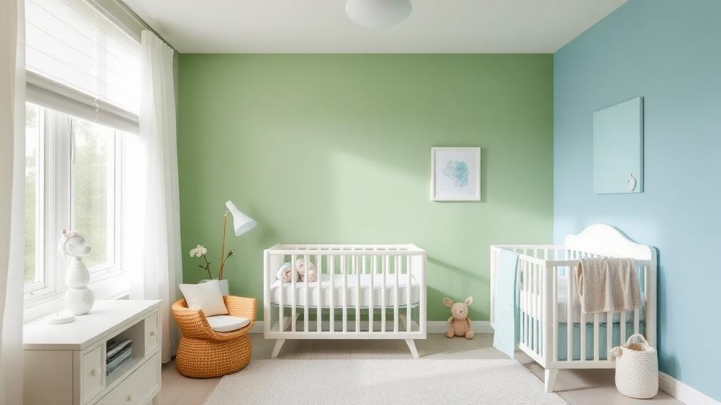
Your Baby's First Environment Matters
A nursery is more than a room with a crib — it's your baby's first designed environment, and the colors you choose can influence sleep quality, cognitive development, emotional regulation, and visual stimulation during the most critical period of brain growth.
Research in developmental psychology shows that infants respond to color from as early as two weeks old, and their color environment affects behavior in measurable ways. Choosing nursery colors isn't just an aesthetic decision — it's a developmental one.
How Babies See Color
Understanding infant vision helps explain why certain nursery colors work better than others:
| Age | Color Vision | Implication |
|---|---|---|
| 0–2 weeks | Primarily black, white, high contrast | High-contrast elements in crib area |
| 2–4 months | Begin distinguishing red and green | Introduce warm and cool accent colors |
| 4–6 months | Most colors visible, prefer saturated hues | Colorful play area elements |
| 6–12 months | Near-adult color perception | Full palette can be appreciated |
This means that your nursery's color scheme will be experienced differently as your baby grows — and a good design accounts for this progression.
Best Colors for Sleep: The Calming Palette
Since the nursery's primary function is sleep, the dominant colors should promote rest:
Soft Blue (#89CFF0)
The most researched calming nursery color:
- Lowers heart rate — Blue environments measurably reduce infant heart rate
- Promotes melatonin — Cool blue tones support the body's sleep preparation
- Creates spaciousness — Blue makes rooms feel larger and more open
- Universally calming — Works across all cultural contexts
| Blue Variant | Hex Code | Best For |
|---|---|---|
| Baby blue | #89CFF0 | Walls, main color |
| Powder blue | #B0E0E6 | Ceiling, larger surfaces |
| Sky blue | #87CEEB | Accent wall |
| Steel blue (muted) | #B0C4DE | Sophisticated nursery |
Sage Green (#A8D5BA)
The science of green shows it's ideal for nurseries:
- Most restful for eyes — Green requires no optical adjustment, reducing visual stress
- Nature connection — Even infants show preference for natural colors
- Promotes calm — Green environments reduce cortisol in children
- Gender-neutral — Perfect for parents avoiding traditional pink/blue
| Green Variant | Hex Code | Best For |
|---|---|---|
| Sage | #A8D5BA | Walls, primary |
| Mint | #B8E8C8 | Fresh, modern nursery |
| Eucalyptus | #8FBC8F | Earth-toned nursery |
| Seafoam | #93E9BE | Coastal-themed nursery |
Lavender (#D8BFD8)
A gentle option with soothing properties:
- Promotes relaxation — Lavender environments reduce crying duration in studies
- Soft visual impact — Low saturation prevents overstimulation
- Versatile pairing — Works with neutrals, greens, and warm tones
Warm White (#FFF8F0)
Not pure white — warm white:
- Avoids the institutional feeling of clinical white (#FFFFFF)
- Reflects warm light that feels nurturing
- Creates a canvas for colorful accents and art
- Photographs beautifully in both natural and artificial light
Colors for the Play Area: Stimulation Zone
While the sleep area should be calming, the play area benefits from more stimulating colors:
Appropriate Stimulating Colors
| Color | Hex Code | Developmental Benefit |
|---|---|---|
| Soft Yellow | #FFE082 | Happiness, visual attention, cognitive stimulation |
| Warm Orange | #FFB74D | Energy, creativity, social engagement |
| Coral | #F08080 | Warmth without overstimulation |
| Teal | #4DB6AC | Curiosity, visual interest |
The Stimulation Balance
Key principle: Stimulating colors should be in moveable objects, not permanent surfaces. This means:
- Walls: Calming (blue, green, warm neutral)
- Toys, books, mobiles: Stimulating (yellow, orange, red)
- Textiles (changeable): Mix of both
- Art: Can include brighter, more engaging colors
This approach lets you adjust stimulation levels as your baby grows without repainting.
Colors to Avoid in Nurseries
Pure White (#FFFFFF)
- Creates glare that can disturb sleep
- Feels cold and institutional
- Every mark and stain is visible
- Use warm whites (#FFF8F0, #FAF0E6) instead
Bright Red (#FF0000)
- Increases heart rate and agitation
- Can overstimulate infants, leading to crying
- Too intense for a rest environment
- Use muted coral or dusty rose if you want warmth
Neon/Saturated Colors
- Electric blue, hot pink, lime green are too visually aggressive
- Can contribute to overstimulation and sleep disruption
- Use muted, soft versions of any color instead
Dark Colors
- Very dark walls can feel oppressive in small nursery spaces
- Dark colors absorb light, making rooms feel smaller
- Can create frightening shadows for developing visual systems
- Exception: a single dark accent wall can work in larger nurseries
Gender-Neutral Nursery Palettes
The trend toward gender-neutral nurseries has produced beautiful palette options:
Trending 2026 Gender-Neutral Palettes
| Palette Name | Colors | Hex Codes |
|---|---|---|
| Modern Earth | Sage + Warm Gray + Cream | #A8D5BA, #C4B9A8, #FFF8E7 |
| Sunset Soft | Peach + Sage + Ivory | #FFDAB9, #9CAF88, #FFFFF0 |
| Nordic Calm | Powder Blue + Birch + White | #B0E0E6, #D2C6A5, #FFFAF0 |
| Desert Bloom | Terracotta + Sand + Olive | #D4956A, #E6D5B8, #8B9A6C |
| Ocean Mist | Seafoam + Warm Gray + White | #93E9BE, #B8B0A8, #FFFFFF |
These palettes work because they:
- Draw from nature rather than gendered associations
- Use earth tones that feel organic and timeless
- Maintain calming properties while avoiding stereotype
- Transition well as the child grows beyond infancy
Color and Light Interaction
Nursery color is inseparable from lighting:
Natural Light Considerations
- North-facing rooms: Use warmer colors (peach, warm white) to compensate for cool light
- South-facing rooms: Cooler colors (blue, green) work well with abundant warm light
- East-facing rooms: Morning light is warm; colors will look warmer in AM, cooler in PM
- West-facing rooms: Afternoon light is intense; avoid colors that become glaring in direct sun
Artificial Light Guidelines
- Use warm LED bulbs (2700K–3000K) — They create nurturing, warm light
- Avoid cool white bulbs (5000K+) — They make rooms feel clinical and disrupt sleep
- Install a dimmer — The most important nursery lighting feature
- Night light color: Red or warm amber — these don't suppress melatonin production
Practical Tips
- Paint a test swatch on the wall and observe it at different times of day before committing
- Use Coloracci's AI palette generator to create a cohesive nursery palette with proper color harmony
- Choose low-VOC or zero-VOC paints — Air quality matters more than color in a nursery
- Start with calming walls, add stimulating accents through toys and textiles
- Plan for growth — Choose a wall color that works through toddlerhood, not just infancy
- Keep the ceiling lighter than the walls — This creates a sense of openness and calm
- Use the 60-30-10 rule: 60% dominant calming color, 30% secondary neutral, 10% accent
Your nursery's color palette is one of the first design decisions you'll make for your child. Choose colors backed by developmental research, and you'll create a space that supports both peaceful sleep and healthy growth.