How to Add Color to Your Home: The Complete Interior Design Guide
· Lion Dada
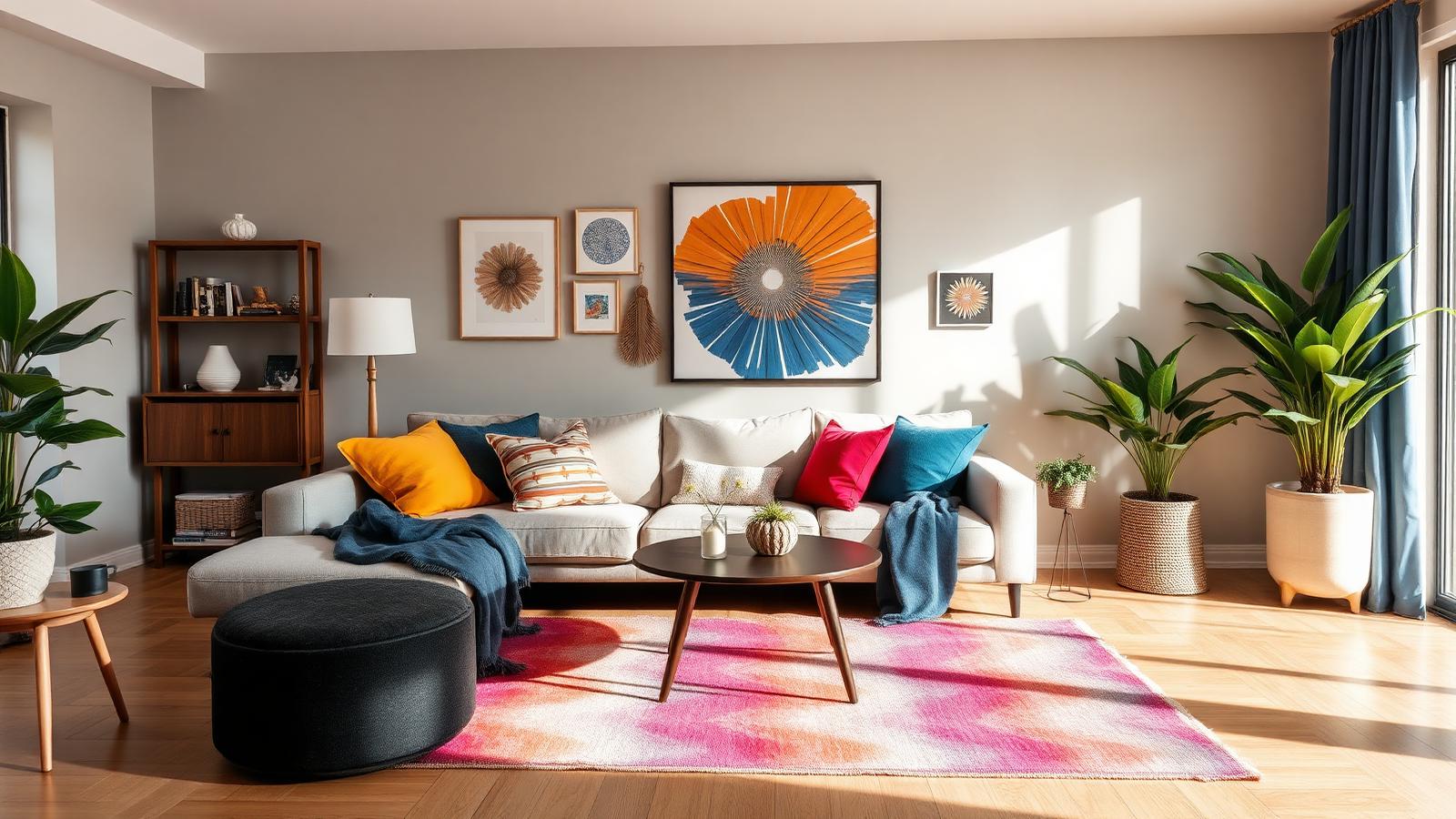
I spent six months living in an apartment that looked like it had been dipped in municipal beige. Not warm beige. Not modern greige. Just... institutional beige. The walls, the carpet, even the vertical blinds (yes, vertical blinds) were varying shades of "builder's special."
Every morning I'd wake up and think, "Today I'll pick a wall color." And every evening I'd be paralyzed by paint swatches, having spent three hours researching the psychological implications of choosing "Swiss Coffee" over "Alabaster."
Then one day, my friend walked in, looked around, and said: "Your apartment looks like a waiting room for people who aren't sure what they're waiting for."
That was the wake-up call I needed.
The 60-30-10 Rule: Your Home's Color Insurance Policy

If you remember nothing else from this guide, remember this: 60% dominant color, 30% secondary color, 10% accent color.
This isn't some arbitrary ratio dreamed up by designers to make you feel inadequate. It's the visual equivalent of a balanced meal.
In practice for a living room:
- 60%: Your walls, large furniture pieces (sofa, carpet)
- 30%: Window treatments, accent chairs, smaller furniture
- 10%: Throw pillows, artwork, decorative objects, plants
The beauty of this rule? It works whether you're adding a single accent pillow or repainting your entire house.
I started with 60% of my existing beige (fine, I kept the walls), 30% navy blue (curtains and an armchair), and 10% mustard yellow (pillows and artwork). Suddenly my waiting room looked like someone actually lived there.
Related: Learn about the psychology of blue and why it works so well in living spaces.
Start With What You Can't Change (Or Don't Want To)
Here's what nobody tells you: your hardwood floor just cost you $6,000 and has a distinct orange undertone. Your grandmother's Persian rug isn't going anywhere. Your landlord explicitly forbids painting the kitchen cabinets.
These aren't obstacles. They're your starting point.
I had a terracotta tile floor that I inherited with the apartment. Instead of fighting it, I pulled colors from it:
- The clay orange → repeated in pottery and cushions
- The cream grout lines → echoed in furniture
- The slight pink undertone → brought out in wall art
Pro tip: Take a photo of your "unchangeable" elements and use a color extraction tool to see what colors are already in your space. You'll be surprised what you find.
The "Walking Through" Test
Stand at your front door. Walk through your home slowly. Do the colors flow from room to room, or do you feel like you're channel-surfing?
You don't need every room to be the same color (please don't), but there should be a visual thread. Think of it like a playlist—the songs don't need to sound identical, but they should feel like they belong together.
My approach:
- Living room: Navy, beige, mustard
- Bedroom: Kept the navy, swapped mustard for sage green
- Bathroom: Kept the beige, added navy towels
One color connects each space. Your home stops feeling like a showroom of disconnected ideas.
Textiles Before Paint: The Reversible Decision

Here's my biggest lesson: start with textiles, not paint.
Paint is semi-permanent. You can change it, but you won't want to for at least two years (because you'll remember how much work it was).
Textiles are experiments:
- Throw pillows: $30 and swappable in 30 seconds
- Curtains: $100 and change the whole room vibe
- Area rugs: $200-500 and anchor your color scheme
- Bedding: $150 and you see it every day
I bought navy curtains and mustard pillows before I painted anything. Lived with them for two weeks. Realized the mustard was too intense and swapped it for a softer golden ochre. Total cost of that experiment: $40.
If I'd painted first? I'd be repainting or living with a mistake.
The Accent Wall Myth: When It Works (And When It Doesn't)
Let me be controversial: most accent walls are a mistake.
An accent wall works when:
✓ It's behind a focal point (bed headboard, fireplace, gallery wall)
✓ The room is large enough that the wall doesn't overwhelm
✓ You're using it to create depth in a long, narrow room
An accent wall fails when:
✗ You just don't want to paint the whole room (commitment issues aren't a design strategy)
✗ The wall has no architectural significance
✗ You're choosing it because it's the easiest wall to reach
I painted an accent wall behind my bed in a deep teal. It worked because the bed is centered on it, and the color draws your eye to the intentional focal point.
My friend painted her dining room's shortest wall burgundy "just to add color." It looks like the wall is trying to escape the room.
Related reading: 2026 Color Trends for inspiration on what's working right now.
Finding Inspiration: The Pinterest Problem
Pinterest will show you 400,000 images of "perfect" living rooms with "perfect" color schemes in "perfect" lighting.
Your home is not Pinterest. Your home has that weird corner where the ceiling slopes. Your home has afternoon sun that turns everything orange. Your home has a radiator from 1987.
Better inspiration sources:
- Hotels you've stayed in: They're designed to make you feel good. What colors did they use?
- Restaurants where you linger: There's a reason you want to stay. Colors play a role.
- Your own photo gallery: Find a vacation photo where you felt happy. Extract those colors.
I took a photo from a trip to Morocco—dusty blue buildings, terracotta pots, sandy streets. Extracted the palette using Coloracci's image tool. That became my home color scheme.

Common Mistakes I Made (So You Don't Have To)
Mistake #1: Matching everything
I bought a navy pillow, navy vase, navy throw blanket, navy candles. My living room looked like a Smurfs convention. Match your tones, not your exact shades.
Mistake #2: Forgetting about lighting
That "perfect greige" looked pink at 7 AM, gray at noon, and purple at 8 PM. Always test colors at different times of day. Morning light is cooler. Evening light is warmer. Your 10 AM paint choice might haunt you at dinner time.
Mistake #3: All accent, no base
I got so excited about adding color that I added fifteen different bright colors. It looked like a kindergarten classroom. You need visual rest areas. Not every surface needs to shout.
Mistake #4: Shopping before planning
I bought a coral chair before deciding on my palette. That chair never found a home because coral clashed with everything I subsequently chose. Plan, then shop. Not the other way around.
Mistake #5: Ignoring the ceiling
Your fifth wall matters. A white ceiling in a colorful room can feel stark. Try extending your wall color to the ceiling at 25% opacity (or just use a softer shade of the same color).
Create Your Home Mood Board First

Before you buy anything, create a mood board. Not a Pinterest board. A real mood board with actual swatches, photos, and textures.
Check out our complete guide on how to create a mood board for step-by-step instructions. Or use a mood board generator to see how your colors work together before committing. Experiment with different combinations. See what feels right.
I created three different mood boards:
- Navy + mustard + beige (felt safe)
- Emerald + terracotta + cream (felt bold)
- Navy + sage + ochre (felt right)
The third one became my home. But I wouldn't have discovered it without testing the others first.
The Reality Check: Start Small, Build Confidence
You don't need to transform your entire home this weekend. You need one successful room.
Start with your bedroom or living room—whichever you spend more time in. Get that right. Live with it for a month. Then expand.
My timeline:
- Month 1: Bought textiles, tested colors, created mood board
- Month 2: Painted bedroom accent wall, added new curtains
- Month 3: Living room textiles (pillows, throw blanket, rug)
- Month 4: Painted living room, added artwork
- Month 5: Bathroom towels and accessories
- Month 6: Felt like I lived in an actual home
Six months from beige paralysis to color confidence. Not because I rushed, but because I took it one decision at a time.
Looking for digital design tips instead? Check out our guide on adding color to digital design.
Your Home, Your Rules
Here's the truth: your home should make you feel good. Not your Instagram followers. Not your interior designer friend. Not the "rules."
The 60-30-10 rule? A guideline, not a law.
The accent wall advice? Works for some people, not all.
The textile-before-paint approach? Made sense for me, might not for you.
But if you're staring at beige walls and feeling paralyzed, start here:
- Find one color you genuinely love
- Buy something small in that color (a pillow, a vase, a plant pot)
- Put it in your space
- Live with it for a week
- If you still love it, add more
Color isn't scary. It's just paint and fabric. And if you hate it? It's just paint and fabric.
Your apartment doesn't have to look like a waiting room. Unless that's your vibe. In which case, commit to it completely and get some of those excellent uncomfortable chairs.
Ready to Add Color With Confidence?
Stop overthinking and start experimenting. Create your perfect home color scheme with these tools:
- Mood Board Generator: Visualize your color combinations before buying anything
- Image Color Extractor: Pull colors from your inspiration photos
- Fibonacci Color Generator: Create harmonious color palettes based on golden ratio
Your perfect color scheme is waiting. It just needs you to take the first step.