Restaurant Color Psychology: How Interior Colors Influence Appetite, Mood & Revenue
· Maya Richardson
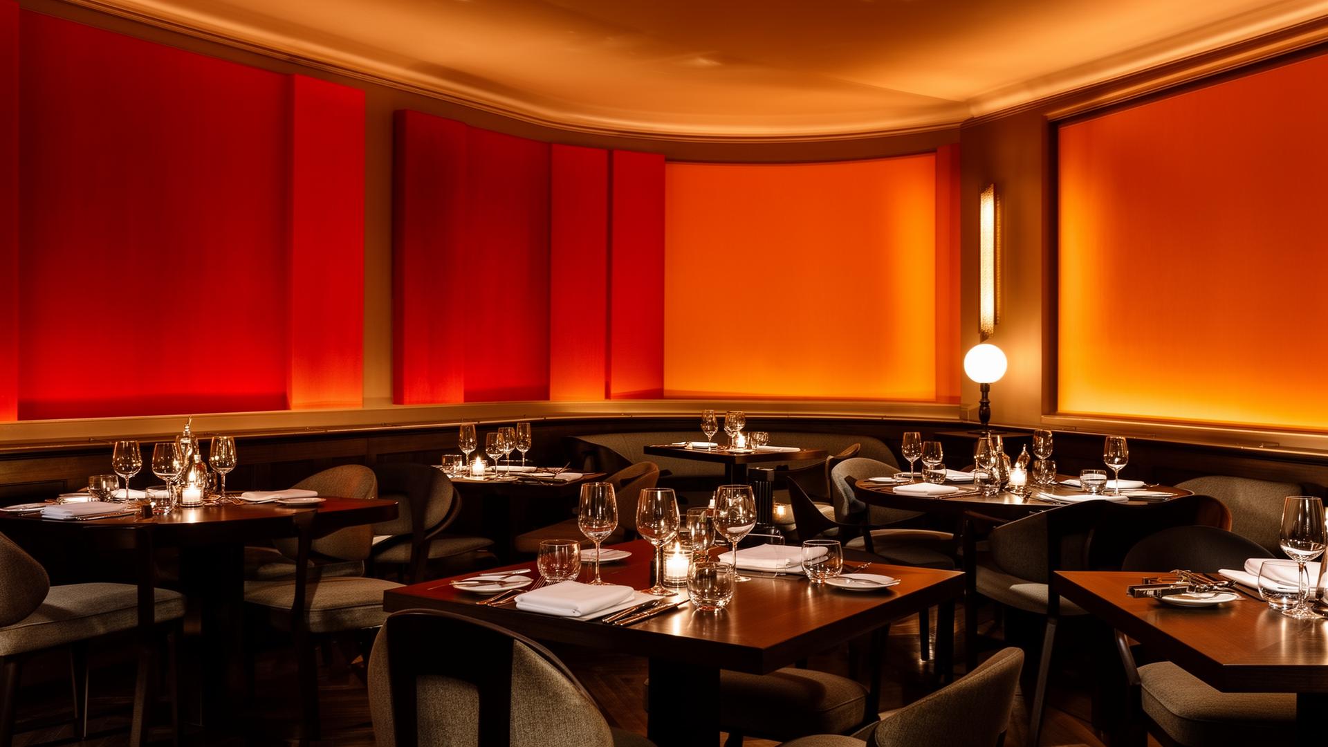
Why the Color of Your Restaurant Walls Might Matter More Than Your Menu
Here's a stat that should make every restaurateur pause: studies show that restaurant color psychology can influence up to 90% of a customer's snap judgment about a dining establishment — before they've even glanced at the menu. Color sends powerful, subconscious messages that affect emotional state, visual perspective, and most critically, appetite.
The food industry has understood this for decades. There's a reason McDonald's wraps itself in red and yellow, why upscale steakhouses favor deep burgundy and black, and why your favorite health-conscious café leans into sage green and cream. None of this is accidental. Every hue on those walls, chairs, and table settings is a calculated decision designed to shape how you eat, how long you stay, and how much you spend.
In this deep-dive guide, we'll break down the complete science of interior design colors for restaurants — mapping every major color to its psychological effect on diners, and giving you actionable strategies to apply these principles to real projects. Whether you're designing a fast-casual chain or a Michelin-starred dining room, the color palette you choose is one of the most powerful tools in your arsenal.
The Appetite Color Wheel: A Framework for Restaurant Design
One of the most useful frameworks in restaurant color psychology divides the color wheel into three distinct sections based on their effect on appetite:
- Strong Stimulants — Colors that actively increase hunger and excitement
- Mild Stimulants — Colors that gently encourage appetite while promoting wellness
- Suppressants — Colors that reduce appetite or shift focus away from food
Understanding where each color falls on this spectrum is the foundation of strategic restaurant interior design. Let's examine each category in detail.
Strong Appetite Stimulants: The Revenue-Driving Colors
These are the colors that food brands and fast-food chains have weaponized for decades. They trigger physiological responses — increased heart rate, heightened senses, and genuine hunger signals — that translate directly to higher order values and faster table turnover.
Red (#FF0000) — The Most Powerful Appetite Stimulant
Red is the undisputed king of appetite stimulating colors. Research consistently shows that red environments increase heart rate and blood pressure, creating a state of heightened arousal that the brain interprets as excitement and hunger.
Why it works:
- Triggers the release of adrenaline, increasing metabolism
- Creates a sense of urgency that encourages faster eating and decision-making
- Associated with passion, excitement, and energy — emotions that amplify the dining experience
- Draws attention immediately, making it ideal for focal walls and signage
Best applications:
- Fast-casual restaurants seeking high table turnover
- Pizza parlors and burger joints where bold flavors match bold colors
- Accent walls in dining rooms (a full red room can feel overwhelming)
- Menu highlights and call-to-action elements
Designer tip: Pure red (#FF0000) is rarely used at full saturation on walls. Instead, opt for deeper variants like crimson (#DC143C) or brick red (#CB4154) that deliver the appetite-stimulating effect without visual fatigue. Consider red as an accent — 10-20% of the total color scheme — rather than a dominant wall color.
Orange (#FFA500) — The Friendly Appetite Booster
Orange combines the energy of red with the cheerfulness of yellow, creating what color psychologists call the "comfort color." It's the shade that says good value, generous portions, and a welcoming atmosphere.
Why it works:
- Stimulates the senses without the intensity of red
- Creates feelings of warmth, friendliness, and community
- Signals affordability and good value — critical for casual dining
- Encourages social interaction, making group dining more enjoyable
Best applications:
- Family-friendly restaurants and casual dining chains
- Buffet-style establishments where abundance is the message
- Tex-Mex, Indian, and Thai restaurants where warm cuisine matches warm walls
- Outdoor dining areas and patios
Designer tip: Orange works beautifully as a gradient — transitioning from deep burnt orange (#CC5500) near the floor to lighter peach (#FFDAB9) near the ceiling. This creates visual warmth without overwhelming the senses. Pair with natural wood textures for a grounded, inviting feel.
Yellow (#FFFF00) — The Speed and Happiness Trigger
Yellow is the fastest color the human eye processes, and the brain's response is equally rapid: a flood of serotonin that creates feelings of happiness and optimism. In restaurant design, yellow is the ultimate tool for fast-service environments.
Why it works:
- Causes the brain to secrete serotonin, the "feel-good" neurotransmitter
- Processed faster than any other color, creating a sense of speed and efficiency
- Associated with sunshine, happiness, and optimism
- Encourages fast eating — customers feel energized rather than relaxed
Best applications:
- Fast-food chains (McDonald's, Subway, Denny's all use yellow prominently)
- Breakfast and brunch restaurants
- Food courts and grab-and-go counters
- Window displays and exterior signage to attract foot traffic
Designer tip: Yellow is the trickiest appetite stimulant to deploy. Too bright and it creates anxiety; too muted and it reads as dingy. The sweet spot is warm golden yellow (#FFD700) to amber (#FFBF00). Never use yellow as the sole wall color in a dining room — it needs grounding colors like charcoal, navy, or chocolate brown.
Mild Appetite Stimulants: The Wellness Colors
Green (#008000) — The Health and Freshness Signal
Green occupies a unique position on the appetite color wheel. It doesn't aggressively stimulate hunger like red or orange, but it creates an environment where customers feel good about eating — particularly when the menu emphasizes fresh, healthy, or organic options.
Why it works:
- Universally associated with health, nature, and freshness
- Creates a calming atmosphere that promotes mental wellness
- Signals "organic" and "natural" without saying a word
- Reduces stress, which can actually increase appetite in anxious diners
Best applications:
- Health-conscious restaurants, juice bars, and salad-focused eateries
- Farm-to-table establishments emphasizing freshness
- Vegetarian and vegan restaurants
- Outdoor dining areas and garden-themed interiors
Color variations for different moods:
- Sage green (#BCB88A): Sophisticated, calming, pairs with neutrals for upscale health dining
- Forest green (#228B22): Rich and earthy, ideal for farm-to-table rustic interiors
- Lime green (#32CD32): Energetic and youthful, best for smoothie bars and fast-casual health food
- Olive green (#808000): Mediterranean warmth, perfect for Italian and Greek restaurants
Appetite Suppressants: Strategic Colors for Specific Goals
Not every restaurant wants customers to eat faster and order more. Fine dining establishments, bars, and specialty venues have different objectives — and suppressant colors serve them brilliantly.
Blue (#0000FF) — The Calming Paradox
Blue is the most complex color in restaurant branding. It actively suppresses appetite (there are almost no naturally blue foods, so our brains don't associate blue with eating), yet it inspires thirst and creates an atmosphere of trust and sophistication.
Why it works as a suppressant:
- No evolutionary association with food — the brain doesn't connect blue with eating
- Lowers heart rate and blood pressure, reducing the urgency to eat
- Creates a meditative, reflective mood that slows dining pace
Where it works strategically:
- Bars and cocktail lounges (blue inspires thirst and pairs with drink-focused venues)
- Seafood restaurants (ocean associations make blue contextually appropriate)
- Upscale restaurants where slow dining and higher per-item spend is the goal
- Restrooms and transitional spaces where appetite suppression is actually beneficial
Designer tip: If you must use blue in a dining room, warm it up. Navy (#000080) with warm lighting reads as sophisticated rather than cold. Teal (#008080) bridges the gap between blue's calming effects and green's freshness — a perfect choice for coastal restaurants.
Purple (#800080) — Luxury and Mystery
Purple is the color of royalty, creativity, and luxury — but it's also one of the strongest appetite suppressants. This makes it a powerful tool for venues where the experience matters more than the eating.
Best applications:
- Wine bars and tasting rooms
- Dessert-focused establishments (purple can enhance the perception of sweetness)
- Upscale lounges and cocktail bars
- Event spaces and private dining rooms
Designer tip: Pair deep purple (#4B0082) with gold accents (#FFD700) for a luxurious atmosphere that screams exclusivity. Use lighter lavender (#E6E6FA) in powder rooms and waiting areas.
Black (#000000) — Sophisticated Elegance
Black creates the ultimate backdrop for fine dining. It eliminates visual distractions, makes plated food appear more vibrant and artistic, and signals exclusivity and high-end quality.
Why it works in fine dining:
- Creates dramatic contrast with food presentation
- Signals sophistication, mystery, and premium pricing
- Makes spaces feel intimate and exclusive
- Focuses attention on the table, the food, and the company
Designer tip: Pure black walls require exceptional lighting design. Use directional spotlights on tables, warm-toned ambient lighting (2700K-3000K), and reflective surfaces like mirrors or polished metal to prevent the space from feeling like a cave.
Brown (#A52A2A) — The Earthy Wildcard
Brown is generally classified as an appetite suppressant, but it's the most contextual color in restaurant design. While it can dampen appetite in isolation, it triggers specific cravings — coffee, chocolate, baked goods, and comfort food.
Best applications:
- Coffee shops and bakeries (brown reinforces the product)
- Steakhouses and BBQ joints (association with cooked meat and wood smoke)
- Rustic and farmhouse-style restaurants
- Whiskey bars and craft beer establishments
Color variations:
- Espresso (#3C1414): Deep, rich, perfect for upscale coffee culture
- Caramel (#FFD59A): Warm and sweet, ideal for dessert-focused venues
- Walnut (#5C4033): Natural and grounding, great for farm-to-table aesthetics
Light vs. Dark: The Brightness Strategy
Beyond individual colors, the overall lightness or darkness of a restaurant's palette profoundly affects the dining experience.
Light Color Environments
Light-colored interiors — whites, creams, pastels, and soft neutrals — make spaces feel larger, airier, and more energetic. They're ideal for:
- Breakfast and lunch establishments: Light colors match the energy of daytime dining
- Health-focused restaurants: Brightness signals cleanliness and freshness
- High-turnover venues: Customers eat faster and leave sooner in bright environments
- Small spaces: Light colors create the illusion of more room
Dark Color Environments
Dark interiors — deep blues, blacks, burgundies, and charcoals — create intimacy, encourage slower dining, and signal premium experiences. They're ideal for:
- Fine dining: Dark environments encourage savoring and longer stays
- Date-night restaurants: Intimacy and romance thrive in darker settings
- Bars and lounges: Dark colors reduce visual stimulation, shifting focus to conversation
- Large spaces: Dark colors make cavernous rooms feel more intimate and personal
The Complete Restaurant Color Reference Table
| Color | Hex Code | Category | Effect on Appetite | Best Restaurant Type | Psychological Message |
|---|---|---|---|---|---|
| Red | #FF0000 | Strong Stimulant | Powerfully increases hunger | Fast-casual, pizza, burgers | Passion, excitement, urgency |
| Orange | #FFA500 | Strong Stimulant | Stimulates comfort eating | Family dining, buffets | Warmth, value, friendliness |
| Yellow | #FFFF00 | Strong Stimulant | Encourages fast eating | Fast food, breakfast spots | Happiness, energy, optimism |
| Green | #008000 | Mild Stimulant | Promotes healthy appetite | Health food, farm-to-table | Freshness, nature, wellness |
| Blue | #0000FF | Suppressant | Reduces appetite, inspires thirst | Bars, seafood restaurants | Calm, trust, sophistication |
| Purple | #800080 | Suppressant | Suppresses appetite | Wine bars, lounges | Luxury, creativity, royalty |
| Black | #000000 | Suppressant | Suppresses appetite | Fine dining, upscale venues | Elegance, exclusivity, drama |
| Brown | #A52A2A | Suppressant | Mixed — triggers coffee/chocolate cravings | Coffee shops, steakhouses | Earthiness, stability, comfort |
Patterns and Analysis: What Restaurant Color Choices Reveal
Looking across successful restaurant brands, several clear patterns emerge:
Pattern 1: Fast food = Warm spectrum dominance. The top 10 fast-food chains by revenue use red, orange, or yellow as their primary brand color. This isn't a trend — it's a direct application of appetite-stimulating color science.
Pattern 2: Price point correlates with color temperature. As menu prices increase, color palettes shift from warm stimulants to cool sophisticates. A $15 burger joint uses red and yellow; a $150 tasting menu restaurant uses charcoal, navy, and gold.
Pattern 3: Health-conscious brands cluster around green. The rise of Sweetgreen, Tender Greens, and similar chains has cemented green as the universal shorthand for "healthy eating."
Pattern 4: Cultural cuisine often mirrors cultural colors. Mexican restaurants lean into warm terracotta and turquoise. Japanese restaurants favor minimalist neutrals with red accents. Italian restaurants embrace the warm rustic palette of Tuscany.
Designer Takeaways: Applying Restaurant Color Psychology to Real Projects
1. Start with the Business Objective
Before selecting a single color, answer these questions:
- What's the target average check size?
- What's the ideal table turnover rate?
- What type of cuisine is being served?
- Who is the target demographic?
These answers will naturally point you toward stimulant or suppressant palettes.
2. Use the 60-30-10 Rule
Apply colors in this ratio:
- 60% — Dominant neutral (walls, ceiling, large surfaces)
- 30% — Secondary color (furniture, fixtures, accent walls)
- 10% — Accent color (tableware, signage, decorative elements)
3. Consider the Lighting
Color only exists in the context of light. A red wall under cool LED lighting looks completely different than under warm incandescent bulbs. Always test your palette under the actual lighting conditions of the space.
4. Account for Cultural Context
Color meanings vary dramatically across cultures. Red means good luck in Chinese culture, mourning in South Africa, and danger in Western contexts. If your restaurant serves a specific cultural cuisine, research the color associations of that culture.
5. Don't Forget the Exterior
The first color impression happens before customers walk through the door. Your exterior palette should communicate the type of dining experience waiting inside — and it needs to work in both daylight and evening conditions.
Beyond Walls: Color in Every Touchpoint
Strategic color meaning in the food industry extends far beyond wall paint:
- Menu design: Red and orange accents on menu items increase order rates for those items by up to 25%
- Tableware: White plates make food appear more colorful and appetizing; dark plates create dramatic presentation
- Staff uniforms: Colors that complement the interior reinforce brand cohesion
- Digital presence: Your website and social media should mirror your physical color palette for brand consistency (explore Coloracci's tools to ensure perfect digital-to-physical color matching)
Conclusion: Color Is Your Silent Business Partner
Restaurant color psychology isn't a nice-to-have — it's a revenue driver. The right palette can increase appetite, extend or shorten dining time, elevate perceived value, and create emotional memories that bring customers back. The wrong palette can suppress appetite, create discomfort, and send messages that contradict your brand.
The most successful restaurants treat color with the same rigor they apply to menu development and service training. They test, iterate, and optimize — because in the dining business, every sensory detail matters.
Ready to build the perfect color palette for your restaurant project? Coloracci's AI-powered palette generator analyzes your brand, cuisine type, and target audience to generate data-driven color recommendations in seconds. And if you're curious about how color psychology works across other industries, check out our guide on email marketing color psychology — the same principles that drive dining decisions also drive click-through rates.
Color isn't decoration. It's strategy. Use it wisely.