Frank Lloyd Wright's Colors: Nature & Architecture's Harmony — Frank Lloyd Wright's Signature Color Palette
· Coloracci Team
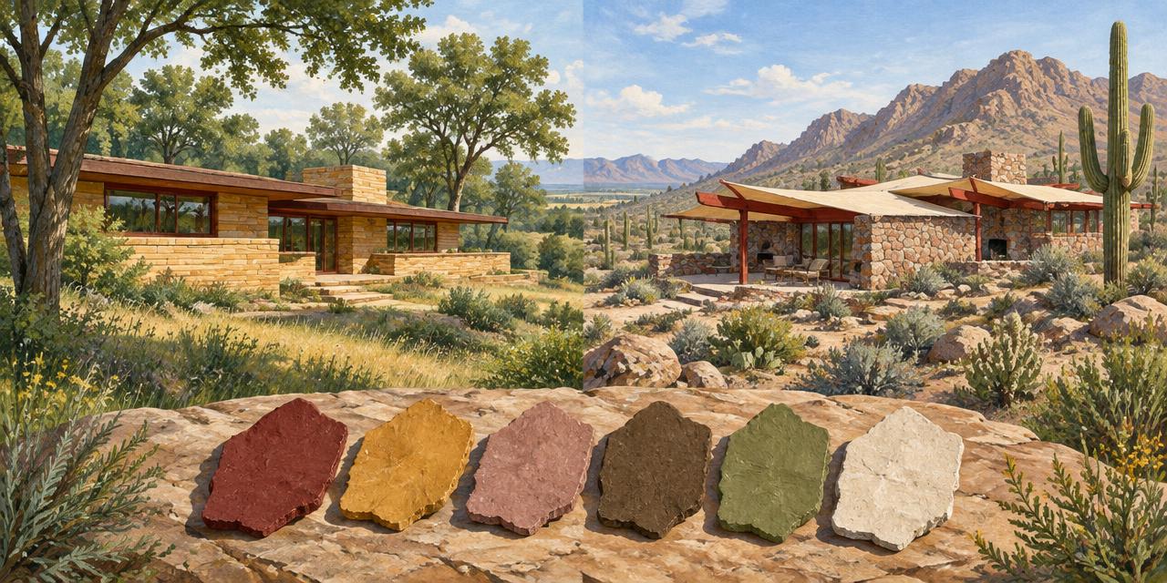
In 1955, Frank Lloyd Wright put architectural color into a paint catalog: the Taliesin palette developed with Martin-Senour. Frank Lloyd Wright's Signature Color Palette was no longer something a designer could encounter only by visiting a house. It could become a specified surface in another project. That is a surprisingly modern move for an architect whose work is so often reduced to stone, timber, and scenery.
The important inheritance is not a shopping list of earthy paints. It is a method: make color participate in the relationship between building, material, light, and landscape. Cherokee Red can articulate construction; ochre can connect a surface to mineral warmth; subdued greens and browns can support continuity without pretending the building is untouched nature.
For a contemporary digital study, start with #9B3C2D, #E3B468, #B7817F, #6D5F4E, and #5E5D4A, plus a light supporting neutral. These are illustrative sRGB references, not authenticated historical formulas or official PPG conversions. This guide examines Wright's wider color language across different settings; our Fallingwater palette analysis examines that residence's specific materials. The accompanying generated illustrations explain relationships, not archival appearances.
Frank Lloyd Wright's Signature Color Palette: A Method, Not One Formula
Wright's organic architecture does not mean that every building should look brown, or that industrial materials must disappear. His work combines assertive geometry with an understanding of its setting. Color helps these seemingly opposed ideas coexist. A red-painted construction element can acknowledge human intervention while belonging to a larger, earthy composition.
This is why the word “signature” needs care. It describes recurring preferences and relationships, not a universal six-color specification applied unchanged to every commission. A wooded Pennsylvania ravine, a Wisconsin hillside, and the Arizona desert present different light, geology, vegetation, and weather. A responsive palette cannot ignore those differences.
For designers, the distinction resembles the difference between a recognizable brand color system and one fixed advertising layout. A consistent identity can accommodate different contexts. Wright's color language remains recognizable through mineral warmth, restrained accents, and integration with material—not through a compulsory arrangement of identical swatches.
Think in three layers: the landscape supplies a chromatic neighborhood; construction introduces material colors; selected finishes organize attention. Flattening all three into a paint chart loses the reasoning. An earth-tone palette becomes architecturally useful only when each color has a job.
Cherokee Red: The Signature Accent Changes with Its Surface
Cherokee Red is the clearest thread through Wright's color story, but it should not be treated as one immutable digital coordinate. The Frank Lloyd Wright Foundation's discussion of its origins describes an evolving family of earthy reds rather than a single timeless formula.
Our working reference, #9B3C2D, is RGB 155, 60, 45: a deep, warm red with substantial brown character. It is less visually strident than a bright signal red. Against stone, timber, or subdued vegetation, that restraint allows it to mark an edge without turning the entire composition into a warning sign.
Surface changes its role. Red concrete floors associated with Wright's Usonian work can establish a continuous ground. Red-painted metalwork produces a finer rhythm of frames and joints. The same family can therefore act as a field in one setting and a line in another. Understanding color proportions is more useful than copying the hue alone.
Fallingwater requires a precise distinction: the official site identifies Cherokee Red on steel and Light Ochre on concrete. Its main floors are stone, not an example of red concrete flooring. Do not transfer a general Wright association to the wrong building. Our Fallingwater guide uses #9B4C3F as a separate illustrative reference; that difference is not evidence of competing official specifications.
In a new design, ask whether the red should anchor a broad surface or punctuate connections. A narrow repeated accent can carry identity with very little coverage. This is a practical color hierarchy decision, not a rule that red must always mean urgency.
Frank Lloyd Wright's Signature Color Palette in Six Digital References
The table separates exact digital values from approximate architectural associations. “Exact HEX” means the coordinate is reproducible in the stated digital space; it does not mean a historic wall, timber sample, or paint chip has been measured to establish that value.
| Item | Color | Hex | Name | Meaning |
|---|---|---|---|---|
| Structural accent study | Deep earthy red | #9B3C2D | Cherokee Red approximation | Construction, continuity, and concentrated warmth |
| Warm mineral field | Golden yellow | #E3B468 | Wright Ochre study | Sandstone-like warmth and sunlight associations |
| Desert atmosphere study | Muted red-pink | #B7817F | Desert Rose editorial reference | Soft mineral warmth and landscape transition |
| Timber and earth study | Deep earthy brown | #6D5F4E | Earth Brown editorial reference | Grounding, grain, and material depth |
| Vegetation support | Muted olive green | #5E5D4A | Muted Olive editorial reference | A subdued link between built forms and planting |
| Light supporting field | Warm pale ivory | #E8DDC7 | Canvas Ivory editorial addition | Breathing room, reflected light, and tonal separation |
The sixth value is an editorial addition for a usable digital composition, not an attributed Wright paint. The names “Wright Ochre” and “Desert Rose” here describe the supplied studies; neither name-value pairing is asserted as an authenticated historical specification. In particular, the rose is not presented as Taliesin West's official paint code.
Use HEX, RGB, and HSL conversion to understand relationships, not to create historical authority. A color-management workflow keeps those coordinates meaningful when images and layouts move between devices.
Ochre, Brown, and Olive: Supporting Colors with Different Jobs
The golden study #E3B468, RGB 227, 180, 104, is appreciably brighter and more yellow than the muted Light Ochre reference used in our Fallingwater article. Treat it as a wider Wright-inspired warm field, not a substitute specification for that building's terraces.
Ochre's usefulness lies in its mineral associations and its ability to introduce warmth without the intensity of a vivid orange. On a broad surface it can establish a sunlit character; beside timber it can reinforce continuity. But bright ochre everywhere can overwhelm delicate material differences. Compare warm and cool relationships before deciding how much area it should occupy.
The brown #6D5F4E, RGB 109, 95, 78, provides lower-value support. It can represent a timber-tonality study or an earthy graphic element, but actual wood contains grain, highlights, and changing undertones. Calling one rectangle “wood” is a useful shorthand, not a material analysis.
The olive #5E5D4A, RGB 94, 93, 74, is notably subdued. Its role is not to announce “eco-friendly” with a saturated green. It supplies a quiet bridge between warm mineral colors and vegetation. The science of green in branding helps distinguish a designed association from a universal psychological claim.
Together, brown and olive prevent the red and ochre from becoming a purely warm spectacle. They introduce depth and restraint. Harmony comes from this division of labor, not merely from choosing colors commonly described as natural. Compare organic modern color relationships and analogous color schemes when developing your own variation.
From Taliesin to Taliesin West: Let Geography Change the Palette
Taliesin in Wisconsin and Taliesin West in Arizona demonstrate why organic architecture cannot be translated into one generic countryside mood. The former belongs to a rolling, vegetated landscape; the latter addresses desert terrain, strong sunlight, rock, and sparse planting. The common principle is responsiveness, not visual sameness.
At Taliesin West, desert masonry, red structural elements, and light roof planes create different relationships from those of a wooded residence. PPG's 2017 announcement describes earthy neutrals tied to Arizona landscapes, including organic greens, reds, and browns. That is firmer evidence than assigning every attractive desert-colored screenshot a historic name.
The supplied rose study #B7817F, RGB 183, 129, 127, is useful for illustrating softened mineral warmth. It can mediate between deep red and pale ivory in an independent composition. However, “Desert Rose” is an editorial label here, not a verified original finish or proof that every pinkish wall at Taliesin West used that paint.
Light complicates the reading. Hard sunlight increases apparent edge contrast; shaded stone may look cooler; reflected light warms pale surfaces. Compare photographs across conditions before sampling them with an image color extractor. For production decisions, a calibrated reference and physical sample matter more than a beautifully graded image.
Build a material mood board with geology, vegetation, finishes, and light together. That method respects Wright's site-responsive thinking more closely than applying the same desert rose to every project.
What the 1955 Palette and 2017 PPG Collection Actually Establish
Wright's Taliesin palette with Martin-Senour dates to 1955. The Frank Lloyd Wright Foundation preserves material from that collaboration, providing an important reference for understanding his engagement with commercially reproducible color.
In June 2017, for Wright's 150th birthday, PPG announced a Frank Lloyd Wright-inspired palette updating that earlier collection. The announcement discusses colors associated with Taliesin West and names such as Wright Deep Rust, Crushed Cinnamon, Wright Green Olive, and Moth Gray. These are commercial collection references with their own documentation.
That collaboration offers organized contemporary paint choices, but it does not authenticate every HEX value circulating online. It is also distinct from PPG's Fallingwater work. A modern licensed or inspired collection, an original architectural finish, and an editorial screen palette are three different kinds of evidence.
Before specifying, record the supplier, product code, coating system, sheen, substrate, and approved sample. For print, record the relevant ink library and stock instead. Our Pantone-versus-HEX guide and print color-management guide explain why matching appearances does not make production systems interchangeable.
What Cinema Reveals About Wright's Color Logic
A comparison with the Wes Anderson color palette reveals a shared commitment to deliberate visual organization. Anderson's colors help construct a heightened fictional world; Wright's colors connect an intervention to a physical setting. Both reward attention to placement, repetition, and surrounding hues.
Our analysis of The Godfather's color palette offers another comparison. Dark material fields and selectively illuminated warm details can direct attention without abundant saturation. Wright's brown and red studies similarly show how depth and restraint can make a limited accent consequential, though architectural experience cannot be reduced to cinematic lighting.
The practical question is the same across media: what should the viewer notice first, and what should remain supportive? Explore the movie palette hub for contrasting examples, then identify the hierarchy rather than borrowing a famous work's colors without its purpose.
Frank Lloyd Wright's Signature Color Palette: A Practical Designer Workflow
Start with context. Identify the actual landscape or institutional story. Gather material references before making a six-swatch board. Use color matching principles to keep measured information separate from visual interpretation.
Assign roles. Select one principal field, one grounding dark, and one recognizable accent. Let the remaining colors serve specific supporting needs. A layout does not need all six in equal amounts. Test a quieter variation with the Fibonacci palette generator, treating its output as a compositional experiment rather than a Wright formula.
Test actual applications. For an exhibition booklet, ivory might carry reading pages, brown the main text, red section markers, and ochre diagram fills. A rose panel could distinguish desert content while olive identifies landscape material. These are independent editorial decisions, not a reproduction of an original building.
Make contrast non-negotiable. Muted brown, red, and olive can be close in perceived depth. Check the real combinations with the contrast checker, consult WCAG color guidance, and test the color-blindness simulator. Do not rely on hue alone for labels or selected states.
Translate carefully. Enter a reference into the HEX-to-Pantone converter to form a shortlist, not to obtain Wright's paint recipe. Choose coated or uncoated print references for the correct job, compare physical chips, and proof the final material. A small numerical color difference cannot guarantee the same appearance across finishes.
Document the decision. Preserve both the inspiration and the final approved specification in a color style guide. Label editorial approximations clearly. Future collaborators should know which values are historical evidence, which are modern products, and which belong to your original design.
Conclusion: Harmony Is a Relationship, Not a Swatch
Wright's most transferable color lesson is not simply to use Cherokee Red. It is to make color cooperate with structure, material, geography, and light. A red line, an ochre plane, dark timber, and subdued vegetation can remain distinct while belonging to one coherent experience.
Use the six digital references to explore that hierarchy, but retain the boundary between inspiration and specification. The wider Wright palette is a design language; each building remains a particular historical and material case.
Build your own considered palette: start with #9B3C2D in the HEX-to-Pantone converter, compare candidates, and approve the right physical sample for your medium. Borrow Wright's discipline of relationships—not an unverified promise of exact equivalence.
Sources and Color-Reference Limits
- Frank Lloyd Wright Foundation: Origins of Wright's Cherokee Red discusses its evolving character and architectural uses.
- The Foundation's 1955 Taliesin palette archive provides historical collection context.
- PPG's June 2017 anniversary collection announcement documents the modern palette and its relationship to the earlier collection.
- Fallingwater's official facts distinguishes Light Ochre concrete from Cherokee Red steel. The supplied HEX values and generated artwork in this article remain illustrative, not conservation records.