The Designer's Guide to Pantone vs. HEX: When to Use Each Color System
· Coloracci Team
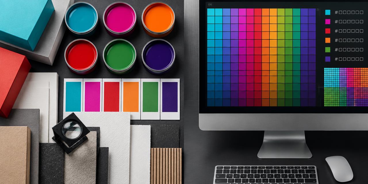
In 1837, Tiffany & Co. chose a robin's-egg blue for its stationery—long before a browser could render a pixel. Today, a designer may encounter that identity as a proprietary physical color and as the commonly cited screen approximation #0ABAB5. Those two specifications are related, but they are not interchangeable. The Designer's Guide to Pantone vs. HEX starts with that distinction: Pantone is built to control color made from ink and material, while HEX is built to describe color made from red, green, and blue light.
That difference matters whenever a brand crosses from a phone to a box, a website to a trade-show wall, or an app icon to embroidered merchandise. A HEX code cannot tell a printer which spot ink to mix. A Pantone number cannot force two uncalibrated displays to emit identical light. Professional color systems succeed when each value is assigned to the medium it was designed to control.
The Designer's Guide to Pantone vs. HEX: The Essential Difference
The Pantone Matching System, usually abbreviated PMS, is a standardized color reproduction system. A Pantone spot color is produced from a defined ink formula rather than simulated only with cyan, magenta, yellow, and black process inks. A printer in New York and a packaging manufacturer in Tokyo can refer to the same physical standard without exchanging a printed sample directly. That shared reference is why Pantone remains valuable for identity programs, packaging, signage, merchandise, and other manufactured objects.
HEX belongs to a different world. A six-digit hexadecimal code expresses an RGB recipe for emitted light. The first pair controls red, the second green, and the third blue; each pair ranges from 00 to FF. Pure red is #FF0000, while black is #000000 and white is #FFFFFF. In normal web practice, those numbers are interpreted in an sRGB environment and sent to a display.
The shortest useful rule is therefore simple:
- Use Pantone when color must be manufactured consistently. Think business cards, brochures, cartons, labels, textiles, promotional objects, and painted environmental graphics.
- Use HEX when color must be displayed on a screen. Think websites, mobile apps, digital ads, email graphics, social media, and presentation interfaces.
Neither system is universally more accurate. Accuracy depends on the output. Pantone is precise about a physical target under controlled conditions. HEX is precise about RGB channel instructions, but the visible result still depends on the display, profile, brightness, ambient light, and viewing angle.
Why Pantone Creates Print Consistency
A spot color is mixed before it reaches the press. Instead of building a corporate orange from overlapping CMYK dots, the printer lays down a dedicated ink. This can improve uniformity, produce hues outside ordinary process-print gamut, and reduce the risk that small registration shifts make a solid logo look dirty at its edges.
That does not mean one Pantone number looks identical on every object. The suffix is part of the specification. A C reference is intended for coated stock; a U reference is intended for uncoated stock. Uncoated paper absorbs and scatters more ink, usually making a color appear softer or duller. Paper brightness, surface texture, ink density, fabric weave, plastic translucency, varnish, and viewing light also influence perception.
A disciplined print specification therefore includes more than a number. It identifies the Pantone library and suffix, the intended substrate, the printing process, and the proofing standard. For critical packaging or merchandise, approve a physical press proof or production sample. A PDF viewed on a laptop is not evidence that the physical ink is correct.
Pantone is the practical choice for:
- Brand identity guides: Define a repeatable physical anchor for logos and signature fields.
- Print collateral: Control solid colors across stationery, brochures, invitations, and presentation folders.
- Product packaging: Coordinate suppliers producing cartons, labels, inserts, and retail displays.
- Merchandise: Give screen printers, textile mills, plastics suppliers, and paint vendors a common target.
- Special effects: Specify fluorescent, metallic, pastel, and other inks that an ordinary screen preview cannot faithfully reproduce.
Even then, process printing may be the economical choice for photography, short digital runs, or artwork using many colors. The designer's job is not to demand spot ink everywhere; it is to preserve the intended hierarchy and know where exact physical matching earns its cost.
Why HEX Creates Screen Consistency
HEX is compact, portable, and native to digital production. The code #DA1884 can be placed in CSS, a design token, an interface library, or an ad specification without translation. Developers can reuse it across states and components, while quality teams can inspect the implemented value directly.
HEX does not guarantee that every viewer sees precisely the same sensation. A calibrated studio monitor and a budget phone may both receive #DA1884 yet emit different light. Wide-gamut displays, operating-system color management, brightness settings, accessibility modes, aging panels, and ambient illumination all alter the experience. HEX consistency means the same digital instruction is delivered—not that every physical display behaves identically.
Good digital color practice includes:
- Designing and exporting in a declared RGB profile, normally sRGB for broad web compatibility.
- Testing critical combinations on multiple real devices instead of trusting one monitor.
- Checking text and controls for accessible contrast rather than judging appearance alone.
- Storing HEX values as semantic design tokens, such as “brand-primary” or “action-danger,” rather than scattering codes throughout files.
- Pairing color with labels, icons, or patterns when color alone would carry essential meaning.
HEX is ideal for websites, apps, display ads, social graphics, dashboards, email, digital signage, and screen presentations. When a digital design later moves into print, convert it deliberately; do not assume the browser code is a production ink instruction.
The Designer's Guide to Pantone vs. HEX Conversions
A conversion is a simulation across media. Pantone describes reflected light from a physical ink and substrate. HEX describes emitted RGB light. Their gamuts overlap, but they are not identical, so no mathematical operation can make every Pantone color and every HEX color visually equivalent under all conditions.
This explains why a HEX-to-PMS search may return several candidates. The answer depends on the RGB profile, the Pantone library, coated or uncoated stock, measurement method, substrate, and the color-difference formula used for comparison. A nearest match is useful for narrowing a physical swatch review; it is not automatic production approval.
Use the Coloracci HEX to Pantone converter to identify close references, then verify the leading candidate in a current physical guide on the intended material. For a brand system, document both values as parallel specifications rather than writing an equals sign between them.
A Reliable Conversion Workflow
- Confirm the source. Establish whether the approved master is a physical swatch, a printed proof, an sRGB file, or a measured sample.
- Choose the destination. Name the exact output: coated carton, uncoated letterhead, cotton, browser interface, or mobile display.
- Find candidates. Use a conversion tool or measured color data to shortlist Pantone or digital approximations.
- Compare physically. For print, assess current swatches under controlled lighting and on a representative substrate.
- Measure the difference. When the work is critical, use Lab values and Delta E as diagnostic evidence, not as a substitute for visual approval.
- Proof in context. A small isolated chip can feel different when surrounded by white space, photography, black type, varnish, or adjacent colors.
- Record the decision. Save the approved Pantone reference, suffix, HEX, RGB, CMYK process build, profile, substrate, and proof date in the brand guide.
The conversion should be repeated when the material changes. The best coated-paper match may not be the best uncoated-paper match, and neither may be achievable on dyed fabric without a custom formulation.
Famous Brand Colors: Useful References, Not Equations
Brand-color lists often present a Pantone number and HEX code as exact equivalents. That format is convenient but technically misleading. The table below treats the digital values as practical screen references and distinguishes confirmed standards from widely circulated approximations.
| Item | Color | Hex | Name | Meaning |
|---|---|---|---|---|
| Tiffany & Co. | Turquoise | #0ABAB5 |
Tiffany Blue digital approximation | Exclusivity, elegance, recognition; the physical PMS 1837 color is proprietary |
| Barbie | Vivid Pink | #DA1884 |
PMS 219 C screen approximation | Play, confidence, high-energy femininity |
| Coca-Cola | Signal Red | #F40009 |
Coca-Cola Red web approximation | Appetite, excitement, immediate recognition; the company says its red has no official Pantone equivalent |
| Hermès | Luxury Orange | #FF5700 |
Hermès Orange web approximation | Craft, warmth, rarity; published Pantone attributions conflict |
| John Deere | Equipment Green | #367C2B |
John Deere Green web approximation | Agriculture, durability, land; third-party values differ from documented brand-book specifications |
| Cadbury | Royal Purple | #3B0083 |
PMS 2685 C screen approximation | Indulgence, heritage, distinction; the Pantone designation is strongly documented, while HEX remains a simulation |
These examples teach two lessons. First, a famous visual identity can remain recognizable across imperfect reproduction because shape, typography, proportion, contrast, and repeated exposure reinforce the color. Second, responsible designers preserve provenance. If a brand has not published a value, label it “approximate” rather than elevating a color-directory result into an official standard.
The same principle applies when studying a restrained digital identity such as the Apple brand color system: color authority comes from consistent use rules, not merely from collecting codes. Pantone's cultural influence also extends beyond production specifications, as the Pantone Color of the Year history shows, but a trend forecast and a manufacturing standard serve different purposes.
A Practical Specification Matrix
Use this decision framework before opening a conversion tool:
| Deliverable | Primary specification | Supporting specification | Approval method |
|---|---|---|---|
| Website or mobile app | HEX / RGB in sRGB | Accessible contrast targets | Multi-device visual and automated testing |
| Digital advertising | HEX / RGB in required profile | Platform export settings | Platform preview and device testing |
| Business card or brochure | Pantone C/U or controlled CMYK | HEX for digital companion files | Physical contract or press proof |
| Product packaging | Pantone plus substrate/process | CMYK fallback and HEX reference | Production drawdown or packaging proof |
| Embroidery or fabric | Textile/material standard | Nearest Pantone reference | Dyed or stitched sample |
| Brand guidelines | Pantone and HEX as parallel masters | RGB, CMYK, Lab, usage rules | Approved cross-media test set |
A useful brand guide does not force one code to solve every output. It creates a small family of approved targets. The Pantone value controls spot-color print; the HEX and RGB values control screen interfaces; the CMYK build supports process printing; material-specific recipes control fabric, plastics, or paint. Each target should be labeled with its role.
Common Pantone vs. HEX Mistakes
Writing “Pantone equals HEX”
Use “digital approximation” or “screen equivalent” instead. The equals sign conceals gamut and material differences.
Omitting C or U
The suffix changes the target. A printer cannot infer whether the designer approved coated or uncoated appearance.
Choosing Color from an Uncalibrated Screenshot
Eyedropping an online swatch compounds unknown display, compression, profile, and source errors. Start from an authoritative specification whenever possible.
Sending Only a HEX Code to a Manufacturer
HEX gives a useful visual clue but not a production recipe. Ask the manufacturer which physical system, substrate sample, or measured values its process requires.
Trusting a Physical Guide Forever
Printed guides age, fade, and accumulate handling damage. Replace them according to the manufacturer's guidance and protect them from sunlight and contamination.
Ignoring the Surrounding Palette
Color appearance is relational. A turquoise beside white feels cleaner; beside orange it becomes more electric; beside a neighboring blue it may feel greener. Approve color inside the real composition, not only as an isolated square.
The Handoff Checklist Designers Should Use
Before releasing a cross-media identity, confirm that the package answers these questions:
- Is the master physical, digital, or intentionally dual?
- Is every Pantone reference labeled with its complete library and suffix?
- Are HEX and RGB values defined in sRGB?
- Are CMYK builds tied to a profile and printing condition?
- Are all conversions labeled as approximations where appropriate?
- Does the guide name acceptable substitutions for budget process printing?
- Are minimum contrast combinations documented for interface text and controls?
- Has the color been reviewed on the actual paper, fabric, coating, or display class?
- Does the supplier know which sample or proof has final authority?
- Are dates and version numbers attached to approved standards?
This checklist prevents the most expensive kind of color error: a technically valid value used in the wrong medium. It also gives printers, developers, marketers, and manufacturers enough context to protect the design without guessing.
Conclusion: Choose the System That Controls the Output
The core of The Designer's Guide to Pantone vs. HEX is not a contest between two code systems. Pantone manages repeatable physical targets; HEX manages repeatable digital instructions. Pantone is the stronger language for spot-color printing, packaging, merchandise, and manufacturing. HEX is the correct language for websites, apps, ads, and any screen-first graphic.
When a project crosses media, specify both. Treat conversions as informed approximations, verify print against current physical references, test digital color across displays, and document which standard governs each output. That approach turns color from a fragile visual preference into a controlled design system.
Ready to translate a screen color into a production shortlist? Enter your code in the HEX to Pantone converter, compare the closest matches, and bring the best candidates to your next physical proof review.