The Organic Harmony of Frank Lloyd Wright's Fallingwater Palette — Frank Lloyd Wright's Fallingwater Color Palette
· Coloracci Team
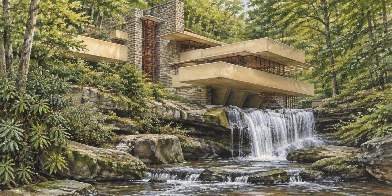
In 1935, Frank Lloyd Wright made the waterfall at Bear Run part of the house rather than a view framed from a distance. Frank Lloyd Wright's Fallingwater Color Palette makes the same decision in color: instead of decorating an isolated object, it connects concrete terraces, stone walls, metal frames, and woodland into one visual experience. Its most useful lesson is not which earthy paint to buy. It is how a limited set of colors can organize radically different materials without flattening their differences.
The short answer is Cherokee Red and Light Ochre, supported by the colors of local stone, wood, water, and shadow. For digital studies, use #9B4C3F and #BFAF83 as approximate starting points. These are editorial sRGB references, not authenticated samples of Wright's original paint or conservation specifications. The artwork accompanying this guide is an illustrative interpretation, not a documentary color record.
Frank Lloyd Wright's Fallingwater Color Palette: Two Colors, Many Surfaces
Fallingwater, designed for the Kaufmann family in southwestern Pennsylvania, is often discussed through its cantilevers. Those projecting terraces establish a powerful horizontal rhythm, while the stone masonry anchors the composition. Color makes this relationship legible: ochre gathers the broad concrete planes together; red-brown delineates the smaller metal elements.
This is a disciplined hierarchy, not a two-color total inventory. Saying Wright specified two primary paint colors does not mean every surface is painted, or that every room contains only two visible hues. Sandstone, timber, glass, foliage, and reflected light introduce many more. The intentional paint palette remains restrained precisely because the site already supplies complexity.
Think of the ochre as a field and the red as a line. The concrete terraces occupy substantial visual area. Window frames, doors, and other metal details occupy much less, yet their repeated color gives them coherence. The red does not need to become a large wall to be consequential: it works through recurrence, position, and contrast.
Cherokee Red: a structural accent rather than a warning signal
The approximate #9B4C3F is a subdued red with a brown influence: RGB 155, 76, 63. Compared with a bright signal red, it has lower lightness and a more earthy appearance. That gives the metalwork warmth without making every frame look like an emergency marker.
Against green foliage, the red family supplies a complementary tendency, but this is not a simple diagram of equal red and green blocks. The forest is textured, variable, and often shaded. Thin red-brown lines remain visible while acknowledging that larger setting. On a pale ochre plane, the same accent appears firmer and more graphic.
PPG currently lists Fallingwater Red as PPG13-02, a useful modern manufacturer reference associated with this color story. It is not proof that a current retail can reproduces every historic finish, and its digital preview need not equal #9B4C3F. A name, formula, coating system, and surface condition are different pieces of information. For preservation work, verify the applicable site documentation and approved coating rather than assuming a retail label is sufficient.
Light Ochre: how a modern plane joins an old landscape
The supplied #BFAF83, RGB 191, 175, 131, is a muted yellow-brown reference. It is warmer than a cool architectural gray and quieter than a saturated mustard. This balance helps the concrete read as a coherent modern intervention without turning it into a white object detached from the terrain.
Ochre also connects visually with warm stone and autumnal vegetation. That connection is relational, not literal camouflage. The house remains unmistakably designed. Its terraces are geometrically assertive; their warmth simply gives those forms a shared vocabulary with the setting.
Do not confuse painted concrete with bare concrete. The ochre finish is a deliberate color decision. A natural concrete gray can be useful in a material study, but it does not replace the ochre as the defining appearance of the terraces.
The Material Palette: Exact HEX Values, Approximate Physical References
Each HEX below is exact as a digital coordinate, while its connection to a building material is approximate. Stone changes across pieces; wood changes with grain and finish; paint changes with lighting and age. These values are suitable for an annotated mood board, not a restoration order.
| Item | Color | Hex | Name | Meaning |
|---|---|---|---|---|
| Painted metalwork study | Earthy red-brown | #9B4C3F | Cherokee Red approximation | Human-made articulation and repeated warm accents |
| Painted concrete terraces | Muted yellow-brown | #BFAF83 | Light Ochre approximation | Horizontal continuity and affinity with the landscape |
| Local masonry study | Warm gray-brown | #A39A8E | Pottsville sandstone reference | Weight, texture, and connection to the site |
| Unpainted concrete comparison | Warm light gray | #C5C2B9 | Natural concrete study | A material comparison, not the terrace paint specification |
| Dark floor and shadow study | Deep neutral gray | #4A4A4A | Slate-like digital reference | Grounding and tonal depth; not a verified flooring identification |
| Supporting wood-tonality study | Golden tan | #D2B48C | Illustrative wood reference | Tactile warmth; not an authenticated cypress or walnut measurement |
The sandstone reference #A39A8E bridges ochre and gray. It is less yellow than the terrace reference and less dark than the red-brown accent, so it mediates between large planes and fine details. The actual masonry matters as much for its rough faces, joints, and horizontal layering as for its average hue.
The #4A4A4A entry requires particular care. Fallingwater's floors are commonly described in authoritative accounts as stone, including flagstone or sandstone; a generic dark-gray swatch should not become a claim that its principal flooring is slate. Keep the supplied slate-like value as a tonal study, and identify the actual material separately when discussing the building.
Similarly, #D2B48C is a convenient golden-tan coordinate, not a measurement of the interior woodwork. The supplied cypress description should not be generalized to Fallingwater's furnishings: the documented furniture includes plywood veneered with North Carolina black walnut. Keep this lighter swatch as an illustrative wood-tonality study rather than relabeling it as an exact walnut color. Transparent finishes can deepen grain and alter sheen without making timber uniform. A wood specimen offers information that a flat rectangle cannot: direction, variation, and moving highlights.
Frank Lloyd Wright's Fallingwater Color Palette and Organic Architecture
Organic architecture is not simply a preference for brown and green. At Fallingwater, it involves relationships between site, form, materials, and occupation. The palette contributes to those relationships because it gives different construction systems distinct roles while keeping them in dialogue.
The sandstone appears rooted and accumulated; the ochre concrete appears continuous and projecting; the red metal appears precise and connective. If every element were painted the same warm neutral, these distinctions would become less legible. Harmony therefore depends partly on preserving difference, not erasing it.
This explains why a six-swatch recreation can feel disappointing. The missing ingredient is often geometry. A broad ochre rectangle and a narrow red border behave differently from two equal circles, even when the HEX values are identical. Surface area determines which color dominates, while edges determine where the eye pauses.
There is also a difference between using local materials and merely imitating their color. A sandstone-colored coating cannot reproduce the shadows within rough masonry. A tan laminate cannot automatically reproduce natural wood grain. Digital approximation is useful for composition, but it should not be mistaken for material equivalence.
For designers, the transferable principle is clear: give each material or functional layer a role, then choose colors that reinforce those roles. Let the ground establish continuity, let structure establish rhythm, and reserve the most distinctive accent for points of connection.
Light, Water, and Seasons Are Part of the Composition
Fallingwater's appearance changes without its fundamental palette being redesigned. Overcast light reduces sharp shadows; sunlight emphasizes projecting edges; wet stone often looks darker than dry stone. Water brings movement and changing reflections into an otherwise stable architectural arrangement.
This means one photograph cannot establish a universal color specification. A warmly processed autumn image can exaggerate ochre and red, while a cool image taken beneath the canopy can make the same surfaces look grayer. White balance, exposure, and reflected light all influence the sampled pixel.
Seasonal foliage changes the visual neighborhood of the house. Dense summer greens make the red-brown detailing more noticeable through hue contrast. Autumn leaves create additional warm relationships with ochre. In winter, the architecture may stand against a more open and less chromatic background.
The practical response is to assess several conditions rather than chase one attractive screenshot. For a physical design, inspect samples in daylight and the intended artificial light. For a digital editorial layout, use a controlled sRGB reference and treat photographs as contextual evidence rather than interchangeable color masters.
A Useful Contrast: Fallingwater and The Grand Budapest Hotel
The restraint of Fallingwater becomes clearer beside a deliberately theatrical color system. In The Grand Budapest Hotel color palette, pinks and purples help construct a heightened cinematic world. At Fallingwater, color supports a conversation with a real site rather than a self-contained fantasy.
Neither approach is inherently more sophisticated. The difference is purpose. A hotel identity inspired by cinema might use conspicuous chromatic contrast to signal escape. A landscape-oriented institution might use a quieter material field and a concentrated accent to signal continuity and care.
The shared lesson is that color needs a compositional job. Wright's red frames and Anderson's colored uniforms organize attention through placement and repetition. Borrowing an isolated swatch without that underlying logic produces decoration; borrowing the hierarchy produces a usable system.
Frank Lloyd Wright's Fallingwater Color Palette: A Designer's Working Method
1. Separate evidence from interpretation
Create two columns in your project notes: documented architectural information and your own visual references. Put the two primary paint names in the first, with a source. Put the six approximate HEX values in the second. Do not silently promote an online sample into an original specification.
For conservation, defer to archival research, finish analysis, approved coating systems, and site-specific requirements. For an independent design inspired by the house, explain the inspiration and develop your own composition rather than implying an authorized reproduction.
2. Assign roles before percentages
Begin with an ochre field, a sandstone-like supporting surface, a dark neutral for grounding, and a restrained red-brown accent. Use wood warmth where the design calls for tactility. Avoid presenting all six colors in equal quantities simply because the table has six rows.
A useful exercise is to render the same composition twice: once with red as a broad background and once as a repeated narrow detail. The second is usually closer to Fallingwater's underlying hierarchy. This is a composition exercise, not a claimed measurement of the building's paint coverage.
3. Test texture alongside hue
Place a painted sample beside actual stone and timber. Check whether a glossy finish makes the red too assertive, whether a flat ochre loses definition in shade, or whether the selected stone introduces an unwanted pink or green cast. Approve relationships, not isolated chips.
For screen work, pair the palette with imagery that reveals material differences. A texture-free diagram can explain hierarchy, but it should sit beside a material study if the goal is to communicate organic architecture rather than a generic earth-tone brand.
4. Translate to print without inventing equivalence
Use the HEX-to-Pantone converter to shortlist nearby references for #9B4C3F or #BFAF83. Its matches are comparisons within the available library, not Wright's paint formulas. A textile reference is not automatically a coated-paper ink specification or an architectural coating.
Read Pantone vs. HEX: when to use each color system before finalizing the handoff. Identify the color space, production library, substrate, finish, and approval sample. For paint, work with the coating supplier; for print, evaluate physical proofs on the chosen stock.
5. Check readability independently
An architectural accent does not automatically make an accessible interface color. Small red-brown text over ochre can look elegant while lacking enough contrast for its intended use. Use a contrast checker with the actual foreground, background, type size, and interaction state rather than relying on the palette's perceived warmth.
Dark neutral text on a lighter field may be the better default, with Cherokee Red reserved for larger details or accents. Never use color alone to distinguish a selected option, an error, or an important link. The palette should support information, not conceal it.
Common Mistakes That Break the Harmony
Replacing Cherokee Red with a bright primary red: this changes both saturation and visual weight. The restrained accent becomes a competing object, especially when applied broadly.
Calling the terraces natural gray concrete: this confuses substrate with finish. The ochre is a deliberate architectural decision, not an incidental concrete tone.
Calling every dark floor slate: appearance alone does not establish geology. Keep the dark-gray reference separate from the building's documented stone materials.
Sampling one generated image as evidence: an illustration can communicate the relationship between forms and colors, but it cannot authenticate a historic coating or material. The same caution applies to heavily edited photographs.
Treating a Pantone shortlist as a restoration recipe: printing inks, textile dyes, and exterior coatings solve different production problems. A shared-looking preview is not a shared formula.
Conclusion: Harmony Comes from Relationships
Fallingwater's palette is memorable because a small number of deliberate paint colors allows a much larger material landscape to remain visible. Cherokee Red articulates human-made detail; Light Ochre unifies projecting concrete; sandstone, timber, shadow, and water complete the experience.
Use the approximate HEX references to study those relationships, not to claim documentary precision. The most valuable inheritance is a hierarchy: broad warm planes, textured supporting materials, and a concentrated accent that connects rather than competes.
Turn the study into a practical shortlist: open the HEX-to-Pantone converter, enter #9B4C3F or #BFAF83, compare nearby references, and verify the right physical samples for your actual material before approving production.
Sources and reference limits
- Fallingwater's official facts identifies Light Ochre for concrete and Cherokee Red for steel.
- Designing Fallingwater provides the site's architectural and sandstone context.
- Iconic Houses' Fallingwater guide documents stone construction and black-walnut-veneered furniture.
- PPG Fallingwater Red identifies the modern PPG13-02 product reference. The six HEX values here remain illustrative approximations rather than conservation standards.