How to Choose Brand Colors: Step-by-Step Guide
· Coloracci Team
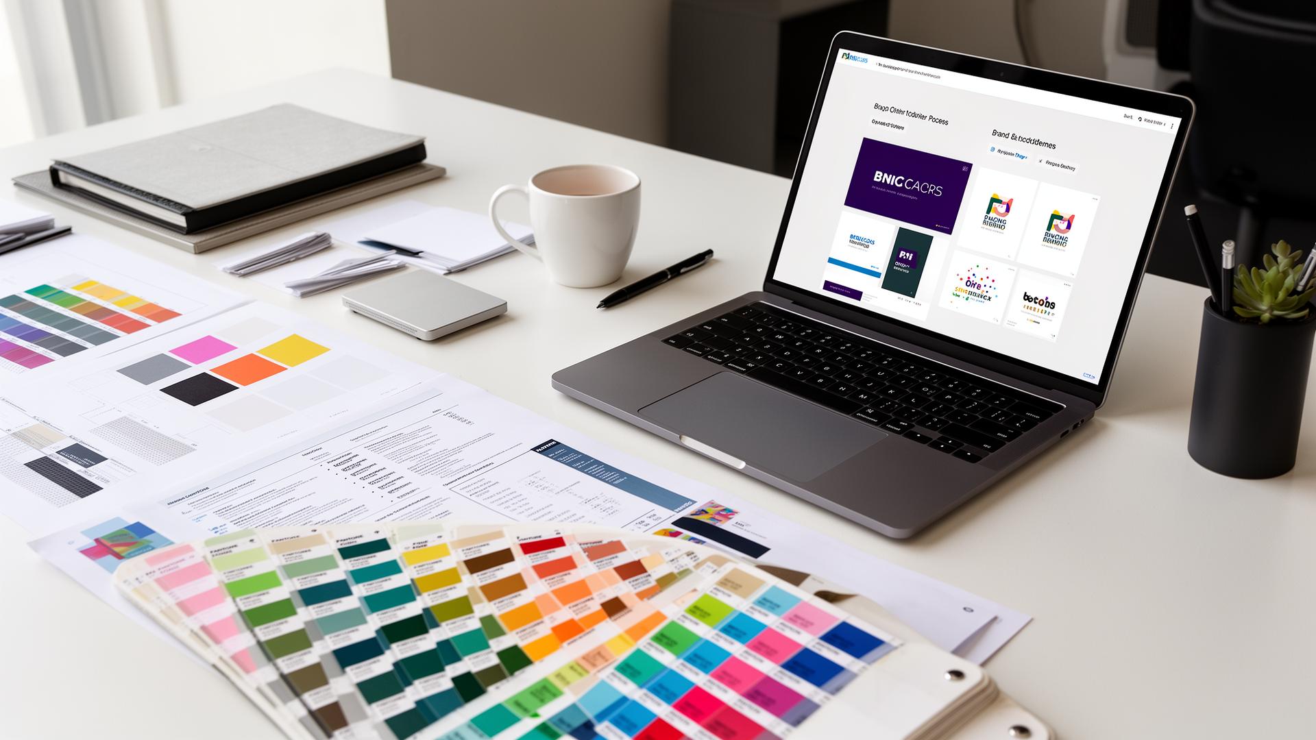
Choosing brand colors is one of the most consequential decisions a business will make, yet it is routinely treated as a matter of personal taste. The founder picks their favorite color, a designer adds a complementary tone, and the palette is declared complete. This approach fails because brand colors are not about preference — they are about strategy. The right palette communicates your values before a single word is read, differentiates you from competitors at a glance, and creates the emotional context in which every interaction with your brand occurs.
This guide provides a structured, five-step framework for choosing brand colors that are strategically sound, psychologically effective, competitively differentiated, thoroughly tested, and systematically documented. Follow these steps in order, and you will arrive at a palette that serves your brand for years rather than months.
Step 1: Understanding Your Brand Values
Before looking at a single color, you must articulate what your brand stands for. Colors are a visual language, and you cannot speak effectively in any language without knowing what you want to say. The brands with the most iconic color identities — Tiffany's robin egg blue, UPS's Pullman brown, T-Mobile's magenta — chose those colors because they precisely communicate specific brand values, not because someone thought they looked nice.
The brand attribute exercise: List five adjectives that describe your brand's personality. Be specific — "professional" is too vague; "quietly authoritative" or "approachably expert" gives color selection something to work with. Then map each attribute to a color family:
- Trustworthy, reliable, established → Blue family (
#1E40AFto#60A5FA) - Innovative, creative, visionary → Purple family (
#6D28D9to#A78BFA) - Energetic, bold, urgent → Red family (
#DC2626to#F87171) - Natural, sustainable, balanced → Green family (
#15803Dto#6EE7B7) - Optimistic, warm, accessible → Yellow/Orange family (
#D97706to#FCD34D) - Luxurious, sophisticated, exclusive → Black/Gold family (
#1A1A1A+#D4AF37) - Clean, simple, transparent → White/Light gray family (
#F9FAFBto#E5E7EB)
The three-word test: Reduce your five adjectives to three core words. These three words become your color selection filter — every color you consider must communicate at least one of them. If your three words are "bold, modern, trustworthy," then #2563EB (a confident, forward-looking blue) passes the filter. #8B4513 (a warm, traditional brown) does not.
Common mistake: Choosing colors that reflect what your industry typically uses rather than what your brand specifically stands for. Not every financial brand needs to be blue. Not every organic brand needs to be green. The most memorable brands are the ones that use color to differentiate — T-Mobile's magenta stands out precisely because every other carrier uses blue or red.
Step 2: Color Psychology Basics
Color psychology is not magic — it is a well-documented field of research that reveals how colors influence perception, emotion, and behavior. Understanding these principles ensures that your brand colors work with human psychology rather than against it.
The core associations:
Blue is the world's most universally liked color and the dominant choice for brands that need to communicate trust, competence, and stability. Research consistently shows that blue environments lower heart rate and blood pressure, creating a physiological state of calm confidence.
- Corporate blue:
#1E40AF— Authority and institutional strength - Tech blue:
#2563EB— Innovation with reliability - Friendly blue:
#3B82F6— Approachable competence - Calm blue:
#60A5FA— Gentle trustworthiness
Red increases heart rate, stimulates appetite, and creates urgency. It is the most physiologically activating color and works best for brands that want to provoke action — fast food, sales, entertainment, and sports.
- Power red:
#DC2626— Confidence and dominance - Warm red:
#EF4444— Energy and excitement - Deep red:
#991B1B— Prestige and established strength
Green communicates growth, health, and environmental consciousness. It is the easiest color for the human eye to process (it sits at the center of the visible spectrum), making it an excellent choice for brands that want to feel effortless and natural.
- Nature green:
#15803D— Environmental commitment - Growth green:
#16A34A— Financial prosperity and expansion - Fresh green:
#22C55E— Health and vitality - Sage green:
#6B8E6B— Calm sophistication
Purple bridges the energy of red and the stability of blue, creating associations of creativity, wisdom, and luxury. It has the strongest associations with imagination and is increasingly popular in tech, AI, and creative industries.
- Royal purple:
#6D28D9— Premium sophistication - Electric purple:
#7C3AED— Creative innovation - Soft purple:
#A78BFA— Approachable creativity
Yellow and Orange are the colors of optimism, warmth, and human connection. They trigger the release of serotonin and create feelings of happiness and energy. They work best for brands that want to feel friendly, inclusive, and cheerful.
- Confident orange:
#EA580C— Bold friendliness - Warm amber:
#D97706— Trustworthy warmth - Sunny yellow:
#EAB308— Pure optimism
Important caveat: Color associations vary across cultures. White represents purity in Western contexts but mourning in much of East Asia. Red signals danger in the West but luck and prosperity in China. If your brand operates internationally, research the cultural meanings of your chosen colors in every target market.
Step 3: Competitor Analysis
Your brand colors must work in the context of your competitive landscape. A color that is strategically perfect in isolation may be strategically disastrous if three of your main competitors use the same shade. The goal is to be both appropriate for your category and distinctive within it.
The competitor color audit:
List your top 8-10 competitors. Include direct competitors, adjacent competitors, and aspirational competitors (brands you admire that your target audience also engages with).
Extract their primary brand colors. Use a color picker tool or browser extension to capture the exact hex codes from their logos, websites, and marketing materials.
Map the competitive color landscape. Plot your competitors' primary colors on a color wheel. You will likely see clustering — most fintech brands cluster around blue (
#1E40AFto#3B82F6), most food delivery brands around red and orange (#DC2626to#EA580C), most wellness brands around green (#15803Dto#22C55E).Identify the gaps. The white space on your competitive color wheel represents opportunity. If every competitor uses blue, a well-chosen purple (
#7C3AED) or teal (#0D9488) immediately differentiates you while maintaining category-appropriate associations.
Case study — Fintech differentiation:
The fintech landscape is dominated by blues: PayPal #003087, Stripe #635BFF (actually purple-leaning), Square #006AFF, Wise #9FE870 (deliberately green to differentiate). Wise's choice of bright green was strategic — it stands out instantly in a sea of blue competitors while communicating the growth and fresh-start values that matter to international money transfer customers.
The rule of one: If you want to be immediately recognizable in your category, own one color so completely that it becomes synonymous with your brand. T-Mobile owns magenta #E20074. Tiffany owns robin egg blue #0ABAB5. UPS owns Pullman brown #644117. Identify whether a similar opportunity exists in your competitive landscape.
Step 4: Testing Your Palette
Before committing to any brand palette, it must survive rigorous testing across every context in which it will appear. A color that looks beautiful on a design mockup may fail catastrophically on a billboard, a mobile screen, or a printed business card.
The seven tests every brand palette must pass:
1. The thumbnail test. Reduce your logo to 32×32 pixels — the size of a browser favicon or app icon. Does your primary color remain identifiable? Colors with similar values (lightness) to their backgrounds disappear at small sizes. Your primary brand color should maintain at least a 3:1 contrast ratio against white and dark backgrounds at favicon scale.
2. The accessibility test. Place your brand colors in the combinations you plan to use — text on backgrounds, buttons on pages, icons on surfaces. Every text combination must meet WCAG AA standards (4.5:1 contrast ratio for normal text, 3:1 for large text). Test with tools like the Coloracci contrast checker. A palette that excludes 15% of the population (people with color vision deficiencies) is not a complete palette.
3. The grayscale test. Convert your palette to grayscale. If two of your key colors become indistinguishable in grayscale, they will be indistinguishable to colorblind users and on monochrome printouts. #2563EB (blue) and #DC2626 (red) look dramatically different in color but can appear similar in grayscale — pair them with a value difference of at least 30% to ensure separation.
4. The print test. Print your palette on standard office paper, premium card stock, and newsprint. RGB screens and CMYK printing produce different color gamuts — your vivid #7C3AED purple may print as a dull, muddy tone if it falls outside the CMYK gamut. Identify the closest achievable CMYK match and decide whether the printed version is acceptable.
5. The dark mode test. Place your primary color on a near-black background (#0A0A0B). Does it maintain its character? Many brand colors need a dark-mode variant — #2563EB might become #60A5FA on dark backgrounds to maintain legibility without losing brand recognition.
6. The emotional test. Show your palette (without any logo or context) to 10-20 people in your target audience. Ask them to describe the personality of a company that uses these colors. If their descriptions match your three brand attribute words from Step 1, the palette is working psychologically. If they don't, revise.
7. The longevity test. Ask yourself: will this palette feel current in five years? Trendy colors (the millennial pink of 2017, the neo-mint of 2020) date quickly. Classic colors (navy, forest green, warm red) endure. Unless your brand strategy requires trend-forward positioning, lean toward timeless over trendy.
Step 5: Color System Creation
A brand color is not a single hex code — it is a system. The most effective brand color systems define a primary color, secondary colors, functional colors, neutral colors, and the rules governing how they interact. Without this system, every new design decision becomes an opportunity for inconsistency.
The five-layer brand color system:
Layer 1: Primary color — Your single most important color, used in the logo, primary buttons, and key brand moments. This color should be the one people think of when they hear your brand name.
- Example:
#2563EB(Brand Blue)
Layer 2: Secondary colors — One to two colors that complement the primary and extend the palette for more complex layouts. These appear in illustrations, secondary buttons, and supporting design elements.
- Example:
#0D9488(Brand Teal),#7C3AED(Brand Purple)
Layer 3: Functional colors — Colors assigned to specific UI functions. These remain consistent regardless of the design context.
- Success:
#16A34A - Warning:
#D97706 - Error:
#DC2626 - Info:
#2563EB
Layer 4: Neutral colors — A grayscale ramp that handles text, backgrounds, borders, and structural elements. The neutral palette should span from near-white to near-black with at least six intermediate values.
- Background:
#FAFAFA - Surface:
#F4F4F5 - Border:
#E4E4E7 - Muted text:
#71717A - Secondary text:
#52525B - Primary text:
#18181B
Layer 5: Extended palette — Lighter and darker variants of each primary and secondary color for hover states, active states, disabled states, and background tints.
- Blue-50:
#EFF6FF(tint background) - Blue-100:
#DBEAFE(light surface) - Blue-500:
#2563EB(primary) - Blue-600:
#1D4ED8(hover) - Blue-700:
#1E40AF(active/pressed) - Blue-900:
#1E3A5F(dark variant)
Documentation is non-negotiable. Your brand color system must be documented in a living style guide that specifies: hex codes, RGB values, CMYK values, Pantone matches, usage rules (which color pairs are allowed, which are forbidden), minimum contrast requirements, and examples of correct and incorrect usage. Without this documentation, brand color consistency degrades with every new designer, developer, or agency that touches your brand.
The naming convention matters. Name your colors by function, not by hue. "Brand Primary" rather than "Brand Blue." "Success" rather than "Green." This creates a system that can evolve — if your primary color changes from blue to purple in a future rebrand, every reference to "Brand Primary" updates automatically, while every reference to "Brand Blue" becomes incorrect and confusing.
Practical Tips for the Color Selection Process
Start with black and white. Design your core brand materials in grayscale first. If they work without color, adding color will make them better. If they fail without color, adding color is a cosmetic fix for a structural problem.
Choose your primary color with your head, not your heart. Your favorite color and your brand's best color are rarely the same. Follow the data from Steps 1-3 and trust the process.
Limit your palette. The most iconic brands use two to three colors. More colors create more opportunities for inconsistency and dilute the associative power of each individual color.
Invest in professional color matching. The difference between a good brand color and a great one is often a matter of subtle adjustment —
#2563EBversus#2B6CB0versus#1D4ED8. Hire a color consultant or use professional tools to fine-tune your selections.Plan for evolution. Your brand colors will need to adapt as your business grows, enters new markets, or shifts positioning. Build flexibility into your system from the beginning.
Brand color selection is not a creative exercise — it is a strategic discipline. The five steps outlined here — values articulation, psychological alignment, competitive differentiation, rigorous testing, and systematic documentation — transform color selection from guesswork into a repeatable, defensible process. The result is a palette that does not merely decorate your brand but actively works for it, communicating your values and differentiating your presence in every context where your colors appear.