Organic Modern Color Palette: A Guide to Warm, Earthy Tones for Your Home
· Coloracci Team
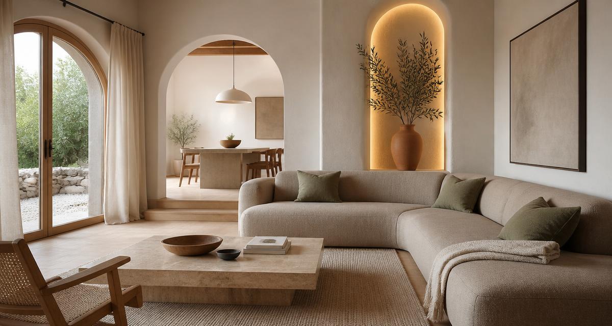
An organic modern color palette is the bridge between clean contemporary architecture and the warmth of the natural world: creamy whites, warm greiges, sand, mushroom, and clay beiges form the bulk of the room, while raw wood, stone, linen, and leather supply texture, and muted accents like sage, terracotta, ochre, and blush add quiet personality. The result is a space that feels both current and timeless — uncluttered, but never cold.
This guide gives you the exact HEX codes, color names, and designer rules that make the organic modern style work. You will learn how to split a room into the 70/20/10 formula, why nature-inspired colors are psychologically grounding, and how to keep the palette from drifting into bland beige. For the broader family of clay, sand, and olive tones, our earth tone color palette guide covers the full range.
What Is an Organic Modern Color Palette?
Organic modern design sits between modernism and rustic warmth. It borrows the clean lines, open space, and simple furniture of modernism, then warms it with natural materials and a sun-bleached color story.
The palette is built on three layers:
- Base colors (70%) — walls, ceilings, large upholstery, and built-ins in warm neutrals.
- Natural materials (20%) — wood, stone, plaster, linen, boucle, and leather. Their colors are chosen, not painted.
- Muted accents (10%) — textiles, art, ceramics, and small furniture in dusty, low-saturation hues.
The key restraint is saturation. Even accents are muted, as if filtered through dust or sunlight. This separates it from a minimalist palette that might rely on stark black and white, or from a Scandinavian palette that can run cool. If you are comparing the two approaches, our minimalist color palette guide explains the difference between restraint and starkness.
The Base Palette: Warm Neutrals (70%)
These are the colors that wrap the room. They are all warm, low-to-mid saturation, and read as neutral while still carrying a subtle color story.
Creamy White and Ivory
The most common wall color in organic modern spaces is not pure white; it is a creamy, warm white with a drop of yellow or pink. It avoids the clinical edge of #FFFFFF and lets natural textures read richer.
- Benjamin Moore White Dove OC-17:
#F3F2ED— Soft warm ivory with a barely-there yellow undertone. - Warm Alabaster:
#F5F2EA— A slightly peach-tinged white that flatters wood and brass. - Raw Linen White:
#EDE8DE— Unbleached, natural, and calm.
If the white makes the room feel brighter but colder, it is too cool.
Warm Greige
Greige is gray enough to feel contemporary, beige enough to feel warm, and neutral enough to pair with almost any accent.
- Benjamin Moore Abalone:
#D4CEC4— A light greige with subtle warm undertones. - Warm Pewter:
#C8C2B8— A mid greige that works well on cabinetry and built-ins. - Soft Greige:
#E0DAD0— A paler version for open, airy rooms.
Sand and Oatmeal
These light, earthy tones bring outdoor warmth inside without becoming yellow. They are perfect for large upholstered pieces, area rugs, and drapery.
- Sand:
#E8DBC5— Warm, sun-bleached beige. - Oatmeal:
#DDD3C4— A slightly deeper, grainy neutral. - Raw Cotton:
#F0E9DD— A very light, warm off-white with a hint of sand.
Mushroom and Clay Beige
For rooms that need more depth, mushroom and clay beiges provide grounding without darkness.
- Mushroom:
#C7B5A0— A mid-value warm beige with brown undertones. - Clay Beige:
#B8A690— Slightly deeper, with a touch of terracotta. - Plaster:
#D6C9B8— A lighter, chalky clay tone.
Soft Taupe
Taupe is brown with a gray veil — warm without being red, sophisticated without being severe.
- Soft Taupe:
#B7A89B— A warm brown-gray. - Warm Taupe:
#A99A8C— A slightly deeper, more earthy version. - Mushroom Taupe:
#9E8F80— For grounding elements like media consoles or dining tables.
Natural Materials as Color (20%)
In organic modern design, material is color. A raw oak floor, a travertine coffee table, a linen sofa, and a blackened-steel lamp all contribute hues that paint cannot replicate.
Pale Woods
- White Oak:
#DCCBB6to#C4B09A— The signature wood of the style. - Ash:
#E3D8C6— Blonde and subtle. - Walnut (used sparingly):
#6E4B33— Adds depth and contrast.
Pale wood keeps the palette light. Walnut is used as a small accent, not the dominant wood.
Stone and Plaster
- Travertine:
#E8DCC4— Warm beige stone with natural pitting. - Limestone:
#DDD4C2— Slightly cooler and more refined. - Raw Plaster:
#D8CFC0— Soft, imperfect, and tactile.
Stone and plaster work best on surfaces that catch light: fireplace surrounds, side tables, and sculptural objects.
Linen, Boucle, and Leather
- Unbleached Linen:
#E6DECF— Slightly darker and warmer than raw cotton. - Boucle:
#E9E2D6— Textured, creamy, and inviting. - Natural Leather:
#C49A6C— A warm tan that ages beautifully.
Boucle adds visual texture without pattern. Leather deepens the color story and gives the room a sense of heritage.
Muted Accent Colors (10%)
Accents in organic modern design are like spices: a small amount transforms the whole dish. They are never loud and always a little dusty.
Muted Sage Green
Sage is the most common accent because it is the color of weathered foliage. It pairs with every neutral in the base layer.
- Sherwin-Williams Clary Sage:
#BDBEAD— Dusty herbal green. - Dried Sage:
#A8A995— A slightly deeper, grayed green. - Soft Moss:
#C3C6B5— A lighter, almost neutral sage.
For a deeper look at how sage behaves on walls, our what colors go with sage green walls guide breaks down every pairing from blush to charcoal.
Dusty Terracotta
Terracotta supplies warmth without overwhelming the calm palette. It is used in small textiles, ceramics, or a single accent wall.
- Sherwin-Williams Cavern Clay:
#B47863— Warm, sun-baked clay. - Dusty Terracotta:
#C0866F— A softer, slightly pinker version. - Burnt Clay:
#A86A55— Deeper and more dramatic.
Warm Ochre
Ochre is a deep, earthy yellow that references turmeric, hay, and old gold. It adds warmth without the harshness of pure yellow.
- Warm Ochre:
#C49A4A— A muted golden-brown. - Deep Ochre:
#A67C3D— More brown, less yellow. - Honey Ochre:
#D4B06A— Lighter and softer.
Desaturated Blush
Blush must be desaturated — almost a warm beige with a hint of pink — to avoid sweetness.
- Desaturated Blush:
#E4C8C1— Soft, warm, and barely pink. - Clay Blush:
#D9B5AC— A slightly deeper, earthier version. - Dusty Rose:
#C9A39B— For small accents and textiles.
Earthy Brown and Bronze
These are the grounding darks. They function like black, but because they are warm, they keep the room cohesive.
- Earthy Brown:
#5C4B3E— A deep, warm brown. - Bronze:
#8B6F4E— A metallic dark tan. - Dark Walnut:
#4A3B2F— For furniture legs and hardware.
Three Complete Organic Modern Palettes
Here are three designer-ready palettes that follow the 70/20/10 rule.
Palette 1: Warm Minimalist
- 70% base: White Dove
#F3F2ED— walls and ceiling. - 20% material: White Oak
#DCCBB6— floors and coffee table. - 10% accent: Sage
#BDBEAD— sofa cushions, throw, and ceramic.
This is the quietest version of the style. It relies on texture variation more than color variation. It is ideal for small rooms and anyone who wants a calm, gallery-like home.
Palette 2: Desert Sun
- 70% base: Sand
#E8DBC5— walls and large upholstery. - 20% material: Natural Leather
#C49A6C— accent chair and leather pouf. - 10% accent: Terracotta
#B47863— throw pillows, pottery, and a single art piece.
This palette is warmer and more sun-drenched. It suits south-facing rooms and open-plan living spaces.
Palette 3: Earth and Moss
- 70% base: Greige
#D4CEC4— walls and built-ins. - 20% material: Walnut
#6E4B33— dining table and media console. - 10% accent: Ochre
#C49A4A— pendant light, ceramics, and a woven throw.
This is the deepest of the three. It is well suited to larger rooms with good natural light.
Color Psychology of Organic Modern Hues
Organic modern palettes are psychologically restorative. The colors are drawn from landscapes the brain already associates with safety and rest.
Warm neutrals like #F3F2ED and #D4CEC4 lower visual stimulation. They do not demand attention, which allows the eye and mind to rest. Studies of interior color consistently show that warm, light neutrals are rated as more relaxing than cool whites or grays.
Sage green (#BDBEAD) carries the benefits of green — growth, renewal, and nature — but at a muted saturation that avoids the energizing effect of bright greens. This makes it ideal for bedrooms, living rooms, and any space intended for unwinding.
Terracotta and ochre are grounding earth tones. They evoke sun-baked clay, dry grass, and harvest fields. These hues are linked to stability and warmth; they make a space feel sheltering rather than exposed.
Wood and stone tones contribute biophilic value. Even indoors, natural materials and their colors remind the brain of outdoor environments, which can reduce stress and improve sense of wellbeing.
How to Apply the 70/20/10 Rule
The 70/20/10 rule is the simplest way to keep an organic modern room balanced.
- 70% base neutrals — walls, ceilings, large rugs, sofas, and built-ins.
- 20% natural materials — wood floors, stone surfaces, linen, leather, and woven textures.
- 10% muted accents — cushions, throws, art, ceramics, and small furniture.
The most common mistake is overloading the accent layer. A terracotta sofa, ochre curtains, and sage walls together tip the room from organic modern to bohemian. Pick one dominant accent color per room and let the others appear as tiny echoes.
Practical Takeaways for Designers and Homeowners
Choose the wall color first. Test it against your largest material — usually the floor — before buying furniture.
Keep whites warm. If a white looks crisp in isolation, it is probably too cool. Look for whites with names like "ivory," "linen," "alabaster," or "dove."
Use texture as a color. A room with only two or three colors can still feel rich if every surface has a different texture: matte plaster, nubby boucle, smooth leather, rough oak.
Limit high-chroma colors. Pure red, bright cobalt, or saturated emerald feel out of place. Choose ochre, deep sage, or dusty rose instead.
Match undertones, not just color names. A warm greige with a green undertone against a pink-leaning terracotta will look subtly off. Always compare samples in the actual room.
Anchor with one dark element. Every successful organic modern room has at least one deep value: a walnut table, bronze hardware, a dark leather chair, or a charcoal linen throw.
Common Mistakes to Avoid
Using stark white. Pure white (#FFFFFF) next to warm wood and earthy accents creates a cold, clinical edge. Warm the white.
Going too gray. Blue-gray or cool greige steers the room toward Scandinavian or industrial style, which is fine — but it is not organic modern.
Overusing terracotta. As a dominant wall color it can overpower the restraint organic modern requires. Use it as an accent, not the main event.
Forgetting contrast. An all-light palette can feel washed out. Introduce one dark element — earthy brown, bronze, walnut, or blackened steel — to give the eye a place to rest.
Adding too many colors. Three to four colors, plus natural materials, is enough. More than that competes with the calm that defines the style.
Complete Organic Modern Color Reference Table
| Item | Color | Hex | Color Name | Psychological Meaning |
|---|---|---|---|---|
| Wall | #F3F2ED |
Warm White Dove | Calm, openness, warmth | |
| Accent Wall | #D4CEC4 |
Warm Greige | Balance, contemporary warmth | |
| Upholstery | #E8DBC5 |
Sand | Comfort, earthiness, neutrality | |
| Flooring | #DCCBB6 |
White Oak | Nature, stability, tactility | |
| Throw Pillows | #BDBEAD |
Sage Green | Restoration, quiet nature | |
| Ceramics | #B47863 |
Dusty Terracotta | Grounding, warmth, shelter | |
| Accent Chair | #C49A6C |
Natural Leather | Heritage, comfort, durability | |
| Light Fixture | #C49A4A |
Warm Ochre | Optimism, harvest, earthy glow | |
| Soft Textile | #E4C8C1 |
Desaturated Blush | Intimacy, softness, warmth | |
| Dark Anchor | #5C4B3E |
Earthy Brown | Grounding, permanence, depth |
Conclusion
An organic modern color palette is the art of restraint and warmth combined. The base is a warm neutral envelope — cream, greige, sand, mushroom, or taupe — supported by natural materials like white oak, travertine, and linen. Accents appear in muted sage, dusty terracotta, warm ochre, desaturated blush, and earthy brown, each used sparingly so the room stays calm.
Start with a warm white or greige wall, add a pale wood floor, choose one muted accent, and finish with one dark anchor. Follow that formula, and you will create a space that feels clean, grounded, and quietly luxurious — the defining mood of organic modern design.
Ready to build your exact palette? Use the Coloracci palette generator to enter your wall color and generate a full organic modern scheme — from base neutrals and wood tones to muted accents and dark anchors — then export the HEX codes straight to your mood board or painter.