How to Create a Color Style Guide for Your Brand
· Coloracci Team
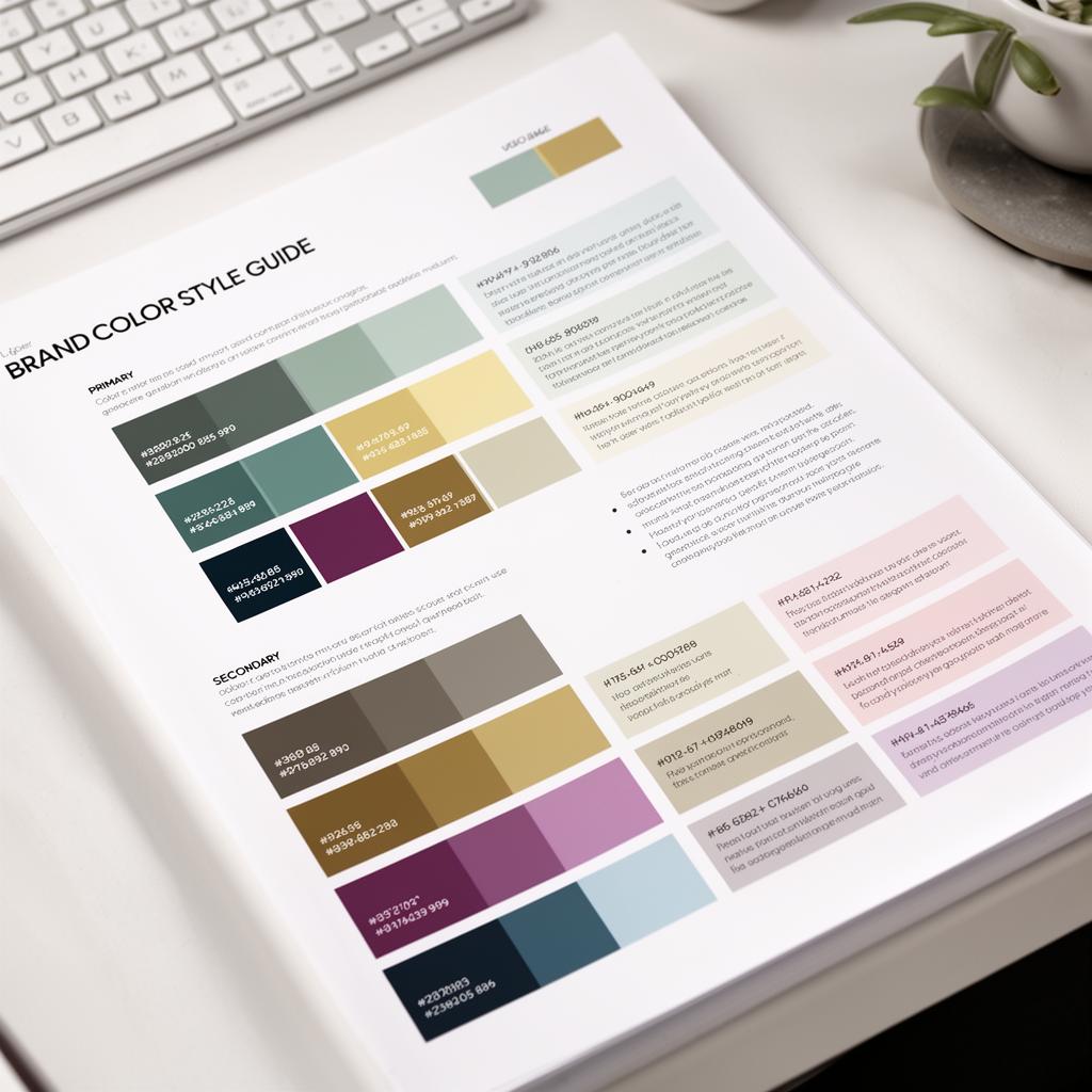
A color style guide is the single most important document for maintaining visual consistency across your brand. Without one, designers improvise, developers approximate, and marketing teams pick colors by gut feeling. The result is a fractured identity where your website uses one shade of blue, your social media templates use another, and your print materials use a third. A well-crafted color style guide eliminates this drift entirely.
This guide walks you through every step of creating a color style guide that your team will actually follow — from defining your core palette to building enforcement mechanisms that prevent color drift over time.
Defining Primary and Secondary Colors
Every brand color system starts with a hierarchy. Your primary colors are the ones customers associate with your brand at a glance. Secondary colors support the primary palette and add versatility for layouts, illustrations, and data visualization.
Primary Palette
Your primary palette should contain no more than two to three colors. These are the colors that appear in your logo, headline treatments, and key brand moments. Limiting the primary palette forces consistency and makes your brand instantly recognizable.
For example, a fintech brand might define:
- Brand Navy —
#0F172A— Used for primary headings, navigation, and logo - Brand Teal —
#0D9488— Used for CTAs, links, and interactive elements - Brand White —
#FAFAFA— Used for backgrounds and negative space
Each primary color entry in your style guide should include:
- The official color name (not just "blue" — give it a specific name)
- Hex, RGB, HSL, and CMYK values (covering digital and print)
- Pantone equivalent for physical materials
- Minimum usage percentage (e.g., "Brand Navy should represent at least 40% of any layout")
Secondary Palette
Secondary colors extend your visual vocabulary without competing with primary colors. They're used for backgrounds, illustrations, charts, status indicators, and supporting UI elements. A strong secondary palette typically includes four to six colors:
- Slate Gray —
#64748B— Body text, secondary labels - Sky Blue —
#38BDF8— Informational highlights, tooltips - Amber —
#F59E0B— Warnings, attention states - Emerald —
#10B981— Success states, positive indicators - Rose —
#F43F5E— Error states, destructive actions - Violet —
#8B5CF6— Premium features, special promotions
Each secondary color should specify its designated purpose. This prevents the common problem of designers grabbing any available color for any purpose, which erodes the meaning of your color system over time.
Neutral Scale
Often overlooked, a defined neutral scale is critical for UI consistency. Define a complete gray ramp from near-white to near-black:
- Neutral 50 —
#F8FAFC— Page backgrounds - Neutral 100 —
#F1F5F9— Card backgrounds, alternating rows - Neutral 200 —
#E2E8F0— Borders, dividers - Neutral 300 —
#CBD5E1— Disabled states, placeholder text - Neutral 500 —
#64748B— Secondary text - Neutral 700 —
#334155— Primary body text - Neutral 900 —
#0F172A— Headings, high-emphasis text
Without a neutral scale, every designer invents their own grays, leading to inconsistent borders, text, and background treatments.
Usage Rules and Color Relationships
Defining colors without usage rules is like providing a dictionary without grammar. Your style guide must specify how colors interact, where they appear, and what they signify.
Do's and Don'ts
Create explicit pairing rules with visual examples:
Do:
- Use Brand Teal
#0D9488for primary CTAs on white or light backgrounds - Pair Brand Navy
#0F172Aheadings with Neutral 700#334155body text - Use Emerald
#10B981exclusively for success and confirmation states
Don't:
- Place Brand Teal text on Brand Navy backgrounds (insufficient contrast at 3.2:1)
- Use Rose
#F43F5Efor decorative purposes — it's reserved for errors - Mix Amber and Rose in the same context — it creates confusing severity signals
Color Proportions
Specify the ratio in which colors should appear. The classic 60-30-10 rule provides a strong starting point:
- 60% — Neutral/White — Backgrounds and negative space
- 30% — Brand Navy — Structural elements, text, containers
- 10% — Brand Teal — Accent elements, CTAs, interactive highlights
This ratio ensures visual harmony while keeping your brand colors prominent without overwhelming the layout.
Tints and Shades
Define approved tints and shades for each primary and secondary color. This prevents designers from creating arbitrary lighter or darker versions:
- Brand Teal 100 —
#CCFBF1— Light backgrounds, badges - Brand Teal 300 —
#5EEAD4— Hover states - Brand Teal 500 —
#0D9488— Default state (primary) - Brand Teal 700 —
#0F766E— Active/pressed state - Brand Teal 900 —
#134E4A— Dark mode variant
Every approved shade should include its specific use case. If it's not in the guide, it shouldn't appear in the product.
Accessibility Standards
A color style guide that ignores accessibility is incomplete. Your guide should define contrast requirements, color-blind safety, and non-color indicators as non-negotiable standards.
Contrast Ratio Requirements
Document the minimum contrast ratios for every text-background combination in your system:
- Normal text (under 18px): Minimum 4.5:1 contrast ratio (WCAG AA)
- Large text (18px bold or 24px regular): Minimum 3:1 contrast ratio
- UI components and icons: Minimum 3:1 against adjacent colors
Pre-calculate and document the results for common pairings:
| Foreground | Background | Ratio | Pass/Fail |
|---|---|---|---|
#0F172A (Navy) |
#FAFAFA (White) |
17.4:1 | ✅ AAA |
#0D9488 (Teal) |
#FAFAFA (White) |
4.6:1 | ✅ AA |
#0D9488 (Teal) |
#0F172A (Navy) |
3.8:1 | ✅ Large text |
#F59E0B (Amber) |
#FAFAFA (White) |
2.1:1 | ❌ Fail |
The Amber example is critical — yellow-orange tones commonly fail contrast checks on white backgrounds. Your guide should explicitly note that Amber #F59E0B must never be used for text on light backgrounds and should always be paired with a dark text label or icon.
Color Blindness Safety
Approximately 8% of men and 0.5% of women have some form of color vision deficiency. Your style guide should:
- Never rely on color alone to convey information. Always pair color with text labels, icons, or patterns.
- Avoid red-green pairings for critical distinctions like success/error. If your success is Emerald
#10B981and error is Rose#F43F5E, add icons (checkmark and X) alongside the color. - Test every palette through deuteranopia, protanopia, and tritanopia simulators.
- Document safe alternative pairs — for example, Blue
#3B82F6and Orange#F97316remain distinguishable across all common CVD types.
Dark Mode Variants
If your brand supports dark mode, the style guide must define the complete dark palette as well. Don't leave dark mode to developer interpretation. Specify:
- Dark mode background:
#0F172A(Brand Navy) or#1E293B(Slate 800) - Dark mode text:
#E2E8F0(Neutral 200) for primary,#94A3B8(Slate 400) for secondary - Dark mode accents: Shift primary teal from
#0D9488to#2DD4BF(lighter variant)
Distribution and Enforcement
The most comprehensive style guide is worthless if no one uses it. Distribution and enforcement mechanisms are what separate aspirational brand guidelines from actually consistent brands.
Design Tokens
Convert your color definitions into design tokens — platform-agnostic variables that feed into every design and development tool:
{
  "color": {
    "brand": {
      "navy": { "value": "#0F172A" },
      "teal": { "value": "#0D9488" }
    },
    "neutral": {
      "50": { "value": "#F8FAFC" },
      "900": { "value": "#0F172A" }
    }
  }
}
Design tokens can be automatically compiled into CSS custom properties, Tailwind config values, iOS/Android color assets, and Figma variables. This ensures a single source of truth.
Shared Libraries and Templates
Distribute your colors through:
- Figma shared libraries with published color styles
- CSS custom properties in a shared stylesheet
- Tailwind configuration with semantic color names
- Brand asset kits with color swatches for presentations and documents
Automated Linting
Implement automated checks in your codebase to prevent color drift:
- Stylelint rules that flag hardcoded hex values not in the approved palette
- ESLint plugins that catch unapproved Tailwind color classes
- CI/CD checks that compare used colors against the token registry
Version Control and Updates
Treat your color style guide as a living document with version numbers. When the palette evolves — as it inevitably will — log every change with rationale:
- v1.0 — Initial palette launch
- v1.1 — Added Violet
#8B5CF6for premium tier - v2.0 — Dark mode palette added; Amber shifted from
#F59E0Bto#EAB308for improved contrast
Versioning creates accountability and lets teams verify which version of the guide they're following.
A color style guide isn't a one-time deliverable — it's an evolving system that grows with your brand. Build it thoughtfully, enforce it consistently, and update it intentionally. The brands that invest in this discipline are the ones whose visual identity remains cohesive whether seen on a billboard, a mobile app, or a favicon.