How to Match Colors Like a Professional Designer | Complete 2026 Guide
· Lion Dada
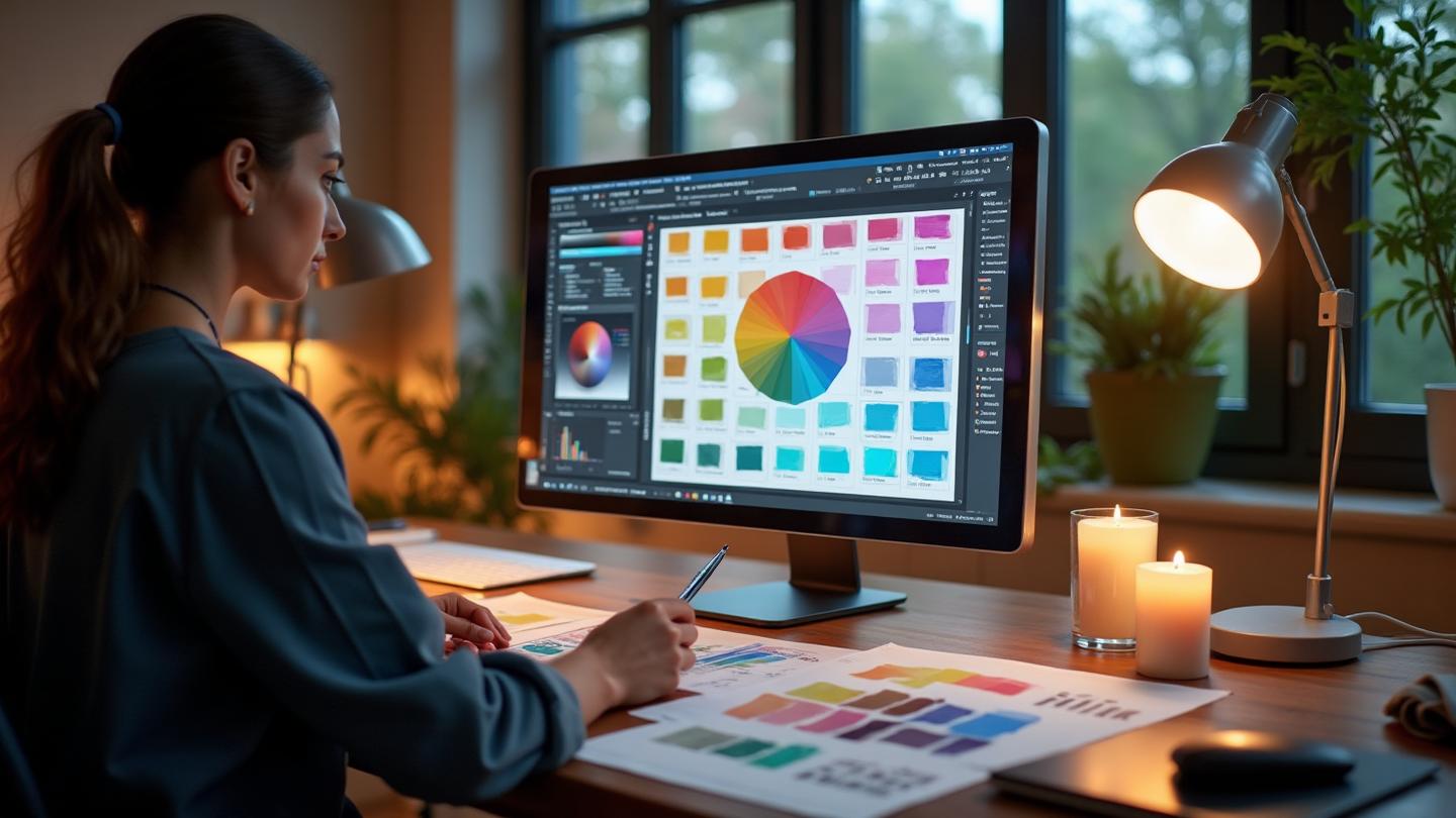
The Day I Ruined a $50,000 Project with One Color Choice
Three years ago, I delivered what I thought was a brilliant rebranding package to a luxury hotel chain. Elegant fonts. Sophisticated layouts. And a color palette I was genuinely proud of.
The client's response? "It looks like a hospital."
I'd matched their request for "clean and professional" with whites, light grays, and a pale blue accent. Technically perfect color harmony. Emotionally? Completely wrong.
That project taught me something crucial: matching colors isn't just about theory—it's about intention.
Today, I'm sharing everything I've learned about color matching since that disaster. The methods I'll show you aren't just formulas you plug numbers into. They're frameworks for creating palettes that feel right.
Let's start with why this matters more than ever.
Why Color Matching Matters in 2026
We're living in a visual-first world. Users make judgments about your design in 0.05 seconds—and color is the first thing they notice.
Here's what the research tells us:
- 93% of purchasing decisions are influenced by visual appearance
- Color increases brand recognition by up to 80%
- The right color combination can improve readability by 40%
But here's what the numbers don't tell you: mismatched colors don't just look bad. They create cognitive friction. Your brain works harder to process information when colors clash.
Professional designers don't pick colors randomly. They use proven systems that have evolved over centuries—from Renaissance painters to modern UI designers.
What Makes Colors "Match"?
Before diving into methods, let's understand why certain colors work together.
Color matching is fundamentally about relationships. It's not about individual colors being "good" or "bad"—it's about how they interact.
Think of it like music. A C note isn't inherently better than an F note. But play them together in the right context, and you get harmony. Play them wrong, and you get dissonance.
The same principles apply to color:
1. Hue Relationships
Colors that share certain positions on the color wheel create predictable harmonies. Complementary colors (opposites) create energy. Analogous colors (neighbors) create calm.
2. Value Contrast
Light and dark versions of colors need to work together. This is critical for accessibility and readability.
3. Saturation Balance
Mixing highly saturated colors with muted tones creates visual hierarchy. All bright or all muted can look flat.
4. Temperature Harmony
Warm colors (reds, oranges, yellows) and cool colors (blues, greens, purples) can be balanced for different emotional effects.
Understanding these principles will help you apply the methods below with intention, not just formula.
The 6 Professional Color Matching Methods
These are the core systems every professional designer knows. Each creates a different feeling and serves different purposes.
Method 1: Complementary Colors
What it is: Two colors directly opposite each other on the color wheel.
Examples: Blue + Orange, Purple + Yellow, Red + Green
When to use: When you need maximum contrast and visual impact. Perfect for call-to-action buttons, logos, and designs that need to grab attention.
The psychology: Complementary colors create tension that demands attention. They're exciting but can be overwhelming in large doses.
Pro tip: Use one color as dominant (60-70%) and the complement as accent (10-20%). Fill the rest with neutrals.
Learn more in our Complementary Colors Examples Guide.
Method 2: Analogous Colors
What it is: Three to five colors sitting next to each other on the color wheel.
Examples: Blue-Green + Green + Yellow-Green, Red + Red-Orange + Orange
When to use: When you want harmony without high contrast. Excellent for nature themes, wellness brands, and designs that need to feel cohesive.
The psychology: These combinations feel natural and soothing. They're easy on the eyes and create a sense of unity.
Pro tip: Choose one color as dominant, and let the others play supporting roles at varying saturations.
Explore more in our Analogous Colors Examples Guide.
Method 3: Triadic Colors
What it is: Three colors evenly spaced (120° apart) on the color wheel.
Examples: Red + Yellow + Blue, Orange + Green + Purple
When to use: When you need vibrant, balanced variety. Great for children's products, playful brands, and designs that need energy without chaos.
The psychology: Triadic schemes feel balanced yet dynamic. They're more complex than complementary but easier to control.
Pro tip: Let one color dominate while using the other two as accents. This prevents visual overwhelm.
Dive deeper in our Triadic Colors Examples Guide.
Method 4: Split-Complementary
What it is: A base color plus the two colors adjacent to its complement.
Examples: Blue + Yellow-Orange + Red-Orange
When to use: When you want the contrast of complementary with more flexibility. It's easier to balance than straight complementary.
The psychology: Creates interest without the tension of direct complements. It feels sophisticated yet approachable.
Pro tip: This is often the "safe choice" for clients who want impact without risk.
See examples in our Split-Complementary Colors Guide.
Method 5: Tetradic (Double Complementary)
What it is: Four colors forming a rectangle on the color wheel—two complementary pairs.
Examples: Red + Green + Blue + Orange
When to use: When you need a rich, complex palette. Works for large projects with multiple components that need distinct but related colors.
The psychology: These schemes feel complete and professional. They offer maximum variety while maintaining relationships.
Pro tip: Balance warm and cool colors equally, and always let one color dominate.
Master this in our Tetradic Colors Examples Guide.
Method 6: Monochromatic
What it is: Variations of a single hue—different saturations and values of one color.
Examples: Navy + Blue + Sky Blue + Light Blue
When to use: When you want elegant simplicity. Perfect for minimalist brands, landing pages, and designs that need sophistication.
The psychology: Monochromatic schemes feel clean, professional, and unified. They're never overwhelming.
Pro tip: Use value contrast to create hierarchy. Without it, monochromatic designs can feel flat.
Learn more in our Monochromatic Color Schemes Guide.
The 60-30-10 Rule: The Secret to Perfect Proportions
Knowing which colors to use is only half the battle. The other half is knowing how much of each to use.
Enter the 60-30-10 rule:
- 60% Dominant Color: Your background, large surfaces, the color that sets the tone
- 30% Secondary Color: Supporting elements, containers, secondary surfaces
- 10% Accent Color: CTAs, highlights, elements that need attention
This isn't arbitrary. It's based on how our eyes naturally seek balance. Too much of any one color feels overwhelming. Too little hierarchy feels chaotic.
Read our deep dive: The Science Behind Color Proportions.
Choosing Your Base Color: Where to Start
The most paralyzing question in color matching: "What color should I start with?"
Here's my process:
1. Industry Standards
Different industries have established color languages:
- Finance: Blues, greens, grays (trust, stability)
- Healthcare: Blues, whites, greens (calm, clean)
- Food & Restaurant: Reds, oranges, yellows (appetite, energy)
- Luxury: Blacks, golds, deep purples (exclusivity, elegance)
- Tech: Blues, purples, clean whites (innovation, clarity)
- Eco/Nature: Greens, earth tones (sustainability, wellness)
These aren't rules, but starting points. Breaking conventions can work—if intentional.
2. Emotional Intent
What should users feel?
- Excitement: Warm colors—reds, oranges
- Calm: Cool colors—blues, greens
- Luxury: Deep, saturated—purples, blacks
- Playfulness: Bright, varied—pinks, yellows
Check our complete Color Psychology Hub for detailed guides on each color.
3. Competitive Analysis
What colors do competitors use? You have two options:
- Fit in: Use similar colors to establish category membership
- Stand out: Choose deliberately different colors to differentiate
Neither is wrong. It depends on strategy.
4. Practical Constraints
Don't forget:
- Existing brand colors that must be incorporated
- Accessibility requirements (contrast ratios)
- Platform considerations (social media, print, web)
Color Matching by Project Type
Web Design
For websites, consider:
- Hero sections: Your most impactful colors here
- Navigation: Needs contrast but shouldn't fight with content
- CTAs: Your accent color should make these pop
- Text: Dark on light or light on dark—always readable
Use our Color Contrast Checker to verify accessibility.
Interior Design
Physical spaces work differently:
- Large surfaces (walls, floors): Dominant color—typically neutrals
- Furniture: Secondary colors
- Accessories: Accent colors that can be changed seasonally
See more in How to Add Color to Your Home.
Fashion & Styling
Personal color matching considers:
- Skin undertones: Warm or cool affects which colors flatter
- Occasion: Formal vs casual affects saturation choices
- Trends: Current fashion color trends inform choices
Brand Identity
Brands need:
- Primary color: The main recognition color
- Secondary palette: Supporting colors for variety
- Neutral palette: For backgrounds and text
- Accent colors: For special emphasis
Study how top brands do it in our Website Redesign Color Guide.
5 Common Color Matching Mistakes
Mistake 1: Using Too Many Colors
The problem: More than 3-4 colors creates chaos.
The fix: Start with a limited palette. You can always add—it's harder to remove.
Mistake 2: Ignoring Accessibility
The problem: Beautiful colors that fail WCAG contrast requirements.
The fix: Check every combination with our Color Contrast Checker. Test with our Colorblind Simulator.
Mistake 3: Matching Colors Without Context
The problem: A palette that looks great in your tool but fails in application.
The fix: Always test colors in realistic contexts—actual buttons, actual text, actual photos.
Mistake 4: Following Trends Blindly
The problem: Using 2026's trending colors without considering your brand.
The fix: Trends inform, not dictate. Your palette needs to work for your context.
Mistake 5: No Hierarchy
The problem: Every color screams equally for attention.
The fix: Apply the 60-30-10 rule. Hierarchy is essential.
How the Pros Do It: Brand Case Studies
Stripe
- Primary: Purple/Blue gradient (#635BFF)
- Secondary: Warm yellows, teals
- Strategy: Complementary undertones with gradient smoothing
Why it works: The gradient creates movement and innovation feel while staying professional.
Airbnb
- Primary: Rausch (coral red) #FF5A5F
- Secondary: Warm neutrals, soft greens
- Strategy: Warm monochromatic with nature accents
Why it works: The coral feels welcoming (like home), while greens suggest exploration.
Spotify
- Primary: Spotify Green #1DB954
- Secondary: Black, white, pops of purple
- Strategy: Bold monochromatic with high contrast
Why it works: The green is energetic and unique. Black provides drama without competing.
Apple
- Primary: Clean whites, silver, space gray
- Secondary: Product-specific accent colors
- Strategy: Neutral foundation with rotating accents
Why it works: The neutrality lets products be heroes while maintaining brand cohesion.
Tools for Professional Color Matching
Our Recommended Workflow
- Start with AI: Use our Fibonacci Color Generator to generate mathematically harmonious palettes
- Check Proportions: Apply the 60-30-10 rule with our Color Hierarchy Tool
- Verify Accessibility: Test with our Contrast Checker
- Simulate Issues: Run through our Colorblind Simulator
- Export & Apply: Get CSS, Tailwind, or Figma exports
Additional Resources
- Image Inspiration: Image Color Extractor to pull palettes from photos
- Mood Boarding: Mood Board Generator for visual exploration
- Light/Dark Mode: Light/Dark Mode Generator for dual palettes
Your 5-Step Color Matching Checklist
Ready to match colors like a pro? Here's your action plan:
- Define your intent: What emotion should colors create?
- Choose a method: Complementary, analogous, triadic, etc.
- Select your base: Consider industry, emotion, and differentiation
- Apply proportions: 60-30-10 is your friend
- Test relentlessly: Accessibility, context, and real applications
Start Matching Colors Now
Theory only gets you so far. The real learning happens when you experiment.
Try our interactive Color Matching Guide above to generate your first professional palette. Or jump into our Fibonacci Color Generator for AI-powered matching.
Color matching isn't a talent you're born with. It's a skill you develop through practice and understanding.
And now you have both the knowledge and the tools.
Related Resources
- Color Harmony Series - Deep dives into each harmony type
- The Science Behind Color Proportions
- Color Psychology Hub - How colors affect perception
- HEX to RGB to HSL Conversion Guide
- Color Picker vs Extractor
- CSS Color Variables & Design Tokens