How to Create a Mood Board: The Complete Guide from Chaos to Clarity
· Lion Dada
The Email That Almost Broke Me
"Make it feel premium but approachable. Modern but timeless. Unique but not weird."
I stared at the client brief, wondering if this was some kind of design Rorschach test. What does "premium but approachable" even look like? How can something be both modern AND timeless?
After three rounds of revisions, two late nights, and one near-breakdown, I discovered what I'd been missing all along: a proper mood board.
That single discovery transformed how I work. Projects that used to take weeks of back-and-forth now get approved in one meeting. Client relationships improved. My stress levels dropped. And it all started with learning how to create a mood board the right way.
Let me show you exactly how.
What Is a Mood Board (And Why You Actually Need One)
A mood board is a visual collection of images, colors, textures, typography, and other design elements arranged to communicate a specific aesthetic or feeling.
But here's what most tutorials won't tell you: a mood board is really a translation device.
It translates vague words like "elegant" and "modern" into concrete visuals that everyone can see and agree on. It's the bridge between what's in your client's head and what ends up in the final design.
The Real Purpose of Mood Boards
- Alignment: Gets everyone on the same page before any design work begins
- Efficiency: Prevents wasted time on wrong directions
- Communication: Gives clients a visual vocabulary to provide feedback
- Inspiration: Serves as a creative springboard throughout the project
- Documentation: Creates a reference point for design decisions
Think of it like this: would you build a house without a blueprint? A mood board is your design blueprint.
Types of Mood Boards: Physical vs. Digital
Physical Mood Boards
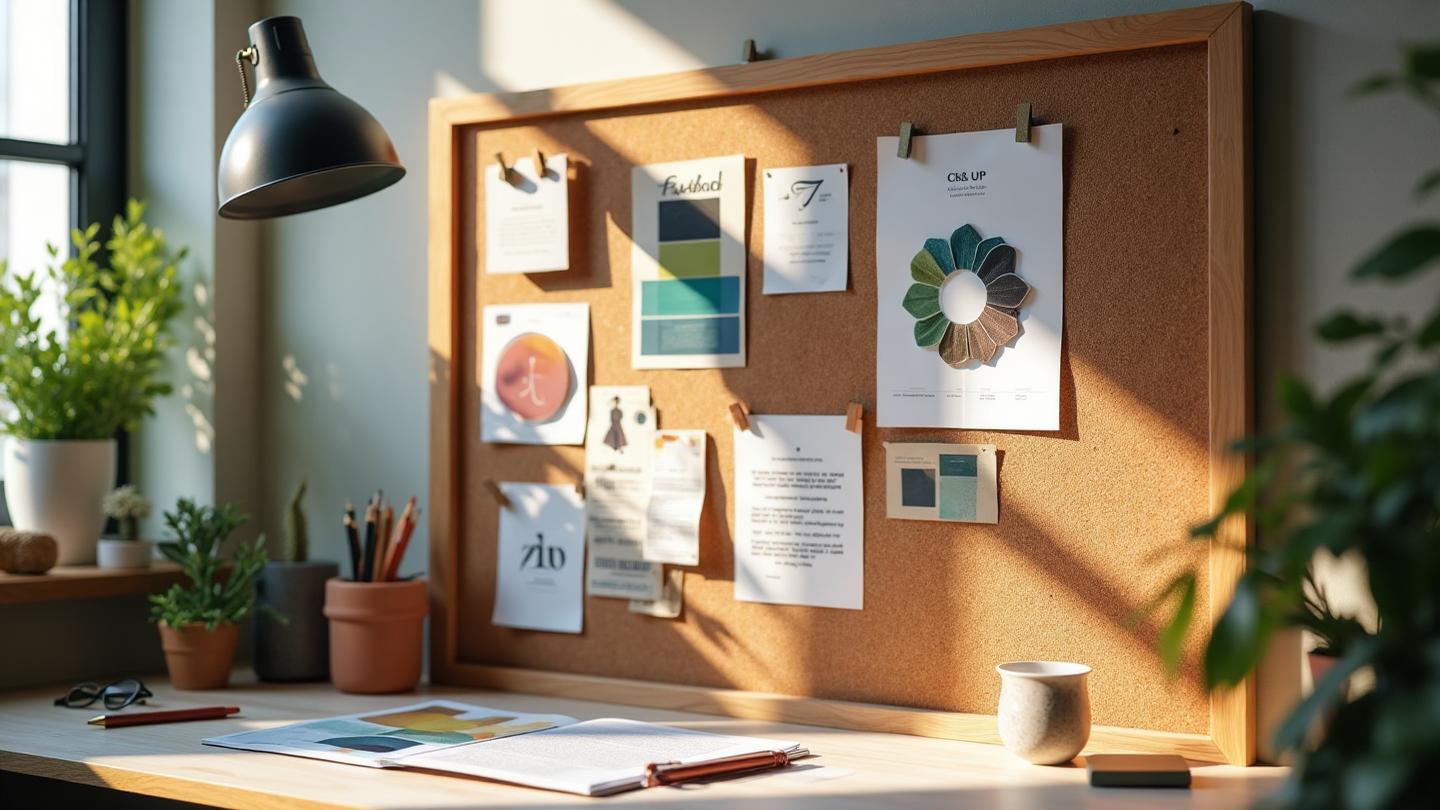
The old-school approach still has its charm. Cork boards with pinned magazine clippings, fabric swatches, paint chips, and printed photos.
Best for:
- Interior design projects
- Fashion and textile work
- Tactile brands (luxury goods, artisanal products)
- In-person client presentations
- When you need to feel materials
The downside? Time-consuming to create, hard to share remotely, and impossible to iterate quickly.
Digital Mood Boards
The modern standard. Created in tools like Figma, Canva, or specialized platforms.
Best for:
- Web and digital design
- Remote collaboration
- Quick iterations
- Easy sharing and feedback
- Most contemporary projects
The downside? Can feel less tangible, requires digital tool proficiency.
My recommendation: Start digital. It's faster, more flexible, and easier to share. You can always print key elements for in-person presentations.
The 5 Essential Elements Every Mood Board Needs
After creating hundreds of mood boards, I've identified five non-negotiable elements. Miss any of these, and your board won't do its job.
1. Color Palette
The foundation of everything. Your color palette sets the emotional tone before anyone reads a single word.
What to include:
- 3-5 core colors (not 15—restraint is key)
- Primary, secondary, and accent colors clearly labeled
- Hex codes for digital work
- Approximate usage ratios (the 60-30-10 rule works well)
Pro tip: Don't just show colors as squares. Show them in context—on fabric, in photography, on surfaces. This helps clients understand how colors behave in real life.
Related reading: The Science of Green in Branding and Psychology of Blue in Design
2. Typography
Fonts communicate personality before anyone reads the words. A serif font whispers "established" while a geometric sans-serif shouts "modern."
What to include:
- Heading/display font
- Body text font
- 2-3 pairings maximum
- Sample text at different sizes
- Font weights you'll use
Pro tip: Show fonts in context, not just as specimens. Apply them to a headline, a paragraph, a pull quote.
3. Textures & Materials
This is where digital mood boards often fail. Texture adds depth and tactile association that flat colors can't provide.
What to include:
- Surface finishes (matte, glossy, metallic)
- Fabric or material references (even for digital projects)
- Patterns and background textures
- Natural materials (wood grain, stone, leather)
Pro tip: For web design, think about how textures translate to UI—subtle gradients, noise overlays, shadow depths.
Related reading: Earth Tone Color Palette Guide
4. Imagery Style
Not the actual photos you'll use, but references that establish the visual language.
What to include:
- Photography style (moody, bright, editorial, documentary)
- Composition preferences (symmetrical, dynamic, minimal)
- Subject matter themes
- Illustration or icon style if applicable
- Color treatment (high contrast, desaturated, vibrant)
Pro tip: Include 5-10 reference images, not 50. Curation is part of the skill.
5. Design Direction (Words)
Yes, words. A good mood board includes 3-5 keywords that capture the essence.
What to include:
- Core mood words (sophisticated, playful, bold)
- Target audience notes
- Brand personality descriptors
- "Anti-board" notes (what to avoid)
Pro tip: Put these words prominently on the board. They anchor the visual elements to a clear intention.
Step-by-Step: How to Create a Mood Board
Step 1: Gather Information (30 minutes)
Before touching any design tool, understand the project:
- What's the brand/project about?
- Who's the target audience?
- What emotions should the design evoke?
- What existing brand elements must be incorporated?
- What does the competition look like?
- Any explicit preferences or restrictions?
Write down 5-10 keywords that capture the direction. This is your compass.
Step 2: Collect Inspiration (1-2 hours)
Cast a wide net. Gather anything that feels relevant:
- Pinterest: Great for volume, but be selective
- Dribbble/Behance: For design-specific references
- Real-world photography: From sites like Unsplash
- Competitor analysis: What works in the industry
- Art and architecture: For unexpected inspiration
- Fashion and interior design: Often ahead of digital trends
Collect 50-100 images initially. You'll curate down later.
Step 3: Curate Ruthlessly (30 minutes)
Now comes the hard part: reducing 100 images to 10-15.
Ask of each image:
- Does this support the mood words?
- Does this communicate to the target audience?
- Does this add something the other images don't?
- Would I be proud to show this to the client?
If it doesn't earn its place, remove it.
Step 4: Extract the Color Palette (20 minutes)
From your curated images, identify recurring colors. Look for:
- Dominant colors appearing across multiple images
- Colors that appear in the best images
- Colors that match your mood keywords
Tools like the Image Color Extractor can help analyze photos and pull out harmonious palettes. For mathematical precision, the Fibonacci Color Generator creates naturally balanced combinations.
Step 5: Select Typography (20 minutes)
Based on your mood words and imagery, choose fonts that match:
- Premium/Luxury: Serifs with high contrast (Playfair Display, Cormorant)
- Modern/Clean: Geometric sans-serifs (Montserrat, Poppins)
- Friendly/Approachable: Rounded sans-serifs (Nunito, Quicksand)
- Editorial/Sophisticated: Classic serifs (Lora, Crimson Pro)
Limit yourself to 2-3 fonts. More creates chaos.
Step 6: Arrange the Board (30-60 minutes)
Now assemble everything in your design tool:
Layout principles:
- Group related elements (all colors together, all typography together)
- Create visual hierarchy—most important elements larger
- Leave breathing room—white space is your friend
- Balance visual weight across the board
- Consider the reading flow (usually top-to-bottom, left-to-right)
Size recommendations:
- Landscape format (16:9 or similar)
- 1920x1080px minimum for digital presentation
- Multiple slides for complex projects
Step 7: Add Context and Labels (15 minutes)
Don't assume the mood board speaks for itself:
- Add your mood keywords prominently
- Label the color palette with hex codes
- Name the fonts and their weights
- Add brief notes explaining key choices
- Include the project name and date
Step 8: Review and Refine (30 minutes)
Step away. Come back with fresh eyes. Ask:
- Does this feel cohesive?
- Would someone unfamiliar understand the direction?
- Does every element earn its place?
- Is anything contradicting the overall mood?
Make adjustments. Sleep on it if time allows.
Mood Boards for Different Project Types
Interior Design Mood Boards
Focus on materials, textures, and spatial relationships.
Essential elements:
- Paint color chips
- Fabric swatches (digitized or physical)
- Furniture style references
- Architectural details
- Lighting mood references
- Floor and wall material options
Tip: Show materials at scale. A wood grain tile looks different as a 2x2 swatch versus a full floor.
Related reading: How to Add Color to Your Home
Brand Identity Mood Boards
Focus on personality and market positioning.
Essential elements:
- Competitor positioning analysis
- Target audience visualization
- Logo style references
- Color psychology reasoning
- Voice and tone examples
- Application mockups (business cards, packaging)
Tip: Include "anti-references"—what the brand should NOT look like. This prevents misunderstandings.
Related reading: Purple in Luxury Branding and Orange in Branding
Digital/Web Design Mood Boards
Focus on UI patterns and interaction style.
Essential elements:
- UI component styles (buttons, cards, forms)
- Hero section references
- Navigation patterns
- Illustration/icon style
- Photo treatment style
- Animation/motion references
Tip: Include responsive considerations—what's the mobile experience feel like?
Related reading: How to Add Color to Digital Design
Fashion/Product Mood Boards
Focus on lifestyle and emotional association.
Essential elements:
- Target customer persona visualization
- Competing brand positioning
- Seasonal/trend context
- Material and manufacturing references
- Retail environment style
- Marketing channel aesthetic
Common Mood Board Mistakes (And How to Avoid Them)
Mistake #1: Too Many Elements
The problem: Mood boards crammed with 50+ images that dilute the message.
The fix: Ruthless curation. 10-15 elements maximum. Each one must earn its place.
Mistake #2: Generic Pinterest Dumps
The problem: Pretty images that could apply to any project.
The fix: Every element should connect back to your specific mood keywords. If you can't articulate why an image is there, remove it.
Mistake #3: Inconsistent Color Story
The problem: Colors from images don't actually work together as a palette.
The fix: Extract your palette explicitly and verify it works. Use tools like the Color Contrast Checker to ensure accessibility.
Mistake #4: Missing Typography
The problem: Beautiful images but no font direction.
The fix: Typography is non-negotiable. Include at least headline and body font selections with examples.
Mistake #5: No Context or Labels
The problem: Clients stare at beautiful boards but don't understand the direction.
The fix: Add keywords, labels, and brief explanatory notes. Guide the interpretation.
Mistake #6: Not Testing with Target Audience
The problem: The mood board looks great to you but misses the actual audience.
The fix: Before finalizing, ask: "Would this resonate with our target user?" Better yet, test with actual users if possible.
The AI Revolution in Mood Boards
Here's where things get interesting.
Traditional mood board creation takes 3-6 hours of focused work. Gathering inspiration, curating, extracting colors, finding fonts, arranging—it adds up.
But AI is changing the game.
AI Mood Board Generation
Modern AI tools can generate complete mood boards in minutes:
- Input keywords or a description
- Receive curated color palettes
- Get font recommendations with reasoning
- See texture and material suggestions
- View design style guidance
The Mood Board Generator does exactly this. You enter "warm, professional, natural wellness brand" and receive a complete mood board with:
- A harmonious color palette with usage suggestions
- Font pairings from Google Fonts with direct links
- Texture and material recommendations
- Design style guidance
- Multiple variations to compare
AI + Human: The Best Approach
AI won't replace your creativity—it accelerates it.
Use AI for:
- Quick exploration of directions
- Generating initial palette options
- Getting unstuck when inspiration runs dry
- Creating comparison boards for different approaches
- Starting points to refine manually
Use human judgment for:
- Final curation and selection
- Understanding client nuances
- Making strategic creative decisions
- Ensuring brand consistency
- Adding unexpected creative elements
The most efficient workflow? Generate 3-4 AI mood boards as starting points, then refine the best one manually.
From Mood Board to Execution
A mood board is only valuable if it guides actual design work.
Making Your Mood Board Actionable
1. Extract Design Tokens
From your finalized mood board, create explicit design tokens:
Primary Color: #2C5530 (Forest Green)
Secondary Color: #D4A84B (Warm Gold)
Accent Color: #F5F1E8 (Cream)

Heading Font: Playfair Display, 700
Body Font: Source Sans Pro, 400/600

Border Radius: 8px
Shadow: 0 4px 12px rgba(0,0,0,0.08)
2. Create a Style Guide Extension
Your mood board can evolve into a mini style guide:
- Component examples based on board aesthetic
- Do's and don'ts for brand expression
- Application examples (headers, cards, buttons)
3. Reference Throughout the Project
Keep the mood board visible during design work. Every decision should connect back to the established direction.
4. Use for Quality Control
When reviewing designs, ask: "Does this match the mood board?" It's an objective standard for subjective work.
Tools for Creating Mood Boards
Traditional Tools
- Figma: Free, collaborative, flexible layouts
- Canva: Template-driven, beginner-friendly
- Adobe InDesign: Professional control, steeper learning curve
- Pinterest Private Boards: Collection-focused, limited layout control
- Milanote: Purpose-built for mood boards, nice organization
AI-Powered Tools
- Coloracci Mood Board Generator: Complete AI mood board generation with color, typography, and style recommendations
- Fibonacci Color Generator: Mathematical color palette creation
- AI Website Designer: Full layout generation from image input
Final Thoughts: The Mood Board Mindset
Creating mood boards isn't just a technique—it's a mindset shift.
It's about translating abstract intentions into concrete visuals. It's about aligning expectations before investing hours in wrong directions. It's about creating a shared language between you and your clients.
That email that almost broke me? "Premium but approachable, modern but timeless." Now I know exactly how to handle it:
- Gather information about what those words mean to THIS client
- Create a mood board that visualizes the interpretation
- Present and align before any design work
- Reference the board throughout the project
The result? Fewer revisions. Happier clients. Better work.
Whether you create mood boards manually or leverage AI generation, the principle remains: clarity before creation.
Now go make something beautiful.
Ready to create your own mood board? Try the AI Mood Board Generator to go from keywords to complete visual direction in under 30 seconds. Or explore the Fibonacci Color Generator for mathematically harmonious palettes that feel naturally balanced.