The Prince of Darkness: A Deep Dive into The Godfather's Color Palette
· Coloracci Team
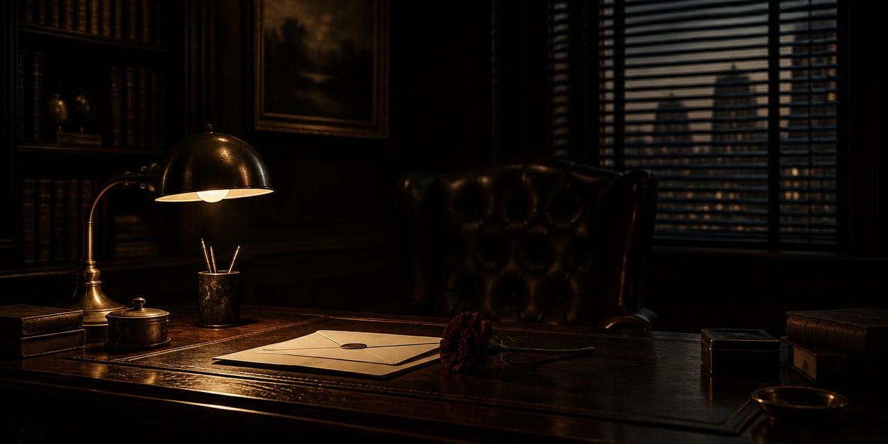
In 1972, the most consequential object in an American crime film may have been a ceiling light that Gordon Willis refused to switch on. Faces receded beneath heavy brows, polished wood dissolved into shadow, and audiences were asked to read power through what the camera withheld. That radical underexposure defines The Godfather color palette: a controlled world of black, umber, tarnished gold, blood red, concrete grey, and ceremonial cream in which darkness is not missing information. Darkness is the information.
Director Francis Ford Coppola and cinematographer Gordon Willis built this language so decisively that Willis became known as “The Prince of Darkness.” The nickname describes more than low exposure. His images use a Renaissance logic of illumination—especially the dramatic chiaroscuro associated with Caravaggio—where light does not reveal an entire room evenly. It selects a hand, a collar, a glass, or part of a face and leaves the surrounding moral space unresolved.
The HEX values below are design-ready interpretations of recurring visual identities, not claims about one definitive film scan. Film stock, laboratory timing, restoration, projection, and display calibration all alter a sampled pixel. What survives those variations is the hierarchy: near-total black as the foundation, earth colors as the family domain, restrained gold as compromised wealth, and rare red as physical consequence.
The Godfather Color Palette at a Glance
| Item | Color | Hex | Name | Meaning |
|---|---|---|---|---|
| Don Corleone's office shadows | Absolute black | #000000 |
Dominant Black | Secrets, death, authority, hidden business |
| Wood paneling and leather | Deep red-brown | #3C2A1E |
Rich Umber | Tradition, inheritance, Old World gravity |
| Practical lamps and brass decor | Muted brown-gold | #A98358 |
Tarnished Gold | Wealth, power, nostalgia, moral decay |
| Blood and violent punctuation | Dark crimson | #6A1A1A |
Blood Red | Injury, consequence, loyalty turned physical |
| New York streets and institutions | Middle neutral grey | #888888 |
Concrete Grey | Public life, impersonality, moral ambiguity |
| Wedding clothes and paper | Warm creamy white | #F0EAD6 |
Aged Parchment | Ceremony, legitimacy, family facade |
Dominant Black — #000000
Dominant Black (#000000) is the architecture of the film's secrecy. It occupies backgrounds, suits, doorways, and the negative space around faces, making the Corleone world feel enclosed even when a room is physically large. Black does not merely signal evil. It creates selective access: the audience may enter the room, but it cannot inspect every corner.
This makes authority spatial. Don Corleone does not need to dominate the frame through scale or movement; the shadow around him isolates the fragments that matter. A hand gesture becomes legible against darkness. A white shirtfront becomes a narrow visual anchor. The environment appears to organize itself around his opacity.
For designers and cinematographers, the important distinction is between decorative black and narrative black. Decorative black provides elegance or contrast. Narrative black conceals relationships, controls attention, and withholds certainty. It should therefore be composed, not applied indiscriminately. A dark frame still needs a readable hierarchy of blacks so that a silhouette, doorway, and suit do not collapse into accidental visual noise.
Rich Umber — #3C2A1E
Rich Umber (#3C2A1E) gives darkness a history. It appears conceptually in wood-paneled offices, leather chairs, furniture, cigars, and the warm density of domestic interiors. Unlike neutral charcoal, umber implies organic material that has aged. It carries touch, use, smoke, varnish, and inheritance.
That material association is essential to the Corleone family's power. Their world does not look newly constructed or technologically efficient. It feels accumulated. Decisions are made in rooms whose surfaces suggest that other decisions were made there long before. Brown becomes the color of continuity: not wholesome earthiness, but tradition hardened into an institution.
Umber also keeps the film from becoming graphically monochrome. When dark brown sits near black, the eye senses depth before consciously identifying hue. This near-neutral relationship is valuable in luxury identities, editorial design, and low-key cinematography. The difference between #000000 and #3C2A1E is modest on a swatch sheet but enormous when spread across textured surfaces and shaped by warm light.
Tarnished Gold — #A98358
Tarnished Gold (#A98358) appears in practical illumination, brass, skin-side highlights, picture frames, and opulent decor. It signals wealth, but it avoids the clean brilliance of digital yellow or polished bullion. Brown moderates the hue, making prosperity feel inherited, private, and compromised.
This muted quality matters. Bright gold celebrates acquisition; tarnished gold suggests that value has survived by absorbing time and contamination. In The Godfather, power is rarely presented as fresh opportunity. It is a burden, an apparatus, and an inheritance. The gold glows, but never innocently.
The same principle applies to premium design. High-end color does not require maximum saturation or metallic simulation. Restraint, material context, and contrast can communicate greater value than shine. Coloracci's analysis of luxury brand color palettes for high-end products explores the broader system: deep neutrals establish discretion while small, warm accents imply rarity.
Blood Red — #6A1A1A
Blood Red (#6A1A1A) is powerful because the film refuses to make red a constant spectacle. When it appears in injury or violence, it enters a world already trained to notice small warm deviations. The hue is deep rather than candy-bright, preserving the film's tonal gravity while making bodily consequence unmistakable.
Red connects family loyalty to physical cost. It turns abstract orders into material outcomes. Because its area is restricted, it does not romanticize the entire image; it punctures it. This is the inverse of branding systems that use saturated red continuously for energy or appetite. The underlying psychology remains urgent, but scarcity changes the reading from invitation to alarm. For a useful comparison, see why red logos drive appetite and rapid recognition.
Concrete Grey — #888888
Concrete Grey (#888888) belongs to the colder, more impersonal world outside the family's enclosed interiors: New York streets, institutional spaces, overcast surfaces, and the moral middle ground occupied by supposedly legitimate systems. It is not as symbolically absolute as black or as emotionally loaded as brown. That neutrality is its function.
Grey separates public procedure from private ritual. The city can appear factual and indifferent while the Corleone rooms feel warm, dense, and dangerously intimate. Yet grey also describes ethical ambiguity. Characters cross between legality and crime, duty and ambition, without entering a clean visual category. A middle grey refuses the comfort of either white innocence or black certainty.
Aged Parchment — #F0EAD6
Aged Parchment (#F0EAD6) supplies the palette's fragile light. It appears in wedding attire, shirts, table linens, invitations, and sunlit ceremonial details. Its warmth prevents it from reading as clinical white. Instead, it evokes paper, lace, tradition, and legitimacy—precisely the public virtues the family performs.
Cream becomes a facade without becoming false in every sense. The wedding is genuinely joyful, family bonds are genuinely meaningful, and ceremonial whiteness has emotional truth. The tragedy is that this truth exists beside coercion. The palette does not simply label outside as good and inside as evil; it shows affection and violence sharing one system.
The Wedding Contrast That Defines The Godfather Color Palette
The opening wedding sequence establishes the film's entire chromatic argument before the story expands. Outside, sunlight reaches pale dresses, flowers, skin, tablecloths, and garden color. Aged Parchment approaches the visual foreground, supported by natural greens and festive warmth. The space is social, musical, and publicly legible.
Inside Don Corleone's office, exposure falls dramatically. Black and Rich Umber consume the frame. Tarnished Gold appears as selective lamplight rather than open sunshine. Visitors enter one by one to request favors, and the visual movement from celebration to negotiation reveals the two operating systems of the family: visible belonging and invisible obligation.
The contrast is stronger because Coppola and Willis do not cut between unrelated palettes. Both worlds share warm undertones. The office's brown belongs materially to the same heritage represented by the wedding's cream and gold. This continuity prevents a simplistic split. The darkness is not an alien force invading the family; it grows from the same tradition.
Doorways become crucial compositional devices. They separate public brightness from private shadow and make crossing itself meaningful. A character framed in a doorway can belong to both worlds momentarily. For cinematographers, this is a practical reminder that palette transitions need not rely on color grading alone. Architecture, blocking, exposure, and eyeline can turn a threshold into a narrative color event.
The sequence also proves that low-key imagery becomes more effective when the audience has seen an alternative. If the whole film were uniformly dark, darkness would normalize. The wedding sunlight calibrates the eye and creates a reference for what the office suppresses. Contrast between scenes builds meaning that no single frame can carry by itself.
Chiaroscuro, Underexposure, and the Prince of Darkness
Willis's underexposure challenged conventional expectations about star lighting and facial visibility. Rather than filling every shadow, he often allowed eyes to sit beneath heavy darkness. This does not make expression irrelevant; it redirects attention toward voice, posture, silhouette, and the limited planes of the face that light reaches.
The connection to Caravaggio is structural rather than ornamental. In dramatic Renaissance chiaroscuro, darkness is an active field from which selected bodies and gestures emerge. Illumination has moral and theatrical weight. In The Godfather, a warm source can reveal enough to establish presence while leaving intention inaccessible. Light does not guarantee truth.
Three technical ideas make the effect more sophisticated than simply lowering exposure:
- Source motivation. Warm light appears to come from lamps, windows, or practical fixtures, giving extreme contrast a plausible origin.
- Selective separation. A shirt collar, cheek, hand, or reflective surface prevents important forms from disappearing entirely.
- Controlled color temperature. Gold and umber unify skin, furniture, and decor, so the frame remains coherent even when tonal values are compressed.
Modern digital cameras can recover extraordinary shadow detail, but recovery is not always the goal. Lifting every dark region may destroy the hierarchy that motivated the shot. The relevant question is not “Can we see into the black?” but “Does the story benefit if we can?” Deliberate darkness requires confidence at capture, careful monitoring, and tests across the intended display environment.
Practical Lessons from The Godfather Color Palette
1. Design darkness in layers
Avoid treating all dark areas as #000000. Build a tonal ladder: absolute black for concealment, #1A1410 for barely readable structure, Rich Umber for material surfaces, and Tarnished Gold for selected highlights. This preserves depth while maintaining the impression of darkness.
2. Let light identify power
Give the most important face or object the most intentional light, not necessarily the brightest light. A controlled highlight on a hand or collar can direct attention more elegantly than a fully illuminated subject. Viewers follow contrast boundaries.
3. Use warm darkness, not an orange wash
The film's sepia character emerges from materials, practical sources, exposure, and grading working together. Applying a uniform brown filter flattens relationships and contaminates neutral references. Place umber in production design, warm the motivated light, and protect selected greys and creams so the image retains range.
4. Reserve red for irreversible moments
If Blood Red appears everywhere, it becomes atmosphere. If it appears only when a promise becomes violence, it becomes narrative punctuation. The same principle works in interfaces, posters, and title design: reserve the strongest accent for the action or fact that changes the reading of the whole composition.
5. Build contrast across sequences
A dark scene gains force from a preceding bright scene. Plan the palette as a timeline rather than a stack of attractive frames. Map where cream expands, where black takes over, and where red interrupts. Cinematic color is rhythm.
6. Preserve skin without neutralizing the world
Warm, low-key environments can push skin toward orange or erase separation. Use source direction and exposure tests to retain believable variation in faces while allowing the room to stay brown and gold. Do not solve every skin-tone problem by flattening the grade.
7. Translate HEX into production materials carefully
HEX describes screen light, not a guaranteed paint, ink, gel, fabric, or metal finish. Use Coloracci's HEX to Pantone converter to find nearby standardized references, then test physical samples under the actual practical lighting. A glossy umber desk, matte black suit, and brushed brass lamp can share a palette while reflecting radically different amounts of light.
Three Adaptations Without Copying the Film
Heritage editorial system: Use #F0EAD6 for reading surfaces, #3C2A1E for headings, #000000 for structural anchors, and #A98358 for rules or folios. Introduce #6A1A1A only for one decisive quotation or callout. This captures gravity without imitating specific imagery.
Low-key interview setup: Place a warm practical lamp deep in the frame, expose the subject one to two tonal zones above the environment, and retain a narrow edge of separation from the background. Let wood and leather contribute umber physically. Keep wardrobe nearly black but not identical to the backdrop.
Prestige identity: Build the primary identity from black and parchment rather than black and bright white. Add Rich Umber to communicate continuity and Tarnished Gold at less than ten percent of the visual area. Blood Red should indicate consequence—a seal, alert, edition mark, or final action—not routine decoration.
In every adaptation, borrow the grammar rather than the costume: concealment, inherited warmth, compromised luxury, ceremonial light, and scarce red. That approach respects the original while producing a system capable of telling a different story.
Conclusion: Darkness as Narrative Authority
The Godfather color palette remains iconic because it does not illustrate power with brightness. It makes power difficult to inspect. Dominant Black withholds access. Rich Umber gives authority an inherited material body. Tarnished Gold makes wealth glow with age and compromise. Concrete Grey cools the public world. Aged Parchment performs legitimacy, while Blood Red reveals the physical price beneath the ceremony.
Gordon Willis's achievement was not simply making a dark film. It was giving darkness structure, temperature, and narrative responsibility. The wedding and the office belong to one family of warm colors, yet exposure transforms their meaning. That duality allows affection, tradition, corruption, and death to coexist without reducing the image to a moral diagram.
For designers and filmmakers, the enduring lesson is exacting restraint: decide what the audience may see, what must remain uncertain, and which rare color will make consequence visible. Then build every surface, source, exposure choice, and grade around that hierarchy.
Ready to construct a palette with the same disciplined tension? Visit the Movie Color Palettes hub, choose a cinematic starting color, and generate a matching scheme—or begin with #3C2A1E, #A98358, and #F0EAD6, then introduce black and blood red only where the story earns them.