The Wes Anderson Color Palette: A Color Story
· Coloracci Team
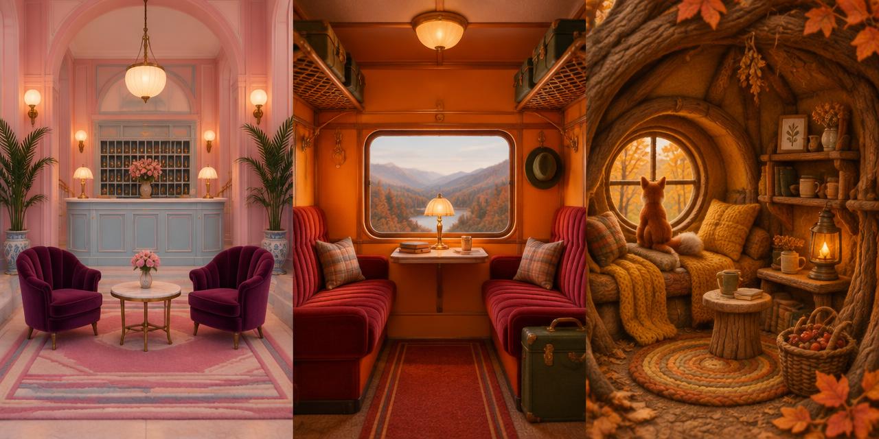
In The Darjeeling Limited (2007), a set of monogrammed suitcases travels through India with three brothers who cannot leave their emotional baggage behind. The object is a useful entrance to the Wes Anderson color palette: color belongs to things people carry, rooms they inhabit, and rituals they repeat. It is not a pastel filter laid over a finished story. From the pink hotel of The Grand Budapest Hotel to the ochre burrows of Fantastic Mr. Fox, a carefully bounded color world makes complicated feelings look deceptively orderly.
The familiar shorthand—symmetry, nostalgia, whimsy—describes the surface. Underneath is a more transferable design method: repeat a limited family of colors, establish a clear spatial hierarchy, then let a character or event disturb it. Anderson's palettes can feel welcoming and uneasy at once. The lesson for designers is not to turn every project pink; it is to make color behave like a narrative system.
How the Wes Anderson Color Palette Tells a Story
There is no single official Anderson palette. Each film has its own production design, costumes, lighting, photographic treatment, and final color decisions. The consistency lies in the relationships: related hues recur across objects, accent colors retain recognizable roles, and the background rarely feels accidental. A uniform can belong to a building's identity as decisively as a sign belongs to a brand.
Symmetrical framing makes those relationships easier to read. When doors, lamps, and furniture repeat across a central axis, a difference in color becomes conspicuous. A purple figure against a pink architectural field is not competing with random visual clutter. The composition has already prepared a place for that figure. Color supplies emphasis inside an ordered structure rather than compensating for a weak one.
This distinction matters in visual communication. An archive interface with carefully aligned thumbnails can let one mustard status marker carry real information. Scatter the same marker across inconsistent layouts and it becomes decoration. Anderson's color logic works because geometry, repetition, material, and storytelling support it. The palette is an agreement among departments, not a secret list of eight magical swatches.
Read the following HEX values as editorial sRGB reference colors, supplied for analysis and design experiments—not studio paint recipes, official costume specifications, or exact measurements of every frame. Exposure, transfers, display settings, and the chosen shot all change a sampled value. The names and meanings below are descriptive interpretations, not claims that the filmmakers assigned universal psychological definitions to these colors.
The Wes Anderson Color Palette: Eight Design-Ready HEX Codes
| Item | Color | Hex | Name | Meaning |
|---|---|---|---|---|
| Grand Budapest reference | Soft rose pink | #E6A8B5 | Muted Pink | Confectionery elegance; an institution remembered affectionately |
| Grand Budapest reference | Saturated violet-purple | #7B3B8B | Rich Purple | Ceremony, character identity, and contrast within a pastel world |
| Darjeeling reference | Strong warm orange | #E27505 | Railway Orange | Movement, visual warmth, and an enclosed journey |
| Darjeeling reference | Dark crimson | #9C1425 | Deep Red | Emotional weight and an anchor beneath brighter warm hues |
| Fantastic Mr. Fox reference | Earthy russet brown | #8D4D1E | Burrow Brown | Tactile shelter, soil, fur, and material continuity |
| Fantastic Mr. Fox reference | Golden yellow-orange | #F4A701 | Mustard Yellow | Autumnal energy and a luminous note within earth colors |
| Cross-film supporting reference | Light softened blue | #A7C5EB | Pastel Blue | Cool separation, breathing space, and a counterpoint to warmth |
| Cross-film supporting reference | Low-chroma green | #8BAF9F | Muted Green | A quieter bridge between warm focal colors and cool surroundings |
Do not distribute these eight colors equally. They represent several different worlds, not one ready-made interface theme. Start with one film family, choose a dominant surface, assign a darker structural color, and reserve a contrasting note for moments that deserve attention. The cool supporting references are useful comparison colors, not proof that the identical digital values recur throughout Anderson's filmography.
The Grand Budapest Hotel: Sweetness with a Formal Backbone
In The Grand Budapest Hotel (2014), pink and purple do different jobs. Muted Pink #E6A8B5 suggests a large, enveloping field: a façade, an architectural surface, or the remembered atmosphere of hospitality. Rich Purple #7B3B8B has more chromatic and tonal weight. It can hold a silhouette or a repeated identity cue without abandoning the confectionery family.
The combination is not simply cute. Purple introduces formality into pink's softness; uniforms and ritual turn hospitality into an institution. Against meticulously arranged spaces, the colors allow refinement to coexist with absurdity. A designer can read this as a tension between the inviting surface of a service and the rules that organize it. That reading is interpretive, but it explains why the pairing offers more than generic femininity or luxury symbolism.
Value separation does important work. Pink contains more lightness, so a purple shape remains recognizable at small scale. A blue detail such as #A7C5EB changes the temperature without introducing the aggression of a highly saturated complementary accent. The palette can therefore expand while retaining a soft envelope. Material is equally important: velvet, painted plaster, paper, and metal do not reflect identical colors identically.
Our dedicated Grand Budapest Hotel color palette analysis examines the film's era changes and institutional decline in greater detail. Its reference swatches differ slightly because it uses a different analytical selection. That is expected: a film palette is a family of relationships, not a corporate identity with one legally controlled pink. This broader guide focuses instead on what carries across Anderson's contrasting visual worlds.
The Darjeeling Limited: Warm Color Inside a Moving Container
The Darjeeling Limited shifts the center of gravity from pastry-box softness to heat, pattern, and travel. Orange #E27505 and Deep Red #9C1425 make a useful analytical pair. Orange has the energy to occupy a broad visual field; the darker red gives that field a boundary and an emotional undertone. Together they produce warmth with friction rather than uncomplicated cheerfulness.
The train is more than a backdrop. In Variety's production-design account, Mark Friedberg describes a customized working train rather than a conventional stationary set. Compartments, windows, corridors, textiles, and luggage turn movement into an ordered sequence of containers. Repeated warm colors hold the interior together while the world outside continues to change. For the viewer, that continuity can make the brothers' shared space feel simultaneously intimate and constraining. Their proximity is carefully designed; their reconciliation is not guaranteed by it.
A restrained green #8BAF9F can demonstrate how to interrupt this warm field without making the whole composition cold. Its lower chroma prevents it from fighting the orange, while its temperature provides useful separation. In a publication design, the equivalent might be a green sidebar within a warm photographic spread: a pause, not a second headline screaming at the same volume.
There is also an ethical lesson. Do not describe this palette as the definitive color of India or reduce a culturally specific setting to an exotic orange-and-red mood board. Analyze the film's designed spaces, commissioned objects, and narrative viewpoint. For your own project, use the relational lesson—warm enclosure, dark anchoring, cool interruption—without pretending that a pair of HEX values represents an entire country.
Fantastic Mr. Fox: Color You Can Almost Touch
With Fantastic Mr. Fox (2009), the material logic becomes impossible to ignore. Stop-motion brings miniature sets, puppet surfaces, fabric, and fur into the photographed image. Brown #8D4D1E and Mustard Yellow #F4A701 connect naturally to that tactile vocabulary: earth and timber establish a ground, while golden orange gives the world a bright autumnal pulse. In a production interview with Nelson Lowry, the production designer describes a limited autumnal palette excluding blue and green. This is a documented creative constraint, unlike the interpretive HEX references in our table.
These hues sit within a broadly analogous warm family, but they are not interchangeable. Brown provides depth and supports the sensation of shelter. Mustard pushes forward and gives silhouettes, garments, or small objects a more assertive presence. If everything were equally luminous, the image would lose its burrow-like enclosure; if everything were equally dark, its adventurous energy would collapse.
Texture supplies variation without requiring more colors. A russet knitted surface, a smooth painted panel, and coarse soil may belong to neighboring hues while producing entirely different visual frequencies. Designers often respond to a flat composition by adding another accent. This film suggests another route: keep the family narrow and vary scale, grain, lightness, and surface behavior instead.
For packaging or editorial illustration, begin with a brown structural layer and a mustard focal element. If your own project requires a cooler accent, recognize that you are departing from the film's documented constraint, not reconstructing its palette. Avoid bathing all photographs in an orange overlay. The goal is coherent material relationships, not the destruction of skin tones, food detail, or product accuracy in pursuit of an instantly recognizable autumnal look.
Why Nostalgia Needs More Than Pastels
The three examples dismantle the idea that Anderson's signature is always pale. The hotel leans toward softened confectionery colors; the train accommodates stronger warm chroma; the fox world favors an earthy range. Nostalgia emerges from their bounded visual systems, repeated objects, period associations, and narrative distance—not from one saturation slider moved left.
Color can also contradict events. A charming field does not make loss, humiliation, or conflict charming. That gap between orderly appearance and unsettled feeling is part of the films' expressive power. In a designer's hands, the useful lesson is to avoid assuming that pink communicates one emotion, brown another, and yellow a third regardless of context. Meaning develops through use and comparison. The American Society of Cinematographers' account of The French Dispatch also makes the collaborative craft visible: Robert Yeoman's photography translates planned compositions into actual images. Attributing every visual decision to the director alone obscures the work needed to sustain that consistency.
For a revealing counterexample, examine The Godfather's color palette. Its shadow-heavy visual hierarchy makes power feel enclosed through darkness rather than through confectionery order. Both approaches depend on controlled visibility. Comparing them teaches more about narrative color than copying a fashionable swatch strip from either film.
Trend forecasting operates differently again. Pantone Color of the Year history tracks colors framed as cultural signals across time. A cinematic palette serves a particular story, even when it later influences design trends. Do not claim that a film's resemblance to a selected Pantone color proves a collaboration, an official match, or a direct influence without documentary evidence.
Build a Wes Anderson Color Palette Without Copying a Film
Begin with a sentence about your own project's tension: “A welcoming archive with strict organization,” or “A playful expedition with underlying uncertainty.” Then choose one color world that helps express it. This gives your selection a purpose before taste takes over. Use the Movie Color Palettes hub to compare complete film analyses and experiment with its palette generator rather than mixing every attractive swatch together.
For a hotel-inspired publication, try pink #E6A8B5 as the large field, purple #7B3B8B for chapter markers, and blue #A7C5EB for occasional contrast. For an expedition identity, let orange #E27505 lead and red #9C1425 anchor it. For a tactile illustrated series, put brown #8D4D1E beneath mustard #F4A701. These are exercises in allocation, not endorsements for every text/background pairing.
Next, make a grayscale version. If headings, primary actions, and important imagery become indistinguishable, hue alone is carrying too much responsibility. Check real foreground/background pairs with the Coloracci contrast checker. For WCAG AA, normal text generally needs 4.5:1 contrast; large text needs 3:1. Pastel surfaces can work beautifully with a sufficiently dark text color, but aesthetic resemblance never excuses unreadable labels.
Finally, document roles rather than just names: “dominant surface,” “chapter identity,” “supporting diagram,” and “restricted accent.” Define focus, error, success, and disabled states independently where the application needs them. A cinematic reference should shape the atmosphere of a useful product, not force essential warnings into a palette that cannot communicate them reliably.
A Production Handoff That Preserves the Story
Keep the digital reference values in sRGB and record where they are used. For print, use the HEX-to-Pantone converter to create a shortlist, not an automatic promise. Compare current physical samples on the intended stock; coated ink, uncoated paper, textiles, and painted props have different reproduction limits. An approved material sample is more valuable than a confident-looking conversion table.
For moving images, test the palette in the actual lighting and viewing pipeline before committing. A mustard fabric in daylight and the same fabric under warm practical lamps can occupy different perceptual positions. Preserve reference stills, specify the intended output, and review adjacent shots together. Continuity depends on what audiences see over time, not whether every object began with a matching swatch.
Conclusion: Order the Colors, Leave Room for Feeling
The enduring appeal of Anderson's palettes comes from controlled relationships that leave emotional interpretation open. Pink can shelter a memory; purple can formalize a character; orange can enclose a journey; brown and mustard can make an invented world feel materially persuasive. None performs that work alone. Composition, objects, texture, and change give the colors their narrative weight.
Build your own color story: open the Movie Color Palettes hub, choose a film reference, and generate a scheme from one meaningful anchor color. Assign each result a job, test its readability, and proof the final medium. Borrow the discipline of the palette—not somebody else's finished world.