Color Management for Print: A Designer's Guide to Accurate Print Colors
· Coloracci Team
The Print Color Problem
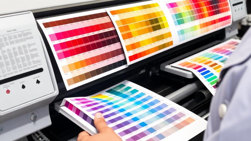
Every designer has experienced it: you spend hours perfecting a design on screen, send it to the printer, and the results come back looking... different. That vibrant electric blue #0066FF turns into a muted, slightly purple version. The rich red #FF0000 looks washed out.
This isn't a printer malfunction—it's a color management problem. And it's entirely preventable.
The Print Color Workflow
Getting accurate print colors requires understanding the full pipeline:
Screen → File → Proof → Press
- Design on a calibrated monitor in the correct color mode
- Convert from RGB to CMYK (or specify Pantone spot colors)
- Soft proof on screen to preview how colors will shift
- Hard proof with a color-accurate test print
- Press check to verify final output matches expectations
Each stage can introduce color drift if not properly managed. Let's address each one.
Understanding ICC Profiles
ICC (International Color Consortium) profiles are translation files that describe how a device reproduces color.
Types of ICC Profiles
Input profiles: Describe how scanners and cameras capture color.
Display profiles: Describe how monitors show color. Created through monitor calibration.
Output profiles: Describe how printers reproduce color. These are the most critical for print work.
Common Output Profiles
| Profile | Use Case |
|---|---|
| Fogra39 (ISO Coated v2) | European sheet-fed offset on coated paper |
| GRACoL 2013 | US commercial offset on grade 1 coated paper |
| SWOP (Specifications for Web Offset Publications) | US web offset (magazines, catalogs) |
| US Web Uncoated | Uncoated paper offset |
| Japan Color 2001 | Japanese printing standards |
How to Apply Profiles
In Adobe InDesign:
- Edit → Color Settings
- Set CMYK working space to your target profile (e.g., Fogra39)
- Set Color Management Policies to "Preserve Embedded Profiles"
In Adobe Photoshop:
- Edit → Color Settings → same profile selection
- When converting: Edit → Convert to Profile → select destination profile
- Choose Relative Colorimetric rendering intent for most work
Soft Proofing in Design Applications
Soft proofing simulates on screen how your design will look when printed.
Photoshop Soft Proofing
- View → Proof Setup → Custom
- Device to simulate: Select your output ICC profile
- Rendering intent: Relative Colorimetric
- Check Simulate Paper Color for the most accurate preview (colors will look duller—this is normal)
- View → Proof Colors (Ctrl/Cmd+Y) to toggle the preview
InDesign Soft Proofing
- Window → Output → Separations Preview
- Or: View → Proof Setup → choose profile
- View → Proof Colors to toggle
What to Look For
- Out-of-gamut colors: Bright RGB colors that can't be reproduced in CMYK. Photoshop highlights these with View → Gamut Warning.
- Shadow detail loss: Dark areas that merge into solid black
- Highlight detail: Light colors that disappear on white paper
Pantone Spot Colors vs Process Colors
Process Colors (CMYK)
Four inks—Cyan, Magenta, Yellow, and Key (black)—mixed as tiny dots to create the illusion of continuous color. Suitable for photographs and designs with many colors.
CMYK gamut limitations:
- Can't reproduce neon or fluorescent colors
- Some blues and greens appear duller than on screen
- Maximum achievable colors: ~16,000 (vs millions in RGB)
Pantone Spot Colors
Pre-mixed inks printed from a dedicated ink well. Each Pantone color is a specific formula.
When to use Pantone:
- Brand colors that must be exact (Coca-Cola Red, Tiffany Blue
#0ABAB5) - Metallic or fluorescent colors (impossible in CMYK)
- One or two-color print jobs (more economical than four-color process)
- Colors outside the CMYK gamut
Cost consideration: Each spot color adds a press plate. A job with CMYK + 2 spots requires 6 plates, significantly increasing cost.
To find the closest Pantone match for any color, use our AI-powered Pantone color checker.
Paper Stock and Color Interaction
Paper dramatically affects how ink looks. The same ink on different stocks can appear as entirely different colors.
Coated vs Uncoated
| Aspect | Coated Paper | Uncoated Paper |
|---|---|---|
| Surface | Smooth, sealed | Porous, textured |
| Ink behavior | Sits on surface | Absorbs into fibers |
| Color appearance | Vivid, saturated | Softer, muted |
| Pantone system | Coated (C) fan | Uncoated (U) fan |
| Best for | Photos, vibrant graphics | Text-heavy, natural feel |
A Pantone color like PMS 286 C (#0033A0) on coated paper looks noticeably brighter than PMS 286 U on uncoated stock.
Paper Color Effects
- Bright white (like Mohawk Superfine): Most accurate color reproduction
- Natural/cream paper: Warms all colors, yellows whites
- Colored stock: Shifts all printed colors—red ink on yellow paper appears orange
- Recycled stock: Generally grayer, reduces saturation
Paper Weight and Opacity
Thinner papers allow show-through, where heavy ink coverage on one side is visible on the other. For double-sided printing with full-color images, use at least 100lb text weight.
Common Print Color Mistakes
Mistake 1: Designing in RGB
Always design in CMYK for print. Converting at the end causes unpredictable shifts, especially in:
- Electric blue
#0066FF→ shifts purple in CMYK - Bright green
#00FF00→ becomes dull - Hot pink
#FF00FF→ dramatically desaturated
Mistake 2: Using 100% Black for Large Areas
C:0 M:0 Y:0 K:100 produces a washed-out, grayish black on large areas.
Rich Black recipe: C:60 M:40 Y:40 K:100 — deep, true black with density.
Super rich black: C:75 M:68 Y:67 K:90 — the richest possible, but watch for drying issues.
Warning: Never use rich black for body text—only large solid areas. Text should be 100K only to maintain sharpness.
Mistake 3: Registration Black
C:100 M:100 Y:100 K:100 is registration black—used only for printer marks. Using it in your design causes massive ink overload, smearing, and drying problems. Total ink coverage should typically not exceed 300%.
Mistake 4: Not Accounting for Dot Gain
Ink spreads slightly when it hits paper (dot gain). A 50% tint may print closer to 58-65%. Light tints below 10% may disappear entirely, and detailed gradients can become banded.
Mistake 5: Ignoring Bleed
Colors that extend to the edge need 3mm (0.125") bleed beyond the trim line. Without bleed, you get white edges where the paper is cut.
Getting Consistent Colors from Screen to Print
The Complete Workflow
- Calibrate your monitor monthly (see our upcoming guide on screen calibration)
- Set correct color mode: CMYK from the start, or use Pantone swatches
- Choose your output profile based on the printer and paper
- Design with awareness: Avoid highly saturated RGB-only colors
- Soft proof with the correct ICC profile
- Request a hard proof: A calibrated test print before the full run
- Attend a press check for critical jobs—approve colors in person
- Keep records: Note CMYK values and Pantone numbers for future reprints
Converting Colors Safely
When converting from RGB to CMYK, or from hex to CMYK:
- Use Relative Colorimetric rendering intent for most designs
- Use Perceptual for photographs with many out-of-gamut colors
- Always visually compare before and after conversion
- Document your original RGB values alongside CMYK conversions
Build Your Print Color Library
Start every print project by defining your colors precisely. Use Coloracci's AI palette generator to explore color combinations, then convert your finalists to CMYK and Pantone values before designing.
A well-managed color workflow means the vibrant design on your screen will look just as intentional when it comes off the press. No surprises, no reprints, no disappointed clients.