Childcare & Daycare Color Psychology: How Playroom Colors Influence Child Development, Behavior & Learning Readiness
· Coloracci Team
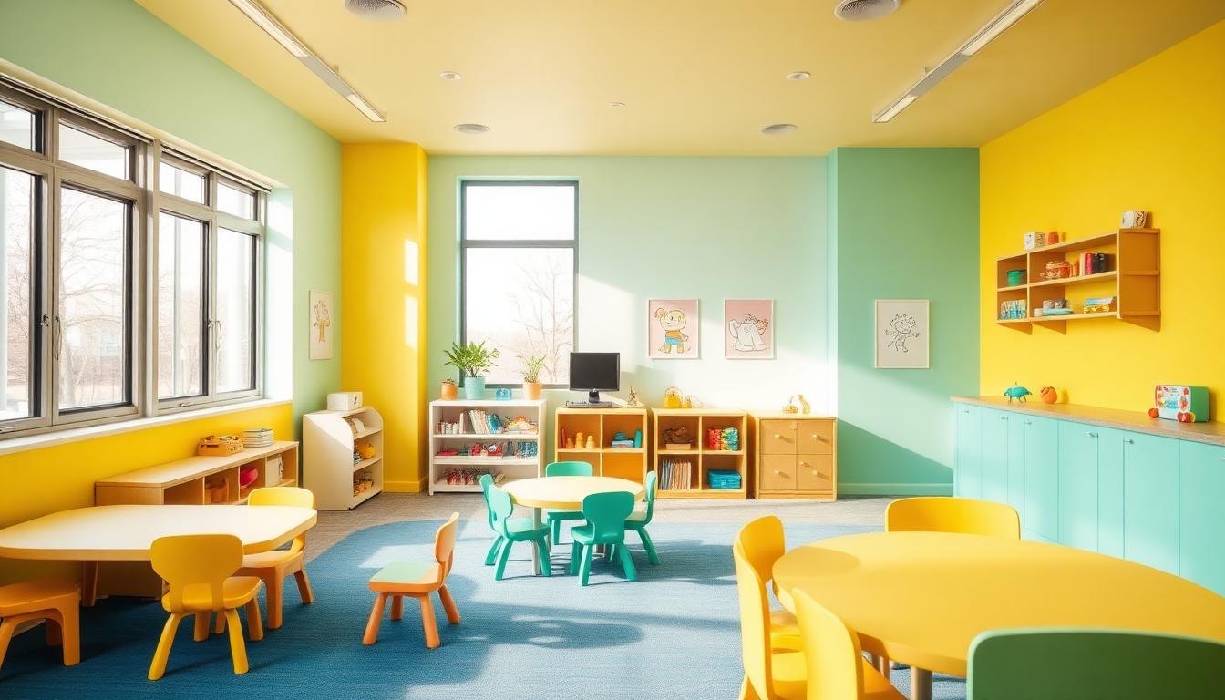
Children See Color Differently — And It Matters More Than You Think
A child's visual system doesn't fully mature until age 7-8. Before that, their color perception is heightened, their emotional responses to color are amplified, and their developing nervous systems are dramatically more sensitive to environmental stimuli than adult systems.
This means that the color choices in a daycare center, preschool, or playroom aren't just aesthetic decisions — they're developmental interventions. Research from the University of Alberta found that strategic classroom color design can improve learning outcomes by up to 22% in early childhood settings. A 2024 study in Early Childhood Research Quarterly showed that daycare color environments directly affect cortisol levels, attention span, and prosocial behavior in children aged 2-5.
Yet most childcare facilities choose colors based on what "looks fun" — typically saturated primary colors on every surface. The science suggests this approach may be doing more harm than good.
The Developmental Color Framework
Children's color needs change rapidly as their visual and cognitive systems develop. What works for an infant room is overwhelming for a preschooler, and what engages a 4-year-old bores a school-age child.

Age-Appropriate Color Intensity Guide
| Age Group | Visual Development Stage | Optimal Color Approach | Saturation Level | Wall Colors |
|---|---|---|---|---|
| 0-6 months | High contrast only | Black, white, and red contrasts | Very high contrast, limited palette | Soft white #FAF8F5 with high-contrast mobiles |
| 6-12 months | Full color emerging | Introduce primary colors gradually | Medium-high on accents only | Warm cream #FFF8E7 with colorful toys |
| 1-2 years | Color discrimination developing | Distinct, clear colors for object identification | Medium on walls, high on learning materials | Soft mint #C5E8D0, warm yellow #F5E6A3 |
| 2-3 years | Color naming begins | Color-coded zones for routine learning | Medium throughout | Distinct zone colors at 40-60% saturation |
| 3-5 years | Full color vision | Nuanced palettes with purpose-driven zones | Moderate walls, varied accents | Sage #96A98B, sky blue #87CEEB, coral #E8907E |
| 5-7 years | Adult-like perception | More sophisticated, less "primary" | Lower saturation walls, strategic pops | Teal #5F9EA0, warm lavender #B8A9C9 |
Understanding these developmental stages is critical for anyone designing spaces where children spend 8-10 hours daily. For foundational color theory, see our guide on warm and cool color theory.
The Overstimulation Problem: Why "Rainbow Rooms" Backfire
The most common mistake in childcare design is the "rainbow room" — every wall a different bright primary color, busy murals everywhere, and neon accents on furniture. Parents love it on tours. Children's nervous systems don't.
What Overstimulation Looks Like
Research from the University of Virginia's Curry School of Education documented that highly decorated, color-saturated classrooms:
- Reduced on-task behavior by 25% compared to moderately decorated rooms
- Increased off-task behavior and distraction episodes
- Led to lower test scores on learning assessments
- Increased cortisol levels (stress hormone) in children under 4
The study concluded that visual complexity competes with learning content for children's limited attentional resources. When walls are screaming for attention, children can't focus on the teacher, the activity, or their peers.
The 60-30-10 Rule for Childcare Spaces
The same 60-30-10 proportion rule used in professional design applies to childcare — with a twist:
- 60% Calming base: Muted, warm neutrals or very soft pastels on walls and large surfaces (
#F5F0E6,#E8E4D9,#D5E8D4) - 30% Supporting color: Medium-saturation colors on furniture, rugs, and storage (
#87CEEB,#96A98B,#E8C07E) - 10% Stimulating accents: Bright, saturated colors reserved for learning materials, toys, and intentional focal points (
#FF6B6B,#4CAF50,#FFD700)
This approach gives children's eyes places to rest while providing enough visual interest to support exploration and learning. For practical palette building, try our AI color palette generator.
Color-Coded Zoning: The Daycare Designer's Most Powerful Tool
Color zoning — using distinct colors to define different activity areas — is the single most effective color strategy in childcare design. Young children are pre-literate, so they can't read signs. But they can learn that "blue area means quiet reading" and "green area means building blocks" within days.
The Evidence-Based Zone Color System
| Activity Zone | Recommended Color | Hex Code | Psychological Rationale |
|---|---|---|---|
| Reading/Quiet Corner | Soft blue | #B8D4E3 |
Blues lower heart rate and encourage sustained attention |
| Active Play | Warm orange (muted) | #E8A87C |
Stimulates physical energy without aggression |
| Art/Creative Station | Soft purple | #C9B8DB |
Associated with creativity and imagination |
| Building/Construction | Sage green | #96A98B |
Green supports spatial reasoning and patience |
| Dramatic Play | Warm coral | #E8907E |
Encourages social interaction and emotional expression |
| Dining/Snack Area | Warm yellow | #F5D78E |
Stimulates appetite and creates cheerful mealtime atmosphere |
| Nap/Rest Room | Lavender | #D5C6E0 |
Promotes melatonin production and relaxation |
| Sensory Play | Teal | #5F9EA0 |
Calming enough for overstimulated children, engaging enough for exploration |
How to Implement Zone Colors
Zone colors don't require painting every wall a different color. Effective implementations include:
- Accent walls: One colored wall per zone, other walls in the base neutral
- Floor markers: Colored rugs, floor tape, or carpet tiles defining boundaries
- Furniture color: Storage units, chairs, and tables in the zone color
- Overhead elements: Colored fabric canopies or hanging decorations
This system mirrors how retail stores use color psychology to guide customer flow — adapted for tiny humans who can't read wayfinding signs.
Nap Room Color Psychology: The Sleep Science
Nap time is critical for cognitive consolidation in young children. The nap room's color environment directly affects how quickly children fall asleep, how long they stay asleep, and how refreshed they feel upon waking.

The Ideal Nap Room Palette
Research on institutional sleep environments (adapted from hotel and spa color psychology) indicates the best nap room colors:
- Walls: Soft lavender
#D5C6E0or dusty blue#B8C8D8— both promote melatonin production - Ceiling: Slightly lighter than walls — pure white
#FFFFFFcreates too much contrast - Bedding: Warm cream
#FFF8E7or soft gray#D4D0CB— avoids visual stimulation - Blackout curtains: Deep plum
#4A3050or charcoal#3C3C3C— blocks light without feeling oppressive
Colors to Avoid in Nap Rooms
- Bright yellow: Stimulates alertness — the opposite of what's needed
- Red or orange: Increases heart rate and physical arousal
- Bright green: While calming for adults, the brightness can overstimulate tired toddlers
- White: Too stark; creates an institutional feel that raises anxiety in young children
The same principles that make blue the best bedroom color for sleep in residential settings apply in daycare nap rooms, but shifted toward lavender, which also has calming associations for children who may be anxious about sleeping away from home.
Color and Emotional Regulation in Early Childhood
One of the most important functions of daycare is teaching children to regulate their emotions. Color environments play a surprising role in this process.
The Calm-Down Space
Every well-designed daycare should include a "calm-down corner" — a dedicated space where overwhelmed children can self-regulate. The color design of this space is critical:
- Wall color: Soft sage green
#B2C5A8— the most consistently calming color across age groups - Lighting: Warm, dim (2700K), never fluorescent — string lights or soft lamps
- Textiles: Weighted blankets in muted blues
#8FAABE, cushions in warm taupe#C4BCB4 - Avoid: Any bright or stimulating colors that could maintain elevated emotional states
Research from the National Institute for Early Education Research found that children with access to color-optimized calm-down spaces showed:
- 34% faster return to baseline emotional states
- 42% fewer aggressive episodes per week
- Improved self-regulation vocabulary ("I need my calm-down space")
Color and Behavioral Challenges
For children with ADHD, autism spectrum differences, or sensory processing differences, color environment matters even more:
- ADHD: Lower overall visual stimulation, muted wall colors, bright accents only on learning materials — helps external environment compensate for internal dysregulation
- Autism Spectrum: Avoid visual complexity and unpredictable patterns. Consistent, predictable color zones reduce anxiety. Soft, warm lighting is critical
- Sensory Processing Sensitivity: Provide both high-stimulation and low-stimulation zones so children can self-select their comfort level
For more on how color therapy principles apply to children's emotional health, see our dedicated guide.
Learning and Cognitive Development Through Color
Color doesn't just affect behavior — it directly influences cognitive processes in developing brains.
Color and Memory Formation
A study published in Memory & Cognition found that children aged 3-5 showed 28% better recall for information presented with color-coding compared to monochrome presentation. The implications for daycare design:
- Number learning: Each number associated with a consistent color across all materials
- Letter recognition: Color-coded vowels vs. consonants improves phonemic awareness
- Routine understanding: Daily schedule displayed in consistent zone colors helps pre-literate children predict transitions
Color and Creativity
Creative expression thrives in environments that balance stimulation with calm. The art station should feature:
- Walls: Soft purple
#C9B8DBor warm violet#B8A9C9— purple's creative associations apply even in early childhood - Work surfaces: Neutral (white or natural wood) — so children's art is the most colorful element
- Supply storage: Color-organized bins — teaches categorization while making cleanup intuitive
- Display wall: Neutral background so children's artwork "pops" — validates their creative output
Color and Language Development
The reading nook color matters for language development:
- Blue tones
#B8D4E3promote the sustained attention needed for story time - Warm lighting (not cool fluorescent) makes the space feel intimate and encourages verbal interaction
- Contrasting book display: Books displayed face-out against a neutral background are 3x more likely to be selected by children than spine-out on a shelf
Outdoor Play Area Color Psychology
Outdoor spaces require different color strategies than indoor environments, primarily because natural light dramatically changes how colors appear.
Outdoor Color Principles
- Structures: Primary colors work better outdoors because natural light desaturates them — what looks overwhelming indoors looks cheerful outside
- Ground surfaces: Green or earth-toned safety surfacing blends with nature; avoid gray rubber (institutional feel)
- Shade structures: Warm tones (
#F5D78E,#E8A87C) create inviting sun protection; avoid blue shade sails (make the covered area feel cold) - Fencing/boundaries: Natural wood or green
#5B7C50— never chain-link (institutional) or white (harsh glare)
The outdoor environment is also where children can experience the full spectrum of earth tone palettes through natural materials — wood, stone, sand, and plants.
The Parent Perception Factor
Daycare color design must satisfy two audiences: children (who actually use the space) and parents (who make enrollment decisions). These audiences often want different things.
What Parents Want vs. What Children Need
| Element | Parents Prefer | Children Need | Design Solution |
|---|---|---|---|
| Walls | Bright, cheerful, "fun-looking" | Calm, low-stimulation base | Neutral walls with strategic bright accents |
| Cleanliness signal | Pure white, clinical clean | Warm tones that feel homelike | Warm whites #FAF8F5 with visible organization |
| Learning evidence | Alphabet borders, number posters everywhere | Clean visual field with intentional learning displays | Rotating display areas, not permanent wall coverage |
| "Worth the cost" signal | Expensive-looking finishes | Natural materials, good lighting | Quality over quantity — fewer, better design elements |
The solution is designing spaces that look intentional and professional to touring parents while functioning optimally for daily child use. Using complementary color schemes strategically creates visual interest for adults while maintaining developmental appropriateness for children.
Daycare Branding and Color Identity
The daycare's brand colors should integrate seamlessly with the developmental color environment, not compete with it.
Brand Color Integration Strategy
- Reception/Lobby: Use brand colors more prominently here — it's the parent-facing space
- Classroom walls: Use brand colors as the 10% accent, not the dominant palette
- Uniforms/aprons: Staff wearing brand colors creates consistent visual identity without environmental overstimulation
- Signage/wayfinding: Brand colors on directional signage helps parents navigate while building recognition
For childcare brands developing their visual identity, our guide on choosing brand colors provides foundational strategy, and our logo color palette tool can generate age-appropriate brand palettes.
Implementation Checklist for Daycare Designers
Before You Paint
- □ Identify the developmental age range for each room
- □ Map activity zones and assign colors from the evidence-based guide above
- □ Test paint samples on actual walls — observe under morning, midday, and artificial light
- □ Use our color contrast checker to ensure wayfinding signage is readable
- □ Check colors with our colorblind simulator — approximately 8% of boys have color vision differences
During Design
- □ Apply the 60-30-10 rule strictly — resist the urge to add more saturated color
- □ Ensure nap room uses only calming palette (lavender/blue family)
- □ Create at least one designated calm-down space with sage/blue tones
- □ Use color-coded storage bins that match zone colors for cleanup routines
- □ Install warm-tone lighting (2700K-3000K) in rest areas, natural daylight in active areas
After Implementation
- □ Observe children's behavior changes for 2-3 weeks
- □ Track nap time duration and settling time
- □ Monitor incident reports for behavioral changes
- □ Survey staff on perceived differences in classroom management
- □ Adjust accent elements (not walls) based on observations
For whole-facility color planning, our color hierarchy tool helps visualize proportions across multiple rooms, and the AI Website Designer can help you create a professional website showcasing your daycare's thoughtfully designed environment.
The Bottom Line: Color as a Developmental Tool
Color in childcare isn't decoration — it's infrastructure. The right color environment supports cognitive development, emotional regulation, physical activity, social learning, and healthy sleep patterns. The wrong one creates overstimulation, behavioral challenges, and missed developmental opportunities.
The research is unambiguous: thoughtful, evidence-based color design in daycare settings measurably improves outcomes for children. A calm-based palette with strategic stimulating accents outperforms the "rainbow room" approach in every measured dimension — from attention span to nap duration to parent satisfaction.
Invest in getting color right, and you invest in the developmental foundation of every child in your care. The tools and principles in this guide — combined with resources like our palette generator and Fibonacci generator for creating harmonious color ratios — give you everything you need to design childcare spaces that truly support growing minds.