Hotel & Spa Color Psychology: How Interior Colors Shape Guest Relaxation, Luxury Perception & Bookings
· Maya Richardson
The $4.7 Trillion Question: Why Hotel Colors Matter More Than Thread Count
The global hospitality industry generates over $4.7 trillion annually — and within that staggering number, a guest's decision to book, stay, return, or recommend is shaped by factors far more subtle than amenity lists and star ratings. Research from the Cornell Hospitality Quarterly reveals that hotel color psychology influences up to 90% of a guest's initial impression of a property, affecting perceived cleanliness, luxury positioning, and emotional comfort before they've touched a pillow or tasted the breakfast buffet.
Color is the hospitality industry's most underutilized strategic asset. While hotels invest millions in architecture, furnishings, and service training, the color palette that envelops every guest interaction — from lobby to suite, spa to restaurant — often receives a fraction of that attention. Yet it's the single design element that speaks to every guest, in every space, at every moment of their stay.
In this comprehensive guide, we'll decode the complete science of hotel and spa interior design colors — mapping every major hue to its psychological effect on guests, and providing actionable strategies for designers working across luxury resorts, boutique hotels, wellness retreats, and urban properties. Whether you're designing a Maldives overwater villa or a Manhattan business hotel, the color palette you choose is the foundation of your guest experience.
The Neuroscience of Color in Hospitality Environments
Before we examine individual colors, understanding why color is so disproportionately powerful in hotel and spa environments is essential.
Why Hotels Are Uniquely Color-Sensitive
Hotels occupy a psychological space unlike any other commercial environment. Guests arrive in states of heightened vulnerability — they're away from home, often fatigued from travel, and navigating unfamiliar surroundings. In this state, the brain relies heavily on environmental cues to determine safety, comfort, and quality. Color is processed 60,000 times faster than text by the human visual system, making it the first and most powerful signal guests receive.
Three neurological mechanisms make color critical in hospitality:
- Cortisol regulation — Cool, muted colors (blues, greens, soft neutrals) lower cortisol production, reducing the stress response that travel naturally triggers
- Dopamine activation — Warm accent colors and gold tones trigger the brain's reward system, creating feelings of luxury and pleasure
- Melatonin influence — Color temperature in guest rooms directly affects sleep quality, with warm, low-saturation palettes promoting healthier melatonin cycles
The 7-Second Lobby Test
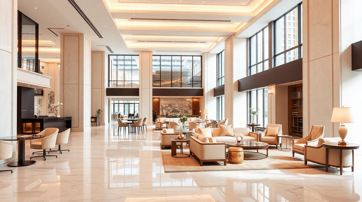
Hospitality research shows guests form a lasting impression of a hotel within 7 seconds of entering the lobby. In that window, color contributes more to the assessment than any other design element — more than furniture quality, spatial proportions, or staff appearance. A warm gold-and-cream lobby reads as "luxury." A stark white-and-chrome lobby reads as "modern but cold." A dark wood-and-burgundy lobby reads as "traditional and established."
Get the lobby palette wrong, and you're fighting an uphill battle for the rest of the guest's stay.
The Complete Hotel Color Palette: Room by Room
Warm Neutrals (#D4C5B2, #E8DDD3) — The Hospitality Foundation
Warm neutrals — cream, taupe, sand, and greige — form the backbone of nearly every successful hotel palette worldwide. They are the Swiss Army knife of hospitality color: universally flattering, culturally neutral, and psychologically comforting.
Why they dominate hospitality:
- Create an immediate sense of warmth and welcome without cultural bias
- Provide a flattering backdrop for all skin tones (critical for guest mirrors and bathroom lighting)
- Suggest cleanliness without the clinical coldness of pure white
- Pair effortlessly with any accent color, allowing seasonal and brand-specific variation
- Evoke natural materials — stone, sand, linen — triggering comfort associations
Best applications:
- Guest room walls and corridor spaces (the largest surface areas)
- Lobby seating areas and reception backgrounds
- Bathroom walls and vanity surrounds
- Bedding and textile base colors
Designer tip: The difference between a $150/night hotel and a $500/night hotel is often the warmth of the neutral palette. Budget properties default to cool gray (#9E9E9E); luxury properties invest in layered warm neutrals — think champagne (#F7E7CE), biscuit (#D4A76A), and parchment (#F1E9DB). Apply this principle using Coloracci's palette tools to find the precise warm neutral that elevates your positioning.
Deep Blue (#1D3557, #457B9D) — Trust, Serenity & Sleep Quality
Blue is the color of water, sky, and tranquility — three things guests universally associate with vacation and escape. In hospitality, blue communicates trustworthiness, calm, and premium quality.
Why it works in hotels:
- Lowers heart rate and blood pressure, promoting genuine physiological relaxation
- Associated with cleanliness and purity — critical signals in shared sleeping environments
- Research shows guests in blue rooms report 15-20% better sleep satisfaction than those in warm-colored rooms
- Projects reliability and quality, supporting premium rate justification
- Universally the most popular color across gender and cultural demographics
Best applications:
- Coastal and resort properties (reflecting surrounding water and sky)
- Guest room accent walls and headboard areas
- Pool and spa waiting areas
- Business hotel conference and meeting rooms (promotes focus and trust)
- Bathroom tile and fixture accents
Room-type calibration:
- Coastal resort: Soft aqua (#A8DADC) and seafoam with white linen — breezy, fresh, vacation-mode
- Urban luxury: Deep navy (#1D3557) with brass accents — sophisticated, grounding, club-like
- Business hotel: Steel blue (#457B9D) with warm wood — professional, reliable, focused
Sage Green (#9DB5A0, #8FAE8B) — Wellness, Nature & Renewal
Green is the spa industry's signature color for good reason. It's the most restful color for the human eye, requires no optical adjustment to perceive, and carries powerful associations with nature, health, and renewal.
Why it works in hotels and spas:
- The easiest color for the eye to process, reducing visual fatigue in spaces designed for rest
- Triggers parasympathetic nervous system activation — the body's "rest and digest" mode
- Strong association with nature, freshness, and clean air
- Communicates wellness, sustainability, and eco-consciousness — increasingly important to travelers
- Creates a sense of balance and harmony that supports extended stays
Best applications:
- Spa treatment rooms, relaxation lounges, and wellness center corridors
- Eco-resort and sustainable property branding
- Garden-facing guest rooms and suites
- Hotel restaurant interiors (green gently stimulates appetite while maintaining calm — see our restaurant color psychology guide)
- Yoga and meditation spaces within the property
Spa-specific guidance: In spa environments, layer multiple green tones to create depth: sage walls (#9DB5A0), eucalyptus accents (#728C73), and mint-infused white (#F0F7F0) for linens. This creates a "forest bathing" effect — the Japanese shinrin-yoku principle — even in windowless treatment rooms.
Gold & Champagne (#C9A84C, #F7E7CE) — Luxury Signaling
Gold is the universal color of luxury, value, and celebration. In hospitality, it functions as a psychological permission slip — telling guests that indulgence is appropriate, that premium pricing is justified, and that the experience they're having is special.
Why it works in hotels:
- Instant association with wealth, exclusivity, and premium quality
- Triggers dopamine release, creating feelings of pleasure and reward
- Warms any neutral palette without overwhelming it
- Photographs beautifully — critical for social media and booking platform imagery
- Cross-culturally associated with celebration, success, and prosperity
Best applications:
- Lobby accents — light fixtures, mirror frames, elevator surrounds
- Reception desk details and key card holders
- Bathroom hardware (faucets, shower fixtures, towel bars)
- Menu and collateral design
- Ballroom and event space architectural details
Luxury calibration: True gold (#FFD700) reads as gaudy in hospitality contexts. Opt for aged brass (#C9A84C), soft champagne (#F7E7CE), or rose gold (#B76E79) for sophistication. The rule: gold should glow, never glare.
Soft White (#F8F9FA, #FFFFFF) — The Cleanliness Signal
White is the single most important color in hospitality — not for walls (use warm neutrals), but for textiles. White bedding, white towels, white robes: these are non-negotiable signals that communicate hygiene, freshness, and premium care.
Why white textiles are essential:
- The most powerful visual signal of cleanliness in a shared sleeping environment
- Creates the perception of newness — white linens look "fresh from the package"
- Photographs as crisp and luxurious on booking platforms
- Easy to bleach and maintain to hospitality hygiene standards
- Universally associated with purity and care across all cultures
Strategic application: While white dominates textiles, use it sparingly on walls. Pure white walls (#FFFFFF) in guest rooms feel clinical and cold — a hospital, not a hotel. Instead, use warm whites like ivory (#FFFFF0), cream (#FFFDD0), or pearl (#F0EAD6) that read as white in photographs but feel warm in person.
Deep Purple & Plum (#4A0E4E, #6A4C93) — Indulgence & Mystique
Purple combines blue's calming properties with red's sensuality, creating a color that feels indulgent, mysterious, and luxurious. In hospitality, it's the color of premium suites, spa experiences, and unforgettable evenings.
Why it works in hotels:
- Historical association with royalty and exclusivity
- Creates a sense of intimacy and privacy — ideal for suites and premium rooms
- Stimulates creativity and imagination, enhancing the "escape" feeling of travel
- Appeals strongly to luxury travelers and wellness seekers
- Pairs beautifully with gold accents for maximum opulence
Best applications:
- Penthouse and premium suite accent walls
- Spa aromatherapy and specialty treatment rooms
- Hotel bar and lounge areas (evening social spaces)
- Turndown service touches (silk pillowcases, eye masks)
- VIP lounge and executive floor corridors
For more on purple's luxury signaling power, see our deep-dive on purple in luxury branding.
Terracotta & Warm Earth (#CC5803, #A0785A) — Boutique Warmth
Earth tones — terracotta, clay, sienna, and warm brown — have surged in hospitality design, driven by the global shift toward authenticity, localism, and biophilic design. These colors connect guests to place and ground the experience in physical, tactile reality.
Why they work in hotels:
- Create feelings of warmth, rootedness, and authenticity
- Connect guests to local landscape and culture (desert resorts, Mediterranean villas, African lodges)
- Support biophilic design principles — the proven wellness benefits of nature-connected environments
- Feel distinctly non-corporate, supporting boutique and independent hotel positioning
- Pair naturally with natural materials: raw wood, rattan, clay, linen
Best applications:
- Boutique and lifestyle hotel lobbies and public spaces
- Desert, Mediterranean, and tropical resort interiors
- Rooftop bars and outdoor dining areas
- Suite sitting rooms and reading nooks
- Artisan and locally-sourced retail spaces within the property
For guidance on earth tone palettes, explore our earth tone color palette guide.
Spa Color Psychology: The Complete Treatment Room Guide
Spa environments demand an even more precise approach to color than hotel guest rooms. In a spa, color must actively support physiological relaxation — lowering cortisol, slowing respiration, and creating the conditions for the body to receive therapeutic benefit.
The Spa Color Hierarchy
| Treatment Type | Optimal Colors | Hex Codes | Psychological Goal |
|---|---|---|---|
| Massage & Bodywork | Sage green, warm taupe | #9DB5A0, #D4C5B2 | Deep muscular relaxation, grounding |
| Facial & Skincare | Soft lavender, cream | #D8C4E0, #FFF8E7 | Gentleness, skin-focus, renewal |
| Hydrotherapy & Pools | Aqua blue, seafoam | #88BDBC, #A8DADC | Water association, cool refreshment |
| Sauna & Steam | Warm amber, natural wood | #D4A76A, #8B7355 | Heat association, Nordic tradition |
| Meditation & Yoga | Soft white, pale sage | #F8F9FA, #E8EDE5 | Mental clarity, spaciousness |
| Aromatherapy | Deep purple, plum | #4A0E4E, #6A4C93 | Sensory depth, mystery, indulgence |
| Nail & Beauty | Blush pink, rose | #FFB4A2, #FFCDB2 | Femininity, beauty, self-care |
| Couples Treatment | Warm cream, soft gold | #FFF8E7, #D4A76A | Intimacy, romance, shared luxury |
Colors to Avoid in Spa Environments
- Bright red — raises heart rate and blood pressure, counteracting relaxation therapies
- Pure white — feels clinical and sterile, triggering medical associations
- Neon or fluorescent tones — cause visual stress and destroy the calm atmosphere
- High-contrast black and white — creates visual tension incompatible with rest
- Cool gray — reads as institutional, undermining the sense of personal care
Hotel Zone Color Mapping
Like retail environments, hotels benefit from color zoning — strategically shifting palettes across different areas to support the specific psychological function of each space.
The Guest Journey Color Map
| Hotel Zone | Color Strategy | Recommended Palette | Hex Codes | Purpose |
|---|---|---|---|---|
| Exterior & Signage | Brand-specific, high contrast | Brand colors + warm neutrals | Varies | Recognition, arrival excitement |
| Porte-Cochère & Entry | Warm, welcoming | Warm gold, cream, amber lighting | #C9A84C, #F7E7CE | Transition from travel to arrival |
| Lobby | Sophisticated warmth | Layered neutrals + luxury accents | #D4C5B2, #C9A84C, #1D3557 | First impression, luxury signaling |
| Corridors | Calm, wayfinding | Muted warm neutral + subtle contrast | #E8DDD3, #A0785A | Navigation, anticipation |
| Guest Room | Rest-optimized | Warm neutrals + cool accents | #E8DDD3, #457B9D, #F8F9FA | Sleep quality, comfort |
| Bathroom | Clean + spa-like | White marble tones + warm metal | #F8F9FA, #C9A84C, #D4C5B2 | Hygiene, personal luxury |
| Restaurant | Appetite-appropriate | Warm earthy tones + ambient lighting | #CC5803, #D4A76A, #2D6A4F | Dining mood, flavor enhancement |
| Bar & Lounge | Intimate, social | Deep blue, plum, brass | #1D3557, #4A0E4E, #C9A84C | Evening atmosphere, socializing |
| Spa | Deep relaxation | Sage, lavender, warm white | #9DB5A0, #D8C4E0, #F8F9FA | Therapeutic support |
| Pool & Fitness | Energizing calm | Aqua, white, natural wood | #88BDBC, #FFFFFF, #8B7355 | Active relaxation, vitality |
| Conference | Focused, professional | Steel blue, warm gray | #457B9D, #6C757D | Productivity, trust |
Hotel Category Color Playbook
Luxury & Five-Star Properties
Primary palette: Warm ivory (#FFF8E7), champagne gold (#C9A84C), deep navy (#1D3557) Accent: Aged brass fixtures, marble veining, fresh floral pops
The luxury hotel palette communicates through restraint and material quality. Colors are muted, never saturated. The palette itself is almost monochromatic — the "wow factor" comes from texture, material, and light rather than color variety. Think Four Seasons, Aman, Ritz-Carlton.
Key principle: In luxury, less color = more perceived value. Let materials and lighting do the work.
Boutique & Lifestyle Hotels
Primary palette: Terracotta (#CC5803), sage green (#9DB5A0), warm white (#FFF8E7) Accent: Handcrafted textiles, local art, natural wood grain
Boutique hotels use color to establish personality and sense of place. Unlike luxury chains that aim for universal sophistication, boutique properties use color to tell a story — reflecting local culture, landscape, and the owner's aesthetic vision. Think Ace Hotel, Soho House, independent design hotels.
Key principle: Boutique color should feel curated, not corporate. Imperfection and personality are assets.
Beach & Coastal Resorts
Primary palette: Ocean blue (#457B9D), sandy cream (#F5E6CA), seafoam (#A8DADC) Accent: Coral (#FF6B6B), driftwood gray (#8B8680), tropical green (#2D6A4F)
Coastal resort palettes mirror their surroundings — the blue of the ocean, the white of the sand, the green of tropical foliage. The goal is to blur the boundary between interior and exterior, making guests feel immersed in the natural environment.
Key principle: Coastal palettes should feel like an extension of the view, not a competition with it.
Urban Business Hotels
Primary palette: Steel blue (#457B9D), warm gray (#9E9E9E), crisp white (#F8F9FA) Accent: Brass (#C9A84C), navy (#1D3557), charcoal (#36454F)
Business travelers need environments that balance professionalism with comfort. Cool blues establish trust and focus; warm metals add the hospitality warmth that distinguishes a great business hotel from a sterile one.
Key principle: Business hotels must feel professional and comfortable. Cool colors provide the former; warm accents provide the latter.
Wellness & Retreat Properties
Primary palette: Sage green (#9DB5A0), lavender mist (#D8C4E0), natural linen (#E8DDD3) Accent: Eucalyptus (#728C73), soft gold (#D4A76A), raw wood (#8B7355)
Wellness retreats use color as therapy itself. Every hue is selected for its physiological calming effect. Saturated colors are avoided entirely. The palette should feel like a deep exhale — soft, organic, and effortlessly peaceful.
Key principle: In wellness design, color should be felt, not noticed. If a guest can name the wall color, it's too prominent.
The Booking Platform Factor: Colors That Convert Online
In 2026, over 70% of hotel bookings originate online. This means your physical color palette must also photograph and render well on screens — a constraint that significantly affects color selection.
Colors That Photograph Well for Bookings
| Color | On-Screen Effect | Booking Platform Impact |
|---|---|---|
| Warm white + gold accents | Reads as bright, luxurious, aspirational | Increases click-through by 15-20% vs. cool-toned rooms |
| Deep blue accent walls | Creates dramatic, Instagram-worthy contrasts | Drives social sharing and user-generated content |
| Sage green with natural light | Reads as fresh, calming, wellness-oriented | Appeals to growing "wellness travel" segment |
| All-white minimalist | Risks looking flat and sterile on mobile screens | Can reduce perceived warmth and value |
| Dark, moody interiors | Dramatic on large screens, murky on mobile | Requires professional photography to avoid appearing dingy |
Key insight: Warm-toned rooms consistently outperform cool-toned rooms on booking platforms. Even if your physical space benefits from cool blues, ensure marketing photography uses warm lighting (golden hour, warm LED) to counterbalance.
Complete Hotel & Spa Color Reference Table
| Color | Hex Code | Psychological Effect | Hotel Application | Best Property Type |
|---|---|---|---|---|
| Warm Cream | #FFF8E7 | Warmth, welcome, comfort | Guest rooms, corridors, lobby | Universal — all hotel types |
| Champagne Gold | #C9A84C | Luxury, reward, celebration | Accents, fixtures, details | Luxury, five-star, ballrooms |
| Deep Navy | #1D3557 | Trust, depth, sophistication | Accent walls, bar areas, suites | Urban luxury, business |
| Sage Green | #9DB5A0 | Calm, nature, wellness | Spa, garden rooms, restaurants | Wellness retreats, eco-resorts |
| Soft Lavender | #D8C4E0 | Gentleness, serenity, femininity | Spa facials, premium suites | Wellness, boutique |
| Aqua Blue | #88BDBC | Freshness, water, cool calm | Pool areas, coastal rooms | Beach resorts, tropical |
| Terracotta | #CC5803 | Warmth, authenticity, place | Boutique lobbies, restaurants | Boutique, Mediterranean |
| Warm Taupe | #D4C5B2 | Comfort, neutrality, sophistication | Base walls, large surfaces | Universal foundation |
| Rose Gold | #B76E79 | Modern luxury, warmth, femininity | Bathroom fixtures, spa details | Luxury, lifestyle, bridal |
| Deep Plum | #4A0E4E | Indulgence, mystery, intimacy | Bar, lounge, premium suites | Boutique, luxury evening |
| Soft White | #F8F9FA | Cleanliness, purity, freshness | Bedding, towels, spa linens | Universal — all textiles |
| Natural Wood | #8B7355 | Authenticity, warmth, grounding | Furniture, flooring, accents | Eco, boutique, wellness |
Designer Takeaways: Actionable Principles
Design for the emotional journey. A guest moves from travel stress → arrival anticipation → comfort → relaxation → departure satisfaction. Your color palette should support each phase.
Warm neutrals are your foundation. Build every hotel palette from warm neutrals outward. Cool grays are the most common mistake in hospitality color design.
Spa colors must be therapeutic. In spa environments, color is not decoration — it's part of the treatment protocol. Every hue should actively support physiological relaxation.
Gold accents justify premium pricing. Strategic touches of gold and brass create luxury perception that supports higher ADR (average daily rate) without proportional cost increases.
Design for the camera. Your palette must work both in-person and on booking platforms. Test all color selections under both natural and artificial lighting, and photograph them on mobile devices.
Zone your palette. Different hotel spaces serve different psychological functions. Use color zoning to guide guests through the emotional arc of their stay.
Cultural sensitivity is non-negotiable. International properties must adapt palettes to local color associations. What communicates luxury in Dubai may differ from Tokyo or São Paulo. See our guide on color meanings across cultures.
Conclusion: Color as the Invisible Concierge
In hospitality design, color functions as an invisible concierge — greeting guests before the front desk staff can, guiding them through spaces without signage, relaxing them before the massage therapist's hands make contact, and creating the emotional memories that drive five-star reviews and repeat bookings.
The most successful hotel and spa designers understand that color is not the final decorative layer applied to a project — it's the foundational strategic decision from which everything else flows. Architecture, lighting, furnishings, textiles, and service choreography all exist within the color environment you create.
Every hue whispers something to your guests. The question is: are you controlling the message?
Ready to build a hospitality color palette grounded in psychology and luxury perception? Use the Coloracci AI palette generator to create strategic color systems for hotels, spas, resorts, and wellness retreats. Explore all our color and design tools to bring your hospitality vision to life.
For more hospitality design insights, explore our guides on restaurant interior color psychology, retail store color psychology, coffee shop color psychology, and email marketing color psychology.