Retail Store Color Psychology: How Interior Colors Drive Shopping Behavior & Purchase Decisions
· Maya Richardson
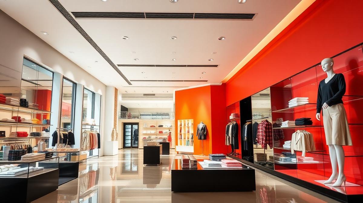
Why the Colors on Your Store Walls Are Quietly Controlling Your Customers
Here's a number that should stop every retail designer in their tracks: research shows that retail store color psychology accounts for up to 85% of a consumer's reason for choosing one product over another. Color is the single most powerful non-verbal cue in a shopping environment — more influential than layout, music, or even scent. It shapes how long customers stay, how much they spend, and whether they return.
Think about the last time you walked into a Target. The bold red walls and signage weren't chosen because someone liked the color — they're engineered to trigger urgency and excitement. Walk into an Apple Store, and the stark whites and warm wood tones slow you down, inviting you to linger and explore. Visit a Whole Foods, and the earthy greens and natural wood tell your brain fresh, organic, trustworthy before you've picked up a single avocado.
None of this is accidental. The best colors for retail stores are the result of decades of consumer psychology research, neuromarketing studies, and real-world A/B testing. In this comprehensive guide, we'll decode the complete science of how interior design colors influence shopping behavior — and give you a practical playbook to apply these principles to any retail project.
If you're designing branded color systems for any industry, understanding retail color psychology is essential. Let's dive in.
The Science Behind Color and Shopping Behavior
Before we examine individual colors, it's important to understand the neurological mechanisms that make color such a powerful force in retail environments.
How the Brain Processes Color in Retail
When a customer enters a store, their brain processes color before text, shape, or spatial layout. The thalamus routes visual color information simultaneously to:
- The amygdala — triggering emotional responses (excitement, calm, urgency)
- The prefrontal cortex — influencing decision-making and spending willingness
- The hippocampus — encoding memory associations (brand recognition, past experiences)
This triple-pathway processing means color simultaneously affects how customers feel, how they decide, and how they remember your store. No other design element operates across all three channels with this speed and intensity.
The 90-Second Rule
Consumer behavior studies have demonstrated that people make a subconscious judgment about an environment within 90 seconds of entering it — and 62-90% of that assessment is based on color alone. In retail, this means your color palette has roughly one and a half minutes to:
- Establish brand identity and positioning
- Set the emotional tone of the shopping experience
- Signal product quality and price point
- Influence the customer's pace and browsing behavior
Get the color wrong, and no amount of merchandising can recover that first impression.
Warm Colors: The Impulse-Buy Accelerators
Warm colors — reds, oranges, and yellows — activate the sympathetic nervous system. They increase heart rate, stimulate adrenaline production, and create a sense of urgency and excitement. In retail, this translates directly to faster decision-making and higher impulse purchases.
Red (#E63946) — The Urgency Trigger
Red is the most psychologically activating color in retail. It commands attention, creates urgency, and is the undisputed champion of clearance sales, limited-time offers, and impulse-buy zones.
Why it works in retail:
- Increases heart rate by 10-15%, creating physical arousal that the brain interprets as excitement
- Triggers urgency-based decision-making — shoppers in red environments make faster purchasing decisions
- Draws the eye immediately, making it ideal for sale signage, focal displays, and checkout areas
- Associated with energy, power, and passion — amplifying emotional engagement with products
Best retail applications:
- Sale and clearance sections (the "red tag sale" isn't arbitrary)
- Checkout counter surroundings to encourage last-minute add-ons
- Window displays designed to stop foot traffic
- Fast-fashion retailers targeting younger demographics (H&M, Zara sale sections)
Strategic caution: Full-saturation red across an entire store creates visual fatigue and anxiety. Limit red to 10-20% of total space, focusing on high-conversion zones. Pair with neutral whites or warm grays to prevent overwhelm. For a deeper look at how red drives action, see our guide on CTA button color psychology.
Orange (#FF8C42) — The Friendly Converter
Orange combines red's energy with yellow's warmth, creating a color that feels approachable, optimistic, and action-oriented. It's the color of "good deals" and "fun shopping" — perfect for value-oriented retail.
Why it works in retail:
- Creates feelings of friendliness and accessibility without red's intensity
- Signals good value and affordability — critical for discount and mid-range retailers
- Encourages social interaction and conversation, increasing group shopping engagement
- Stimulates enthusiasm and impulsive action without pressure
Best retail applications:
- Home improvement and DIY stores (Home Depot's iconic orange)
- Children's retail and toy stores
- Sports and outdoor recreation retailers
- Promotional displays and "new arrival" signage
- Seasonal pop-up areas and endcap displays
Designer tip: Terracotta (#CC5803) and burnt orange (#BF5700) feel more sophisticated than pure orange, making them viable for mid-range and lifestyle retailers. Use coral (#FF6B6B) for a modern, Instagram-friendly aesthetic that appeals to younger shoppers.
Yellow (#FFD166) — The Attention Magnet
Yellow is the first color the human eye processes — it's quite literally the most visible color in the spectrum. In retail, it's the ultimate attention-grabber, ideal for window displays, wayfinding, and promotional callouts.
Why it works in retail:
- Highest visibility of any color — the reason taxis, warning signs, and sale tags are yellow
- Triggers serotonin release, creating feelings of happiness and optimism
- Encourages exploration and curiosity, increasing dwell time in browsing areas
- Associated with youth, energy, and affordability
Best retail applications:
- Window displays and storefront signage (especially competing in busy commercial strips)
- Wayfinding and directional signage within large retail spaces
- Promotional and discount messaging (yellow tags, price stickers)
- Children's sections and toy departments
- Food courts and quick-service retail (Subway, McDonald's)
Strategic caution: Overuse of yellow creates anxiety and visual strain. Yellow works best as an accent — 5-15% of total palette — directing attention to specific zones rather than dominating the environment. Pure bright yellow (#FFFF00) on walls causes headaches; opt for warm gold (#FFD700) or soft mustard (#E4B363) instead.
Cool Colors: The Browsing Extenders
Cool colors — blues, greens, and purples — activate the parasympathetic nervous system. They slow heart rate, reduce blood pressure, and create feelings of calm, trust, and contemplation. In retail, this translates to longer browsing times, higher-value purchases, and stronger brand loyalty.
Blue (#457B9D) — The Trust Builder
Blue is the most universally liked color across demographics and cultures. In retail, it builds trust, reduces purchase anxiety, and encourages thoughtful, high-value buying decisions.
Why it works in retail:
- Creates feelings of trust, reliability, and security — critical for high-ticket purchases
- Reduces blood pressure and slows heart rate, making customers feel relaxed and unhurried
- Associated with professionalism and quality — signals premium positioning
- Encourages longer dwell time and more thorough product evaluation
Best retail applications:
- Electronics and technology stores (Samsung stores, Best Buy)
- Financial services and banking retail spaces
- Jewelry and luxury accessories (Tiffany & Co.'s iconic blue)
- Pharmacy and healthcare retail (Boots, CVS)
- Men's fashion and professional wear
Designer tip: Navy (#1D3557) communicates authority and luxury. Powder blue (#A8DADC) feels approachable and calming. Pair deep blue walls with warm metallic accents (gold, copper) for premium positioning that still feels welcoming.
Green (#2D6A4F) — The Wellness Signal
Green is the color of nature, health, and renewal. In retail, it's the go-to for any brand wanting to signal freshness, sustainability, or wellness. It's one of the most versatile retail colors, working across price points and demographics.
Why it works in retail:
- Most restful color for the eye — allows prolonged browsing without fatigue
- Strong association with health, freshness, and organic/natural products
- Communicates sustainability and eco-consciousness — increasingly important for modern consumers
- Creates feelings of balance and harmony in the shopping environment
Best retail applications:
- Organic and natural grocery stores (Whole Foods, Sprouts)
- Health and wellness retailers (pharmacies, supplement stores)
- Sustainable and eco-friendly fashion brands
- Garden centers, plant shops, and outdoor living
- Financial services (the color of money, wealth, and growth)
For more on how green drives brand positioning, explore our guide to green in branding.
Purple (#6A4C93) — The Luxury Differentiator
Purple has the shortest wavelength of visible light and has been historically associated with royalty, luxury, and exclusivity. In retail, it's a powerful signal of premium positioning and creative distinction.
Why it works in retail:
- Immediate association with luxury, exclusivity, and sophistication
- Stimulates the brain's problem-solving and creativity centers
- Appeals strongly to female demographics (studies show purple as the #1 favorite color among women aged 25-45)
- Creates a sense of mystery and discovery — encouraging deeper exploration
Best retail applications:
- Luxury beauty and cosmetics (Tatcha, Urban Decay)
- Premium chocolate and confectionery
- High-end fashion boutiques and designer consignment
- Wellness spas and fragrance retailers
- Creative and artisan retail concepts
Read more about purple in luxury branding.
Neutral Colors: The Strategic Foundation
Neutrals — black, white, gray, and beige — are not "background" colors. They're strategic choices that communicate specific brand values and create the spatial context that makes accent colors effective.
White (#FFFFFF) — The Premium Canvas
White dominates luxury retail for a reason. It creates the perception of space, cleanliness, and sophistication while letting products become the focal point.
Why it works in retail:
- Creates the illusion of larger, more open spaces
- Makes products the visual hero — eliminating competition from the environment
- Communicates purity, cleanliness, and modernity
- Associated with premium and luxury positioning (Apple, COS, Aesop)
Best for: Technology, luxury fashion, minimalist brands, beauty retail, and gallery-style concept stores.
Black (#1A1A2E) — The Exclusivity Signal
Black creates drama, mystery, and a sense of exclusivity. It's the retail color of VIP sections, luxury flagships, and brands that want to feel aspirational.
Why it works in retail:
- Creates a sense of exclusivity and sophistication
- Dramatic contrast makes products and lighting pop
- Associated with power, elegance, and premium quality
- Reduces visual noise, focusing attention on curated displays
Best for: Luxury fashion, high-end electronics, nightlife-adjacent retail, premium fragrance, and invitation-only shopping experiences.
Warm Gray & Beige (#D4C5B2) — The Comfort Zone
Warm neutrals create feelings of comfort, familiarity, and trust. They're the safe space of retail — welcoming without being loud, sophisticated without being cold.
Best for: Furniture and home décor (IKEA, West Elm), bookstores, lifestyle brands, premium grocery, and any store optimizing for long browsing sessions.
Color Zoning: A Strategic Floor Plan Approach
The most sophisticated retailers don't use a single color palette — they use color zoning, strategically shifting hues across different areas of the store to guide customer behavior through the shopping journey.
The Retail Color Zone Framework
| Store Zone | Recommended Colors | Hex Examples | Psychological Goal |
|---|---|---|---|
| Storefront & Window | Red, Yellow, Orange | #E63946, #FFD166, #FF8C42 | Stop foot traffic, attract attention |
| Entrance & Decompression | Warm neutrals, soft gold | #D4C5B2, #E4B363 | Welcome, transition, slow pace |
| Browsing Aisles | Blue, Green, Soft white | #457B9D, #2D6A4F, #F8F9FA | Extend dwell time, reduce pressure |
| Feature Displays | Purple, Deep teal | #6A4C93, #1B4965 | Highlight premium/new products |
| Sale & Clearance | Red, Orange, Yellow | #E63946, #FF8C42, #FFD166 | Create urgency, drive impulse buys |
| Checkout Counter | Red accents on neutral | #E63946 on #F8F9FA | Encourage last-minute add-ons |
| Fitting Rooms | Warm pink, Soft peach | #FFB4A2, #FFCDB2 | Flattering light, positive self-image |
This zoned approach maximizes the psychological impact of each color by placing it exactly where its effect is most valuable. Warm, stimulating colors at the entrance and checkout drive action; cool, calming colors in browsing zones encourage exploration and higher-value purchases.
Retail Category Color Playbook
Different retail verticals have established color conventions backed by consumer expectations and psychological research. Here's a complete breakdown:
Fashion & Apparel
| Store Type | Primary Palette | Hex Codes | Why It Works |
|---|---|---|---|
| Fast Fashion | Red, White, Black | #E63946, #FFFFFF, #1A1A2E | Urgency + trend-forward + accessible |
| Luxury Fashion | Black, Gold, Cream | #1A1A2E, #C9A84C, #FFF8E7 | Exclusivity + aspiration + warmth |
| Athleisure | Orange, Gray, White | #FF8C42, #6C757D, #FFFFFF | Energy + performance + clean |
| Sustainable Fashion | Green, Beige, Sage | #2D6A4F, #D4C5B2, #9DB5A0 | Eco-conscious + natural + honest |
Electronics & Technology
| Store Type | Primary Palette | Hex Codes | Why It Works |
|---|---|---|---|
| Premium Tech | White, Blue, Silver | #FFFFFF, #457B9D, #C0C0C0 | Clean + trustworthy + futuristic |
| Gaming Retail | Black, Neon Green, Purple | #1A1A2E, #39FF14, #6A4C93 | Immersive + energetic + creative |
| Mobile/Telecom | Blue, White, Brand accent | #457B9D, #FFFFFF, varies | Trust + clarity + brand identity |
Food & Grocery
| Store Type | Primary Palette | Hex Codes | Why It Works |
|---|---|---|---|
| Organic/Natural | Green, Cream, Earth tones | #2D6A4F, #FFF8E7, #8B7355 | Health + freshness + authenticity |
| Discount Grocery | Yellow, Red, White | #FFD166, #E63946, #FFFFFF | Value + energy + accessible |
| Gourmet/Specialty | Black, Gold, Deep green | #1A1A2E, #C9A84C, #2D6A4F | Premium + curated + quality |
For more on how colors shape the food industry, read our article on restaurant color psychology.
Beauty & Cosmetics
| Store Type | Primary Palette | Hex Codes | Why It Works |
|---|---|---|---|
| Mass Market Beauty | Pink, White, Silver | #FFB4A2, #FFFFFF, #C0C0C0 | Feminine + clean + approachable |
| Luxury Beauty | Black, Rose Gold, Cream | #1A1A2E, #B76E79, #FFF8E7 | Sophistication + glamour + warmth |
| Clean Beauty | White, Sage, Sand | #FFFFFF, #9DB5A0, #D4C5B2 | Purity + nature + transparency |
The Data: How Color Impacts Key Retail Metrics
Research from the Institute for Color Research, Seoul International Color Expo, and multiple neuromarketing studies provides concrete data on color's impact:
| Metric | Color Impact | Source Data |
|---|---|---|
| Purchase Decision Speed | Warm-colored environments produce 15-20% faster purchase decisions | Journal of Business Research |
| Dwell Time | Cool blue/green environments increase browsing by 25-30% vs. red | Seoul International Color Expo |
| Impulse Purchases | Red checkout zones increase impulse buys by 18% vs. neutral zones | Institute for Color Research |
| Brand Recognition | Color increases brand recognition by 80% | University of Loyola |
| Product Evaluation | Products in blue environments receive higher quality ratings | Journal of Consumer Psychology |
| Willingness to Pay | Luxury black environments increase perceived value by 20-35% | Neuromarketing Journal |
These numbers reveal a clear pattern: warm colors drive action and volume, while cool colors drive value and quality perception. The most effective retail environments blend both strategically.
Common Retail Color Mistakes (And How to Avoid Them)
Mistake 1: Color Overload
Using too many saturated colors creates visual chaos. The fix: limit your palette to 2-3 primary colors plus 1-2 neutrals. Use the 60-30-10 rule — 60% dominant neutral, 30% secondary color, 10% accent.
Mistake 2: Ignoring Lighting Interaction
Colors look dramatically different under fluorescent, LED, and natural light. Always test your palette under the exact lighting conditions of your space. Warm LEDs (2700K-3000K) amplify warm colors; cool LEDs (5000K+) enhance blues and greens.
Mistake 3: One Palette for Every Zone
A single color scheme across the entire store misses the opportunity for psychological zoning. Different areas serve different behavioral goals — your colors should reflect that.
Mistake 4: Following Trends Over Strategy
A trending color that contradicts your brand positioning will hurt more than help. If your luxury jewelry store follows a neon trend, you're sending conflicting signals about quality and exclusivity.
Mistake 5: Neglecting Cultural Context
Color associations vary significantly across cultures. Red signals luck in China but danger in Western markets. White is purity in the West but mourning in parts of Asia. For global or multicultural retail, research your specific audience. Our guide on color culture meanings covers this in detail.
Designer Takeaways: Applying Retail Color Psychology
Here are the actionable principles for your next retail design project:
Start with behavioral goals, not aesthetics. Define what you want customers to do in each zone before choosing colors.
Use the Color Zone Framework. Map warm stimulating colors to action zones (entrance, checkout, sales) and cool calming colors to browsing and evaluation zones.
Test with real customers. Conduct A/B tests with color variations on key walls, signage, and displays. Measure dwell time, conversion rates, and average transaction value.
Layer color with lighting. Color and light are inseparable in retail. Design them together, not sequentially.
Build brand-color consistency. Your store colors should reinforce — never contradict — your brand identity across all channels. Use a unified palette tool to maintain consistency from digital to physical.
Respect the 60-30-10 rule. For more on this foundational principle, see our guide to color proportions.
Complete Retail Color Reference Table
| Color | Hex Code | Psychological Effect | Retail Application | Best For |
|---|---|---|---|---|
| Red | #E63946 | Urgency, excitement, impulse | Sales zones, checkout, window displays | Fast fashion, clearance, food |
| Orange | #FF8C42 | Warmth, value, action | Promotional displays, DIY, sports | Value retail, children's, home |
| Yellow | #FFD166 | Attention, optimism, energy | Signage, wayfinding, window | Discount, food service, children's |
| Blue | #457B9D | Trust, calm, quality | Electronics, finance, luxury | Technology, jewelry, pharmacy |
| Green | #2D6A4F | Health, nature, freshness | Organic grocery, wellness, eco | Natural foods, sustainable brands |
| Purple | #6A4C93 | Luxury, creativity, mystery | Premium beauty, fashion, artisan | Luxury cosmetics, boutique |
| White | #FFFFFF | Purity, space, premium | Luxury flagship, tech, beauty | Apple-style, minimalist brands |
| Black | #1A1A2E | Exclusivity, power, drama | Luxury fashion, VIP sections | High-end fashion, premium |
| Warm Gray | #D4C5B2 | Comfort, trust, sophistication | Furniture, lifestyle, bookstores | Home décor, premium grocery |
| Rose/Pink | #FFB4A2 | Flattering, warmth, femininity | Fitting rooms, beauty retail | Fashion, cosmetics, lingerie |
Conclusion: Color Is Your Silent Salesperson
In retail design, color is the one element that speaks to every customer, in every zone, at every moment — without saying a word. It's the silent salesperson that guides feet through aisles, hands toward products, and wallets toward registers.
The most successful retailers understand that color isn't decoration — it's strategy. Every hue on every wall, display, and sign is a psychological lever that either pulls customers toward a purchase or pushes them toward the exit.
Whether you're designing a neighborhood boutique or a global flagship, the principles in this guide give you a science-backed framework for making color work harder in every square foot of your space.
Ready to build a retail color palette grounded in psychology? Use the Coloracci AI palette generator to create strategic color systems for any retail concept — from fast-fashion to luxury flagship. Explore all our color and design tools to bring your retail vision to life.
For more on how color shapes consumer psychology across industries, check out our articles on email marketing color psychology, landing page color strategy, and the psychology of color in marketing.