Complementary Colors Explained: A Designer's Guide
· Coloracci Team
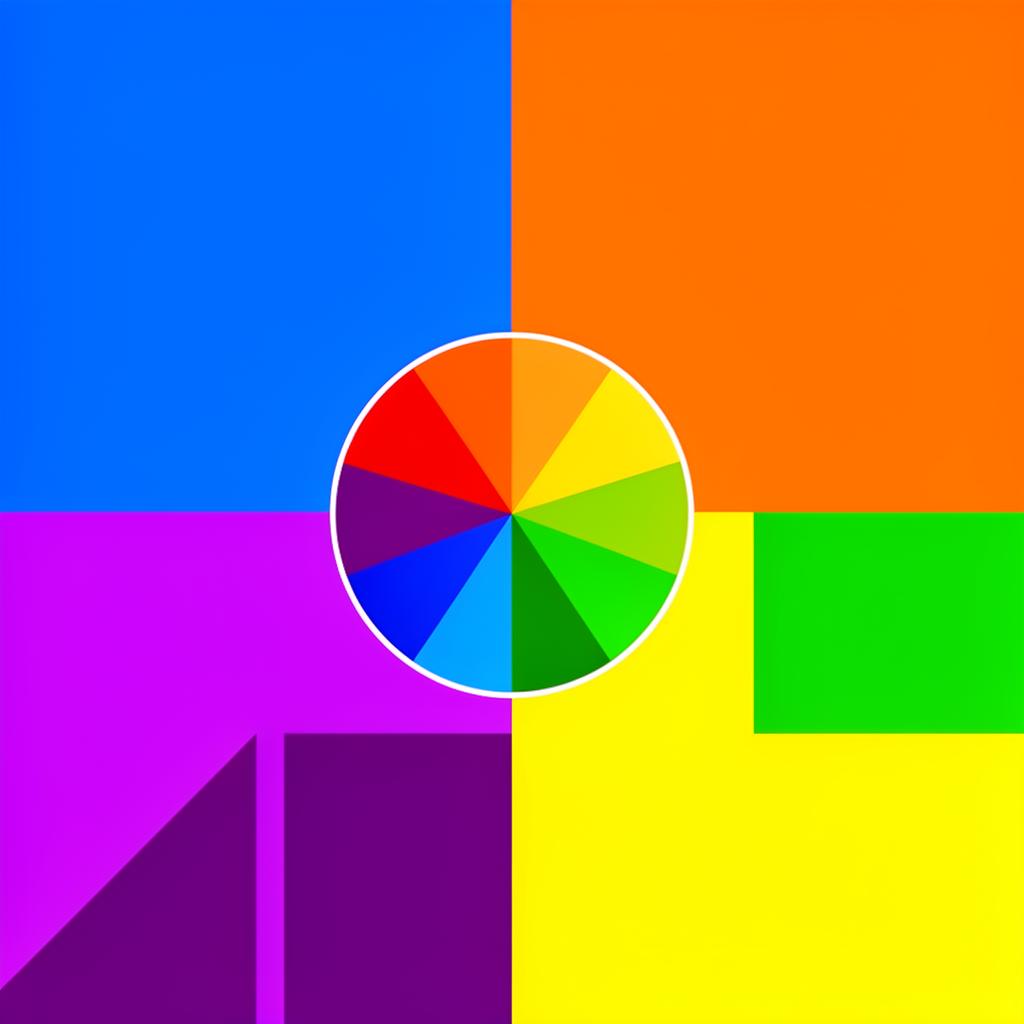
Complementary colors are the most powerful relationship on the color wheel. They sit directly opposite each other, creating maximum contrast, maximum visual tension, and — when used skillfully — maximum impact. Every designer encounters complementary colors early in their education, but surprisingly few deploy them with real confidence in professional work. The gap between understanding the theory and applying it effectively is wide, and bridging it requires both technical knowledge and practical judgment.
This guide covers everything a working designer needs to know about complementary colors: the science behind why they work, the specific pairings you will use most often, practical techniques for web and UI design, and the common mistakes that turn complementary schemes from striking to painful.
What Are Complementary Colors?
Complementary colors are pairs of colors that sit directly opposite each other on the color wheel. When placed side by side, they create the strongest possible contrast between two hues. When mixed together (in paint or light), they cancel each other out — producing neutral gray in subtractive mixing (paint) or white in additive mixing (light).
The six primary complementary pairs that every designer should know by heart:
Red and Cyan (or Red and Green in traditional theory)
- Red
#FF0000↔ Cyan#00FFFF - In traditional RYB color theory: Red
#E63946↔ Green#2D6A4F
Blue and Orange
- Blue
#1A56DB↔ Orange#FF6B35 - The most popular complementary pair in commercial design
Yellow and Purple (Violet)
- Yellow
#FFD60A↔ Purple#7B2D8E - The highest luminance contrast of any complementary pair
Teal and Coral
- Teal
#008080↔ Coral#FF6F61 - A modern, sophisticated pairing popular in contemporary design
Chartreuse and Magenta
- Chartreuse
#7FFF00↔ Magenta#FF00FF - Bold and energetic, common in entertainment and gaming
Azure and Vermillion
- Azure
#007FFF↔ Vermillion#E34234 - Classic and authoritative, used extensively in news media and sports
The reason complementary colors create such strong contrast is rooted in human vision. Our eyes contain three types of cone cells that respond to red, green, and blue wavelengths. When you look at a color, the cones for that wavelength fire intensely while the cones for the opposite wavelength are suppressed. When a complementary color appears nearby, the suppressed cones suddenly activate, creating a heightened visual experience. This is not a cultural phenomenon — it is a biological one, which is why complementary color contrast is effective across all cultures and contexts.
Color Wheel Theory: Understanding the Foundation
The color wheel is the map that makes complementary relationships visible. But not all color wheels are created equal, and the one you use affects which colors you consider "complementary."
The RYB (Red-Yellow-Blue) color wheel is the traditional artist's wheel taught in art schools for centuries. In this model, the primary complementary pairs are red/green, blue/orange, and yellow/purple. This wheel works well for painting and physical media but does not accurately represent how colors mix in light or on screens.
The RGB (Red-Green-Blue) color wheel is the standard for digital design. This is the model your screens use, and it produces different complementary pairs: red/cyan, green/magenta, and blue/yellow. When you are designing for screens — which is most modern design work — this is the wheel you should reference.
The HSL (Hue-Saturation-Lightness) model is the most practical for finding complements in digital design. To find any color's complement, simply add or subtract 180° from its hue value. For example:
- Blue at hue 220° → Complement at hue 40° (warm gold/amber)
- Red at hue 0° → Complement at hue 180° (cyan)
- Green at hue 120° → Complement at hue 300° (magenta)
This 180° rule is the fastest way to find complementary colors when you are working in CSS or any design tool that uses HSL values. In code:
/* Primary color */
--brand-blue: hsl(220, 90%, 50%);  /* #0A5AE6 */

/* Complementary color (220 + 180 = 400 - 360 = 40) */
--brand-complement: hsl(40, 90%, 50%);  /* #E6A60A */
Understanding which color wheel you are working with prevents a common source of confusion: a designer using RYB theory might call #FF6600 the complement of #0066FF, while a designer using RGB theory would identify #FFFF00 as blue's complement. Both are "correct" within their respective systems, but for web design, RGB/HSL is the authoritative reference.
Using Complementary Colors in Web Design
Complementary colors are a powerful but dangerous tool in web design. Used well, they create interfaces that are vibrant, engaging, and effortlessly guide the user's attention. Used poorly, they create visual chaos that fatigues users and drives them away. Here are the techniques that separate professional results from amateur attempts.
The 80/20 Rule (or the Dominant-Accent Approach)
The most reliable technique for using complementary colors in web design is radical asymmetry: use one color as the dominant presence (80% or more of the colored area) and its complement as a small, strategic accent (20% or less). This approach harnesses the contrast power of complementary colors without creating visual competition.
Example: Blue-dominant with orange accent
- Background and primary UI: White (
#FFFFFF) and light gray (#F5F5F5) - Primary brand color: Blue
#1A56DBfor headers, navigation, primary buttons - Complementary accent: Orange
#FF6B35exclusively for CTAs, badges, notifications, and elements that need maximum attention
This asymmetry works because the small amount of orange is amplified by its contrast against the dominant blue. The orange CTA button on a blue-themed page practically glows — not because orange is inherently attention-grabbing, but because the complementary relationship with blue makes it impossible to ignore.
Split-Complementary for Flexibility
If pure complementary contrast feels too stark for your project, split-complementary schemes offer a gentler alternative. Instead of using the exact complement, use the two colors adjacent to the complement on the color wheel. For a blue primary (#1A56DB, hue 220°), the split complements would be:
- Amber-orange at hue 30° →
#E68A0A - Red-orange at hue 50° →
#E6B30A
Split-complementary schemes retain most of the energy of true complementary pairs while introducing variety and reducing the "vibrating" visual tension that full complements can create.
Toning Down Complementary Colors
Professional designers rarely use complementary colors at full saturation simultaneously. Instead, they tone down one or both colors to create sophistication:
- Desaturate one color: Keep your primary at full saturation (
#1A56DB) but reduce the complement's saturation (#C49272instead of#FF6B35) - Shift lightness: Use a dark shade of one (
#0D2B6B) with a light tint of the other (#FFD4C2) - Use neutralized versions: Both colors at 40-60% saturation create an elegant, muted palette that still benefits from complementary contrast
Complementary Colors in Data Visualization
Complementary colors are ideal for data visualization because they create instant visual distinction between categories. Blue (#1A56DB) and orange (#FF6B35) is the most popular pairing in data viz because:
- It works for color-blind users (blue and orange are distinguishable in most forms of color blindness)
- The high contrast makes chart elements immediately distinguishable
- Both colors read well against white and light gray backgrounds
Common Mistakes Designers Make
Mistake 1: Equal Proportions
The most common error is using complementary colors in equal proportions. A website that is 50% blue and 50% orange does not look harmonious — it looks like a visual battlefield. Complementary colors fight for dominance, and when neither wins, the user's eye bounces uncomfortably between them. Always establish a clear hierarchy: one color dominates, the other accents.
Mistake 2: Full Saturation Adjacent Placement
Placing fully saturated complementary colors directly adjacent to each other creates a phenomenon called "simultaneous contrast" or "vibrating edges." The boundary between the two colors appears to shimmer and pulse, which causes visual fatigue and can even trigger headaches in sensitive individuals. Always separate complementary colors with neutral space (white, gray, or black) or use toned-down versions when they must be adjacent.
Mistake 3: Complementary Colors for Large Text Areas
Never use a complementary color pair for text and background. Red text on green background, or purple text on yellow background, creates extreme visual strain regardless of the contrast ratio. Even if the combination technically passes WCAG accessibility standards, it is uncomfortable to read. Body text should always use near-black (#1A1A1A) or near-white (#F5F5F5) on a neutral or very lightly tinted background. Reserve complementary color contrast for non-text elements: buttons, icons, dividers, illustrations, and decorative accents.
Mistake 4: Ignoring Cultural Context
Some complementary pairs carry strong cultural associations. Red and green is the universal Christmas palette in Western markets. Purple and yellow evokes sports teams (Los Angeles Lakers, Minnesota Vikings). Blue and orange is associated with certain tech brands (Firefox, Fanta). Before committing to a complementary scheme, research whether your chosen pair triggers unintended associations in your target market.
Mistake 5: Forgetting About Dark Mode
A complementary scheme that works beautifully on a white background may fail completely in dark mode. Saturated blue (#1A56DB) on white is comfortable; the same blue on near-black (#121212) can feel harsh and neon-like. Build your complementary palette with both light and dark contexts in mind:
- Light mode: Blue
#1A56DB+ Orange accent#FF6B35on white - Dark mode: Lighter blue
#5B8DEF+ Softer orange#FFB088on#121212
Practical Hex Code Reference for Common Complementary Pairs
For designers who want ready-to-use complementary palettes:
- Corporate Blue + Warm Orange: Primary
#1A56DB, Complement#FF6B35, Neutral#F8F9FA - Forest Green + Berry Red: Primary
#2D6A4F, Complement#E63946, Neutral#F0F0F0 - Rich Purple + Golden Yellow: Primary
#7B2D8E, Complement#FFD60A, Neutral#FAFAFA - Teal + Coral: Primary
#008080, Complement#FF6F61, Neutral#F5F5F5 - Navy + Amber: Primary
#001F3F, Complement#FFBF00, Neutral#FFFFFF
Complementary colors are the most powerful tool in the designer's color toolkit, but they demand respect. The difference between a striking complementary scheme and a painful one often comes down to proportion, saturation, and strategic restraint. Master these three variables, and complementary colors will elevate every project you touch.