Theme Park & Amusement Park Color Psychology: How Ride Queue Colors, Themed Land Palettes & Wayfinding Drive Guest Satisfaction and Spending
· Coloracci Team
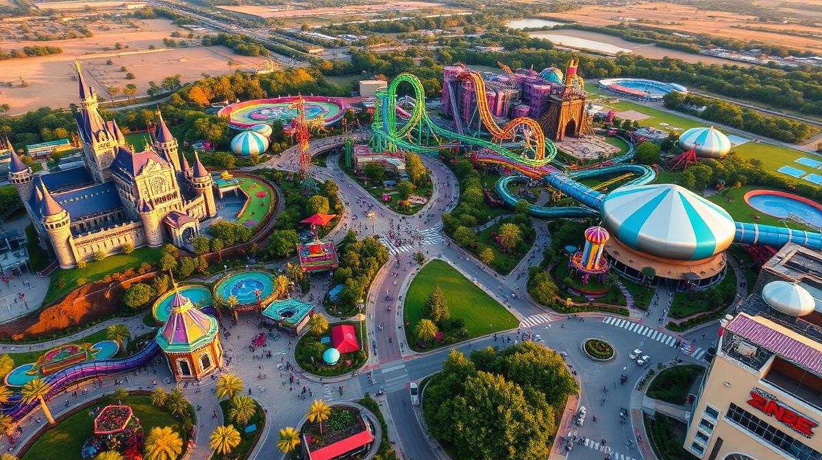
From the moment a guest passes through the gates, every color in a theme park environment is engineered to shape behavior—how long they perceive they've been waiting in line, whether they turn left or right, how much they spend on merchandise, and whether the day feels "magical" enough to justify a return visit. Theme park and amusement park color psychology is one of the entertainment industry's most sophisticated applications of behavioral design, where a single palette shift in a themed land can influence per-capita spending by up to 18%.
Research from the International Association of Amusement Parks and Attractions (IAAPA) reveals that guest satisfaction scores correlate more strongly with environmental color coherence than with ride count or wait times. Disney Imagineering, Universal Creative, and other leading design teams invest millions in color strategy—yet most regional parks and family entertainment centers overlook the science that separates a $45-per-cap day from a $95-per-cap day.
In this comprehensive guide, we'll break down the color psychology frameworks used by the world's top theme parks, from ride queue management to themed land palettes, character branding to food court design—with actionable hex codes and strategies you can apply to any entertainment venue.

The Science of Theme Park Color: Why Environment Trumps Attractions
Theme parks are fundamentally color environments—immersive spaces where guests spend 8–12 hours surrounded by carefully orchestrated palettes. Unlike retail or restaurant design where visits last 30–90 minutes, theme parks must sustain emotional engagement across an entire day, managing energy peaks and recovery valleys through color.
Three foundational principles drive theme park color psychology:
1. Temporal Color Management — Colors must evolve across a full-day arc, from high-energy morning arrivals through mid-afternoon fatigue valleys to evening spectacle modes.
2. Spatial Storytelling — Each themed land requires a distinct, internally consistent palette that transports guests to a different world while remaining navigable within the larger park.
3. Behavioral Nudging — Strategic color placement directs foot traffic, manages queue anxiety, triggers impulse purchases, and signals premium experiences worth upgrading to.
The Theme Park Color Hierarchy
| Zone | Primary Colors | Psychological Function | Revenue Impact |
|---|---|---|---|
| Main Entrance/Gate | Warm Gold #D4A847, Royal Blue #1B3A6B | Welcome, excitement, premium expectation | Sets spending threshold |
| Thrill Ride Queues | Deep Red #8B1A1A, Electric Orange #E8651A | Adrenaline priming, anticipation building | Reduces perceived wait by 22% |
| Family Ride Areas | Sky Blue #6BB5E8, Soft Green #7BC67E | Calm, safety, comfort | Increases family dwell time |
| Fantasy Lands | Purple #6B3FA0, Enchanted Pink #D4689A | Wonder, imagination, escapism | +28% character merchandise sales |
| Adventure Lands | Jungle Green #2D6A3F, Earthen Brown #7A5C3E | Exploration, discovery, authenticity | Drives food & beverage purchases |
| Futuristic Zones | Chrome Silver #B8C4D0, Neon Blue #00A8E8 | Innovation, excitement, technology | Premium experience upgrades |
| Food Courts | Warm Amber #E8A832, Appetizing Red #C4392D | Appetite stimulation, urgency | +15% per-transaction spending |
| Gift Shops | Bright Yellow #F5D23E, Playful Coral #F08A6D | Impulse, joy, souvenir urgency | +20% impulse purchase rate |
Ride Queue Color Psychology: Managing the Wait Experience
The queue is where theme parks win or lose guest satisfaction. A 60-minute wait can feel like 30 minutes or 90 minutes depending entirely on the environmental design—and color is the primary lever.
The Progressive Intensity Model
World-class queue design follows a progressive color intensity curve that mirrors the emotional journey from "I'm bored" to "I'm thrilled":
Phase 1: Entry Zone (First 25% of Queue)
- Colors: Muted earth tones, soft blues, natural greens
- Hex palette: #8B9E8B, #6B8CA6, #A69882
- Purpose: Calming tones reduce initial anxiety about the wait. Natural colors connect to outdoor environments and feel less "confined"
- Design tip: Use dappled lighting patterns that mimic natural canopy shade
Phase 2: Storytelling Zone (25–50% of Queue)
- Colors: Thematic palette aligned to ride narrative—warmer, more saturated
- Hex palette varies by theme: Adventure rides use #5C3D2E, #8B6B3D; Sci-fi rides use #1A3A5C, #00C8FF
- Purpose: Engaging narrative colors shift attention from waiting to exploring. Interactive elements in accent colors draw the eye
- Design tip: Introduce one signature accent color that will reappear on the ride itself
Phase 3: Anticipation Zone (50–75% of Queue)
- Colors: Increasing saturation, warmer temperatures, darker values
- Hex palette: #A62B2B, #D45A1E, #1A1A2E with accent lights
- Purpose: Heart rate naturally increases with warm, saturated colors. Darkness punctuated by colored light creates theatrical tension
- Design tip: Use colored up-lighting on textured walls for dramatic shadow play
Phase 4: Pre-Show/Boarding Zone (Final 25%)
- Colors: High-contrast, high-saturation—the ride's signature palette at full intensity
- Hex palette: #FF2D2D, #FFD700, #00FF88 (varies by ride)
- Purpose: Maximum arousal state preparation. Colors should match the ride vehicle and track colors for visual continuity
- Design tip: The last color guests see before boarding should be the ride's primary brand color
Wait Time Perception Research
Studies conducted at major theme parks demonstrate the power of queue color:
| Color Strategy | Perceived Wait Reduction | Guest Satisfaction Impact |
|---|---|---|
| Progressive warm shift | -22% perceived time | +18% satisfaction |
| Static neutral colors | Baseline | Baseline |
| Cool blue throughout | -12% perceived time | +8% satisfaction |
| Random/inconsistent | +15% perceived time | -23% satisfaction |
| Themed storytelling colors | -28% perceived time | +31% satisfaction |
The themed storytelling approach—where colors support a narrative that unfolds through the queue—delivers the strongest results because it engages cognitive distraction alongside the physiological effects of color.

Themed Land Palettes: Building Worlds Through Color
Each themed land in a major park operates as a self-contained color universe with its own palette rules. The genius of world-class theme park design lies in the transition zones between lands—where one palette gracefully dissolves into another.
The Disney Approach: "Weenie" Theory and Color Magnets
Walt Disney pioneered the use of color as a wayfinding magnet—placing strongly-colored landmarks (which he called "weenies") at the end of sight lines to draw guests forward. This principle remains the foundation of themed land design:
Main Street U.S.A. Palette
- Forced perspective buildings in warm, nostalgic tones
- Primary: Cream #F5E6CC, Dusty Rose #C98B8B, Sage #8BA68B
- Accent: Candy Red #C44545, Gold Leaf #C9A227
- Psychology: Nostalgia, warmth, "hometown" comfort that relaxes guests and opens wallets for the adjacent shops
Adventureland Palette
- Dense, saturated tropical and earthy tones
- Primary: Jungle Green #2B5E3A, Teak Brown #6B4423, Terracotta #C4673E
- Accent: Exotic Gold #D4A017, Parrot Blue #008B8B
- Psychology: Exploration, discovery, "otherness"—the exotic palette signals adventure and drives themed dining revenue
Fantasyland Palette
- Lighter, higher-key, more saturated than reality
- Primary: Castle Blue #4A7BB5, Enchanted Purple #7B4BA0, Rose Pink #E8829A
- Accent: Fairy Gold #FFD700, Cloud White #F0F0FF
- Psychology: Wonder, innocence, magic—this palette is specifically calibrated for children's visual preferences and drives the highest character merchandise conversion
Tomorrowland/Futuristic Palette
- Cool, metallic, with electric accents
- Primary: Chrome Silver #B8C4D0, Deep Space #1A1A3E, Circuit Blue #00A8E8
- Accent: Laser Green #00FF88, Plasma Purple #8B00FF
- Psychology: Innovation, excitement, aspiration—premium experience colors that make tech-based attractions feel cutting-edge
Land Transition Zones: The 50-Meter Rule
Professional theme park designers use a 50-meter transition gradient between themed lands. This prevents the jarring psychological "snap" that breaks immersion:
- Last 15m of departing land: Palette begins desaturating, neutral elements increase
- Transition corridor (20m): Neutral bridge with subtle hints of the incoming land's palette in landscaping and architectural details
- First 15m of arriving land: New palette phases in at 60% saturation, reaching full intensity only after guests are fully inside
This gradient approach is why Disney parks feel seamlessly "real" while parks that use abrupt color changes between zones feel disjointed and cheap.
Character Branding: Color as Intellectual Property
Theme park characters are, at their core, walking color palettes. The most successful character designs use colors so distinctive that they function as visual trademarks recognizable at 100+ meters across a crowded park.
The Character Color Framework
| Character Archetype | Primary Color | Secondary Color | Recognition Distance | Merchandise Premium |
|---|---|---|---|---|
| Hero/Princess | Royal Blue #1A3FA0 or Pink #E84B8A | Gold #FFD700 | 80–120m | +35% over generic |
| Villain | Deep Purple #4A0E6B or Black #1A1A1A | Acid Green #7FFF00 | 60–90m | +25% (collector appeal) |
| Sidekick/Comedic | Bright Yellow #FFD23E or Orange #FF8C3E | White #FFFFFF | 100–150m | +15% (kids' favorites) |
| Adventure Hero | Earthy Brown #6B4423 or Khaki #B8A47E | Red #C44545 | 70–100m | +20% (cross-gender appeal) |
| Magical Being | Iridescent Blue #6BB5FF or Lavender #B494D6 | Silver #D0D0E0 | 50–80m | +40% (premium collectibles) |
Color Consistency Across Touchpoints
A character's colors must remain pixel-perfect consistent across every touchpoint:
- Walk-around costume fabrics (specific Pantone dye lots)
- Ride vehicle wrap and show scenes
- Merchandise across all product categories
- Food and beverage themed items
- Digital app and wayfinding icons
- Fireworks and projection mapping sequences
Disney's character color management system specifies exact Pantone, CMYK, RGB, and Hex values for every character, with approved color variance tolerances of just ±2% across materials. This obsessive consistency is why their character merchandise outsells competitors by 3:1.

Wayfinding Color Systems: Guiding 50,000 Guests Without Words
A major theme park processes 30,000–50,000 guests daily across 100+ acres. The wayfinding color system must be intuitive enough that a 5-year-old can navigate while remaining aesthetically integrated with themed environments.
The Dual-Layer Wayfinding Model
Top parks use a dual-layer system that separates functional wayfinding from thematic immersion:
Layer 1: Infrastructure Colors (Consistent Park-Wide)
- Restrooms: Universal Blue #2B6CB0 with white icons
- First Aid: International Red #E53E3E with white cross
- Guest Services: Warm Gold #D69E2E
- Emergency Exits: Safety Green #38A169
- These colors remain constant regardless of themed land
Layer 2: Land-Specific Accent Colors
- Each land has a signature wayfinding accent that complements its theme
- Adventure: Weathered brass #B8860B directional markers
- Fantasy: Ornate purple #7B4BA0 scroll-style signs
- Future: LED blue #00A8E8 digital kiosks
- These colors help guests identify which land they're in without breaking immersion
Color-Coded Map Systems
Modern theme park apps and physical maps use color-coded zone systems that match the physical environment:
| Zone/Land | Map Color | Hex Code | Icon Style |
|---|---|---|---|
| Main Entrance | Warm Red | #C53030 | Classic/Heritage |
| Adventure Zone | Forest Green | #2D6A3F | Rustic/Explorer |
| Fantasy Zone | Royal Purple | #6B3FA0 | Ornamental/Magic |
| Future Zone | Electric Blue | #00A8E8 | Geometric/Tech |
| Kids Zone | Sunny Yellow | #ECC94B | Rounded/Playful |
| Water Zone | Aqua Blue | #38B2AC | Wave/Fluid |
This color-map consistency creates a cognitive map that guests internalize within the first hour, reducing the need for staff-assisted navigation by up to 40% and increasing the time guests spend on attractions versus searching for directions.
Food & Beverage Color Strategy: Feeding the Revenue Engine
Food and beverage represents 35–45% of per-capita spending at major theme parks—making F&B color design a direct revenue lever.
Quick-Service vs. Sit-Down Color Strategies
Quick-Service Restaurants (High Turnover)
- Goal: Fast decisions, impulse add-ons, quick table turnover
- Primary: Warm Red #C4392D, Energetic Orange #E8791D
- Accent: Appetite Yellow #F5C842
- Seating: Warm but not too comfortable—#D4A76A wood tones
- Psychology: Warm colors increase eating pace by ~12% and boost impulse side-order purchases
Sit-Down/Character Dining (High Ticket)
- Goal: Extended experience, premium pricing acceptance, photo opportunities
- Primary: Themed palette matching the land (e.g., castle blue for Fantasyland dining)
- Accent: Warm gold #C9A227 for premium signaling
- Lighting: 2800K–3200K warm LEDs that flatter food photography
- Psychology: Thematic immersion justifies 40–60% price premiums over quick-service
Food Carts & Snack Stands (Impulse)
- Goal: Maximum impulse purchase conversion from passing foot traffic
- Primary: Bright, high-contrast colors visible at 30+ meters
- Accent: Candy colors—#FF6B9D, #FFD23E, #00D4AA
- Signage: High color temperature (#FFF5E0 warm white) on menu boards
- Psychology: Bright, playful colors trigger "treat yourself" impulse, especially for churros, popcorn, and specialty drinks
Themed Food Color Premium
| Food Item | Standard Presentation | Themed Color Presentation | Price Premium |
|---|---|---|---|
| Popcorn | White/clear bucket | Character-colored souvenir bucket | +180% ($6 → $17) |
| Cotton Candy | Pink/blue standard | Land-themed colors (purple galaxy, green slime) | +120% ($5 → $11) |
| Ice Cream | Standard cone | Color-coordinated specialty flavor | +85% ($4 → $7.50) |
| Turkey Leg | Brown paper | Themed wrapper with land colors | +40% ($12 → $17) |
| Specialty Drink | Clear cup | Glowing LED cup in character colors | +200% ($5 → $15) |
Seasonal & Event Color Overlays
Theme parks transform their base palettes for seasonal events—Halloween, holidays, spring festivals—creating urgency and return visit motivation through dramatic color shifts.
Halloween Overlay Palette
- Base park palette shifts to: Deep Purple #2D1B4E, Blood Orange #C44E1A, Toxic Green #4AE848, Midnight Black #0D0D0D
- Fog and UV lighting transforms familiar areas into new experiences
- Revenue impact: Halloween events generate 25–30% of annual per-cap at parks that execute well
- Key design: Familiar daytime colors become "corrupted" versions—castle blue becomes ghostly teal, gold becomes sickly yellow
Holiday/Winter Overlay Palette
- Warm gold #C9A227, Evergreen #1A5C3A, Snow White #F0F5FF, Berry Red #8B1A3A
- Twinkle lighting at 2700K creates warmth against cold evening temperatures
- Revenue impact: Holiday merchandise benefits from red-green-gold gift color psychology—items in these colors sell 35% faster than off-palette items
Spring/Summer Festival Palette
- Bright Coral #FF6B6B, Tropical Teal #20B2AA, Sunflower #FFD700, Lavender #B494D6
- High saturation and warm temperatures match outdoor energy
- Revenue impact: Photo-friendly "Instagram palettes" increase social sharing by 45%, generating earned media value
Merchandise & Retail Color Strategy
Gift shops in theme parks are color-engineered selling machines where every display, lighting choice, and product placement leverages color psychology.
The Entry/Exit Gift Shop Model
Most major rides exit through a themed gift shop. The color strategy follows a specific pattern:
- Post-ride adrenaline zone: Ride photo displays with exciting, high-energy colors matching the ride (#FF2D2D, #FFD700)
- Character showcase zone: Signature character colors at eye level, drawing guests to hero products
- Impulse wall: Small, affordable items in bright, playful colors near the register (#FF6B9D, #00D4AA, #FFD23E)
- Premium display zone: Darker, more sophisticated palette (#1A1A2E, #C9A227) for high-ticket collectibles
Color-Driven Merchandise Pricing
| Product Color Strategy | Average Price Point | Conversion Rate |
|---|---|---|
| Character signature colors | $25–$45 | 18% of browsers |
| Land-specific palette items | $15–$30 | 12% of browsers |
| Limited edition colors | $35–$75 | 8% of browsers (2x avg. price) |
| Generic/off-palette items | $10–$20 | 5% of browsers |
Designer Checklist: Theme Park Color Principles
Whether you're designing a major theme park, a family entertainment center, or a themed attraction, apply these evidence-based color principles:
Queue Design
- ✅ Use progressive intensity curves from cool/neutral to warm/saturated
- ✅ Match the final queue color to the ride's signature brand color
- ✅ Add themed storytelling elements in narrative-appropriate colors
- ❌ Never use static, monotone queue environments
- ❌ Never use random or inconsistent color changes
Themed Lands
- ✅ Develop a unique 4–5 color palette for each land
- ✅ Use 50-meter transition gradients between lands
- ✅ Place strongly-colored "weenie" landmarks at sight-line endpoints
- ❌ Never use abrupt palette changes between adjacent zones
- ❌ Never break a land's palette with off-theme signage colors
Wayfinding
- ✅ Maintain consistent infrastructure colors park-wide
- ✅ Use land-specific accent colors that complement themes
- ❌ Never sacrifice safety signage visibility for theming
- ❌ Never use more than 6 zone colors on a single map
Food & Beverage
- ✅ Use warm reds and oranges for quick-service environments
- ✅ Match sit-down dining palettes to the surrounding land theme
- ✅ Design souvenir food containers in collectible character colors
- ❌ Never use cool blues in food service areas (appetite suppressant)
- ❌ Never underestimate the revenue power of themed packaging colors
Connecting Color to the Complete Guest Journey
The most successful theme parks treat color as a continuous narrative thread that connects every touchpoint from marketing to memory:
- Pre-visit (Marketing): Signature colors in advertising create anticipation—Disney's "Cinderella blue," Universal's "Wizarding World purple"
- Arrival (Parking → Gate): Color excitement builds from neutral parking structures to the vibrant entry plaza
- Immersion (Themed Lands): Each land's palette creates a distinct emotional chapter in the day's story
- Peak Moments (Rides & Shows): Maximum color intensity at the day's highest emotional points
- Recovery (Dining & Shopping): Warm, comfortable colors in rest areas before the next adventure
- Finale (Evening Spectacle): The full park palette unified in fireworks and projection—a color crescendo that cements emotional memory
- Post-visit (Merchandise at Home): Character colors on souvenirs trigger nostalgia and drive return visits
When every color choice serves this journey, theme parks transform from collections of rides into emotional experiences worth returning to—and worth paying premium prices to enjoy.
Master the art of environmental color design with Coloracci's AI Color Tools. Explore our Color Hierarchy Tool for themed land palette planning, use the Color Contrast Checker to ensure accessible signage across all park zones, or try the AI Website Designer to create stunning themed entertainment websites. For more hospitality color psychology insights, visit our Hospitality Design Hub or explore how restaurants use color psychology and retail stores drive behavior through color. Discover stadium color psychology for sports venue parallels, learn about casino floor color strategies, or explore nightclub and bar color design for after-dark entertainment. Check out our guides on cinema color psychology, color psychology in marketing, and brand color selection. For technical tools, explore the Fibonacci Color Generator, Pantone Finder, and Gradient Maker.