Casino Floor Color Psychology: Vegas, Monte Carlo & Macau Design Secrets
· Marcus Chen
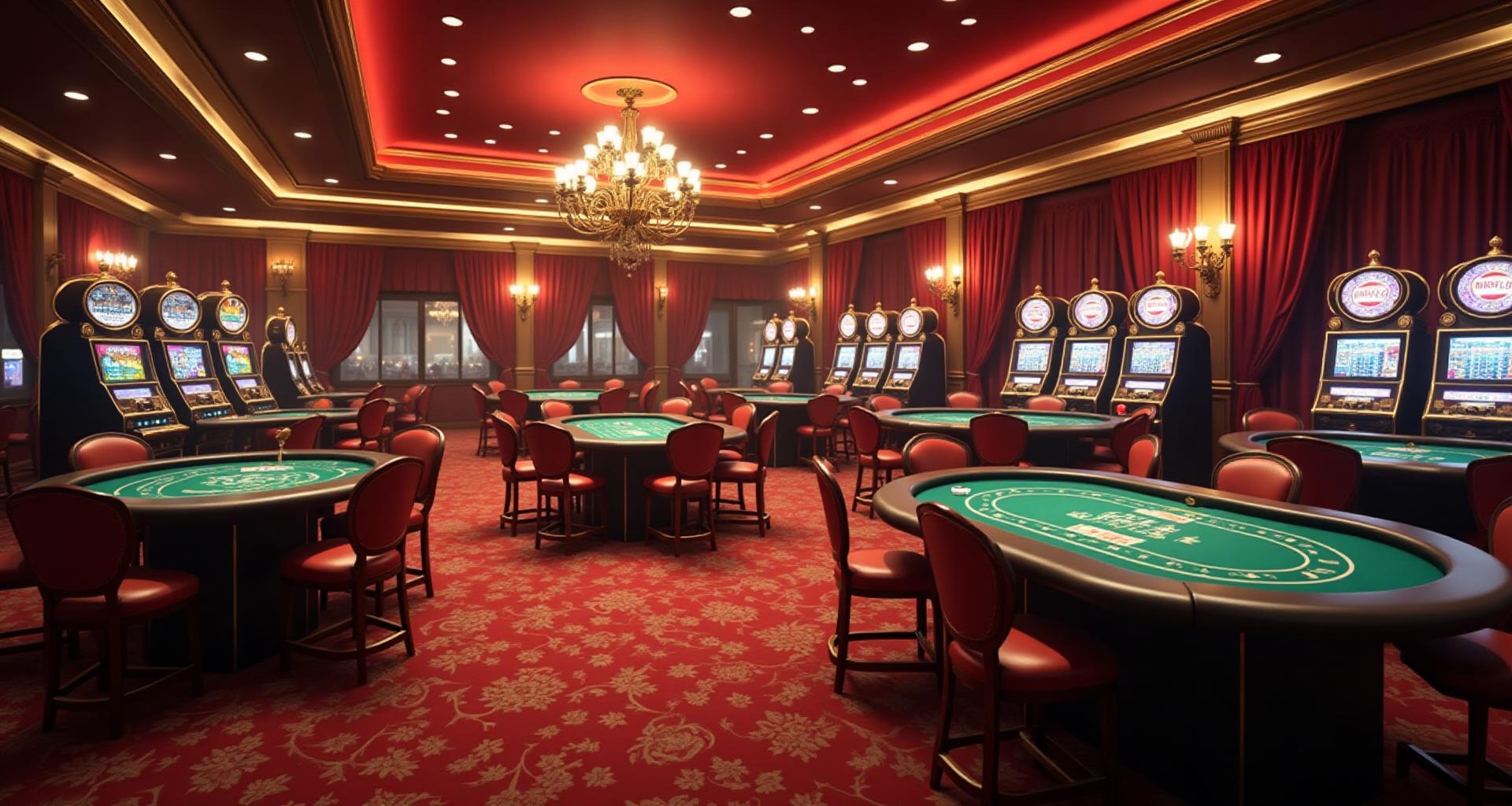
The Night I Lost Track of Time (And $400)
I remember stepping onto a casino floor in Las Vegas for the first time. It was supposed to be a quick walk-through on my way to dinner. Three hours later, I was still there—completely unaware that the sun had set hours ago.
That experience haunted me. Not because of the money (okay, partly because of the money), but because I couldn't understand how I had lost all sense of time. There were no windows. No clocks. The lighting never changed. And the colors... the reds, the golds, the deep blacks... they wrapped around me like a velvet blanket that whispered "stay a little longer."
That night began my obsession with casino color psychology—a field where billions of dollars ride on getting the shade of red exactly right.
The Science of Casino Color Psychology
Before we dive into specific casinos, let's understand the neurological wizardry happening in your brain when you walk onto a casino floor.
How Colors Affect Gambling Behavior
Research published in the Journal of Gambling Studies found that red environments increase betting frequency by up to 12% compared to blue environments. Why? Red triggers physiological responses:
- Elevated heart rate: Red increases pulse by an average of 3-5 BPM
- Heightened arousal: The color signals excitement and urgency
- Risk tolerance: Players in red environments make larger bets
- Time distortion: Warm colors make time feel like it passes faster
Meanwhile, the strategic absence of certain colors matters just as much. You'll rarely find cool blues (the color of calm and relaxation) dominating a casino floor. Blue makes people want to stop and think—exactly what casinos don't want.
The Dopamine-Color Connection
Every jackpot sound, every flashing light, every gold accent is designed to trigger dopamine release. This is why dopamine decor principles apply directly to casino design—though casinos discovered these techniques decades before interior designers gave it a name.
The Three Casino Capitals: Color Philosophies Compared
The world's three gambling capitals—Las Vegas, Monte Carlo, and Macau—each developed distinct color philosophies that reflect their cultural origins and target demographics.
Las Vegas: The Neon Maximalist
Walk down the Las Vegas Strip and you're assaulted by color in the best possible way. Vegas doesn't whisper—it screams.
The Vegas Color Formula:
- Dominant Reds: Vegas Red (#FF0000) appears everywhere, from carpets to signage
- Electric Golds: Jackpot Gold (#FFD700) signals winning and wealth
- Neon Everything: Pinks, purples, teals—nothing is off-limits
- Strategic Black: Creates contrast and frames the bright accents
The philosophy behind Vegas color design is sensory overwhelm. By bombarding visitors with visual stimulation, casinos create a heightened state of arousal that makes everything feel more exciting—including losses.
Famous Vegas Color Moments:
- The Bellagio's lobby uses deep burgundy and cream to signal luxury upon entry
- The Wynn employs rich amber tones that photograph beautifully (hello, Instagram)
- Circus Circus leans into playful purples and yellows to attract families
Monte Carlo: European Restraint
Cross the Atlantic to Monte Carlo, and the color approach flips entirely. The Casino de Monte-Carlo, opened in 1863, pioneered the "old money" aesthetic that luxury casinos worldwide now emulate.
The Monte Carlo Color Formula:
- Monaco Blue: Deep navy (#1B365D) dominates upholstery and walls
- Champagne Tones: Creams and ivories replace harsh whites
- Antique Gold: Warmer, more muted than Vegas gold
- Burgundy Accents: Rich wine tones instead of pure red
The philosophy here is aspirational elegance. Monte Carlo colors say "you belong among royalty." They appeal to players who consider themselves sophisticated—people who want to feel like James Bond, not a tourist.
Macau: Cultural Color Power
Macau overtook Las Vegas as the world's largest gambling destination, and color played a crucial role. Chinese cultural color associations transform the gaming floor:
The Macau Color Formula:
- Lucky Red: Red represents fortune, joy, and success in Chinese culture
- Prosperity Gold: Gold (财 cái - wealth) dominates more than anywhere else
- Ivory/Cream Bases: White is associated with death in Chinese culture, so pure white is avoided
- Jade Green Accents: Green symbolizes prosperity and harmony
Understanding color meanings across cultures is essential for casino designers working internationally. What works in Vegas might offend in Macau, and vice versa.
Why Casinos Avoid Blue and Natural Light
Here's a question that puzzled me for years: why do casinos feel so other? The answer lies in what they deliberately exclude.
The War on Blue
Blue is objectively a popular color—it's calming, trustworthy, and universally liked. So why is it nearly absent from casino floors?
The Anti-Blue Strategy:
- Blue reduces arousal: Studies show blue environments lower heart rate and blood pressure
- Blue promotes rational thinking: Gamblers who think clearly bet less
- Blue signals "stop and rest": Casinos want you moving between machines
- Blue feels cold: Warmth encourages lingering
You will find blue in casino hotels—in spas, pools, and bedrooms where relaxation is the goal. But on the gaming floor? Blue is the enemy.
The Windowless Wonder
Notice that you can't tell if it's 3 PM or 3 AM from inside a casino? That's not an accident.
The Timeless Environment:
- No windows: Natural light creates time awareness
- Constant warm lighting: 2700K-3000K bulbs mimic perpetual golden hour
- No clocks: Removed in the 1970s and never returned
- Consistent temperature: No seasonal or daily variation
The absence of natural light does something remarkable to human perception. Without the sun's movement, our internal clocks drift. That "quick 30 minutes" becomes three hours before we notice.
This connects to the color strategy: warm reds and golds don't just excite—they replicate the feeling of eternal sunset, that magical hour when people naturally feel social and alert.
The Red & Gold Formula: Why It Works
Let's break down the two most important colors in casino design.
Casino Red: The Psychology of Excitement
Red is the most psychologically loaded color in the casino palette. Here's why it dominates:
Neurological Effects:
- Increases metabolic rate by up to 13%
- Triggers fight-or-flight adjacent responses
- Creates perception of time moving faster
- Associated with passion, excitement, and danger
Cultural Universality:
- Western: Excitement, passion, urgency
- Asian: Luck, prosperity, celebration
- Universal: Attention, importance
Different casinos use different reds:
- Vegas Red (#FF0000): Pure, intense, electric
- Casino Crimson (#DC143C): Slightly deeper, more sophisticated
- Lucky Red (#B22222): Warmer, more traditional
- Burgundy (#800020): Luxury positioning, less aggressive
The choice depends on the target demographic. Younger crowds respond to brighter reds; high rollers prefer deeper burgundies that suggest exclusivity.
Gold: The Color of Winners
Gold works alongside red to complete the casino color equation.
Why Gold Works:
- Winner's color: Gold medals, gold trophies, gold rings
- Wealth association: Direct link to actual gold and money
- Warmth without aggression: Unlike red, gold calms while exciting
- Photographs beautifully: Important for modern social media marketing
Gold appears in:
- Jackpot displays: Reinforcing the promise of wealth
- VIP areas: Signaling premium status
- Architectural details: Chandeliers, trim, buttons
- Chip designs: The highest value chips are often gold-colored
The relationship between luxury brand color psychology and casino design is direct. Casinos are, at their core, luxury experiences—they just happen to involve gambling.
Carpet Psychology: The Hidden Design Layer
Here's something most visitors never consciously notice: casino carpets are deliberately, strategically ugly.
The Carpet Strategy:
- Busy patterns hide chips: Dropped chips disappear into complex designs
- Dark colors hide stains: Spilled drinks, cigarette burns, foot traffic
- Low-contrast with chips: Makes it easier to see the gaming tables above
- Psychological "down" signal: Encourages looking UP at the exciting machines
Famous casino carpets have become collector's items. The Imperial Palace's "famous ugly carpet" sold for over $30,000 when the casino renovated. Designers now intentionally create "ugly beautiful" patterns that accomplish all objectives while achieving cult status.
The Color Rule: Use complex, dark, warm-toned carpets that accomplish practical goals while keeping eyes directed toward the gaming action above.
Lighting as Color: The Invisible Palette
Light isn't just illumination in a casino—it's the most powerful color tool available.
Warm Lighting Strategy
Casinos operate almost exclusively in the 2700K-3000K color temperature range.
Why Warm Light Works:
- Flattering skin tones: Players look healthy and attractive
- Comfortable atmosphere: Cool light feels sterile, warm feels welcoming
- Time distortion: Mimics sunset, when people naturally socialize
- Gold enhancement: Makes gold tones glow and sparkle
- Reduced fatigue: Warm light is easier on eyes during long sessions
LED Zone Design
Modern casinos use programmable LED lighting to create distinct zones:
Slot Machine Areas:
- Brighter overall lighting
- Colorful accent lighting (purples, pinks, teals)
- Flashing reward lights
- Lower ceiling heights with more intimate lighting
Table Game Areas:
- Focused spotlight on tables
- Darker surroundings (creates "stage" effect)
- Warmer, more sophisticated tones
- Higher ceilings with grander lighting fixtures
VIP Rooms:
- Very low overall lighting
- Dramatic accent lighting
- Candle-like warmth (sometimes actual candles)
- Personalized lighting controls
The slot machine zone uses neon color psychology to create energy, while table games employ dark mode design principles to create sophistication.
Zone Color Design
A well-designed casino is actually several different environments stitched together, each with its own color strategy.
The Slot Floor
Target Mood: Playful, accessible, energetic
Color Strategy:
- Brightest overall lighting
- Multi-colored LED accents
- Bold patterns and graphics
- Democratic feel—anyone can play
The slot floor is designed to be the most visually stimulating area. Colors change constantly, winner lights flash, and the overall effect is a carnival atmosphere that says "fun is happening here!"
Table Games
Target Mood: Sophisticated, focused, serious
Color Strategy:
- Classic green felt (tradition dating back centuries)
- Wood tones (mahogany, walnut)
- Gold and brass accents
- Darker surroundings that create intimacy
The poker room deserves special mention. That specific shade of green (#0D5E3A, often called "gaming green" or "billiard green") has psychological effects:
- Reduces eye strain: Green is the most restful color for human eyes
- Promotes concentration: Helps players focus on strategy
- Traditional associations: Links to wealth (money), nature (growth), and games (billiards)
- Neutral backdrop: Doesn't interfere with reading other players
VIP and High Roller Rooms
Target Mood: Exclusive, powerful, intimate
Color Strategy:
- Dominated by black and gold
- Minimal distractions
- Highest quality materials
- Personal space and privacy
The color palette shrinks dramatically in VIP rooms. Where the slot floor might use 10+ colors, VIP spaces often use just 3-4. This creates a feeling of exclusivity—you've graduated beyond the colorful chaos of the main floor.
Restaurant and Bar Areas
Target Mood: Reset, refresh, recharge
Color Strategy:
- Contrasting with the gaming floor
- Often uses blues and greens (finally!)
- Warmer, more residential feel
- Creates mental "break" before returning to gaming
Smart casino design creates deliberate color transitions that make non-gaming areas feel like different worlds. This allows guests to psychologically reset before returning to the floor refreshed and ready to play more.
Cultural Lucky Colors in Casino Design
Understanding cultural color associations is critical for international casino design.
Chinese Color Preferences (Macau Focus)
- Red (红 hóng): The luckiest color; represents joy, fortune, and success
- Gold (金 jīn): Wealth and prosperity; the color of money
- Avoid White: Associated with death and mourning
- Avoid Green Hats: A euphemism for infidelity—never put green near heads
- Lucky Number 8: Often incorporated into design through repetition
Macau casinos incorporate these principles everywhere:
- Red dominates carpet and upholstery
- Gold appears in every possible architectural detail
- Cream replaces white wherever possible
- The number 8 appears in patterns and layouts
Western Color Preferences (Vegas/Monte Carlo)
- Green: Lucky in Western tradition (Irish luck, dollar bills)
- Red: Excitement and passion (less luck-focused than in China)
- Black: Sophistication and high-stakes
- Gold: Winner's color, trophy color
This explains why poker tables are green (Western luck) but baccarat tables in Macau often feature red (Chinese luck).
The Ethics of Manipulative Color Design
Let's address the elephant in the room: is all of this... ethical?
Casino design exists to maximize time on premises and money spent. Every color choice is calculated to achieve these goals. The same psychology that makes romantic restaurant design encourage lingering makes casino design encourage continuous play.
The Manipulation Argument:
- Windowless environments exploit circadian rhythm confusion
- Warm colors artificially elevate arousal
- The absence of "calm" spaces removes mental reset opportunities
- Slot machine colors trigger addictive dopamine loops
The Design Argument:
- Adults choose to enter casinos
- Entertainment venues naturally encourage participation
- Similar techniques are used in restaurants, malls, and theme parks
- Responsible gaming initiatives balance the design
The Reality: Modern casinos increasingly incorporate responsible gaming features:
- Clocks in gaming apps
- Self-exclusion programs
- Trained staff for problem gambling identification
- Cool-down zones with deliberately calming colors
The color psychology remains powerful, but the industry has (slowly) acknowledged its responsibility to implement safeguards.
What Hospitality Can Learn from Casinos
You don't need to run a casino to apply these principles. Hospitality venues of all types can learn from decades of casino research.
For Restaurants
Casinos and romantic restaurants share many goals: keeping guests comfortable, creating a sense of timelessness, and encouraging spending.
Applicable Principles:
- Warm lighting (2700K-3000K) flatters guests and creates comfort
- Limited blue in dining areas (save it for the restrooms)
- Strategic red accents increase appetite and excitement
- Gold accents signal premium positioning
For Hotels
Casino hotels have perfected the transition between excitement (gaming floor) and relaxation (guest rooms). Non-casino hotels can apply this thinking:
Applicable Principles:
- Create distinct color zones for different experiences
- Use color transitions to signal psychological shifts
- Bedrooms should contrast with public spaces
- Luxury positioning requires color restraint, not maximalism
For Bars and Lounges
The speakeasy aesthetic that many bars pursue has direct casino lineage.
Applicable Principles:
- Darker environments encourage intimacy
- Gold accents create perceived luxury at any price point
- Warm light makes everyone look better (and drink more)
- Minimal blue keeps energy high
Designing Your Entertainment Venue
Ready to apply casino color psychology to your own project? Here's a framework:
Step 1: Define Your Player (Customer) Type
Are you targeting:
- High rollers → Monte Carlo palette (navy, burgundy, gold)
- Young energizers → Vegas palette (neon, bright red, electric accents)
- Cultural markets → Research specific color preferences
- Luxury seekers → Black and gold minimalism
Step 2: Map Your Zones
Every venue has different zones with different objectives:
- Entry/lobby: First impression colors (usually warmer, welcoming)
- Main experience: Peak excitement colors (red, gold, energy)
- Support areas: Reset colors (can use blues and greens)
- Premium areas: Restrained, exclusive colors (dark neutrals, gold accents)
Step 3: Layer Lighting
Color only exists through light. Plan:
- Ambient lighting: Overall color temperature (usually warm)
- Accent lighting: Colored LEDs for zone differentiation
- Task lighting: Focused light for activities (gaming, dining)
- Effect lighting: Moving lights, pattern projections
Step 4: Test and Iterate
Casino designers extensively test their color choices:
- Focus groups with target demographics
- Behavioral observations
- Revenue correlation analysis
- Time-on-floor metrics
For smaller venues, even informal observation can reveal how colors affect guest behavior.
Conclusion: The Colors That Keep Us Playing
Standing on a casino floor today, I see it differently. That warm embrace I felt on my first Vegas visit wasn't magic—it was the result of a century of color psychology research, billions of dollars in testing, and the cumulative knowledge of how human brains respond to carefully chosen shades of red and gold.
Is it manipulative? Perhaps. Is it effective? Absolutely. And is it beautiful? In its way, yes—there's an artistry to creating environments so perfectly calibrated to human psychology.
Whether you're designing a casino, a restaurant, a hotel, or any hospitality venue, the lessons from Las Vegas, Monte Carlo, and Macau are clear:
Color isn't decoration. It's strategy.
Create Your Casino-Inspired Palette
Ready to apply casino color psychology to your own project? Use our design tools to create palettes that capture the excitement and sophistication of the world's greatest gaming floors:
AI Website Designer - Generate complete entertainment venue websites with strategic color psychology
Color Hierarchy Tool - Plan your 60-30-10 color distribution for maximum impact
Fibonacci Generator - Create mathematically harmonious palettes
Gradient Maker - Build dramatic gradients for luxury effects
The house may always have an edge in gambling, but with the right colors, your venue will always have an edge in design.