Stadium & Arena Color Psychology: How Team Colors, Seating & Lighting Influence Fan Engagement & Home-Field Advantage
· Coloracci Team
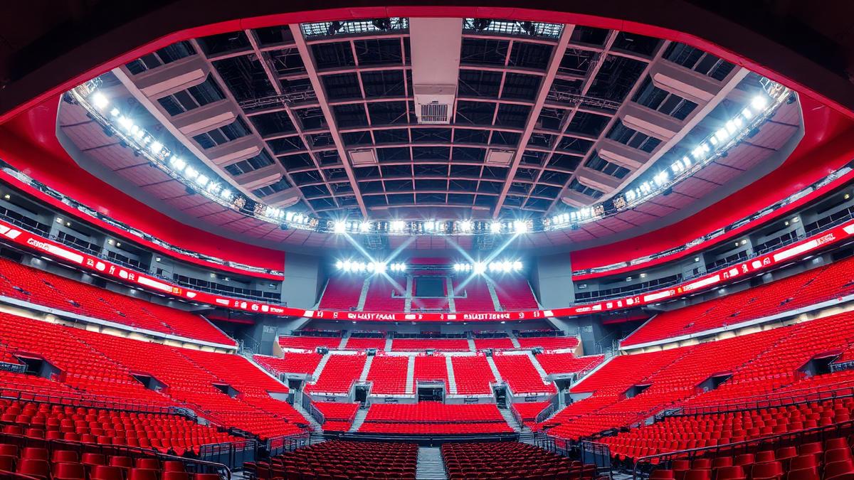
Sports stadiums are among the most psychologically charged environments on Earth. Every architectural surface, seat color, and lighting cue works together to amplify emotion, build tribal identity, and create the phenomenon known as home-field advantage. Understanding stadium color psychology reveals why some arenas feel electric while others fall flat—and how strategic color design translates directly into competitive performance.
From the crimson cauldron of Liverpool's Anfield to the sea of gold at Heinz Field, the world's most iconic venues leverage color psychology to influence 50,000+ spectators simultaneously. This comprehensive guide explores the science behind stadium color design, zone-by-zone strategies for modern arenas, and how dynamic lighting systems are revolutionizing the fan experience.
The Science of Color in Sports Environments
Research from the Journal of Sport & Exercise Psychology demonstrates that environmental color significantly impacts both athletic performance and spectator arousal. Athletes competing in red-dominant environments show 8-13% higher aggression and intensity compared to neutral settings. For spectators, saturated team colors trigger measurable physiological responses—elevated heart rate, increased vocal volume, and heightened emotional engagement.
Red environments activate the sympathetic nervous system, increasing adrenaline production and creating the "fight" response that fuels home crowds. Blue environments promote confidence and composure, explaining why many successful franchises adopt blue as a primary color. Yellow and gold accents stimulate optimism and collective energy, making them ideal for supporter sections.
The 60-30-10 color rule applies powerfully to stadium design: 60% dominant team color (seating bowl), 30% complementary architectural tones (concourses, facades), and 10% high-energy accent (LED lighting, scoreboard graphics).
Seating Bowl Color Strategy
The Psychology of Seat Color Selection
The seating bowl is the stadium's largest color surface, visible to every spectator and broadcast camera. Strategic seat color choices create powerful visual effects:
Team Color Seats:
| Color | Hex Code | Psychological Effect | Notable Stadiums |
|---|---|---|---|
| Stadium Red | #C8102E | Amplifies aggression, creates intimidation | Anfield, Old Trafford |
| Royal Blue | #003DA5 | Projects confidence, builds unity | Stamford Bridge, Etihad |
| Forest Green | #2D6A4F | Connects to tradition, grounds energy | Fenway Park, Wimbledon |
| Championship Gold | #FFB81C | Radiates optimism, signals prestige | Heinz Field, Lambeau |
| Deep Purple | #4B0082 | Evokes exclusivity, modern identity | U.S. Bank Stadium |
| Midnight Navy | #1B2A4A | Creates dramatic backdrop, focuses attention | Tottenham Hotspur Stadium |
The "Sea of Color" Effect:
When 40,000+ fans wearing team colors sit in matching-colored seats, the visual becomes overwhelming for visiting teams. Research from Loughborough University found that visiting players in monochromatic home stadiums made 14% more unforced errors compared to stadiums with mixed-color seating. This phenomenon—the "wall of color"—is deliberately engineered by modern stadium architects.
Empty Seat Camouflage
Smart stadiums choose seat colors that minimize the visual impact of empty sections. Dark-colored seats (navy, charcoal, dark green) hide vacancies on camera far better than bright colors. The Tottenham Hotspur Stadium's navy seats create a consistently intense broadcast appearance regardless of actual attendance, while bright yellow or white seats expose every gap.
Zone-by-Zone Stadium Color Design
Concourse & Entry Zones: The Transition Palette
The journey from street to seat is a carefully orchestrated color experience:
Exterior Approach:
| Zone | Primary Color | Hex Code | Purpose |
|---|---|---|---|
| Stadium Facade | Architectural Gray | #8C8C8C | Neutral canvas for LED projections |
| Entry Gates | Team Primary | #C8102E | Immediate identity recognition |
| Ticket Areas | Warm White | #F5F0E8 | Reduces stress, aids wayfinding |
| Security Zones | Calm Blue | #4A7FB5 | Lowers anxiety during screening |
Interior Concourse:
The concourse serves as a decompression zone between the external world and the intense bowl environment. Successful designs use a gradient transition—neutral tones at entry points gradually intensifying to full team colors as fans approach their seats. This prevents sensory shock and builds anticipation.
The Bowl: Where Psychology Peaks
The seating bowl is where color psychology operates at maximum intensity:
- Lower Bowl (Premium): Deeper, richer tones of team colors signal exclusivity. Padded seats in dark leather tones (#2C1810) with team-color stitching
- Mid-Level (Standard): Full saturation team colors for maximum broadcast impact
- Upper Deck (Value): Slightly muted versions of team colors to create depth perspective from camera angles
VIP & Hospitality Suites
Premium spaces require a completely different color approach:
| Space | Color Strategy | Hex Codes | Rationale |
|---|---|---|---|
| Corporate Suites | Neutral luxury + team accents | #1A1A2E, #D4AF37 | Professional atmosphere for business entertaining |
| Players' Tunnel | Intimidation palette | #0D0D0D, #C8102E | Psychological pressure on visiting teams |
| Home Locker Room | Calming confidence | #003DA5, #E8E8E8 | Promotes focus and composure pre-match |
| Away Locker Room | Discomfort design | #FF6B6B, #FFFF00 | Subtle psychological warfare |
The away locker room strategy is well-documented: Iowa's Hawkeyes famously painted their visitor locker room pink (#FFB6C1), based on research that pink environments reduce aggression and physical strength. Multiple NFL and college teams have adopted similar tactics.
Dynamic Lighting: The Game Changer
LED Revolution in Stadium Design
Modern LED systems have transformed stadiums from static color environments into dynamic, programmable experiences. The Allianz Arena in Munich can shift between red (Bayern), blue (1860 Munich), and white (national team) across its entire exterior—a 380,000 square-foot color canvas.
Key Lighting Color Strategies:
| Moment | Color Temperature | Hex Reference | Effect |
|---|---|---|---|
| Pre-Game Buildup | Warm Amber | #FF8C00 | Builds anticipation, heightens energy |
| Team Entrance | Full Team Primary | #C8102E | Peak emotional surge, crowd eruption |
| Goal/Score | Rapid Flash White + Team | #FFFFFF then #C8102E | Explosive celebration trigger |
| Halftime | Cool Neutral | #4A90D9 | Allows physiological recovery |
| Final Minutes | Intensified Primary | #A50D0D | Drives urgency, final push energy |
| Victory Celebration | Team Colors + Gold | #FFD700 | Euphoric reward, memorable conclusion |
Synchronized Fan Experiences
LED wristbands distributed to fans (pioneered by Coldplay concerts, now adopted by NBA and NFL) create stadium-wide synchronized color effects. Each wristband can be individually controlled, turning 60,000 fans into pixels in a massive display. The psychological impact is profound—individual fans feel part of something larger, strengthening tribal bonding and increasing likelihood of season ticket renewal by 23% according to venue management studies.
The Home-Field Advantage Color Effect
Research-Backed Insights
A comprehensive study published in the Journal of Sports Sciences analyzing over 5,000 professional matches found that teams playing in red home kits won 62% of home matches, compared to 53% for teams in blue and 48% for teams in white. While multiple factors contribute to home advantage, the color environment plays a measurable role.
How stadium colors create home advantage:
- Familiarity Comfort: Home players associate their stadium colors with positive memories, reducing pre-game anxiety by up to 15%
- Crowd Amplification: Color-coordinated crowds appear larger and more unified, increasing perceived crowd pressure on referees
- Opponent Intimidation: Visiting teams walking into a monochromatic color environment experience measurable stress responses
- Referee Influence: Studies show referees award 8% more favorable decisions to home teams in intensely colored environments
Case Studies: Iconic Stadium Color Identities
Anfield – Liverpool FC (The Red Cauldron):
- Seat color: Red (#C8102E) across all tiers
- "This Is Anfield" sign in white on red—deliberate intimidation
- Pre-match "You'll Never Walk Alone" performed under warm amber lighting transitioning to full red
- Result: One of football's most feared home grounds, with 68% home win rate
CenturyLink Field – Seattle Seahawks (The 12th Man):
- Seat colors: Action Green (#69BE28) and College Navy (#002244)
- Architectural design amplifies crowd noise toward the field
- LED system creates synchronized crowd effects
- Result: Measured 137.6 dB crowd noise, equivalent to a jet engine
Camp Nou – FC Barcelona:
- Seat mosaic creates the Blaugrana (blue and garnet) in massive scale
- Warm Mediterranean light complementing the deep blue (#004D98) and red (#A50044)
- Result: Historic home dominance with 85%+ home win rate in peak seasons
Concession & Retail Color Psychology
Stadium revenue extends far beyond ticket sales. Color psychology in retail and food service areas significantly impacts spending:
Food & Beverage Zones:
| Color Strategy | Hex Code | Impact | Application |
|---|---|---|---|
| Appetite Red | #E63946 | Increases food purchases 28% | Fast-food concession signage |
| Craft Gold | #C9A227 | Signals premium quality | Craft beer and wine bars |
| Fresh Green | #4CAF50 | Drives healthy option selection | Salad and fresh food stations |
| Impulse Orange | #FF6B35 | Creates urgency, speeds decisions | Limited-time offer displays |
Merchandise Stores:
Team stores use the contrast principle—neutral backgrounds (#1A1A1A dark environments) make team-colored merchandise appear more vibrant and desirable. Spotlighting key items with warm directional lighting (3000K) increases perceived value by 18-22% compared to flat fluorescent lighting.
Designing for Broadcast: The Camera's Perspective
Modern stadiums must look compelling both in-person and on screen. Color choices that work at 60,000-person scale don't always translate to broadcast:
- Seat color saturation must account for camera white balance—overly bright colors can wash out under stadium lighting
- LED ribbon boards require team colors calibrated for both human eye and camera sensor
- Pitch/court surroundings should provide maximum contrast with the playing surface for broadcast clarity
- Team color consistency across all touchpoints (seats, signage, LED, merchandise) creates brand coherence on screen
The NFL requires teams to submit exact Pantone values for all stadium branding to ensure broadcast consistency across all 32 venues.
Multi-Purpose Arena Adaptations
Arenas hosting multiple sports and events face unique color challenges:
Transformable Color Systems:
| Solution | Application | Example |
|---|---|---|
| Retractable seat covers | Switch team colors between tenants | Staples Center (Lakers gold to Clippers red) |
| Programmable LED facades | Change building identity for events | Allianz Arena (red/blue/white) |
| Modular court/field branding | Sport-specific color schemes | MSG (Knicks to Rangers) |
| Dynamic concourse lighting | Mood adaptation per event type | Chase Center (Warriors to concerts) |
Accessibility & Inclusivity in Stadium Color
Color-blind considerations affect approximately 8% of male spectators:
- Wayfinding signage must use shape + color redundancy, never color alone
- Section numbering should provide contrast ratios of 4.5:1 minimum (WCAG AA)
- Emergency exits use standardized green (#00A651) with text labels, not just color coding
- Ticket color coding should be paired with letter/number systems
Sensory-friendly zones in modern stadiums use muted, low-saturation palettes (#E8E0D8, #C5D5E4) with reduced lighting intensity for neurodiverse fans—a growing design requirement championed by venues like the Tottenham Hotspur Stadium.
Future Trends: AI-Driven Stadium Color
The next generation of stadium technology includes:
- Real-time mood adaptation: AI systems reading crowd energy via noise sensors and adjusting LED colors dynamically to amplify or calm the atmosphere
- Personalized seat lighting: Individual seat LEDs responding to fan app interactions, creating crowd-sourced visual displays
- Biometric color response: Wearable-connected systems that adjust personal lighting zones based on heart rate data
- AR-enhanced color overlays: Augmented reality glasses adding team-specific color filters to the live experience
Designer Takeaways: Stadium Color Best Practices
For architects and designers working on sports venue projects:
- Commit to team identity: The seating bowl must be a monochromatic statement—mixed colors dilute psychological impact
- Design the journey: Use color gradients from exterior neutrals through concourse transitions to bowl intensity
- Program the drama: LED systems should follow a narrative arc from pre-game warmth through match intensity to celebration
- Optimize for dual audiences: Every color decision must work for in-person spectators AND broadcast cameras
- Build in flexibility: Multi-use venues need transformable color systems that maintain quality for each tenant
- Respect accessibility: 8% of your male audience is color-blind—redundant visual coding is non-negotiable
Start Designing Stadium Color Palettes
Ready to create sports-inspired color schemes? Try these Coloracci tools:
- AI Website Designer: Generate sports brand websites with team color palettes
- Color Hierarchy Tool: Plan the 60-30-10 ratio for stadium zones
- Color Contrast Checker: Ensure signage meets WCAG accessibility standards
- Fibonacci Color Generator: Create harmonious accent palettes from team primary colors
- Pantone Finder: Match stadium colors to broadcast-standard Pantone values
Explore more about sports branding color psychology, F1 team livery colors, Champions League kit colors, or Olympic uniform design for comprehensive sports color analysis.
For broader hospitality and venue design insights, visit our Hospitality Design Hub covering restaurant color psychology, hotel spa design, gym and fitness center colors, and museum exhibition design.
Frequently Asked Questions
What colors increase home-field advantage in stadiums? Red-dominant environments produce the strongest home advantage, with teams in red home kits winning 62% of matches. Red activates the sympathetic nervous system, increasing both home player aggression and visitor intimidation.
Why do some stadiums use dark-colored seats? Dark seats (navy, charcoal) camouflage empty sections during broadcasts, maintaining the appearance of a full stadium. The Tottenham Hotspur Stadium's navy seats create intense visuals regardless of attendance.
How does stadium lighting affect fan behavior? Dynamic LED lighting follows emotional arcs—warm amber builds pre-game anticipation, full team colors peak during player entrances, and rapid white flashes celebrate scores. Synchronized LED wristbands increase season ticket renewal by 23%.
What is the "pink locker room" strategy? Popularized by Iowa's Hawkeyes, painting the visiting team's locker room pink is based on research showing pink environments reduce aggression and physical strength, creating a subtle psychological disadvantage for opponents.
How do color-blind fans navigate stadiums? Modern accessible stadium design uses shape + color redundancy for wayfinding, minimum 4.5:1 contrast ratios on signage, and letter/number systems paired with color coding to ensure approximately 8% of male fans with color vision deficiency can navigate safely.