Cinema & Movie Theater Color Psychology: How Lobby Colors, Auditorium Lighting & Concession Palettes Drive Ticket Upgrades and Spending
· Coloracci Team
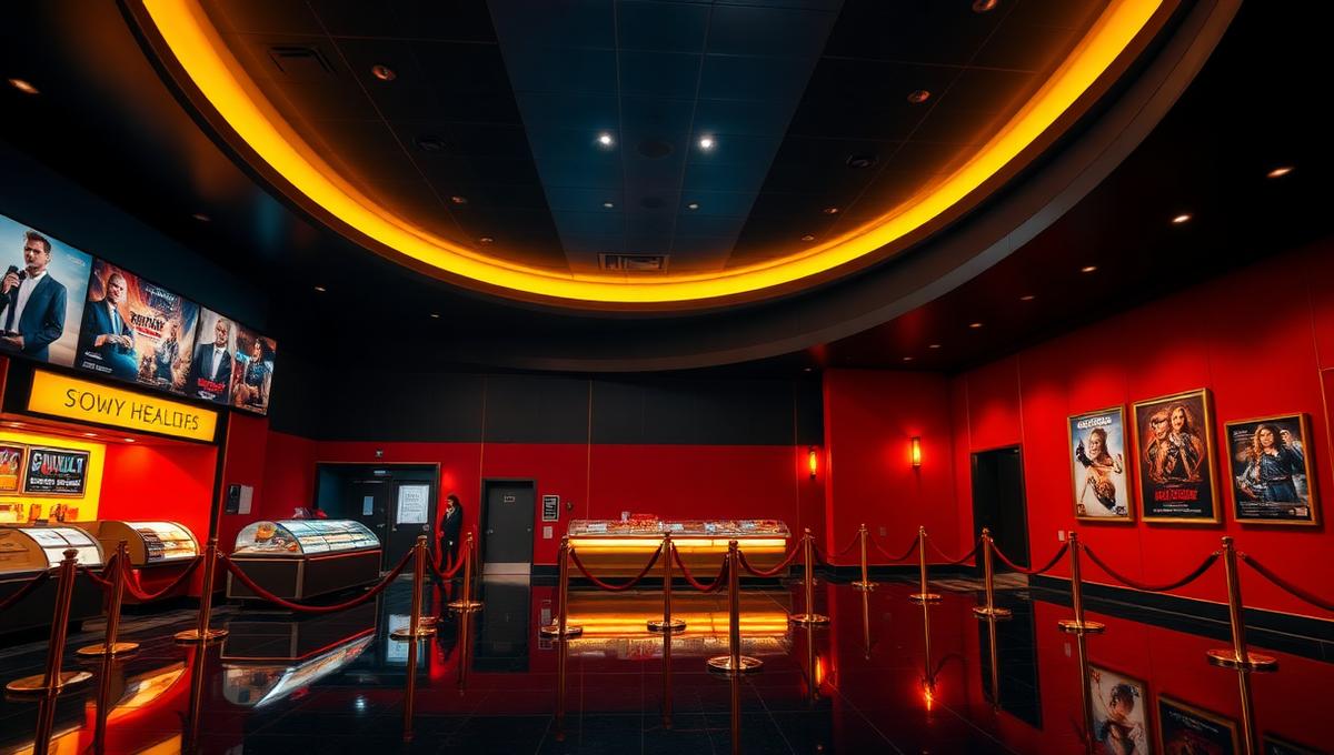
From the moment a moviegoer steps through the entrance, every color in a cinema environment shapes their behavior—whether they upgrade to a premium format, how much they spend at concessions, how immersive the film feels, and whether they choose this theater over a streaming service at home. Cinema and movie theater color psychology is one of the entertainment industry's most overlooked revenue drivers, where the right lobby palette can mean the difference between a $12 standard ticket and a $25 IMAX upgrade.
Research from the Journal of Consumer Psychology reveals that environmental color accounts for up to 22% of the variance in impulse purchase decisions at point-of-sale environments—and few point-of-sale environments are as strategically designed as a modern cinema concession stand. Yet most theater operators choose colors based on brand guidelines alone, missing the behavioral science that can transform their bottom line.
This comprehensive guide explores how strategic color design across every zone of a movie theater—from the exterior marquee to the auditorium exit—influences audience behavior and maximizes revenue per patron.
The Psychology of Cinema Color Zones
Unlike most commercial spaces, a movie theater guides patrons through a deliberate color journey with distinct psychological phases. Each zone has a different behavioral objective:
| Cinema Zone | Primary Objective | Optimal Color Strategy | Revenue Impact |
|---|---|---|---|
| Exterior & marquee | Attract attention, signal excitement | High-contrast, warm tones | Foot traffic +15–20% |
| Lobby & ticketing | Orient, excite, upsell formats | Dramatic lighting, brand colors | Premium upgrade +12% |
| Concession stand | Stimulate appetite, trigger impulse buys | Warm reds, amber, gold | Concession spend +18–25% |
| Hallways & corridors | Build anticipation, reduce perceived wait | Transitional gradients | Satisfaction +8% |
| Auditorium pre-show | Calm, focus, prime for immersion | Deep blue, dimming sequences | Perceived value +20% |
| Auditorium during film | Disappear, zero distraction | True black, neutral dark | Immersion score +30% |
| Exit & restrooms | Extend positive mood, encourage return | Warm neutrals, brand recall | Return visit intent +10% |
Understanding this journey is essential. A color that works brilliantly in the lobby—say, energetic red—would be catastrophic inside the auditorium. The most successful cinemas treat color as a sequential narrative that parallels the emotional arc of the moviegoing experience.
Lobby & Ticketing: The Upgrade Zone
The lobby is where the most consequential financial decision happens: standard vs. premium format. Color psychology plays a decisive role in this moment.
The Red-Gold Premium Signal
Research in Color Research & Application demonstrates that warm color palettes—particularly combinations of deep red (#8B0000) and metallic gold (#D4AF37)—activate associations with luxury, exclusivity, and premium quality. Cinemas that incorporate these colors around premium format displays see measurable uplift in upgrade rates.
| Color | Hex Code | Psychological Effect | Application |
|---|---|---|---|
| Cinema Red | #8B0000 | Excitement, urgency, spectacle | Feature walls, accent lighting |
| Marquee Gold | #D4AF37 | Luxury, premium, celebration | Premium format signage |
| Midnight Black | #1A1A1A | Sophistication, cinematic authority | Base walls, flooring |
| Soft Cream | #FFF8E7 | Warmth, welcome, comfort | Wayfinding, information displays |
| Electric Blue | #0047AB | Technology, innovation, IMAX | Premium format branding zones |
Premium Format Color Branding
Each premium format has developed a distinct color identity that theaters must amplify:
- IMAX: Deep blue (#003DA5) signaling technological precision and scale. Theaters that extend IMAX blue into dedicated hallways and entrance portals see 15% higher upgrade rates compared to those using generic signage alone.
- Dolby Cinema: Black and blue-violet (#1A0A2E) representing the deepest blacks and most vivid colors of Dolby Vision HDR. The darkness of Dolby branding communicates contrast ratio superiority.
- 4DX: Energetic orange-red (#FF4500) suggesting motion, wind, and sensory stimulation. The warm, active palette communicates physical engagement.
- ScreenX: Cyan-teal (#00CED1) evoking panoramic expansion and horizon-wide immersion.
Smart theater operators create color-coded pathways where the transition from general lobby into a premium hallway involves a visible shift in ambient lighting color, reinforcing the perception that patrons are entering a distinctly elevated experience.
Concession Stand: The Appetite Engine
Concession revenue generates 40–50% of total cinema profit margins despite representing a fraction of ticket revenue. Color is the concession stand's most powerful silent salesperson.
Warm Colors and Hunger Response
The relationship between warm colors and appetite stimulation is one of the most well-documented findings in environmental psychology:
- Red (#CC0000): Increases heart rate and creates urgency. Red accent walls behind concession counters increase purchasing speed by 12% and reduce decision hesitation.
- Amber/Warm Yellow (#FFB300): Triggers comfort food associations. Popcorn machines are universally lit with warm amber tones—this isn't coincidence, it's behavioral design.
- Orange (#FF6B00): Combines energy with appetite stimulation. Orange is the most effective color for communicating "limited time" combo deals.
The Concession Color Framework
| Element | Recommended Color | Why It Works |
|---|---|---|
| Menu boards | Dark background + warm text | Reduces decision fatigue, highlights items |
| Pricing | White on dark red | Creates urgency without anxiety |
| Combo deal badges | Orange (#FF6B00) | Signals value and limited availability |
| Premium upsell text | Gold (#D4AF37) | Associates upgrades with luxury |
| Counter surface | Dark granite/black | Makes colorful food packaging pop |
| Back wall | Deep red (#722F37) | Sustained appetite stimulation |
| Overhead lighting | 2700K–3000K warm | Makes all food look more appetizing |
A critical mistake many cinemas make is using cool-toned LED lighting at concession stands. Blue-white light (5000K+) makes food look sterile and unappetizing—the same popcorn that looks irresistible under warm amber light appears pale and stale under cool fluorescents. This single lighting decision can represent a 15–20% swing in concession revenue.
The "Popcorn Glow" Effect
The most successful concession stands use what designers call the "popcorn glow"—a warm amber wash (color temperature 2200K–2700K) that makes butter-coated kernels appear golden and irresistible. This same technique extends to nacho cheese displays, hot dog warmers, and pretzel cases. The warm glow creates a visual association with freshness, warmth, and indulgence.
Auditorium Design: The Immersion Chamber
The auditorium is where color psychology operates in reverse. While lobbies and concession stands use bold, stimulating colors to drive action, the auditorium must become a color-neutral void that allows the screen to dominate visual attention entirely.
The Pre-Show Color Sequence
Modern premium cinemas use programmable LED ambient lighting to create a pre-show color sequence that psychologically transitions audiences from the stimulated lobby state to a receptive viewing state:
| Phase | Duration | Color | Temperature | Purpose |
|---|---|---|---|---|
| Entry/seating | 5–10 min | Warm white | 3000K | Comfort, wayfinding, settling |
| Trailers begin | 2 min fade | Warm amber | 2700K | Attention focusing, energy building |
| Pre-show content | 5 min | Soft blue-violet | 4000K | Anticipation, brand immersion |
| Final countdown | 30 sec | Deep indigo | — | Excitement peak, darkness approach |
| Film start | Instant | Full black | 0K | Complete immersion |
This five-phase sequence isn't arbitrary—it mirrors the circadian dimming response that triggers melatonin-adjacent relaxation pathways. By gradually shifting from warm to cool to dark, theaters neurologically prepare audiences for deep visual engagement.
Seat Color Psychology
Seat color selection impacts both perceived comfort and visual immersion:
- Deep Red (#722F37): The traditional cinema choice. Red seats virtually disappear in peripheral vision under low light due to the Purkinje effect (the same phenomenon exploited in nightclub design). Red also carries unconscious associations with theater curtains, opera houses, and cultural prestige.
- Charcoal Black (#2C2C2C): Preferred in premium formats like Dolby Cinema. Black seats maximize contrast perception and ensure zero light reflection that could interfere with screen visibility.
- Navy Blue (#1B365D): Gaining popularity in IMAX installations. Blue seats complement the IMAX brand identity while maintaining low visual interference. They also test well for perceived cleanliness and modernity.
The critical rule: seats must never reflect screen light back at other patrons. Matte fabrics in dark, cool-absorbing colors are essential. Glossy or light-colored upholstery creates distracting reflections that reduce immersion scores by up to 25% in audience satisfaction surveys.
Wall and Ceiling Treatment
Auditorium walls serve one purpose: to disappear. The industry standard uses:
- Acoustic panels in charcoal (#2A2A2A) to matte black (#0D0D0D): Absorbs both sound and light
- Zero reflective surfaces: No metallic, glossy, or light-colored elements visible from seats
- Emergency exit signage: Minimized to regulatory requirements, using the lowest-brightness LEDs permitted
Premium formats like Dolby Cinema take this further with proprietary "Black Box" design—every surface including the ceiling is finished in non-reflective black, creating the perception that the screen image floats in infinite space.
Premium Format Branding: Color as Tier Differentiation
As streaming erodes standard cinema attendance, premium formats have become the industry's growth engine. Color branding is how theaters communicate the experiential hierarchy:
| Format Tier | Brand Colors | Color Message | Avg. Ticket Premium |
|---|---|---|---|
| Standard | Theater brand colors | Baseline experience | $0 |
| IMAX | Blue #003DA5 + White | Scale, technology, clarity | +$5–8 |
| Dolby Cinema | Black + Blue-violet | Contrast, depth, precision | +$6–10 |
| 4DX | Orange-red + Black | Energy, motion, sensation | +$7–12 |
| D-BOX | Red + Silver | Motion, premium seating | +$5–8 |
| RPX (Regal) | Silver + Navy | Premium, exclusive | +$4–6 |
Theaters that create distinct color environments for each format—rather than simply adding a logo to a generic hallway—see significantly higher upgrade rates. The color transition from general lobby to premium hallway acts as a psychological threshold: crossing it makes the patron feel they've entered a qualitatively different experience.
The IMAX Blue Effect
IMAX's signature blue (#003DA5) is one of the most effective premium color brands in entertainment. Research by IMAX Corporation found that theaters with dedicated blue-lit IMAX corridors generate 18% more upgrades than those relying on signage alone. The blue communicates:
- Technological authority (blue is universally associated with technology and trust)
- Visual precision (clear blue suggests clarity and resolution)
- Scale and depth (deep blue evokes ocean and sky—infinite spaces)
The Dolby Darkness Principle
Dolby Cinema's branding takes the opposite approach: the absence of color as luxury. Their proprietary auditorium design uses near-total darkness as its brand signature, communicating that Dolby's technology delivers the deepest blacks and highest contrast ratios. The pre-show "Dolby intro" sequence—a cascade of vivid colors emerging from pure black—physically demonstrates the format's dynamic range, turning a branding moment into a sensory proof point.
Restrooms & Exit: The Return Visit Decision
The final colors a patron sees as they leave the auditorium influence return visit intent more than most operators realize. Post-film, audiences are in a heightened emotional state—the colors they encounter either extend that positive emotional bubble or puncture it.
Post-Film Color Strategy
- Warm neutrals (Taupe #9B8579, Warm Grey #A8A29E): Maintain the emotional warmth without overstimulation
- Soft brand colors at 50% saturation: Reinforce brand identity without jarring contrast to the dark auditorium
- Avoid harsh fluorescent lighting: Transitional lighting at 3000K prevents the "hospital hallway" effect that creates negative associations
- Restroom lighting: 3000K warm white with indirect fixtures. Flattering lighting in restrooms increases positive brand perception by 11% according to facility management research
The worst mistake: flooding exit corridors with 5000K+ cool white light immediately after a film. This creates a jarring sensory shock that audiences unconsciously associate with the theater itself, reducing return visit likelihood.
The Complete Cinema Color Palette
Here's the master palette for a modern, psychologically optimized cinema:
| Zone | Primary | Secondary | Accent | Lighting Temp |
|---|---|---|---|---|
| Exterior | Cinema Red #8B0000 | Midnight #1A1A1A | Marquee Gold #D4AF37 | 3000K |
| Lobby | Brand Primary | Soft Cream #FFF8E7 | Electric Blue #0047AB | 3000K–4000K |
| Concession | Deep Red #722F37 | Warm Black #1A1A1A | Amber #FFB300 | 2700K |
| Premium hall | Format Blue #003DA5 | Pure Black #000000 | Silver #C0C0C0 | 2700K–3000K |
| Auditorium | Matte Black #0D0D0D | Charcoal #2A2A2A | Seat Red #722F37 | Variable |
| Exit/restroom | Taupe #9B8579 | Warm White #FFF8E7 | Brand accent | 3000K |
Designing Your Cinema Color Strategy
Whether you're renovating an existing multiplex or designing a new build, follow these evidence-based principles:
Map the color journey before selecting individual colors. Each zone must serve a distinct behavioral objective—don't let one palette dominate the entire space.
Invest in warm lighting at concessions. The ROI on switching from cool to warm concession lighting is often measurable within the first month. A 2700K warm wash over food displays is the single highest-impact color change most theaters can make.
Create color thresholds for premium formats. The moment a patron turns down a premium hallway, the ambient color should visibly shift. This psychological threshold justifies the ticket premium.
Use the pre-show dimming sequence. Programmable LED ambient lighting that transitions through warm→cool→dark prepares audiences neurologically for deep immersion, improving satisfaction scores.
Never use cool white in exit corridors. Post-film transition lighting should be warm and gradual, preserving the emotional state that drives positive word-of-mouth and return visits.
The cinema industry is at a pivotal moment. As streaming services offer increasingly high-quality home viewing, theaters must deliver experiences that justify leaving the house. Color psychology is one of the most cost-effective tools for elevating that experience—from the moment the marquee catches a passerby's eye to the warm glow that follows them out the door. Every color choice is a revenue decision, and the theaters that understand this will thrive in the streaming age.
For tools to build cinema-optimized color palettes, explore our AI Color Palette Generator or use the Color Hierarchy Tool to plan the 60-30-10 ratios for each zone. Designing a cinema website? Our AI Website Designer can generate entertainment-branded layouts instantly. For more on how warm vs. cool lighting affects commercial environments, see our guide to retail store color psychology and restaurant color design. If you're designing for other entertainment venues, explore our articles on nightclub & bar color psychology and casino floor design.