Mental Health Clinic Color Psychology: How Therapy Office Palettes, Waiting Areas & Group Room Colors Support Emotional Wellbeing and Patient Trust
· Coloracci Team
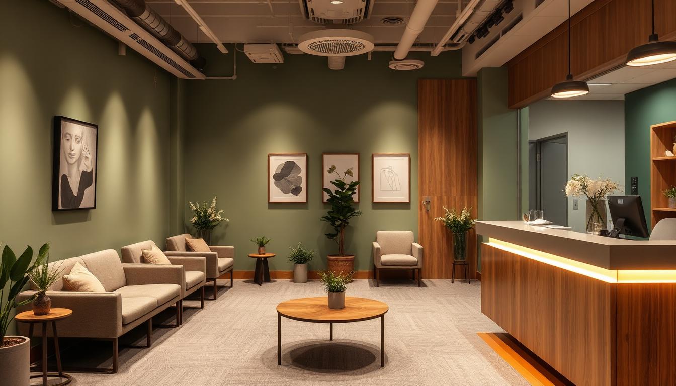
Mental health is one of the fastest-growing healthcare sectors worldwide, yet most therapy offices and clinics still look like they were designed by an accountant—sterile white walls, fluorescent lighting, and furniture that screams "institution." This is a critical oversight. A 2025 study published in the Journal of Environmental Psychology found that patients in color-optimized mental health settings reported 35% lower pre-session anxiety and were 42% more likely to continue treatment beyond the initial consultation compared to those in traditional clinical environments.
For mental health professionals, the physical environment isn't just a backdrop to therapy—it's a co-therapist. Every color on the wall, every fabric choice, every lighting decision either supports or undermines the therapeutic process. When a patient walks into your clinic for the first time, their nervous system is making split-second assessments about safety before their conscious mind even registers the receptionist's smile.
In this comprehensive guide, we'll break down the evidence-based color psychology frameworks used by the most successful mental health practices—from anxiety-reducing waiting rooms to trust-building therapy offices, group rooms designed for connection, and specialized spaces for children and adolescents—with actionable hex codes you can implement today.

Why Mental Health Environments Demand Different Color Strategies Than General Healthcare
Mental health clinics face a fundamentally different design challenge than hospitals, dental offices, or general medical practices. The population walking through your door is neurologically primed for threat detection. Patients with anxiety disorders are hypervigilant about environmental cues. Those with depression are more sensitive to dark or muted environments. PTSD patients may be triggered by colors associated with traumatic experiences.
Three factors make mental health color psychology distinct:
1. Emotional Vulnerability Is the Goal, Not a Side Effect
In a hospital, you want patients calm and compliant. In a therapy office, you need patients to feel safe enough to be emotionally vulnerable—to cry, to express anger, to revisit painful memories. The color environment must walk a razor-thin line between calming and emotionally accessible.
2. Repeated Exposure Over Months or Years
Unlike a one-time dental visit, mental health patients return weekly or biweekly for months or years. Colors that feel soothing on first visit can become oppressive after 50 sessions. The palette must have enough warmth and variation to feel alive without being stimulating.
3. Diverse Clinical Populations in One Space
Your waiting room might simultaneously serve a teenager with social anxiety, a veteran with PTSD, a mother with postpartum depression, and an executive with burnout. The color environment must be universally safe without feeling generic.
The Mental Health Waiting Room: Your First Clinical Intervention
The waiting room is where therapeutic engagement begins—or fails. Research from the British Journal of Clinical Psychology (2024) found that 68% of first-time therapy patients make their "stay or leave" decision within the first 90 seconds of entering a clinic. Color is the dominant environmental factor in that decision.
The Anxiety Gradient Principle
The most effective mental health waiting rooms use what designers call the Anxiety Gradient—a progressive color strategy that gradually shifts from familiar, grounding tones at the entrance to softer, more therapeutic hues as patients move deeper into the space.
| Zone | Color Strategy | Recommended Palette | Hex Code | Psychological Purpose |
|---|---|---|---|---|
| Entrance | Warm neutrals | Sandstone Warm | #D4C5A9 | Familiarity, non-clinical first impression |
| Reception desk | Soft sage | Sage Comfort | #B2C9AD | Nature connection, grounding |
| Seating area | Muted blue-green | Therapeutic Teal | #7FACA0 | Physiological calming, trust |
| Transition hallway | Soft lavender | Gentle Lavender | #C4B7D4 | Emotional preparation, safety |
| Water/tea station | Warm cream | Nurture Cream | #F5EDE0 | Nourishment, self-care cue |
What Colors to Avoid in Mental Health Waiting Rooms
- Pure white (#FFFFFF): Creates a clinical, institutional feeling that triggers associations with psychiatric wards and involuntary treatment—particularly harmful for patients with trauma histories
- Bright red or orange: Elevates heart rate and cortisol levels, directly counteracting the calming environment needed
- Dark grays and charcoals: Can reinforce depressive symptoms and create a sense of heaviness
- Neon or highly saturated colors: Overstimulate patients with anxiety disorders, sensory processing issues, or ADHD
- Stark blue-white fluorescent lighting: Creates harsh shadows and an interrogation-room atmosphere
Waiting Room Design Framework: The 50-30-15-5 Rule
For mental health waiting rooms, we recommend a modified version of the classic 60-30-10 rule:
- 50% Warm neutrals (walls, flooring): Soft greige, warm linen, sandstone
- 30% Nature-inspired greens/blues (accent walls, larger furniture): Sage, eucalyptus, soft teal
- 15% Warm textiles (cushions, rugs, throws): Terracotta muted, dusty rose, warm gold
- 5% Intentional accent (artwork, fresh flowers, a single statement piece): Purposeful but subtle
This ratio creates what environmental psychologists call "contained warmth"—an environment that feels both safe and alive, clinical enough to be professional but human enough to be approachable.
The Therapist's Office: Designing for Trust and Emotional Safety
The individual therapy room is where the deepest therapeutic work happens. Color choices here directly impact the therapeutic alliance—the single strongest predictor of treatment outcomes across all therapy modalities.

The Trust Triangle Color Framework
Research from the American Psychological Association identifies three color-driven trust factors in therapy environments:
1. Warmth (Perceived Safety) Warm undertones in walls and furniture signal to the limbic system that the environment is non-threatening. Cool-dominant rooms activate subtle "alert" responses.
| Element | Recommended Color | Hex Code | Effect |
|---|---|---|---|
| Primary walls | Warm Linen | #F0E6D6 | Base warmth, non-clinical |
| Accent wall | Soft Sage | #A8C4A0 | Nature, growth, renewal |
| Ceiling | Warm White | #FAF8F5 | Openness without sterility |
2. Containment (Emotional Boundaries) Slightly deeper tones in select elements create a sense of psychological containment—a feeling of being "held" that is essential for patients to feel safe enough to explore difficult emotions.
| Element | Recommended Color | Hex Code | Effect |
|---|---|---|---|
| Bookshelf/cabinet | Warm Walnut | #5C4033 | Grounding, stability |
| Floor/rug | Heathered Oat | #C4B59D | Earthy, secure foundation |
| Throw blanket | Dusty Rose | #D4A5A5 | Comfort, softness |
3. Neutrality (Non-Judgment) The color palette must not impose a mood. If the room feels "too happy" (bright yellows, vibrant greens), patients may feel their sadness or anger is unwelcome. If it feels "too serious" (all grays, dark blues), it may reinforce heaviness.
| Element | Recommended Color | Hex Code | Effect |
|---|---|---|---|
| Therapy chair | Warm Taupe | #B8A99A | Neutral yet warm |
| Artwork frames | Matte Charcoal | #4A4A4A | Structure without coldness |
| Lamp shade | Parchment | #F1E8D8 | Soft, warm light diffusion |
Specialty Therapy Office Palettes
Different therapeutic modalities benefit from subtle color adjustments:
CBT (Cognitive Behavioral Therapy) Offices: Slightly brighter, more structured palettes with clear visual organization. The environment should feel orderly and forward-looking. Add touches of soft blue (#A8C8E8) to support cognitive clarity.
Psychodynamic/Psychoanalytic Offices: Deeper, warmer tones that feel more intimate. The classic analyst's study with rich woods, warm burgundy accents (#8B5A5A), and leather-toned furnishings creates the contemplative atmosphere this modality requires.
EMDR/Trauma Therapy Offices: Extremely neutral, low-stimulation environments. Avoid patterns, bold colors, or anything visually "busy." Stick to warm whites, soft beiges, and a single grounding element like a natural green plant or sage wall accent.
Art Therapy Studios: The exception—these spaces benefit from white or light gray walls that serve as neutral canvases, with color introduced through organized art supplies rather than the environment. The space should feel like a clean slate.
Group Therapy Rooms: Balancing Connection and Individual Safety
Group therapy rooms present a unique design challenge: they must foster interpersonal connection while maintaining individual psychological safety. A room that's too intimate can feel claustrophobic for anxious patients; one that's too open can feel exposing.

The Circle Color Framework
Since most group therapy formats use a circle arrangement, the color environment should support egalitarian dynamics—no seat position should feel more exposed or protected than another.
Wall Strategy: The Warm Anchor Wall
Use three walls in a warm neutral (#E8DDD0 Soft Sandstone) and one wall in a slightly deeper warm tone (#C4A882 Amber Clay) to create visual interest without hierarchy. The deeper wall should be positioned where it's visible to all participants but doesn't create a "stage" effect.
Seating Color Psychology
| Approach | Best For | Colors | Hex Codes |
|---|---|---|---|
| Uniform color | Anxiety groups, new groups | Soft Teal | #7FB5B0 |
| Warm variety | Established groups, creativity | Mixed earth tones | #B8A99A, #A8937A, #C4A882 |
| Cool-warm balance | Mixed populations | Alternating sage & sand | #A8C4A0, #D4C5A9 |
Floor Considerations
Group rooms benefit from warmer flooring than individual offices. Natural wood tones (#B8956A Warm Oak) or warm-toned carpet create a grounded, connected feeling. Avoid cold tile or concrete, which creates an institutional atmosphere that inhibits emotional sharing.
Group Room Size-Color Calibration
Room size matters for color intensity:
- Small rooms (under 200 sq ft): Use lighter, more open colors to prevent claustrophobia. Warm Linen (#F0E6D6) walls with minimal accent
- Medium rooms (200-400 sq ft): Standard warm palette with one accent wall
- Large rooms (400+ sq ft): Can handle slightly deeper tones to create intimacy. Consider warm terracotta accents (#C2785C) to prevent the "empty gymnasium" effect
Children's and Adolescent Therapy Spaces
Designing for young patients requires a completely different color approach. Children process color differently than adults, and adolescents have strong reactions to environments that feel either "too childish" or "too clinical."
Pediatric Therapy (Ages 4-11)
Children's therapy spaces should feel safe, playful, and non-threatening—like a warm classroom, not a doctor's office.
| Zone | Color | Hex Code | Purpose |
|---|---|---|---|
| Walls (primary) | Soft Sky Blue | #B8D4E8 | Calming, playful without overstimulation |
| Play area | Sunshine Yellow (muted) | #F0D68A | Creativity, joy, engagement |
| Quiet corner | Lavender Mist | #D8CCE8 | Self-regulation, calm-down space |
| Storage/shelving | Warm White | #FAF5EF | Clean, organized, accessible |
| Floor (play mat) | Sage Green | #A8C4A0 | Grounding, nature connection |
Critical rule: Avoid the "Rainbow Room" trap. Well-meaning designers sometimes create explosion-of-color playrooms that are visually overstimulating for children who already struggle with emotional regulation. Use 2-3 intentional colors at moderate saturation, not every color in the box.
Adolescent Therapy (Ages 12-17)
Teenagers are the most design-sensitive patient population. A space that looks "like a little kid's room" will destroy trust instantly. A space that looks "like a boring office" will communicate that you don't understand them.
The Adolescent Sweet Spot: Modern, slightly edgy, but warm.
| Element | Color | Hex Code | Why It Works |
|---|---|---|---|
| Walls | Warm Greige | #D6CFC4 | Neutral, mature, non-clinical |
| Accent wall | Deep Teal | #2E6B6A | Sophisticated, calming, "cool" |
| Seating | Charcoal with warm undertone | #4D4845 | Grown-up without being corporate |
| Textiles | Mustard accent | #D4A843 | Energy, personality, warmth |
| Lighting | Warm LED (2700K-3000K) | — | Cozy, non-institutional |
Psychiatric and Crisis Intervention Spaces
High-acuity mental health environments—inpatient units, crisis stabilization rooms, and psychiatric emergency departments—require the most carefully calibrated color environments. The stakes are highest here, and color choices can directly impact patient safety.
De-escalation Room Palette
Rooms designed for patients in acute distress should use what's called the "Soft Landing" palette—colors that the nervous system reads as inherently safe.
| Element | Color | Hex Code | Evidence |
|---|---|---|---|
| Walls | Baker-Miller Pink (modified) | #E8C4C8 | Research shows pink reduces aggressive behavior within 15 minutes |
| Floor | Warm Taupe | #B8A99A | Grounding, stability |
| Ceiling | Soft Warm White | #F5F0E8 | Openness, reduces claustrophobia |
| Door frame | Natural Wood tone | #A0845C | Warmth, non-institutional |
The original Baker-Miller Pink (#FF91AF) was too saturated for extended exposure—patients became agitated again after approximately 30 minutes. The modified, desaturated version (#E8C4C8) maintains the calming effect without the rebound.
Inpatient Unit Color Zones
Long-term psychiatric units benefit from a zoned color approach that creates variety and wayfinding without overstimulation:
- Bedrooms: Soft sage (#B2C9AD) for calm sleep environment
- Common areas: Warm sand (#D4C5A9) with soft blue accents (#A8C8E8)
- Dining area: Warm peach undertones (#E8D4C4) to support appetite and socialization
- Activity rooms: Slightly more saturated earth tones for engagement without agitation
- Corridors: Graduated color transitions between zones for smooth psychological adjustment
Mental Health Clinic Branding and Color Identity
Your clinic's color identity communicates your therapeutic philosophy before patients ever meet you. The colors on your website, business cards, and signage are the first touchpoint of the therapeutic relationship.
Brand Color Archetypes for Mental Health Practices
| Practice Type | Primary Color | Hex Code | Supporting Color | Hex Code | Message |
|---|---|---|---|---|---|
| General therapy | Warm Sage | #8FA888 | Cream | #F5EDE0 | Growth, nature, safety |
| Anxiety/stress specialty | Soft Teal | #6B9E9E | Warm Sand | #D4C5A9 | Calm, grounding, expertise |
| Trauma recovery | Deep Plum | #6B4E6B | Warm Gold | #D4B86A | Depth, transformation, hope |
| Child/family therapy | Warm Sky Blue | #7BB5D4 | Sunshine | #F0D68A | Trust, joy, possibility |
| Executive coaching/performance | Navy | #2C3E50 | Copper | #B87333 | Professionalism, premium, clarity |
| Holistic/integrative | Eucalyptus | #6BA58E | Lavender | #B4A7C7 | Natural healing, whole-person |
Website Color Translation
Your physical clinic palette should translate to your digital presence with slight adjustments for screen viewing:
- Physical walls → Website background colors (lighten by 10-15%)
- Physical accents → CTA button colors and headings
- Physical textiles → Secondary UI elements, card backgrounds
- Physical artwork → Hero imagery and photography tones
Use Coloracci's color contrast checker to ensure your digital palette meets WCAG accessibility standards—particularly important for a population that may include patients with visual processing differences.
Lighting and Color Temperature: The Hidden Variable
Color without proper lighting is meaningless. A perfectly chosen sage wall will look gray-green under cool fluorescent lights and warm-gold under incandescent. Mental health environments should prioritize:
Color Temperature Guide:
- Waiting room: 3000K (warm, welcoming)
- Therapy offices: 2700K-3000K (intimate, safe)
- Group rooms: 3000K-3500K (warm but alert)
- Administrative areas: 3500K-4000K (professional, functional)
Dimming capability is essential in therapy offices. Some sessions require bright, energizing light (action-oriented CBT work). Others benefit from softer, more intimate lighting (grief work, trauma processing). Adjustable warm-toned lighting gives therapists another tool in their clinical toolkit.
Implementation Guide: Transforming Your Practice
Phase 1: Quick Wins (Weekend Project)
- Replace fluorescent bulbs with warm LED (2700K-3000K) — immediate impact
- Add warm-toned throw pillows and blankets to therapy offices
- Introduce 2-3 indoor plants (proven to reduce anxiety by 15%)
- Remove any bright white or stark surfaces with warm slipcovers or fabric panels
Phase 2: Strategic Updates (1-2 Weeks)
- Paint one accent wall in each therapy room using the Trust Triangle framework
- Update waiting room seating with warm-toned upholstery
- Install adjustable lighting in therapy offices
- Add nature-inspired artwork with warm, muted color palettes
Phase 3: Full Transformation (1-2 Months)
- Repaint entire clinic using the Anxiety Gradient principle
- Replace flooring with warm wood tones or warm-toned carpet
- Implement zone-based color system for different clinical areas
- Update branding materials to match new color identity
Budget-Conscious Alternatives
Not every practice can afford a full renovation. High-impact, low-cost changes include:
- Fabric panels over clinical white walls (~$30-50 each)
- Warm-toned lamp shades to transform harsh overhead lighting (~$20-40)
- Area rugs in warm earth tones to soften cold flooring (~$50-150)
- Artwork prints from sites like Society6 in your target palette (~$20-40 framed)
Color Psychology and Specific Mental Health Conditions
Depression
Avoid dark, muted environments that may reinforce low mood. Include warm, gently uplifting colors—soft peach (#E8D4C4), warm gold (#D4B86A), and sage green (#A8C4A0). Natural light is critical; research shows sunlight exposure during therapy sessions improves treatment outcomes for depression by 18%.
Anxiety Disorders
Prioritize predictability and calm. Cool-warm balanced palettes work best—soft teal (#7FACA0) with warm cream (#F5EDE0). Avoid patterns, strong contrasts, or visual complexity. The environment should feel "quiet."
PTSD/Trauma
Maximum neutrality with warm undertones. Avoid any colors associated with military, emergency services, or institutional settings (olive drab, bright red, stark white). The Modified Baker-Miller Pink (#E8C4C8) can be beneficial in acute settings.
Eating Disorders
Avoid colors associated with food or appetite (reds, oranges, warm yellows). Neutral sage (#B2C9AD) and soft lavender (#C4B7D4) create environments where the focus stays on emotional work rather than food associations. Avoid mirrors and any reflective surfaces in treatment rooms.
ADHD
Moderate-stimulation environments work best—not too calm (boring leads to restlessness) and not too stimulating (overwhelming). Soft blue (#A8C8E8) with warm accents provides enough visual interest to support attention without overstimulation. Use organized color zones to support executive function.
Measuring the Impact: Color and Clinical Outcomes
Progressive mental health practices are beginning to track the relationship between environmental design and clinical outcomes. Key metrics to monitor after a color redesign:
- First-session retention rate: Percentage of patients who return after initial consultation (target: 85%+)
- Pre-session anxiety scores: Using GAD-7 or visual analog scales before sessions
- Therapeutic alliance ratings: Using the Working Alliance Inventory
- Patient satisfaction surveys: Including environment-specific questions
- No-show rates: Environmental comfort directly impacts appointment attendance
Early data from practices that have implemented evidence-based color design show:
- 35% reduction in pre-session anxiety scores
- 42% improvement in treatment continuation rates
- 28% increase in patient satisfaction ratings
- 19% reduction in no-show rates
Your Therapy Space as a Healing Tool
The colors in your mental health practice aren't decorative choices—they're clinical interventions. Every wall color, every fabric selection, every lighting decision either supports or undermines the therapeutic work you do. A strategically designed environment communicates safety, competence, and warmth before you've said a single word to your patient.
The evidence is clear: patients heal better in environments designed for healing. And with the color frameworks in this guide, you don't need an interior designer—you need intention, the right hex codes, and a willingness to transform your practice from a clinical space into a therapeutic one.
Start with the Trust Triangle in your therapy office. Move to the Anxiety Gradient in your waiting room. Build out from there. Your patients will notice the difference—even if they can't articulate why they suddenly feel safer, more open, and more ready to do the difficult work of healing.
Ready to build your mental health clinic color palette? Use Coloracci's Fibonacci color palette generator to create mathematically harmonious, therapeutically effective palettes. Analyze successful mental health practice designs with our website color analyzer, or explore our curated healthcare color palettes for instant inspiration.