Colors for Productivity: The Science of Office and Workspace Color Design
· Coloracci Team
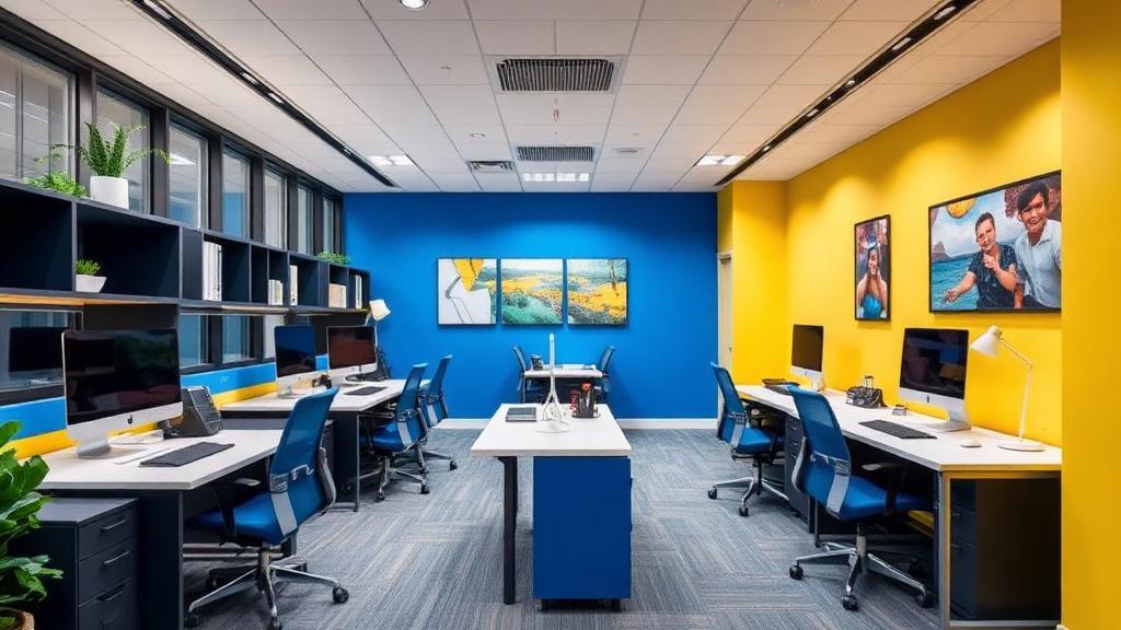
Your Workspace Color Is Affecting Your Work
Research from the University of Texas found that gray, beige, and white offices — the most common workspace colors — actually impair productivity and increase feelings of sadness and depression. Meanwhile, strategically chosen colors can boost focus by up to 15%, enhance creative output, and reduce workplace stress.
The science is clear: color is one of the most underutilized tools in workspace design. Whether you're designing a corporate headquarters, a coworking space, or your home office, understanding color psychology can measurably improve performance.
The Four-Color Productivity Framework
Research by color psychologist Angela Wright identified four primary colors that affect four types of cognitive work:
| Color | Best For | Hex Code | Cognitive Effect |
|---|---|---|---|
| Blue | Analytical tasks | #3B82F6 | Enhances focus, concentration, clear thinking |
| Yellow | Creative tasks | #F59E0B | Stimulates innovation, optimism, idea generation |
| Green | Balance tasks | #10B981 | Promotes calm, reduces eye strain, steadies focus |
| Red | Detail tasks | #EF4444 | Heightens attention to detail, urgency, physical energy |
The Critical Factor: Saturation
Wright's research revealed that it's not just the hue that matters — saturation determines whether a color stimulates or calms:
- High saturation — Stimulating, energizing, increases pulse rate
- Low saturation — Calming, soothing, promotes sustained focus
- Medium saturation — Balanced, suitable for long working hours
For most office environments, medium-to-low saturation versions of productive colors work best for sustained work periods.
Blue for Analytical Work
The Research
Blue environments have been consistently linked to improved analytical performance:
- A study in Science found that blue environments enhanced creative problem-solving
- Blue light exposure increases alertness and cognitive performance
- Blue-decorated offices showed 15% improvement in detail-oriented task completion
Recommended Blue Office Palette
| Application | Color | Hex Code |
|---|---|---|
| Wall accent | Soft steel blue | #7B9EB8 |
| Furniture | Navy accent | #1E3A5F |
| Accessories | Bright blue | #3B82F6 |
| Background | Pale blue-gray | #E8EDF2 |
Where to Use Blue
- Accounting and finance departments — Blue supports number-crunching focus
- Programming areas — Developers benefit from blue's concentration-enhancing properties
- Meeting rooms for data discussions — Blue promotes analytical thinking
- Home offices for writing and research — Blue supports sustained mental effort
Yellow for Creative Work
The Research
Yellow stimulates the ego and optimism, creating psychological conditions favorable for creative thinking:
- Yellow environments increase creative output by 12% compared to neutral rooms
- The color activates the left brain's analytical creativity
- Yellow objects in peripheral vision stimulate divergent thinking
Recommended Yellow Office Palette
| Application | Color | Hex Code |
|---|---|---|
| Accent wall | Muted gold | #D4A843 |
| Accessories | Warm yellow | #F59E0B |
| Furniture accent | Ochre | #C88B2B |
| Background | Cream | #FFF8E7 |
Where to Use Yellow
- Brainstorming rooms — Yellow stimulates idea generation
- Design studios — Creative environments benefit from yellow energy
- Marketing departments — Yellow promotes innovative thinking
- Collaborative spaces — Yellow's warmth encourages open communication
The Yellow Warning
Too much saturated yellow can cause anxiety and eye strain. Use yellow as an accent (10-30% of visible surfaces), not as a dominant wall color. The 60-30-10 rule works well: 60% neutral, 30% complementary, 10% yellow accents.
Green for Balance and Sustained Focus
The Research
Green is the most restful color for the human eye and promotes the broadest range of productive behaviors:
- Green reduces eye strain by 20% compared to white environments
- Nature views (green) reduce post-task recovery time
- Green environments lower cortisol (stress hormone) levels by 13%
Recommended Green Office Palette
| Application | Color | Hex Code |
|---|---|---|
| Plants | Natural green | Various |
| Wall accent | Sage | #8FA886 |
| Furniture | Forest | #2D5A3D |
| Background | Mint tint | #F0F7F4 |
Where to Use Green
- Call centers — Green reduces stress during repetitive work
- Customer service areas — Green promotes patience and empathy
- General offices — The safest choice for mixed-task environments
- Break rooms — Green aids recovery and mental reset
The Plant Factor
Live plants are the most effective way to introduce green into workspaces. Research shows that offices with plants have:
- 15% higher productivity
- 6% higher wellbeing scores
- 37% lower tension levels
- Improved air quality, which further enhances cognition
Red for Detail-Oriented Tasks
The Research
Red increases attention to detail and physical performance, but with important caveats:
- Red environments improve performance on detail-oriented tasks (proofreading, fact-checking)
- Red light increases physical strength and reaction time
- However, red impairs creative performance and increases test anxiety
Recommended Red Office Usage
| Application | Color | Hex Code |
|---|---|---|
| Small accents | Burgundy | #7B2332 |
| Alert elements | Signal red | #EF4444 |
| Fabric accents | Terracotta | #C66B4A |
| Artwork | Warm red | #C0392B |
Where to Use Red (Carefully)
- Quality control areas — Red heightens attention to errors
- Physical workspaces — Red boosts physical energy and endurance
- Deadline-driven zones — Red creates appropriate urgency
- Exercise rooms — Red increases physical performance
The Red Warning
Red should never be a dominant workspace color. It increases cortisol, raises blood pressure, and creates fatigue. Use red as a strategic accent — a chair, a wall graphic, accessories — never as a wall color for spaces where people work for extended periods.
How Tech Companies Design Office Colors
- Multicolor scheme reflecting the brand's four-color identity
- Different zones use different colors to signal different work types
- Informal areas use brighter, more saturated colors
- Focus areas use muted, calming palettes
Apple
- Minimalist whites and warm grays — reflecting the product aesthetic
- Natural materials (wood, stone) introduce warm earth tones
- Large windows for natural light and green views
- Color restraint matches the brand's design philosophy
Slack
- Aubergine and warm tones from the brand palette
- Colorful meeting rooms with distinct personality
- Warm, non-corporate feeling throughout
- Color customization options in certain spaces
Remote Workspace Color Tips
For home offices, apply these research-backed guidelines:
- Face a wall, not a window — Then paint that wall in your productive color
- Use your webcam background — The color behind you in video calls affects others' perception
- Layer with accessories — Desk items, art, and textiles are easier to change than walls
- Match color to your primary work type — Writers (blue), designers (yellow), managers (green)
- Control lighting — Color appearance changes dramatically with warm vs. cool lighting
Practical Tips
- Audit your current workspace colors — Are they helping or hindering your work?
- Use Coloracci's AI palette generator to create a workspace palette matched to your work type
- Start with one accent wall — It's the easiest and most impactful change
- Add plants first — The easiest way to introduce productive green
- Avoid all-white and all-gray — Research consistently shows these harm productivity and mood
- Consider circadian lighting — Warm light in morning/evening, cool light midday, matching natural patterns
Your workspace color isn't just decoration — it's a productivity tool. Use it intentionally and your work will improve measurably.