Healthcare and Hospital Color Palettes: Calming Design
· Coloracci Team
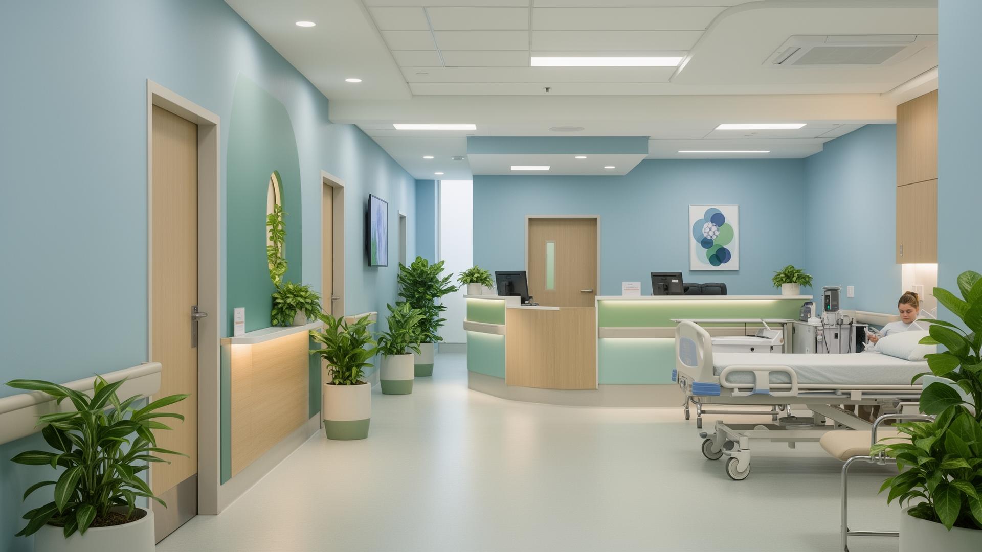
Healthcare environments carry a unique design burden that no other industry faces: the colors on the walls, floors, and furnishings directly influence patient recovery, staff performance, and visitor comfort. A poorly chosen palette can elevate blood pressure, increase perceived pain, and amplify anxiety. A thoughtfully designed palette can shorten hospital stays, reduce medication requests, and create an atmosphere where healing feels possible. This is not speculation — decades of environmental psychology research confirm that color is one of the most powerful non-pharmacological interventions available to healthcare architects and interior designers.
This guide examines the science behind healthcare color choices, explains why specific hues dominate hospital environments worldwide, provides exact hex codes for building healthcare palettes, and offers practical recommendations for patient rooms, waiting areas, surgical suites, and medical brand identities.
Why Hospitals Use Blue and Green
Walk into almost any hospital in the world and you will encounter blue and green. This is not a coincidence, a trend, or a matter of aesthetic preference. It is the result of over a century of evidence-based design decisions rooted in physiology, psychology, and practical functionality.
Blue lowers heart rate and blood pressure. Research published in the Journal of Environmental Psychology found that exposure to blue environments reduced systolic blood pressure by an average of 5-7 mmHg compared to red or yellow environments. For patients already experiencing cardiovascular stress, this reduction is clinically meaningful. Blue also activates the parasympathetic nervous system — the body's "rest and digest" mode — which counteracts the fight-or-flight response that hospitals inevitably trigger.
The most effective healthcare blues sit in the mid-tone range, avoiding both the coldness of navy and the childishness of sky blue:
- Clinical Trust Blue
#5B9BD5— The most widely used hospital blue, conveying competence and calm - Healing Sky Blue
#A8D8F0— Lighter variant for ceilings and upper walls, mimicking open sky - Deep Medical Blue
#2E5984— Used sparingly for accent walls and wayfinding signage - Soft Periwinkle
#B4C7E7— Popular in pediatric and maternity wards for its gentle warmth
Green reduces visual fatigue and promotes balance. Surgeons in the early 20th century discovered that staring at red blood and tissue for hours caused a visual afterimage effect — green spots would appear when they looked away. In the 1920s, hospitals began painting operating rooms green to counteract this phenomenon. The practice expanded because green sits at the center of the visible spectrum, requiring minimal effort from the eye muscles to process. Staff who work 12-hour shifts in green-tinted environments report less eye strain and fatigue.
Healthcare greens work best when they carry a slight blue undertone, avoiding the yellow-greens associated with nausea:
- Sage Healing Green
#B2D8B2— The definitive healthcare green, balancing warmth and clinical cleanliness - Surgical Green
#4CAF93— The classic operating room color, still used in scrubs and draping - Nature Recovery Green
#7CB68E— Used in rehabilitation facilities to evoke outdoor environments - Mint Fresh
#C8E6D4— Light enough for large surface areas without feeling institutional
Calming Color Psychology in Medical Settings
The psychology of calming colors in healthcare goes beyond simply choosing "cool" colors. Effective healthcare palettes account for patient demographics, the specific type of care being delivered, lighting conditions, and cultural context.
Warm neutrals reduce the institutional feeling. One of the biggest complaints patients have about hospitals is that they feel cold, sterile, and impersonal. Research from the Center for Health Design found that patients in rooms with warm neutral accents rated their care experience 23% higher than patients in identical rooms with standard white walls — even when the medical care was objectively the same.
Effective warm neutrals for healthcare include:
- Linen Warm White
#F5F0E8— Replaces harsh clinical white while maintaining brightness - Sandstone Comfort
#E8DDD0— Grounding without darkening the space - Gentle Taupe
#D4C5B5— Adds warmth to corridors and waiting areas - Soft Cream
#FAF3E0— Ideal for ceilings where pure white creates glare under fluorescent lighting
Lavender bridges clinical and comforting. Lavender occupies a unique position in healthcare color psychology. It carries the calming properties of blue, the gentle warmth of pink, and cultural associations with cleanliness and freshness. Studies in palliative care settings found that lavender-tinted rooms were associated with lower anxiety scores and higher patient satisfaction compared to blue rooms.
- Healing Lavender
#D4C4E0— Effective in oncology and long-term care settings - Soft Lilac
#E8DAF0— Light enough for large surfaces, soothing without being cloying - Muted Violet
#9B8EC0— Used as an accent color in wellness-oriented facilities
Colors to avoid in healthcare settings. Certain colors consistently produce negative outcomes in medical environments:
- Bright red increases anxiety, raises perceived pain levels, and is associated with emergency and danger
- Saturated yellow can cause agitation in patients with cognitive impairments, particularly dementia
- Pure white creates institutional coldness, contributes to glare, and makes spaces feel sterile rather than clean
- Dark gray or black evokes depression and can make small patient rooms feel confining
Patient Room Colors: Evidence-Based Recommendations
Patient rooms require the most careful color consideration because patients spend extended periods in these spaces, often while experiencing pain, anxiety, or disorientation. The goal is to create an environment that supports circadian rhythm regulation, reduces stress, and provides visual comfort.
The three-zone approach. Leading healthcare designers use a three-zone color strategy for patient rooms:
Ceiling zone — The lightest value, typically
#F5F0E8(Linen Warm White) or#E8F4FD(Whisper Blue). Patients spend significant time looking up, and the ceiling color should reduce glare while creating a sense of openness.Upper wall zone — A mid-value calming tone, such as
#B4C7E7(Soft Periwinkle) or#B2D8B2(Sage Healing Green). This zone occupies the majority of the visual field and sets the emotional tone of the room.Lower wall and accent zone — A slightly deeper tone or warm neutral, such as
#D4C5B5(Gentle Taupe) or#7CB68E(Nature Recovery Green). This zone grounds the space and conceals scuff marks and wear from equipment.
Specialized patient room palettes:
General medical-surgical rooms benefit from blue-green palettes that promote rest without inducing drowsiness during the day:
- Primary wall:
#C5DAE8— Soft blue that maintains alertness - Accent wall:
#B2D8B2— Sage green for visual relief - Trim and ceiling:
#F5F0E8— Warm white for softness
Pediatric rooms require more color variety and higher saturation to engage children and reduce fear:
- Primary wall:
#A8D8F0— Cheerful sky blue - Accent elements:
#FFD580— Warm sunny yellow (used sparingly) - Secondary accent:
#F4B8C1— Gentle coral pink
Maternity and labor rooms should balance calming with energizing, supporting both the intensity of labor and the joy of delivery:
- Primary wall:
#E8DAF0— Soft lilac for calm - Accent wall:
#C8E6D4— Mint green for freshness - Warm accents:
#FAE6D3— Peach warmth
ICU and critical care rooms prioritize stress reduction and equipment visibility:
- Primary wall:
#D6E5F0— Muted clinical blue - Floor and lower wall:
#C8C8C8— Neutral gray for equipment contrast - Ceiling:
#F0F0F0— Near-white for optimal lighting
Medical Brand Colors: Building Trust Through Design
Medical brands face a specific color challenge: they must simultaneously communicate trust, expertise, compassion, and innovation. The color choices of the world's most successful healthcare brands reveal consistent patterns.
Blue dominance in healthcare branding. Approximately 72% of top healthcare brands use blue as their primary color. Blue communicates trust, reliability, and competence — the three qualities patients prioritize when choosing a healthcare provider.
- Mayo Clinic Blue
#005DAA— Deep, authoritative, institutional - Cleveland Clinic Green
#006747— Distinctive differentiation through green - Kaiser Permanente Blue
#0072CE— Bright, modern, accessible - Johns Hopkins Blue
#002D72— Traditional, academic, prestigious
Emerging trends in medical branding. Modern healthcare brands are moving beyond traditional blue:
- Teal and turquoise (
#008B8B) combine blue's trust with green's healing associations - Warm coral accents (
#E8837C) add humanity and approachability to clinical identities - Gradient transitions from blue to green suggest holistic, whole-person care
- Muted earth tones signal wellness-oriented and integrative medicine practices
Digital healthcare brands — telemedicine platforms and health apps — tend toward softer, more approachable palettes:
- Headspace Teal
#3CBCC3— Friendly, modern, non-clinical - Calm Blue
#3A7BD5— Serene, trustworthy, digital-native - Mindfulness Sage
#8DAA91— Natural, organic, wellness-oriented
Practical Tips for Healthcare Color Design
Always test colors under the actual lighting conditions. Hospital lighting varies dramatically between fluorescent corridors, LED patient rooms, and natural-light atriums. A color that looks calming under warm LEDs can appear sickly under cool fluorescents. Test your palette with
#B2D8B2sage green under both 3000K and 5000K lighting before committing.Account for metamerism. Colors that match under one light source can appear dramatically different under another. Always evaluate color samples under daylight, fluorescent, and LED lighting simultaneously. This is especially critical for healthcare where lighting changes from room to room.
Use color for wayfinding, not just decoration. Assign distinct color families to different departments — blue for cardiology (
#5B9BD5), green for rehabilitation (#7CB68E), lavender for oncology (#D4C4E0). This reduces patient confusion and anxiety about navigation.Consider the demographics of your patient population. Geriatric facilities benefit from higher contrast ratios and warmer palettes. Pediatric spaces can handle more saturation and variety. Mental health facilities should avoid overstimulating combinations.
Balance evidence with humanity. While research guides color selection, the ultimate goal is to make people feel cared for. A perfectly optimized palette that ignores cultural context or personal preference fails its purpose. Include elements of personalization — adjustable colored lighting, artwork with varied palettes, warm textiles — to soften the clinical environment.
Maintain contrast for accessibility. All text and signage must meet WCAG AA standards (4.5:1 contrast ratio minimum). Healthcare environments serve patients with visual impairments, cognitive changes, and medication-induced vision effects. Ensure that
#2E5984(Deep Medical Blue) text on#F5F0E8(Linen Warm White) backgrounds provides sufficient readability.Plan for long-term maintenance. Healthcare environments experience heavy wear. Choose colors that age gracefully and can be touched up without visible patches. Mid-tone blues and greens conceal wear better than pure whites or very dark colors.
Healthcare color design is one of the rare fields where aesthetic choices carry measurable clinical consequences. The difference between a well-designed and poorly designed hospital palette is not merely visual — it is felt in patient outcomes, staff retention, and institutional reputation. Every hex code in a healthcare environment is a decision about human wellbeing.