The Psychology of Color in Healthcare: Designing for Healing and Hope
· Coloracci Team
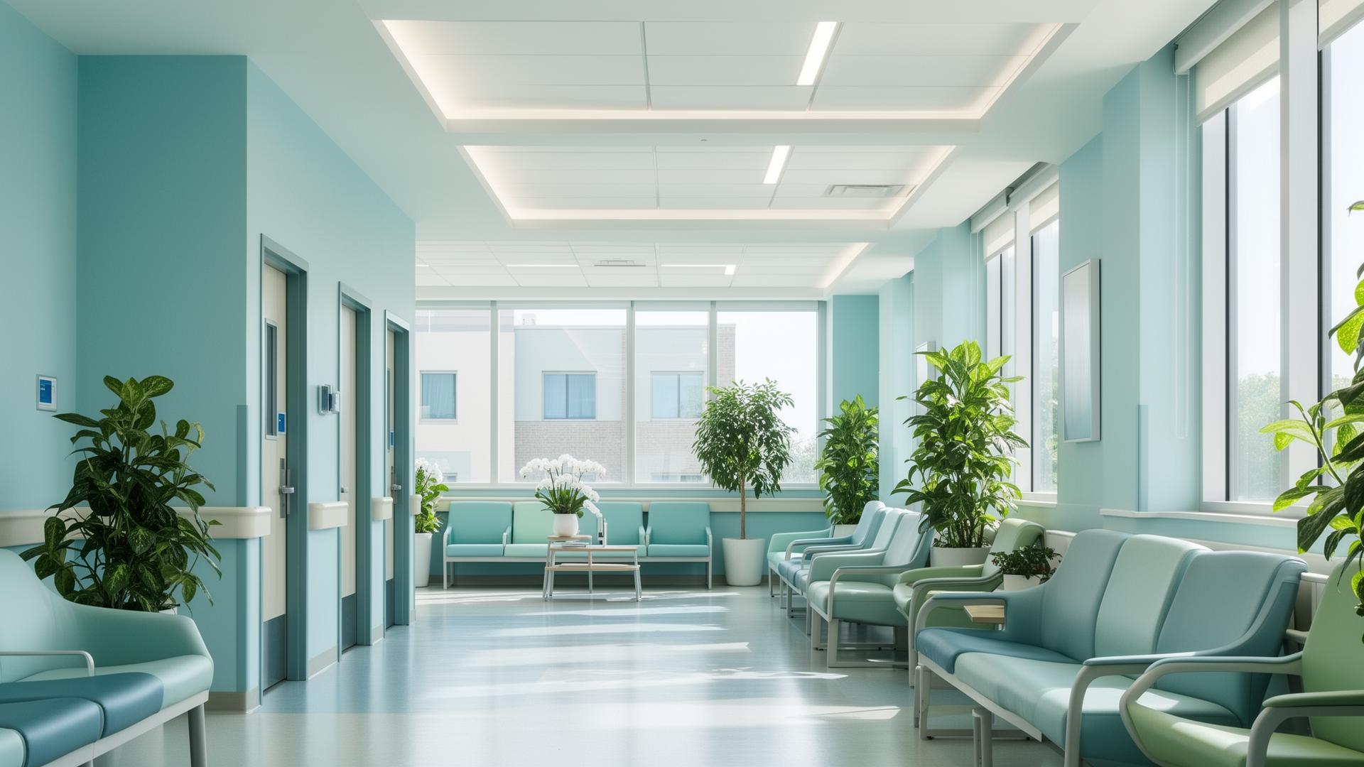
The moment you walk into a hospital, a doctor's office, or a wellness clinic, the colors surrounding you begin to shape your experience. Before a single word is spoken or a chart reviewed, the hues on the walls, the furniture, and even the staff uniforms are already communicating — calming your nerves, building trust, or, if poorly chosen, amplifying anxiety.
This is the psychology of color in healthcare, and it's far more than an aesthetic choice. It's a strategic design discipline rooted in decades of research that directly impacts patient outcomes, staff well-being, and the overall perception of care quality. For designers, architects, and healthcare administrators, understanding this discipline is not optional — it's essential.

The Impact of Color on Patients
Research consistently demonstrates that color has a measurable physiological and psychological effect on the human body. In healthcare environments, where patients are often at their most vulnerable, these effects are amplified.
- Stress Reduction: Studies published in the Journal of Environmental Psychology show that exposure to cool-toned environments (blues and greens) can lower heart rate and blood pressure in patients awaiting procedures.
- Perception of Wait Time: Warm, well-lit waiting areas with thoughtful color palettes can make perceived wait times feel shorter, directly improving patient satisfaction scores.
- Pain Perception: Some research suggests that patients in rooms with calming blue or green hues report lower levels of perceived pain compared to those in stark white or overly bright rooms.
- Trust and Confidence: The colors a healthcare facility uses signal professionalism and competence. A palette that feels clean, calm, and organized subconsciously builds trust in the care being provided.
For healthcare providers, these are not abstract ideas. Patient satisfaction surveys, recovery times, and staff retention are all tangible metrics influenced by the built environment — and color is one of the most impactful, yet cost-effective, tools available.
Core Colors in Healthcare Design
Not all colors are created equal when it comes to healing environments. Let's break down the key players in the healthcare color palette, complete with specific hex codes you can use in your next project.
Blue: The Foundation of Calm
Blue is, without question, the dominant color in healthcare design — and for good reason. It's universally associated with calmness, serenity, and trust. It lowers blood pressure, slows respiration, and creates a sense of order and reliability.
| Shade | Hex Code | RGB | Best Use |
|---|---|---|---|
| Healing Sky Blue | 168, 216, 240 | Patient rooms, recovery areas | |
| Serene Cerulean | 108, 173, 223 | Accent walls, wayfinding signage | |
| Deep Trust Blue | 58, 124, 165 | Reception areas, branding elements | |
| Soft Powder Blue | 176, 212, 232 | Corridor walls, general calming |
Design Tip: Use lighter blues (
Green: Nature's Healer
Green connects us to the natural world, evoking feelings of renewal, balance, and tranquility. In a healthcare context, it reduces anxiety and is believed to be the easiest color on the eyes — which is why surgeons' scrubs are green or teal, to reduce eye fatigue during long procedures.
| Shade | Hex Code | RGB | Best Use |
|---|---|---|---|
| Sage Healing Green | 178, 216, 178 | Waiting rooms, counseling offices | |
| Restorative Green | 122, 181, 122 | Rehabilitation spaces, gardens | |
| Soft Mint | 200, 230, 201 | Corridors, transitional spaces | |
| Deep Forest Calm | 74, 124, 89 | Accent walls, outdoor connections |
Design Tip: Pair sage green (
White: The Double-Edged Sword
White represents cleanliness, sterility, and purity — all values central to healthcare. However, an over-reliance on white creates environments that feel cold, institutional, and anxiety-inducing. The key is balance.
| Shade | Hex Code | RGB | Best Use |
|---|---|---|---|
| Clinical White | 255, 255, 255 | Ceilings, trim, clean surfaces | |
| Warm White | 250, 249, 246 | General walls, softened base | |
| Linen White | 245, 240, 235 | Patient rooms, family areas |
Design Tip: Never use pure white (
Warm Tones: Strategic Accents of Optimism
Yellows and soft oranges bring energy, warmth, and optimism to healthcare spaces. They're particularly effective in pediatric wards, cafeterias, and common areas where a sense of positivity is paramount. However, they should be used as accents, not dominant colors, as overly warm environments can increase agitation.
| Shade | Hex Code | RGB | Best Use |
|---|---|---|---|
| Sunshine Yellow | 253, 238, 135 | Pediatric areas, activity rooms | |
| Warm Amber | 245, 199, 126 | Cafeterias, family lounges | |
| Soft Peach | 250, 218, 221 | Maternity wards, neonatal units | |
| Gentle Coral | 244, 168, 150 | Accent details, artwork frames |

Healing Color Palettes for Healthcare Settings
Knowing individual color properties is essential, but the real magic happens when colors are combined into cohesive palettes. Here are four evidence-based palettes designed for specific healthcare environments.
🏥 General Hospital Palette
A balanced, universally calming palette suitable for most hospital environments.
| Role | Color | Hex Code |
|---|---|---|
| Primary Wall | Healing Sky Blue | |
| Secondary | Warm White | |
| Accent | Sage Green | |
| Detail | Deep Trust Blue | |
| Neutral | Soft Gray |
🧸 Pediatric Ward Palette
Warm, cheerful, and engaging without being overstimulating.
| Role | Color | Hex Code |
|---|---|---|
| Primary Wall | Sunshine Yellow | |
| Secondary | Soft Mint | |
| Accent | Gentle Coral | |
| Detail | Serene Cerulean | |
| Neutral | Linen White |
🧘 Wellness Clinic Palette
Nature-inspired and grounding, ideal for holistic health centers, therapy offices, and rehabilitation facilities.
| Role | Color | Hex Code |
|---|---|---|
| Primary Wall | Sage Healing Green | |
| Secondary | Linen White | |
| Accent | Warm Amber | |
| Detail | Deep Forest Calm | |
| Neutral | Soft Stone |
🤱 Maternity & Neonatal Palette
Soft, nurturing, and emotionally warm.
| Role | Color | Hex Code |
|---|---|---|
| Primary Wall | Soft Peach | |
| Secondary | Warm White | |
| Accent | Powder Blue | |
| Detail | Restorative Green | |
| Neutral | Blush Gray |

Practical Application: Where to Use Each Color
Understanding color psychology is one thing; knowing where to apply it is another. Here's a room-by-room guide:
- Patient Rooms: Light blues (
#A8D8F0 ) and warm whites (#FAF9F6 ) as base colors. Avoid stark white ceilings — use a warm tone to soften the overhead view for bedridden patients. - Waiting Areas: Sage greens (
#B2D8B2 ) combined with natural materials. Add warm accent pillows or artwork in#F5C77E to prevent the space from feeling too cool. - Corridors & Wayfinding: Use color-coding with deeper hues (
#3A7CA5 ,#4A7C59 ) for wayfinding systems. This improves navigation and reduces stress from disorientation. - Operating Rooms: Teal and green-blue tones to reduce eye fatigue. Avoid reds, which can cause afterimage effects for surgeons staring at red tissue.
- Cafeterias & Common Areas: Warm accents (
#FDEE87 ,#F5C77E ) to stimulate appetite and create a social, uplifting atmosphere. - Staff Areas: Blues and greens to reduce burnout. Consider deeper, richer tones (
#3A7CA5 ) that communicate competence and calm without feeling childish.
For deeper insights into how color influences behavior across different industries, explore our guide on email marketing color psychology — many of the same principles apply.
Cultural Considerations in Healthcare Color
Color perception is not universal. In a globalized world, healthcare facilities serve diverse populations, and designers must account for cultural color associations:
- White symbolizes mourning in many East Asian cultures, which can create unintended anxiety in facilities serving these communities.
- Red is considered auspicious and lucky in Chinese culture but can signal danger or emergency in Western contexts.
- Green is sacred in Islam and generally positive across cultures, making it one of the safest universal choices for healthcare.
- Yellow can signify jealousy or caution in some Western cultures, while in many Asian cultures it represents royalty and prosperity.
- Purple is associated with mourning in parts of South America and Thailand, making it a risky choice for healthcare interiors in multicultural settings.
Best Practice: When designing for multicultural communities, lean on blues and greens — which have the most universally positive associations — and use warm accents sparingly. Always conduct cultural research specific to the patient population being served. Our article on color cultures around the world provides an in-depth look at how colors are perceived differently across nations.
The Evidence: Why This Matters
The business case for thoughtful healthcare color design is compelling:
- Reduced Average Length of Stay: Patients in rooms with views of nature (and corresponding green/blue palettes) were discharged 0.74 days earlier, according to Ulrich's landmark 1984 study.
- Improved HCAHPS Scores: The Hospital Consumer Assessment of Healthcare Providers and Systems survey includes questions about the physical environment. Better scores lead to better reimbursement under value-based care models.
- Lower Staff Turnover: Healthcare workers in well-designed environments report higher job satisfaction and lower burnout rates, which directly impacts recruitment costs.
- Reduced Medication Use: Some studies suggest that calming environments can reduce the need for sedative medications, particularly in psychiatric and elderly care settings.
Frequently Asked Questions
What is the most calming color for a hospital?
Soft blue shades, particularly in the range of
Why do surgeons wear green or blue scrubs?
Surgeons wear green or teal scrubs primarily to reduce eye fatigue. When a surgeon stares at red-colored tissue and organs for extended periods, the brain develops afterimages — ghost-like green spots that can interfere with vision. By wearing green or blue, the afterimages blend into the scrub color rather than appearing on white surfaces, maintaining visual acuity. Additionally, green and blue are calming colors that help reduce stress during high-pressure procedures.
How can color be used to improve patient experience in a hospital?
Color can improve patient experience in multiple ways: using calming blues and greens in patient rooms to reduce anxiety, employing warm accent colors in waiting areas to make perceived wait times feel shorter, implementing color-coded wayfinding systems to reduce navigational stress, and choosing warm whites instead of stark clinical white to create a more welcoming atmosphere. The key is creating evidence-based palettes that are tailored to each specific area of the facility.
Are there any colors to avoid in healthcare design?
Yes, several colors should be used with extreme caution or avoided in healthcare settings. Bright red can increase anxiety, heart rate, and blood pressure — counterproductive in a healing environment. Stark, pure white (
Design with Intention
The colors in a healthcare environment are not decoration — they are part of the treatment. From the soft blue that lowers a patient's blood pressure in a pre-op room to the warm yellow that makes a child smile in a pediatric ward, every hue is an opportunity to heal.
For designers and healthcare professionals ready to build evidence-based color palettes, the tools exist to make it precise and actionable.
Want to create a healing color palette for your next healthcare project? Try Coloracci's AI-powered palette generator to explore calming blues, restorative greens, and warm accent combinations — all backed by color science. Discover the latest in color trends for 2026 to keep your designs current and impactful.