Social Media Color Psychology: Why Your Instagram Looks Different From Your LinkedIn (And Why It Should)
· Lion Dada
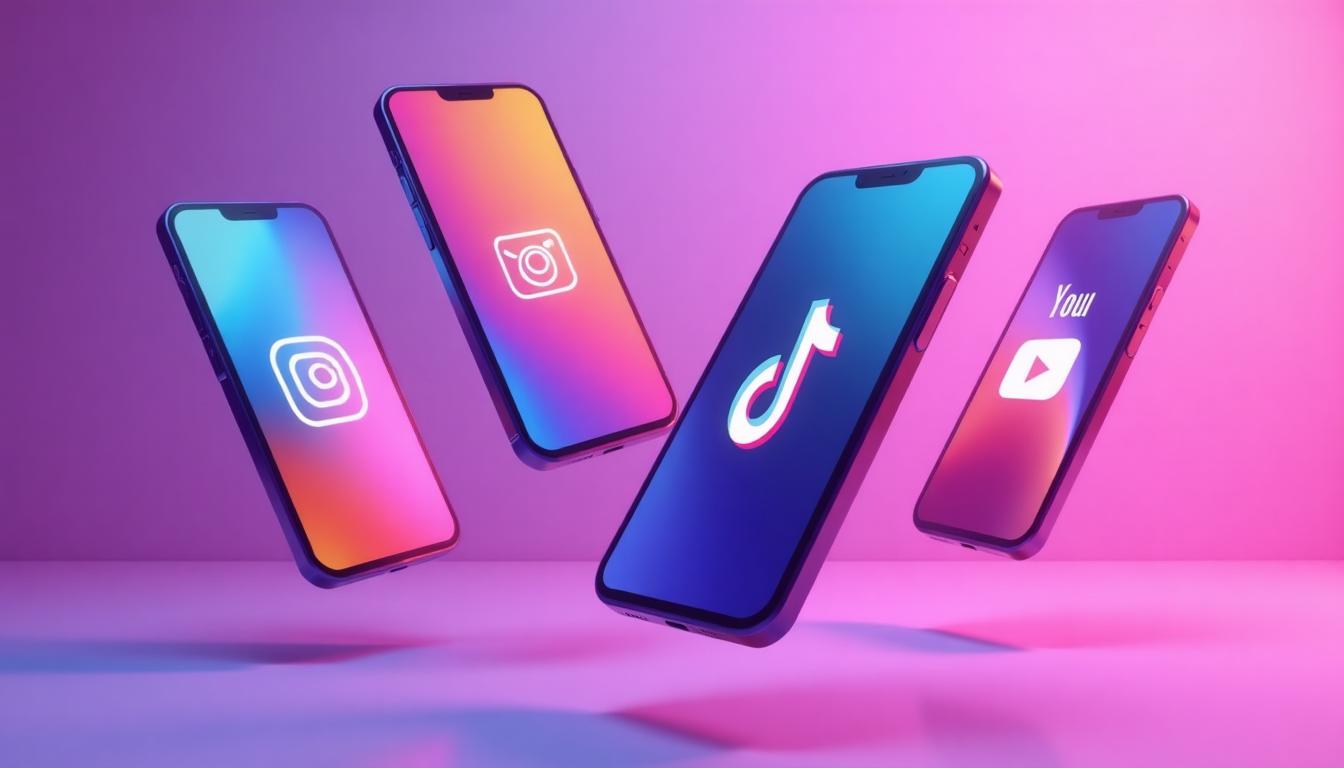
Last month, I watched a client lose three weeks of work because they used the same vibrant coral across every social platform. On Instagram, it was performing beautifully—engagement was up 40%. On LinkedIn? Crickets. On TikTok? It got lost in the visual chaos entirely.
This wasn't a random fluke. It was color psychology meeting platform psychology, and the collision was expensive.
Here's what I've learned after years of watching brands succeed and fail across social platforms: the color that makes your Instagram pop might be the exact reason your LinkedIn posts get ignored. And understanding why is the difference between a cohesive brand and a confused one.
The Psychology of Platform Identity
Before we dive into specific platforms, we need to understand something fundamental: every social media platform creates its own "color environment." The blues of Facebook, the gradient purples of Instagram, the black-and-neon of TikTok—these aren't just branding choices. They're psychological containers that influence how users perceive everything within them.
When you post on Instagram, your content exists within a warm, aesthetic-focused environment. When you post on LinkedIn, you're in a professional, trust-focused space. The same exact red reads completely differently in each context.
This is what I call "platform-native color thinking." It's not about abandoning your brand colors—it's about understanding how to adapt them to thrive in each unique environment.
Research from color psychology studies consistently shows that context changes perception. A study on color in marketing found that the same color can evoke trust in one context and alarm in another. Social platforms are just extreme examples of this principle.
Instagram: The Art of Visual Harmony
Instagram isn't just a photo-sharing app anymore—it's a carefully curated visual gallery. And like any gallery, it has unwritten rules about what belongs.
The Instagram Aesthetic in 2026
The current Instagram aesthetic has evolved significantly from the oversaturated, high-contrast look of the early 2010s. Today's successful Instagram feeds favor:
- Warm undertones: Terracotta, coral, warm beige
- Muted saturation: Colors that feel natural, not digital
- Cohesive feeds: A consistent color story across posts
- Negative space: Room to breathe between elements
The psychology of warm colors explains why this works. Warm tones feel approachable, authentic, and—crucially—"real" in an age of increasing skepticism toward polished content.
Colors That Work on Instagram
Coral (#FF6F61): This isn't just any coral—it's the specific warm coral that photographs well across different lighting conditions. It's become almost synonymous with "Instagram aesthetic."
Terracotta (#E07A5F): Earth tones dominate lifestyle content. Terracotta bridges the gap between warm and neutral, making it incredibly versatile.
Sage Green (#9CAF88): The sustainability movement has made sage green a power color on Instagram. It suggests eco-consciousness without being preachy.
Dusty Rose (#D4A5A5): Perfect for feminine brands, beauty content, and anything targeting a predominantly female audience.
These colors work because they align with Instagram's underlying psychology: aspiration, beauty, and curated authenticity. They photograph well, look good on mobile screens, and create the "scroll-stopping" effect every brand wants.
The Instagram Feed Formula
Think of your Instagram profile as a mosaic. Each post is a tile, and together they should create a cohesive picture. The most successful brands use a limited palette—usually 3-4 core colors—and repeat them in predictable patterns.
This is where understanding monochromatic color schemes becomes invaluable. Varying the saturation and brightness of your core colors creates visual interest while maintaining cohesion.
LinkedIn: Professional Without Being Boring
LinkedIn is the only major social platform where appearing too casual can actually hurt you. But that doesn't mean your content needs to look like a 1990s corporate brochure.
The New LinkedIn Aesthetic
The old LinkedIn look—stock photos of handshakes, generic blue everything, clip art—is dying. The new LinkedIn aesthetic balances professionalism with personality. Think "thought leader" not "middle manager."
Colors That Command Respect
Navy Blue (#1B365D): Still the king of professional color. Navy reads as authoritative without being aggressive. It's the color of "I know what I'm talking about."
Teal (#008080): The modern alternative to corporate blue. Teal suggests innovation while maintaining professionalism. It's particularly effective for tech and creative industries.
Forest Green (#228B22): Increasingly popular as sustainability becomes a business priority. Forest green signals growth mindset and environmental consciousness.
Deep Purple (#483D8B): For creative industries that want to stand out without sacrificing credibility. Purple suggests creativity within professional bounds.
The psychology of blue in business explains why these colors dominate. Blue triggers trust responses, and variations like navy and teal add sophistication without losing that fundamental trustworthiness.
The LinkedIn Content Formula
LinkedIn rewards content that looks like it took effort. That means:
- Clean, readable graphics (not too much text)
- Professional photography or high-quality illustrations
- Limited color palettes (2-3 colors maximum)
- Strong contrast for mobile readability
The key insight? LinkedIn users scroll differently. They're often multitasking—checking feeds between meetings, during commutes. Your content needs to communicate value instantly. High contrast helps: think white text on navy backgrounds, or navy text on cream.
TikTok: Energy, Chaos, and Attention
TikTok threw out the social media design playbook and wrote a new one. The platform rewards boldness, authenticity, and—surprisingly—a kind of intentional imperfection.
Why Traditional Design Fails on TikTok
I've seen countless brands try to apply their polished Instagram aesthetic to TikTok and watch it disappear into the void. Why? Because TikTok's algorithm and user behavior favor content that feels native to the platform.
TikTok content that performs typically features:
- High energy visuals and rapid cuts
- Bold, attention-grabbing colors
- Text overlays that are readable in 0.5 seconds
- A slight "rawness" that signals authenticity
Colors That Cut Through the Noise
Electric Cyan (#00F5FF): TikTok's own branding influence has made cyan a platform-native color. It reads as young, tech-savvy, and energetic.
Hot Pink (#FF1493): The beauty and entertainment industries have made hot pink synonymous with TikTok content. It's attention-grabbing without feeling corporate.
Lime Green (#32CD32): Energy, health, eco-consciousness—lime green hits multiple Gen Z priorities at once.
Vibrant Orange (#FF6B35): Food content, lifestyle motivation, and anything needing warmth with energy.
The psychology of high-contrast colors explains TikTok's color success. Complementary pairs and high saturation create the visual "pop" that stops scrolling thumbs.
The TikTok Text Overlay Secret
One thing most brands get wrong: text overlays on TikTok need different color treatment than static graphics. Here's why:
- Videos have changing backgrounds—your text color needs to be readable against multiple colors
- White with black shadow works almost universally
- Neon colors (cyan, pink, green) remain visible even on busy backgrounds
- Avoid subtle colors—they disappear
Facebook: The Evolving Giant
Facebook often gets overlooked in social media strategy conversations, but it remains massive—especially for local businesses, community building, and audiences over 35.
Understanding Facebook's Audience
Facebook's demographics have shifted significantly. The platform now skews older than Instagram or TikTok, which changes the color psychology entirely.
Colors that work on Facebook:
Warm Orange (#FF8C42): Friendly, approachable, perfect for local businesses and community content.
Sky Blue (#87CEEB): Open, trustworthy, community-focused. Works well for groups and non-profit content.
Forest Green (#355E3B): Nature, health, sustainability—appeals to Facebook's increasingly eco-conscious older demographic.
Facebook Ads vs. Organic Content
Here's something most guides miss: Facebook ads and organic posts need different color strategies.
For Organic Content: Warmer, more approachable colors perform better. Think about community, connection, conversation.
For Facebook Ads: Higher contrast works better. The feed is crowded—your ad needs to stand out. Red CTAs still perform well here, unlike on more aesthetically-conscious platforms.
Pinterest: The Inspiration Board
Pinterest is fundamentally different from other social platforms because of user intent. People come to Pinterest to dream, plan, and collect. This aspirational mindset changes everything about color psychology.
The Pinterest Sweet Spot
Pinterest rewards content that looks:
- Aspirational but achievable
- Beautifully composed
- Seasonally relevant
- Emotionally evocative
Colors That Get Saved
Blush Pink (#FFB6C1): Wedding planning and beauty content dominate Pinterest, making blush pink incredibly powerful.
Eucalyptus Green (#5F8575): Home decor and lifestyle content loves this muted, sophisticated green.
Soft Lavender (#E6E6FA): Wellness, self-care, and "calm aesthetic" content performs exceptionally well with lavender tones.
The psychology of soft colors explains Pinterest's preference for muted palettes. These colors feel sophisticated, achievable, and worth saving.
YouTube: Thumbnails That Click
YouTube is a platform where color choices directly impact revenue. Thumbnail colors can mean the difference between viral success and complete obscurity.
The Science of YouTube Thumbnails
YouTube thumbnails need to accomplish one thing: get clicked. And in a sea of competing videos, that requires bold color choices.
The Yellow Effect: Yellow thumbnails statistically get more clicks. It's the most visible color on the YouTube interface and creates instant contrast.
The Red CTA: YouTube's own branding makes red feel native to the platform. Red arrows, red text, red highlights—they all perform well.
Face + Color: The most clicked thumbnails combine expressive human faces with bold background colors. The contrast between natural skin tones and vibrant backgrounds creates visual tension.
High Contrast is Non-Negotiable: Unlike Instagram where subtle colors thrive, YouTube punishes subtlety. If your thumbnail doesn't pop at 160px wide, it fails.
Cross-Platform Brand Consistency
Now for the million-dollar question: how do you maintain brand identity across platforms while adapting to each one's unique color psychology?
The 70-20-10 Rule for Social Media
Here's a framework that works:
- 70% Platform-Native: Adapt your colors to what works on each platform
- 20% Brand-Consistent: Include your core brand color in secondary positions
- 10% Signature Elements: Keep one distinctive element (a specific color, pattern, or graphic treatment) consistent everywhere
This isn't about abandoning your brand—it's about being smart about how you express it.
Case Study: How Smart Brands Adapt
I've studied brands that do this well. Take a hypothetical lifestyle brand with coral as their primary color:
On Instagram: Full coral aesthetic, warm and curated On LinkedIn: Coral as an accent color against navy backgrounds On TikTok: Neon-shifted coral for higher energy On Pinterest: Muted coral paired with neutrals On YouTube: Coral in thumbnails with high contrast black text
Same brand. Six different color executions. One cohesive identity.
Common Social Media Color Mistakes
After years in this space, I've seen the same mistakes repeatedly:
Mistake #1: The Copy-Paste Approach
Taking the exact same visual assets across all platforms. Your Instagram carousel won't work on LinkedIn. Your TikTok video thumbnail isn't a Pinterest pin.
Mistake #2: Ignoring Platform Context
That beautiful muted sage green that works on Instagram? It disappears on TikTok. Colors don't exist in isolation—they exist in context.
Mistake #3: Desktop-First Design
Most social media consumption happens on mobile. Colors that look good on your 27" monitor might be unreadable on a phone screen. Always design mobile-first and test on actual devices.
Mistake #4: Inconsistency Over Time
Jumping between color schemes confuses your audience. While you should adapt to platforms, your core color story needs to remain recognizable over months and years.
Mistake #5: Following Trends Blindly
Just because neon colors are trending on TikTok doesn't mean they'll work for your B2B software company. Trends should inform, not dictate.
Building Your Platform-Specific Color Strategy
Ready to create your own platform-specific color strategy? Here's a step-by-step approach:
Step 1: Define Your Core Colors
Start with your brand's foundation—usually 2-3 colors that define your identity. Need help? Our AI Palette Generator can analyze your existing brand and suggest complementary colors.
Step 2: Create Platform Variations
For each core color, create variations:
- Warm version: For Instagram, Pinterest
- Cool/Professional version: For LinkedIn
- Saturated/Neon version: For TikTok
- High contrast version: For YouTube thumbnails
Step 3: Build Platform Templates
Create templates for each platform that incorporate your platform-specific colors. This saves time and ensures consistency.
Step 4: Test and Iterate
Use analytics to understand what's working. Track which color variations perform best on each platform and adjust accordingly.
Tools for Social Media Color Success
Building a platform-specific color strategy requires the right tools:
For Color Extraction: Our Image Color Extractor helps you analyze competitor content and identify platform-specific trends.
For Accessibility: The Color Contrast Checker ensures your social content is readable for all users.
For Palette Creation: The Color Palette Generator helps you build harmonious color systems that work across platforms.
For Trend Research: Understanding color trends in design helps you stay current without being trend-dependent.
The Future of Social Media Color
As platforms evolve, so will color psychology. Here are trends I'm watching:
AR Integration: As AR features expand, we'll need to think about how colors interact with real-world environments.
Dark Mode Dominance: More users are switching to dark mode, changing how our colors appear in feeds.
Video-First Everything: Even platforms like LinkedIn are pushing video, meaning static color strategies need to evolve.
AI-Generated Content: As AI tools become more common, distinctive color choices will be increasingly important for standing out.
Your Next Steps
Social media color psychology isn't just about picking pretty colors—it's about understanding how visual communication works in each unique digital environment.
Start by auditing your current social presence. Are you using the same colors everywhere? Are those colors optimized for each platform's unique psychology?
Then, experiment. Test platform-specific variations and track the results. The data will show you what works for your specific audience on each platform.
Remember: the brands that win on social media aren't the ones with the biggest budgets or the most posts. They're the ones who understand that every platform is its own world, with its own rules, its own psychology, and its own color language.
And once you speak that language fluently? Your content doesn't just get seen—it gets felt.