Triadic Colors Examples: The Complete Guide to Three-Color Harmony
· Lion Dada
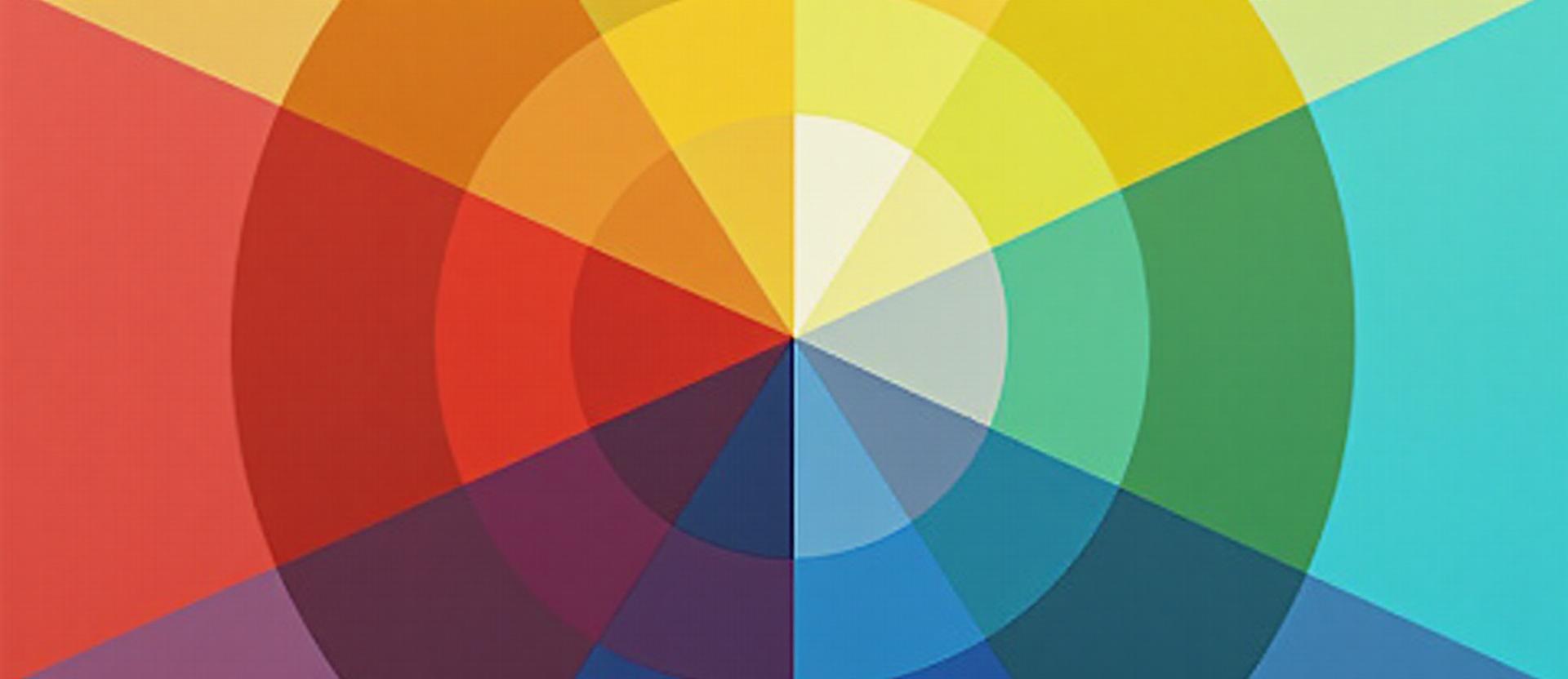
The Superman Moment That Changed Everything
I was seven years old, sitting cross-legged on the carpet, absolutely mesmerized by Christopher Reeve flying across the screen. But here's the thing I didn't understand until decades later—it wasn't just Superman that captivated me. It was his colors.
Red cape. Yellow belt. Blue suit.
Three colors. Equally spaced. Perfectly balanced. Absolutely impossible to ignore.
That combination isn't random. It's one of the most powerful color relationships in existence: the triadic color scheme.
And once you understand how it works, you'll never look at logos, movie costumes, or brand identities the same way again.
What Are Triadic Colors?
Triadic colors are three colors positioned exactly 120 degrees apart on the color wheel. Unlike complementary colors (which use two opposite colors) or analogous colors (which use neighboring colors), triadic schemes create a perfect triangle of visual balance.
The classic examples:
- Primary triad: Red, Yellow, Blue
- Secondary triad: Orange, Green, Purple
What makes triadic special? You get maximum variety while maintaining perfect balance. Three distinct colors, three different emotional signals, zero visual chaos—when done right.
Triadic vs Complementary vs Analogous: When to Choose Each
Before diving deeper, let's clear up when triadic is the right choice:
| Scheme | Colors Used | Energy Level | Best For |
|---|---|---|---|
| Complementary | 2 (opposites) | High contrast | Bold statements, call-to-actions |
| Analogous | 3-5 (neighbors) | Calm, harmonious | Serene spaces, nature brands |
| Triadic | 3 (120° apart) | Vibrant but balanced | Dynamic brands, children's products |
Choose triadic when you need:
- Visual variety without chaos
- High energy that doesn't feel aggressive
- Multiple distinct elements to differentiate
- A playful, bold, or dynamic feeling
Avoid triadic when:
- You want serene, calming vibes (use analogous)
- Minimalism is the goal
- You're working with serious, subdued brands
The Science: Why 120° Creates Perfect Balance
Here's where it gets interesting. Your eyes have three types of color receptors (cones) that respond to different wavelengths. Triadic colors stimulate all three cone types relatively equally—creating visual satisfaction without overwhelming any single receptor.
This is why triadic palettes feel:
- Complete (all bases covered)
- Balanced (no color dominates your perception)
- Energetic (multiple distinct signals)
It's the same reason three-legged stools are stable. Equal distribution, perfect balance.
The 6 Classic Triadic Schemes (And When to Use Each)
1. Primary Triad: Red, Yellow, Blue
The OG. The classic. The one that built Superman, Burger King, and every primary school art class.
Colors: #E53935 (Red) • #FDD835 (Yellow) • #1E88E5 (Blue)
Psychology: Bold, energetic, childlike, heroic, trustworthy yet exciting
Best for:
- Children's brands and products
- Fast food (Burger King, McDonald's variations)
- Superhero aesthetics
- Brands wanting "universal appeal"
- Educational content
Famous examples:
- Superman costume
- Burger King logo
- IKEA (modified)
- Lidl supermarkets
- Barcelona FC
The trick: Use red as the accent (10-15%), yellow as secondary (25-30%), and blue as the dominant (55-60%). Pure primaries at full saturation can feel childish—mute them slightly for adult applications.
2. Secondary Triad: Orange, Green, Purple
More sophisticated than primaries, this triad feels organic and dynamic. It's nature meets creativity.
Colors: #FB8C00 (Orange) • #43A047 (Green) • #7B1FA2 (Purple)
Psychology: Creative, natural, unconventional, energetic but grounded
Best for:
- Health and wellness brands
- Creative agencies
- Sustainable companies
- Festival and event branding
- Children's educational products
The magic: This triad works brilliantly for brands that want energy without the "obvious" primary palette. It feels fresher, more contemporary.
3. Warm Triad: Red-Orange, Yellow-Green, Blue-Purple
A sophisticated step up from primaries—keeping the energy but adding nuance.
Colors: #FF5722 (Red-Orange) • #7CB342 (Yellow-Green) • #5E35B1 (Blue-Purple)
Psychology: Energetic, sophisticated, creative, contemporary
Best for:
- Tech startups wanting differentiation
- Creative industries
- Youth-focused brands (not childish)
- Event and entertainment
4. Cool Triad: Yellow-Orange, Blue-Green, Red-Purple
Contemporary and unexpected. This triad feels modern without being sterile.
Colors: #FFB300 (Yellow-Orange) • #00897B (Blue-Green) • #AD1457 (Red-Purple)
Psychology: Fresh, contemporary, confident, slightly unconventional
Best for:
- Modern retail brands
- Wellness with energy
- Fashion-forward companies
- Digital products
5. Playful Triad: Pink, Lime, Cyan
Y2K is back, baby. This neon-adjacent triad screams fun, youth, and zero apologies.
Colors: #E91E63 (Pink) • #CDDC39 (Lime) • #00BCD4 (Cyan)
Psychology: Fun, youthful, bold, unapologetic, trendy
Best for:
- Gen Z brands
- Gaming companies
- Music and entertainment
- Social media aesthetics
- Streetwear
Warning: This palette has a short shelf life. It's trendy now. Use with caution for brands needing longevity.
6. Sophisticated Triad: Burgundy, Olive, Teal
Proof that triadic doesn't mean childish. This muted triad oozes maturity and premium positioning.
Colors: #880E4F (Burgundy) • #827717 (Olive) • #006064 (Teal)
Psychology: Mature, sophisticated, premium, timeless, refined
Best for:
- Luxury brands
- Premium hospitality
- Wine and spirits
- High-end fashion
- Professional services
The secret: Desaturate your triadic colors for instant sophistication. Same relationships, completely different feeling.
Famous Triadic Branding: Real-World Examples
Google: The Modified Triad
Google uses Red, Yellow, Blue, and Green. That's technically four colors, but the core is a modified primary triad. The green adds their signature playfulness.
Why it works: Google wants to feel friendly, accessible, and fun—like a helpful friend, not a scary corporation. The triadic base achieves exactly that.
Burger King: Primary Power
Red, Yellow, Blue (in the flame icon). Pure primary triad for maximum visibility and appetite stimulation. Fast food loves triadic because it demands attention and triggers cravings.
Mozilla Firefox: Secondary Strength
Orange, Purple, and hints of Blue-Green. The firefox uses a secondary triad variation for brand energy that feels creative and unconventional.
Barcelona FC: Unexpected Sophistication
Deep Blue and Burgundy as primaries with Gold as accent. A compressed triadic that commands respect while maintaining visual energy.
Triadic Colors in Interior Design
Using three colors in a room is challenging—but when done right, it's spectacular.
The 60-25-15 Rule for Triads
This is non-negotiable for triadic interiors:
- 60% — Dominant color (walls, large furniture)
- 25% — Secondary color (curtains, rugs, smaller furniture)
- 15% — Accent color (pillows, art, accessories)
Children's Rooms: Embrace It
Primary triadic works brilliantly in kids' spaces. Red, yellow, and blue create a stimulating, playful environment. Use softer versions (coral, butter yellow, sky blue) for a less intense feel.
Living Rooms: The Sophisticated Approach
Use the muted triadic (burgundy, olive, teal) for a grown-up space that still has personality. Keep walls neutral and let furniture and accessories carry the triadic relationship.
Related: How to Add Color to Your Home
Triadic Colors in Digital Design
Data Visualization: The Perfect Use Case
When you have three categories to distinguish, triadic is ideal. Each color is maximally different from the others, making comparison instant.
Example: Sales (Blue), Costs (Orange), Profit (Green) — secondary triad for clear, beautiful charts.
Warning/Success/Info Systems
Most UI design systems use triadic-inspired status colors:
- Red = Error/Danger
- Yellow/Orange = Warning
- Green = Success
- Blue = Info
This isn't coincidence—it's triadic logic applied to user communication.
Brand Systems with Three Accent Colors
If your brand needs multiple accent colors (for departments, product lines, or campaigns), triadic provides natural harmony.
Related: How to Add Color to Digital Design
Triadic Colors in Fashion
Color Blocking: Make a Statement
Triadic color blocking is bold. It's not subtle. A red jacket, yellow bag, and blue shoes is a look. You'll be noticed.
The approach:
- Choose one color to dominate (your top or bottom)
- Use the second for accessories
- Reserve the third for small accents
When to Avoid Triadic in Fashion
Job interviews (unless creative industry). First dates (too intense). Funerals (obviously). Triadic outfits say "LOOK AT ME" — make sure that's what you want to say.
Common Triadic Mistakes (And How to Fix Them)
Mistake #1: Equal Saturation Chaos
Using all three colors at full intensity creates visual chaos. Your eye doesn't know where to look.
The fix: Saturate one color, mute the other two. Or mute all three for sophistication.
Mistake #2: Equal Distribution
Splitting your design 33/33/33 creates confusion. There's no hierarchy, no focal point.
The fix: Always use 60-25-15 or similar weighted distribution.
Mistake #3: Ignoring Neutrals
Triadic schemes need breathing room. Without neutrals (white, gray, black, earth tones), the colors compete endlessly.
The fix: Use neutral backgrounds and let triadic colors pop against them.
Mistake #4: Wrong Undertones
Mixing warm and cool versions of triadic colors creates discord. A warm orange with a cool purple feels "off."
The fix: Commit to warm OR cool across all three colors.
Muted Triads: The Sophisticated Secret
Take any triadic scheme and reduce saturation by 30-50%. Suddenly, that childish primary palette becomes premium.
Example:
- Primary full: #FF0000, #FFFF00, #0000FF (circus vibes)
- Primary muted: #C62828, #F9A825, #1565C0 (sophisticated energy)
This is how designers use triadic in luxury contexts. Same relationships, different intensity.
When to Choose Triadic: The Decision Framework
Use Triadic When:
- You need visual energy and variety
- Multiple distinct elements need differentiation
- Brand personality is bold, playful, or dynamic
- You're targeting younger or family demographics
- The context allows for color intensity
Skip Triadic When:
- Minimalism is the goal
- You want serene, calming effects
- Brand needs to feel serious and subdued
- You're working with existing color constraints
- The context requires subtlety
Building Your Own Triadic Palette
Ready to create? Here's the process:
- Start with your hero color — the most important color for your brand or project
- Find its triadic partners — rotate 120° and 240° on the color wheel
- Adjust saturation — mute for sophistication, keep pure for energy
- Establish hierarchy — decide which is 60%, 25%, and 15%
- Add neutrals — give the colors space to breathe
- Test in context — does it feel right for your purpose?
Try it yourself: Our Fibonacci Generator creates harmonious triadic variations automatically. Or explore triadic schemes with our AI Website Designer.
The Triadic Mindset
Triadic color schemes represent something deeper than just color theory. They're about balance through variety, harmony through contrast.
In a world that often thinks in binaries (black or white, this or that), triadic thinking embraces complexity. Three options. Three perspectives. Three colors that shouldn't work together but absolutely do.
That seven-year-old watching Superman didn't understand color theory. But something in his brain recognized that red, yellow, and blue cape-belt-suit combination as right. As balanced. As heroic.
Now you know why.
Continue Your Color Theory Journey:
- Complementary Colors Examples — The power of opposites
- Analogous Colors Examples — Harmony through neighbors
- Color Wheel Theory: Complete Guide — Understanding the fundamentals
Tools to Try:
- Fibonacci Color Generator — Create harmonious palettes
- AI Website Designer — Generate color schemes from images
- Mood Board Generator — Explore color combinations visually
- Color Contrast Checker — Ensure accessibility