Fashion Colors by Decade: From 1950s Pastels to Today's Sustainable Tones
· Lion Dada
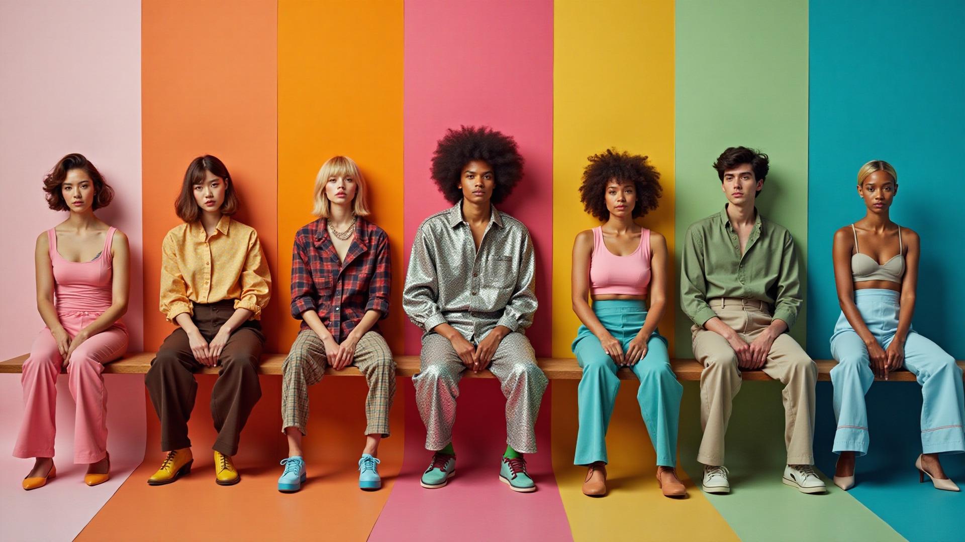
The Closet That Tells a Story
I was helping my grandmother clean out her closet last summer when I found it: a perfectly preserved powder blue dress from 1958. As I held it up to the light, she smiled and said, "That was the color of hope back then."
That moment changed how I see fashion. Colors aren't just aesthetic choices—they're time capsules. Each decade leaves its chromatic fingerprint on our wardrobes, reflecting the fears, dreams, and revolutions of its era.
Let me take you on a journey through seven decades of fashion colors, from post-war optimism to today's sustainability-driven palettes.
The 1950s: Pastel Dreams and Post-War Optimism
After the rationing and darkness of World War II, the 1950s exploded in soft, hopeful colors. Women traded their utilitarian wartime wardrobes for dresses in
The Psychology Behind 1950s Colors
These weren't random choices. Pastels represented:
- Safety and femininity after years of women working in factories
- Prosperity through the ability to buy new clothes in delicate, impractical colors
- Optimism for a peaceful future
The 1955 film Funny Face captured this perfectly with its iconic "Think Pink" number. Audrey Hepburn and Grace Kelly became style icons draped in soft
Key 1950s Colors
- Baby Pink
- Powder Blue
- Mint Green
- Cream
- Lavender
Want to create a 1950s-inspired palette for your brand? Try our AI Website Designer to generate vintage-inspired color schemes.
The 1960s: Psychedelic Revolution and Mod Rebellion
The 1960s split fashion into two distinct movements, each with its own color philosophy: the geometric Mod movement and the wild Psychedelic revolution.
Mod Movement: Sharp and Bold
The early 60s Mod look, championed by Twiggy and Mary Quant, favored sharp contrasts:
- Black and white geometrics
Electric orange Sunshine yellow
Psychedelic Era: Colors That Vibrate
By the late 60s, colors became weapons of rebellion. Influenced by LSD culture and the Vietnam War protests, fashion embraced colors that literally seemed to vibrate when placed next to each other:
Hot pink Lime green Purple haze
Andy Warhol's Pop Art aesthetic merged with fashion, creating pieces that felt like wearable art. The message was clear: reject the pastels of your parents' generation.
These complementary color combinations created maximum visual tension—exactly what the counterculture wanted.
The 1970s: Earth Tones Meet Disco Glitter
The 1970s had a split personality. Daytime fashion embraced the environmental movement with earthy, natural colors. Nighttime belonged to disco's metallic excess.
Daytime: Back to Nature
The first Earth Day in 1970 sparked a fashion revolution toward natural tones:
Avocado green (yes, it was cool then) Burnt orange Mustard yellow Chocolate brown
These colors reflected a generation's desire to reconnect with nature after the synthetic optimism of the 50s and the chemical rebellion of the 60s.
Nighttime: Studio 54 Shimmer
When the sun went down, earthy tones gave way to metallic gold, silver, and bronze. Disco demanded attention, and fashion delivered with sequins, lamé, and colors that caught the light.
The psychology of mustard yellow traces its current revival back to this decade.
The 1980s: Neon Explosion and Power Dressing
If the 70s had a split personality, the 80s had no personality limits at all. This was the decade of MORE—more color, more brightness, more excess.
MTV and the Color Revolution
When MTV launched in 1981, fashion suddenly needed to pop on screen. Enter neon:
Hot pink Electric blue (cyan) Neon green Purple
Miami Vice taught men that pastels could be powerful. Madonna proved that more was always more. The aerobics craze put neon spandex on every suburban street.
Power Dressing
Meanwhile, the boardroom saw its own color revolution. Women entering corporate America needed to command attention, leading to bold power suits in strong colors:
Power red Navy blue - Dramatic shoulder pads in every shade
The psychology of red in branding explains why power colors still dominate corporate wardrobes.
The 1990s: Grunge Meets Minimalism
The 90s were fashion's hangover from the 80s excess. Two opposing movements emerged, both rejecting the previous decade's maximalism.
Grunge: Anti-Fashion Fashion
Seattle's grunge scene brought a deliberately drab palette to mainstream fashion:
Flannel red Forest green Washed black Faded grey
Kurt Cobain and his peers wore thrift store finds not as ironic fashion statements, but as genuine rejections of consumerism. The colors were muted, the fabrics worn, the message clear: we don't care about your fashion rules.
Minimalism: The Clean Slate
Meanwhile, designers like Calvin Klein and Jil Sander embraced the opposite approach—but with the same anti-80s message:
Beige Khaki White Black
What makes gray was the color question of the decade, as designers explored every shade from silver to charcoal.
The 2000s: Y2K Dreams and Metallic Futures
As the millennium turned, fashion looked to the future—and the future was shiny, pink, and covered in logos.
Y2K Aesthetic
The early 2000s believed the future would be:
Bubblegum pink Metallic silver Baby blue Clean white
Paris Hilton embodied this era in her velour Juicy Couture tracksuits. The color palette suggested a world of leisure and technology—plastic, shiny, and unapologetically girly.
Logo Mania
Colors became secondary to logos. Every brand needed to be visible, leading to:
Hot pink (Von Dutch, Juicy Couture) Cyber lime (Ed Hardy) Black (to make logos pop)
The psychology of pink in design explains the science behind this decade's obsession with the color.
2010s-2020s: Sustainable Earth and Digital Influence
After decades of color trends driven by subcultures and celebrities, social media fundamentally changed how fashion colors spread. Instagram's visual nature pushed fashion toward the photographable.
The Instagram Aesthetic
The early 2010s saw the rise of:
Crisp white Black Camel Gray
Millennial pink
Sustainability Shifts Colors
As climate anxiety grew, fashion colors shifted toward:
Sage green Terracotta Warm beige Digital lavender
These earth tone palettes reflect a generation's desire to reconnect with nature—echoing the 1970s but with 2020s sophistication.
Dopamine Dressing
Post-pandemic, fashion embraced "dopamine dressing"—wearing bright, joyful colors as a mood boost:
Viva Magenta (Pantone 2023) Golden yellow Royal purple
What Fashion Colors Tell Us About Culture
Looking back across seven decades, patterns emerge:
After Crisis, Color Heals
- Post-WWII: Soft pastels signaled peace
- Post-2020: Dopamine dressing brought joy back
Rebellion Rejects Parents' Palettes
- 60s rejected 50s pastels with psychedelics
- 90s rejected 80s neon with grunge mutes
Economic Conditions Shape Choices
- Prosperity brings bold experimentation
- Uncertainty brings neutral safety
Technology Influences Color
- TV made 60s colors pop
- MTV neon-ified the 80s
- Instagram created the 2010s aesthetic
Using Decade Colors in Modern Design
Understanding fashion color history isn't just nostalgia—it's a powerful design tool.
Evoking Specific Eras
Want your brand to feel:
- Classic and elegant? Use 1950s pastels
- Rebellious and bold? Try 1960s psychedelics
- Natural and grounded? Embrace 1970s earth tones
- Energetic and fun? Go 1980s neon
- Edgy and authentic? Consider 1990s grunge
- Futuristic and playful? Try 2000s Y2K
- Sustainable and conscious? Use 2020s earth tones
Finding Your Era
Not sure which decade matches your brand? Try our Mood Board Generator to explore different aesthetic directions, or use the AI Website Designer to generate palettes inspired by specific decades.
Common Mistakes When Using Vintage Colors
1. Going Too Literal
Don't recreate an entire 80s palette—select one or two signature colors and modernize them.
2. Ignoring Context
Avocado green worked in 1970s kitchens but feels dated in modern spaces unless paired with contemporary elements.
3. Forgetting Accessibility
Vintage colors weren't designed with digital accessibility in mind. Always check color contrast ratios.
4. Missing the Mood
Colors carry emotional baggage. Neon pink says "fun" but also "cheap" depending on context.
Create Your Own Decade-Inspired Palette
Ready to explore fashion colors for your next project? Here's how:
- Identify your target emotion - What feeling should your brand evoke?
- Choose your decade - Which era's values align with your message?
- Extract signature colors - Use our Image Color Extractor on vintage photos
- Modernize the palette - Adjust saturation and brightness for contemporary appeal
- Test accessibility - Ensure your colors work for all users
Try It Yourself: Vintage Photo Filter
Want to see how decade-specific color grading transforms your photos? Upload any image below and apply authentic vintage filters from each era:
The Colors of Tomorrow
Fashion colors will continue evolving with our culture. Current trends suggest:
- Digital-native colors designed for screens rather than fabric
- Sustainable dyes limiting available palettes
- AI-generated palettes creating combinations humans wouldn't consider
- Personalized color based on individual psychology and skin tone
Whatever colors dominate the 2030s, they'll tell the story of our generation—just as every decade before us left its chromatic mark on fashion history.
What's your favorite fashion decade? Explore vintage-inspired color palettes with our AI tools or find the perfect Pantone match for that vintage piece you've been dreaming about.