Complementary Colors Examples: The Complete Visual Guide to Color Opposites
· Lion Dada
The Blue Door That Changed Everything
Three years ago, I was standing in front of my grandmother's house in Tel Aviv, staring at her front door. It was painted this gorgeous deep cobalt blue—had been for decades. But what stopped me that day wasn't the door itself.
It was the orange bougainvillea vine that had grown beside it.
Blue door. Orange flowers. I'd seen this combination a thousand times, but I'd never seen it. The colors didn't just coexist—they electrified each other. The blue looked bluer. The orange practically glowed. Something clicked in my brain that day about why certain color combinations feel alive while others fall flat.
That's the magic of complementary colors. And once you understand it, you'll see it everywhere.
What Are Complementary Colors, Really?
Let's start with the basics—but I promise to make this interesting.
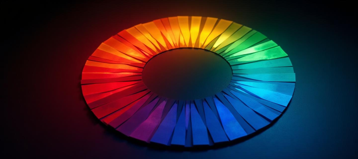
Complementary colors sit directly across from each other on the color wheel—exactly 180 degrees apart. They're mathematical opposites, which is precisely why they create such visual tension.
Here's what makes them special: when placed next to each other, complementary colors make each other appear more intense. It's not your imagination. It's called simultaneous contrast, and it's a real phenomenon in how our eyes and brain process color.
Your eye actually creates the complementary color as an afterimage. Stare at a red square for 30 seconds, then look at a white wall—you'll see a green ghost. That's your visual system at work, and it's why complementary combinations feel so energizing.
The Science Behind the Magic
This isn't just design theory—it's neuroscience.
When you look at a color, your eye has three types of cone cells that activate in different combinations. Complementary colors stimulate completely different cones, giving your brain the maximum range of color information simultaneously.
That's why complementary combinations:
- Grab attention faster than any other color relationship
- Create the strongest visual contrast (besides black and white)
- Feel dynamic and energetic
- Can actually cause visual vibration if both colors are highly saturated
The ancient Egyptians used blue and orange in their art. Medieval painters understood red and green. Even before color theory existed, artists intuitively grasped that these opposites created something special.
The 6 Classic Complementary Pairs
Let me walk you through each major complementary pair, because each has its own personality and best uses.
1. Red and Green: The Classic Holiday Combo
Yes, it's Christmas colors. But red and green have been powerful long before modern holidays. In nature, ripe red fruit against green leaves signals "eat me" to animals—it's evolutionary design.
Where it works:
- Food branding (think salads, fresh produce, Italian restaurants)
- Environmental and sustainability brands
- Sports teams (looking at you, every football league)
Where it fails:
- Corporate settings (too playful)
- Digital interfaces (too much visual tension)
The trick with red and green is proportion. A splash of red against dominant green feels fresh. Equal amounts feel like a holiday decoration.
2. Blue and Orange: The Universal Favorite
This is the complementary pair that works in almost every context. Movie posters use it constantly—seriously, look up "orange and blue movie posters" and prepare to be amazed.
Why? Blue creates trust and calm. Orange creates energy and warmth. Together, they balance professionalism with approachability.
Real-world examples:
- Firefox logo (instantly recognizable)
- Gulf Oil branding
- Every sports team ever (Knicks, Mets, Denver Broncos)
- Countless movie posters (think Blade Runner, Star Wars, practically every action film)
Blue and orange is the "safe bet" of complementary pairs. If you're not sure what combination to use, start here.
3. Yellow and Purple: The Royalty Pair
This is the most dramatic complementary pair. Yellow is optimism and energy. Purple is luxury and mystery. Together, they create bold, memorable statements.
Where it shines:
- Lakers basketball (arguably the most recognizable sports color scheme)
- Cadbury chocolate (pure luxury positioning)
- Creative agencies and art studios
- Bold fashion statements
The challenge: Yellow and purple can easily look gaudy if you're not careful. The key is letting one color dominate heavily and using the other as an accent.
4. Red-Orange and Teal: The Modern Update
This is the contemporary twist on blue and orange. Teal adds sophistication that pure blue lacks, while red-orange feels more current than standard orange.
You'll see this combination everywhere in modern design:
- Tech startups wanting to feel warm
- Health and wellness brands
- Contemporary interior design
- Editorial and magazine design
5. Yellow-Orange and Blue-Purple: The Sunset Palette
Think of a sunset—golden orange sky meeting deep purple twilight. This combination feels natural because we've seen it in nature our entire lives.
It works beautifully for:
- Travel and hospitality brands
- Meditation and wellness apps
- Photography portfolios
- Atmospheric restaurant design
6. Yellow-Green and Red-Purple: The Daring Choice
This is the most unusual complementary pair, and honestly, the hardest to pull off. It can look either incredibly sophisticated or like a mistake.
When it works (fashion-forward brands, avant-garde design), it really works. When it fails, it just looks confusing.
Complementary Colors in Interior Design
Let's get practical. How do designers use complementary colors in real spaces?
The 60-30-10 Rule
This is the golden ratio of color in interior design:
- 60% dominant color (usually neutral—walls, large furniture)
- 30% secondary color (upholstery, curtains, area rugs)
- 10% accent color (the complementary pop—pillows, art, accessories)
So for blue and orange, imagine:
- 60% crisp white walls and light gray sofa
- 30% navy blue rug and curtains
- 10% burnt orange throw pillows and a statement vase
This approach lets complementary colors enhance rather than overwhelm.
Real Room Examples
Blue and Orange Living Room: Mediterranean villas have perfected this—terracotta floors (orange family) with blue ceramic tiles and textiles. The result is warm yet refreshing.
Yellow and Purple Bedroom: One of my clients wanted a dramatic bedroom. We painted one wall deep aubergine purple, kept everything else neutral, and added mustard yellow bed linens and lamp. The room feels like a boutique hotel.
Green and Red Kitchen: Not for the faint of heart, but forest green cabinets with copper (red family) hardware and fixtures creates an incredibly sophisticated space. Think British country estate, not Christmas nightmare.
For more ideas on adding color to your home, check out my guide on how to add color to your home. And if you want to visualize your complementary color scheme before committing, start with a mood board to align your vision.
Complementary Colors in Branding
Smart brands use complementary colors strategically. Let me show you why.
Firefox: Blue and Orange Done Right
Mozilla's Firefox logo uses this complementary pair to communicate:
- Orange fox: Energy, speed, warmth, friendliness
- Blue globe: Trust, technology, connectivity, professionalism
The combination says "fast and friendly, but also reliable." Perfect for a browser.
Lakers: Yellow and Purple Dominance
The Los Angeles Lakers might have the most recognizable color scheme in sports. That yellow and purple combination is:
- Impossible to miss in a crowd
- Directly associated with the team (no confusion with other teams)
- Bold enough to represent "showtime" basketball
Complementary Colors in Food Branding
Food brands love complementary colors because they stimulate appetite.
- Pizza Hut: Red and green (Italian flag, but also complementary)
- Orange Theory Fitness: Blue and orange (energy + trust)
- Subway: Yellow and green (freshness + appetite)
If you're building a food-related brand, complementary colors are worth serious consideration.
Complementary Colors in Digital Design
Here's where complementary colors get tricky. Screens are different from print or physical spaces.
The Accessibility Challenge
High-contrast complementary colors can create readability problems. Blue text on orange backgrounds might look striking, but it's a nightmare for dyslexic readers and people with visual impairments.
Always check your complementary combinations with the Color Contrast Checker and Colorblind Simulator.
When to Use Complementary Colors in UI
DO use complementary colors for:
- Call-to-action buttons (orange button on blue interface)
- Important notifications that need to stand out
- Data visualization where categories need clear distinction
- Landing pages and marketing materials
DON'T use complementary colors for:
- Body text and backgrounds
- Large adjacent areas
- Situations requiring prolonged reading
- Interfaces used for long periods
The CTA Button Trick
One of my favorite digital design tricks: if your primary brand color is blue, make your "Buy Now" or "Sign Up" button orange. The complementary contrast naturally draws the eye.
Learn more about applying color effectively in digital design.
Complementary Colors in Fashion
Fashion offers some of the most creative uses of complementary colors.
Making It Work
The fashion industry understands that complementary colors worn together make a bold statement. Here's how to pull it off:
Anchor with neutrals: Wear complementary colors but balance them with black, white, or gray. A blue dress with an orange bag works beautifully with nude shoes as a bridge.
Play with saturation: Navy (desaturated blue) with rust (desaturated orange) is much easier to wear than electric blue with neon orange.
Use the 70-30 rule: 70% of one color, 30% of its complement. A mostly purple outfit with gold/yellow accessories feels intentional, not costume-y.
Color Palette Ideas for Fashion
Sophisticated blue and orange: Navy blazer, white shirt, burnt orange scarf, tan shoes
Dramatic yellow and purple: Deep plum dress with gold jewelry and mustard clutch
Natural red and green: Forest green trousers, burgundy (red family) sweater, earth tone accessories
Split Complementary: The Easier Alternative
If straight complementary feels too intense, try split complementary. Instead of using a color's direct opposite, use the two colors adjacent to its complement.
For example:
- Instead of blue and orange, try blue with yellow-orange and red-orange
- Instead of red and green, try red with blue-green and yellow-green
Split complementary maintains visual interest while reducing the "vibration" effect that can make pure complementary combinations feel overwhelming.
You can experiment with these relationships using the Fibonacci Color Generator, which creates mathematically harmonious palettes.
Common Complementary Color Mistakes
After reviewing hundreds of student and client projects, here are the mistakes I see most often:
Mistake 1: The 50/50 Split
Using complementary colors in equal amounts creates visual chaos. Your eye doesn't know where to rest.
Fix: Always establish a dominant color. One color should cover 60-80% of your composition.
Mistake 2: Maximum Saturation Everything
Two fully saturated complementary colors literally vibrate against each other. It's called "chromatic aberration" and it gives people headaches.
Fix: Desaturate one or both colors. Navy and coral work better than pure blue and pure orange.
Mistake 3: Ignoring Undertones
Not all reds work with all greens. A warm orange-red clashes with cool blue-green, even though they're technically complementary.
Fix: Match undertones. Warm red pairs with warm green (yellow undertones in both). Cool red pairs with cool green.
Mistake 4: Forgetting Neutrals
Complementary colors need breathing room. Without neutrals (white, black, gray, brown), the combination feels suffocating.
Fix: Use neutrals as a bridge between your complementary colors.
Tools for Finding Perfect Complements
You don't have to eyeball complementary colors. Here are tools that help:
Fibonacci Color Generator: Creates mathematically harmonious palettes based on any starting color, including perfect complementary matches.
Image Color Extractor: Upload a photo you love and extract the exact complementary colors being used.
AI Website Designer: Describe your project and get AI-generated color schemes that use complementary relationships effectively.
Pantone Color Finder: Find the exact Pantone matches for your complementary colors.
When NOT to Use Complementary Colors
Complementary colors aren't always the answer. Skip them when:
- You want a calm, meditative atmosphere (use analogous colors instead)
- Your brand personality is subtle or understated
- You're designing for extended reading or screen time
- Cultural context makes certain color combinations inappropriate
- Your target audience might have accessibility needs
For calmer, cohesive palettes, explore earth tone palettes or analogous color schemes.
The Bottom Line
Complementary colors are the most powerful tool in color theory because they create maximum contrast while maintaining visual harmony. They're nature's way of saying "look here."
But power requires restraint. The best complementary color designs:
- Establish one dominant color
- Use the complement strategically for impact
- Bridge with neutrals
- Consider saturation carefully
- Test for accessibility
Next time you see a combination that stops you in your tracks—a sunset, a movie poster, your grandmother's front door—look closer. Chances are, you're seeing complementary colors doing what they do best: making each other shine.
Related Reading
- Triadic Colors Examples: The Complete Guide to Three-Color Harmony
- Analogous Colors Examples: Guide to Harmonious Color Neighbors
- Color Wheel Theory: Complete Guide from Newton to AI
- Psychology of Blue in Design
- Orange Color in Branding
- How to Add Color to Your Home
- Color Accessibility WCAG Guide
- Earth Tone Color Palette Guide
- How to Create a Mood Board
- Purple in Luxury Branding
- The Psychology of Red Logos
- Science of Green in Branding
- What Makes Gray: Complete Guide
- The Psychology of Christmas Colors — the ultimate red & green complementary example!