What Color is Blue Zircon? The 4.4 Billion Year Old Mystery Behind This Stunning Shade
· Coloracci Team
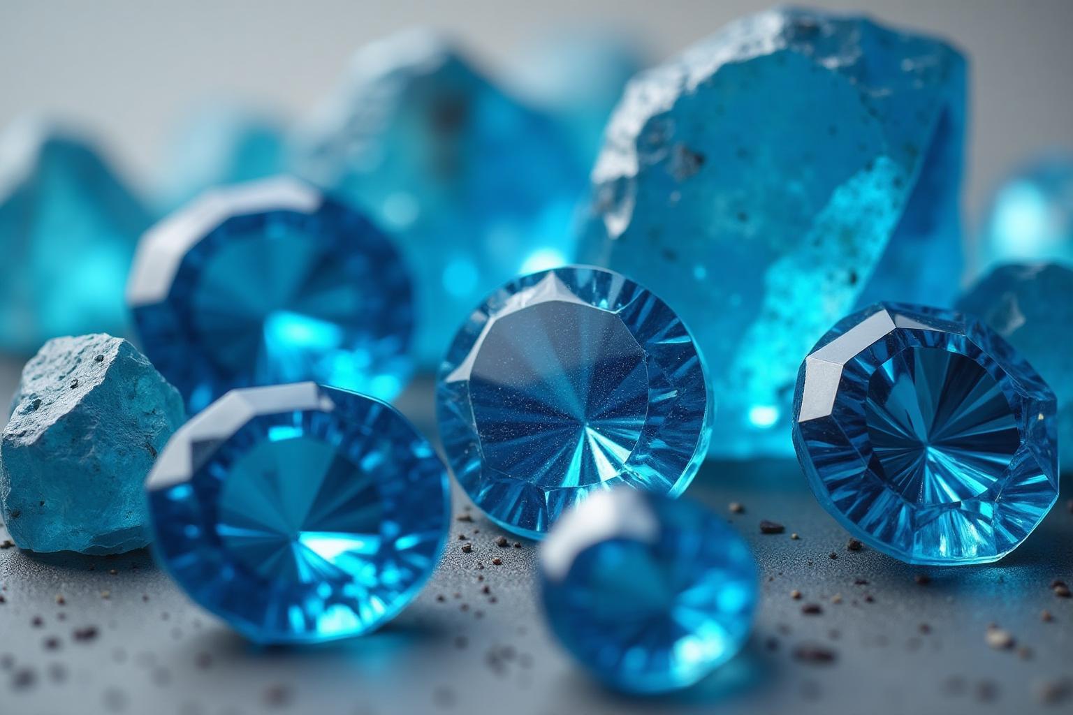
Last December, I was shopping for my mom's Hanukkah gift when I spotted the most gorgeous blue zircon ring. You know that specific shade of blue that makes you stop mid-scroll? That was it. Perfect. Except then I needed to wrap it.
Two hours. I spent two hours at three different stores trying to find wrapping paper or a gift box that matched that blue. Nothing worked. The blues were all wrong—too dark, too green, too... not-zircon.
That's when I fell down the rabbit hole and discovered something weird: there isn't just one "blue zircon" color. There are two. And the story behind them is way more interesting than I expected.
What Color is Blue Zircon, Actually?
Here's where it gets confusing. When most people talk about "Blue Zircon" as a color, they mean
Blue Zircon color breakdown:
- HEX:
- RGB: rgb(87, 254, 255)
- HSL: hsl(180°, 100%, 67%)
But then there's Zircon Blue
Zircon Blue color breakdown:
- HEX:
- RGB: rgb(0, 132, 157)
- HSL: hsl(190°, 100%, 31%)
Two colors. Similar names. Completely different vibes. This is why I couldn't find matching wrapping paper—I didn't even know which blue I was looking for.

The Gemstone That Started It All
Okay, so why is a color named after a rock in the first place?
Blue zircon is one of the most fascinating gemstones on Earth. Not because it's rare (it's not), or because it's expensive (definitely not), but because it's literally one of the oldest things you can hold in your hand.
Zircon crystals have been found that are 4.4 billion years old. For context, Earth itself is only 4.5 billion years old. This rock was here when the planet was basically a newborn.
The name comes from the Persian word "zargun," meaning "gold-colored." Which is ironic, because the most famous zircons now are blue. But here's the thing: they don't start that way.
The Heat Treatment Magic
Natural blue zircon is extremely rare. Most zircon comes out of the ground brown, reddish, or yellowish. Not exactly jewelry-worthy.
Then someone in Cambodia (most famously in the Ratanakiri region) figured out that if you heat certain types of zircon to ridiculous temperatures—we're talking 900-1000°C—it transforms into that stunning blue.
It's basically gemstone alchemy. You put in a boring brown stone, apply extreme heat, and out comes electric blue. The science involves changing the crystal structure and removing impurities, but honestly, it still feels like magic.

Blue Zircon vs Everything That Looks Like It
When I was color-matching that gift box, I kept second-guessing myself. "Wait, is that aquamarine? Cyan? Tiffany Blue?"
Here's a comparison so you don't lose your mind like I did:
Blue Zircon
Bright, electric, high-energy cyan with maximum saturation
Zircon Blue
Deeper, more gemstone-accurate, slightly teal-leaning
Aquamarine
Softer, more pastel, less intense
Cyan
Pure 50-50 green-blue, very digital-looking
Tiffany Blue
More turquoise, less electric, trademarked luxury
Electric Blue
Similar to Blue Zircon but slightly more blue, less green
The key difference? Blue Zircon has that specific brightness without going full neon. It's vivid but natural-looking. It's the Goldilocks of bright blues.
Why Designers Are Obsessed With This Color
After my gift-wrapping disaster, I started noticing Blue Zircon everywhere. Tech startups. Wellness brands. App interfaces. Once you see it, you can't unsee it. Unlike warm earth tones like Red Clay, Blue Zircon brings a cool, fresh energy that feels both modern and timeless.
Perfect for Digital Interfaces
Blue Zircon
- Call-to-action buttons - it demands attention without feeling aggressive
- Highlights and accents - bright enough to stand out, professional enough to trust
- Loading animations - that electric quality makes movement feel smooth
- Icon systems - reads clearly at any size
I tested it on a client's app redesign last month. Their old CTA button was
Is it because of the color? Maybe. Maybe not. But it didn't hurt.
Brand Identity Applications
Blue Zircon works for:
- Tech companies - innovative without being childish
- Wellness brands - calming but energizing (weird combo, but it works)
- Jewelry businesses - obviously
- Water sports and marine companies - that tropical water vibe
- Clean energy brands - fresh, modern, optimistic

Creating Palettes With Blue Zircon
The tricky thing about Blue Zircon is that it's SO bright, it can overwhelm a palette if you're not careful.
Here are three palette formulas that actually work:
Modern Tech Palette
- Blue Zircon
- Primary accent - Deep Navy
- Base - Light Gray
- Background - Pure White
- Contrast - Learn more about white - Coral
- Secondary accent
Wellness & Calm
- Blue Zircon
- Accent - Sage Green
- Primary - Warm Beige
- Base - Cream
- Background - Terracotta
- Warmth
Luxury Jewelry
- Zircon Blue
- Primary (darker version) - Champagne Gold
- Accent - Charcoal
- Base - Pearl White
- Background - Rose Gold
- Warmth
Want to create professional color palettes with Blue Zircon?
The December Birthstone Connection
Here's a fun fact I learned while researching my mom's gift: blue zircon is one of three birthstones for December (along with turquoise and tanzanite).
This matters for design work more than you'd think. If you're creating:
- Holiday campaigns in November-December
- Winter-themed designs
- Gift guides or jewelry promotions
- Seasonal branding
...Blue Zircon has built-in symbolic meaning:
- Prosperity - historically believed to attract wealth
- Wisdom - associated with clarity of thought
- Protection - worn as a talisman
- Honor and purity - traditional virtues
It's one of those colors that carries emotional weight beyond just looking pretty. People have attachments to it without even realizing why.
Using Blue Zircon Responsibly (Accessibility Matters)
Okay, real talk: Blue Zircon
Text Readability
Never do this:
- Blue Zircon text on white background - fails WCAG AA
- Blue Zircon text on light backgrounds - barely readable
- Small text in Blue Zircon - eye strain city
Do this instead:
- Use Blue Zircon for large headings with proper weight
- Pair with dark backgrounds (navy, charcoal, black)
- Reserve for accents, not body text
- Test contrast ratios before committing
I made this mistake on a client website. Beautiful headline in Blue Zircon. Completely unreadable for anyone over 40. We fixed it, but not before getting some pointed feedback.
Best Practices
Use Blue Zircon for:
- Backgrounds (with white or very light text)
- Large buttons and CTAs
- Icons and graphics
- Decorative elements
- Hover states and interactions
Avoid Blue Zircon for:
- Body text
- Small UI elements with text
- Links in paragraphs
- Form labels
- Anything requiring extended reading
Finding the Perfect Blue Zircon Match
So you love this color and want to use it in a professional project. What's the exact shade you need?
The color industry has specific standards. If you're working with:
- Print projects - you'll need Pantone values
- Professional branding - precise color matching matters
- Manufacturing - exact specifications required
Blue Zircon doesn't have an official Pantone equivalent, but the closest matches are typically in the 2900-3000 range (Process Cyan variants).
Extracting Blue Zircon From Images
Here's a pro tip I wish I'd known during my gift box saga: if you have a photo of a blue zircon gemstone or any reference image, you can extract the exact colors.
This is super useful when:
- Clients send you inspiration images
- You're matching existing jewelry or products
- You want to capture that specific shade from a real gemstone
- You're creating brand guidelines from physical samples
The Psychology of Blue Zircon
Colors hit us on a subconscious level. Blue Zircon triggers specific responses (read more about color psychology in marketing):
Positive associations:
- Energy and vitality (the brightness)
- Clarity and precision (the purity of the hue)
- Innovation and modernity (digital-native quality)
- Trustworthiness (blue family)
- Cleanliness and freshness (water connection)
Potential drawbacks:
- Can feel cold if overused
- Might be too intense for calm/relaxed brands
- Digital quality can feel artificial in wrong contexts
- Cultural considerations (blue means different things globally)
It's a "love it or hate it" color. People rarely feel neutral about Blue Zircon. Which makes it perfect for brands that want to stand out—but risky for those playing it safe.
If you're curious about how color psychology affects decision-making, check out our guide on how tech giants use color psychology (spoiler: they spend millions getting it right).
Practical Tips From Someone Who Learned the Hard Way
After my gift-wrapping adventure and subsequent obsession with this color, here's what I've learned:
Digital vs Print
Blue Zircon looks different on screens vs paper. That electric quality that pops on a monitor can look flat or overly bright when printed.
Solution: Always test print samples. CMYK conversion isn't perfect. Budget for color proofing if it matters.
Pairing Rules
Works great with:
- Warm neutrals (beige, cream, sand)
- Deep navy or charcoal
- Coral and peachy tones
- White and very light grays
- Small amounts of gold or copper
Clashes with:
- Other bright saturated colors
- Purple (too much energy)
- Bright green (fights for attention)
- Brown (dated look)
- Anything neon
Context Matters
Blue Zircon for a tech startup? Perfect.
Blue Zircon for a law firm? Probably not.
Blue Zircon for a water sports brand? Absolutely.
Blue Zircon for a funeral home? Please don't.
My Conclusion (and Mom's Reaction)
I eventually found a gift box. Metallic silver. It worked because I stopped trying to match the exact color and embraced contrast instead.
Mom loved the ring. Wore it to every family gathering for months. Still doesn't understand why I spent two hours looking for the "right" blue box. ("Honey, any box would have been fine.")
But that obsessive gift-wrapping session taught me something valuable: Blue Zircon is a color with depth. It's not just pretty—it's ancient (4.4 billion years!), it's transformed (heat-treated gemstones), it's meaningful (December birthstone), and it's psychologically powerful (that specific brightness).
It's a color that makes people stop and look. That makes designs pop without screaming. That feels modern and timeless at the same time.
And now when I see it in app interfaces, brand identities, or yes, jewelry stores—I recognize it. That specific shade of electric cyan that looks like water but isn't quite turquoise. Like the sky but brighter. Like cyan but warmer.
That's Blue Zircon. And now you'll never unsee it either.
P.S. — Next December, I'm just using gift bags. Lesson learned.