What Makes Gray? The Complete Guide to the World's Most Misunderstood Color
· Lion Dada
I'll never forget the Great Gray Paint Disaster of 2023.
I stood in my kitchen, staring at five different "gray" paint samples on the wall, and I wanted to cry. The sample that looked perfect in the store now looked distinctly purple. The "warm gray" I thought would be cozy looked green. And the "cool gray" that was supposed to be sophisticated? It looked like a dentist's office.
My husband walked in, looked at the wall, and said what I was thinking: "Why is choosing gray paint harder than choosing a career?"
That was my breaking point. I became obsessed. I read everything about gray. I learned about undertones, greige, LRV values, north-facing light, south-facing light, and the difference between Agreeable Gray and Accessible Beige (yes, they're different, and yes, it matters).
Three weeks later, I finally understood something profound: Gray isn't boring. Gray is the most complex, strategic, and misunderstood color in design.
This is everything I wish I knew before I started.
What Actually Makes Gray? The Science
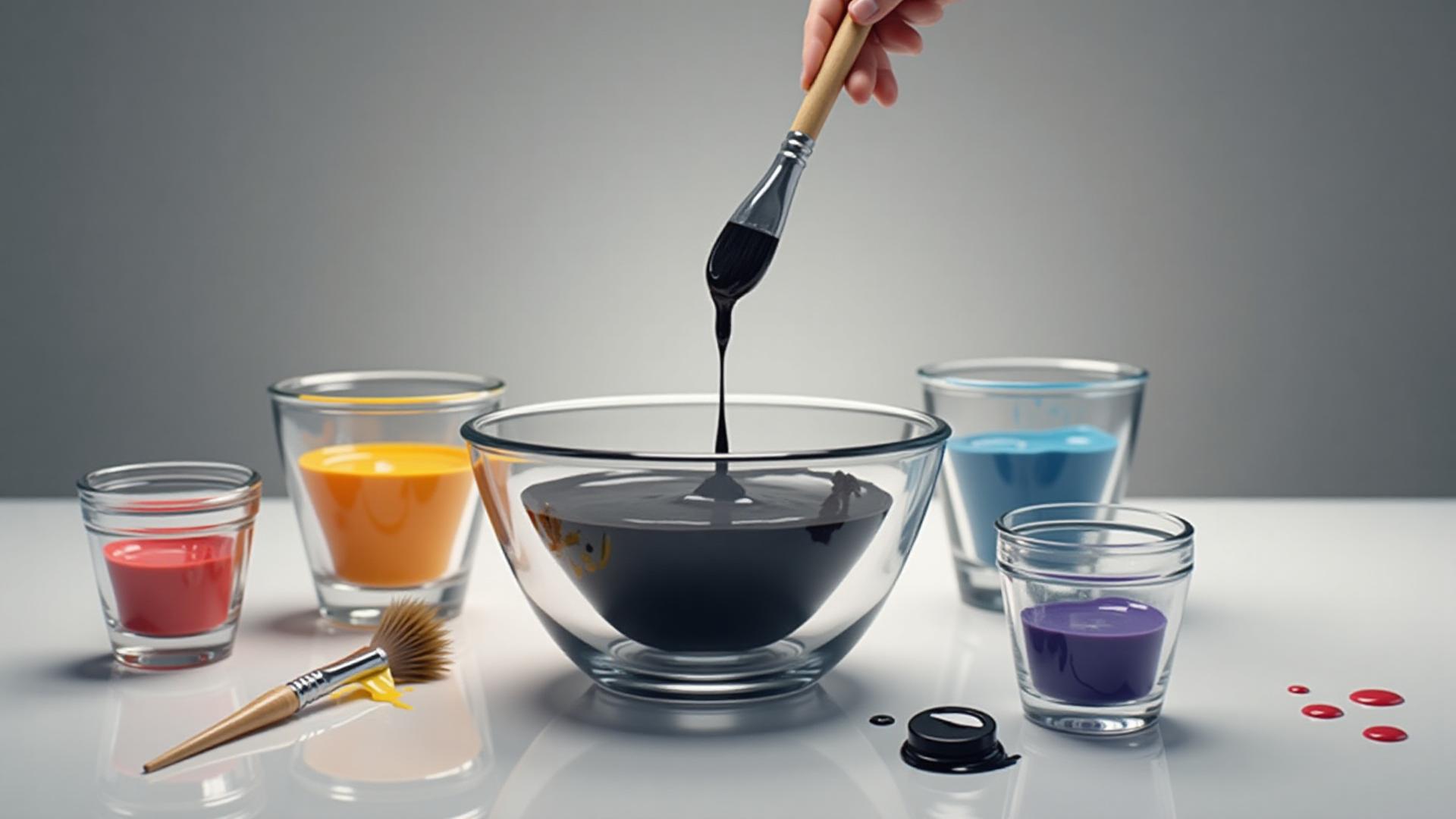
Here's what I thought before my paint disaster: Gray is black mixed with white. Done.
Here's what I learned: That's technically true, but it's the least interesting way to make gray.
The Simple Method: Black + White
Yes, mixing black and white creates gray. But here's the problem—pure gray (what designers call "true gray" or "neutral gray") almost never exists in real spaces. Why? Because black and white pigments themselves have subtle undertones, and the lighting in your space adds its own color cast.
In digital design, pure gray is easy: set RGB values where R=G=B.
The Advanced Method: Complementary Colors
This blew my mind: Any two complementary colors mixed together create gray.
- Blue
+ Orange = Gray - Red
+ Green = Gray - Yellow
+ Purple = Gray
This is why gray always "leans" somewhere. That purple-looking gray on my wall? It had blue undertones. The green-looking gray? It had yellow undertones. Every gray is secretly two colors fighting for dominance.
The Undertone Revelation
Here's the truth that changed everything for me: Every gray has an undertone. There is no such thing as a perfectly neutral gray in real-world application.
Grays can have:
- Blue undertones (cool, modern, can look purple)
- Green undertones (can look muddy or sophisticated depending on lighting)
- Purple undertones (common in "slate" grays)
- Yellow/beige undertones (these are "warm grays" or greige)
- Red/pink undertones (rare but they exist, often in "taupe-grays")
The lighting in your space will amplify these undertones. North-facing rooms with cool light will make warm grays look MORE beige. South-facing rooms with warm light will make cool grays look MORE blue or purple.
Gray vs Grey: Does the Spelling Matter?
Quick linguistic detour that actually matters for searching online: both spellings are correct.
- Gray (with an "A") = American English → "A" for America
- Grey (with an "E") = British English → "E" for England
For design purposes, they mean the same thing. But if you're searching for paint colors or design inspiration, you'll find different results with each spelling. I've started using "gray" for paint names (most US paint companies use "gray") and "grey" when I'm feeling fancy.
Fun fact: Sherwin-Williams uses "gray" in all their paint names (Agreeable Gray, Dorian Gray). Benjamin Moore uses both ("Gray Owl" but also "Chelsea Grey"). There's no rhyme or reason to it.
The Gray Spectrum: 20 Shades You Need to Know
Let me break down the five categories of gray I discovered during my obsessive research:
Light Grays (The "Safe" Zone)
Colors like Whisper Gray
Pro: Almost impossible to mess up
Con: Can feel cold or sterile in large spaces
Best for: Bathrooms, small spaces, modern minimalist design
Warm Grays / Greige (The Crowd Pleasers)
This is where Agreeable Gray
Pro: Cozy, timeless, hides imperfections
Con: Can look beige in bright light
Best for: Living rooms, bedrooms, kitchens (basically everywhere)
Cool Grays (The Sophisticated Ones)
Stonington Gray
Pro: Clean, contemporary, sophisticated
Con: Can feel cold in rooms without warm elements
Best for: Modern spaces, south-facing rooms, offices
Mid-Tone Grays (The Versatile Workers)
Chelsea Gray
Pro: Balanced, works with many design styles
Con: Can feel "safe" or boring without careful styling
Best for: Cabinets, accent walls, exteriors
Dark Grays / Charcoals (The Bold Statements)
Charcoal
Pro: Dramatic, hides imperfections, creates contrast
Con: Can make spaces feel smaller, shows dust easily
Best for: Accent walls, cabinets, exterior doors, modern kitchens
Warm Gray vs Cool Gray: The Battle That Actually Matters
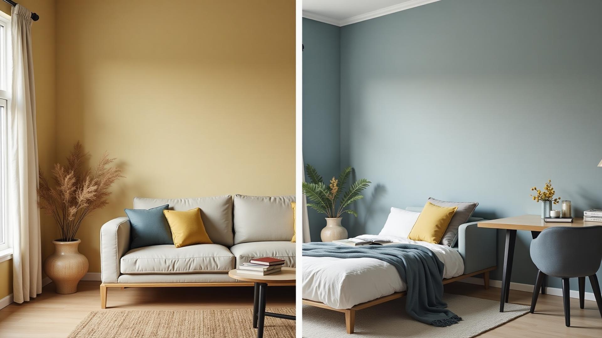
This is the most important distinction you need to understand. Forget light vs dark—warm vs cool determines whether your gray will work in your space.
Warm Grays (Yellow/Beige Undertones)
Warm grays have yellow, red, or beige undertones. When you see them next to pure white, they look slightly tan or creamy.
When to use warm grays:
- North-facing rooms (they need warmth to counter the cool natural light)
- Spaces with cool-toned flooring (gray tile, concrete)
- When you want "cozy" or "inviting"
- Farmhouse, transitional, or traditional design styles
The warm gray mistake I made: I chose a warm gray for a south-facing room that already had tons of warm natural light. It looked beige. Not gray. Beige.
Cool Grays (Blue/Green Undertones)
Cool grays have blue, green, or purple undertones. Next to pure white, they might look slightly blue or slate-like.
When to use cool grays:
- South-facing rooms (they need cooling to counter the warm natural light)
- Spaces with warm wood tones (oak, maple) that need balancing
- When you want "modern" or "sophisticated"
- Contemporary, industrial, or Scandinavian design styles
The cool gray mistake everyone makes: Using cool gray in a north-facing room. It will look purple, blue, or downright depressing.
The White Paper Test (My Foolproof Method)
Hold your gray paint sample next to a piece of pure white printer paper in the actual room where you'll use it. Look at the gray at different times of day.
- If it looks slightly tan/cream next to the white → Warm gray
- If it looks slightly blue/green/purple next to the white → Cool gray
- If you can't tell → That's called "true gray" and it's rare (or you're colorblind like my husband)
Want to explore gray undertones interactively? Our AI Color Picker can help you identify whether grays lean warm or cool instantly.
Greige: The Color That Changed Everything
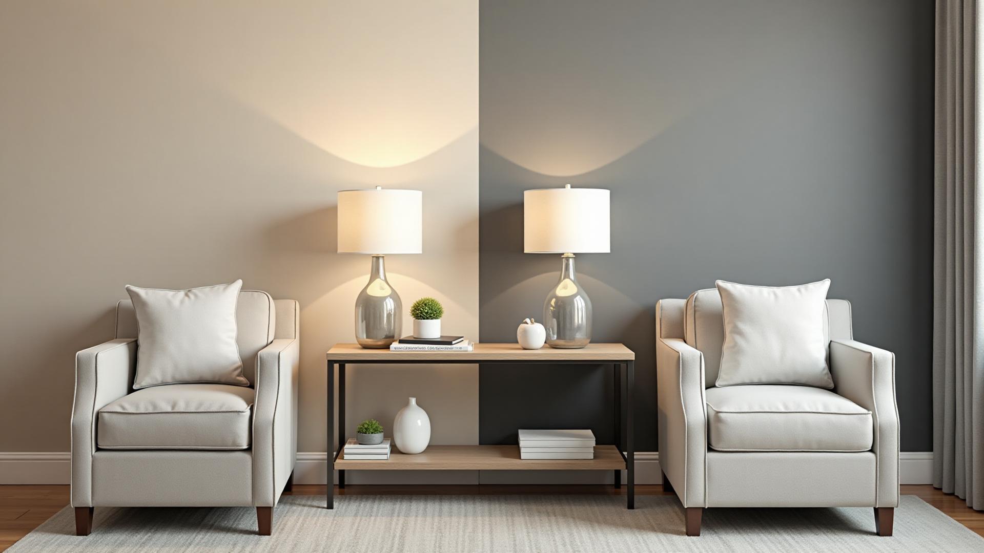
Let's talk about the elephant in the room—or rather, on the wall.
Greige (gray + beige) isn't technically gray. It's a hybrid that's been dominating interior design since 2015 and shows no signs of stopping.
What Makes Greige Different from Gray?
Greige has significantly more beige/brown undertones than a warm gray. If a warm gray is 80% gray and 20% beige, greige is 50/50 or even 40% gray and 60% beige.
The most famous greiges:
- Sherwin-Williams Agreeable Gray
(the #1 best-selling paint color in America) - Benjamin Moore Revere Pewter
(the designer favorite) - Accessible Beige
(warmer than Agreeable Gray)
Why Greige Dominates 2024-2025
After years of cool grays, the design world swung toward warmth. Greige gave people the sophistication of gray with the coziness of beige. It's the perfect compromise color.
Greige psychology: Gray says "sophisticated." Beige says "comfortable." Greige says "sophisticated AND comfortable," which is exactly what everyone wants their home to feel like.
The Greige Controversy (Yes, Really)
Some designers and publications (including House Digest) predict greige will look dated by 2026-2027. The argument: it's become so ubiquitous that it's lost its personality.
My take after obsessing over this for weeks: Greige became popular because it's timeless and versatile. It might become less trendy, but it won't look "bad" the way Tuscan yellow from 2005 looks bad now.
If you're choosing cabinet colors or planning to sell your house within 5 years, greige is still a safe bet.
Gray in Interior Design: The Cabinet Revolution
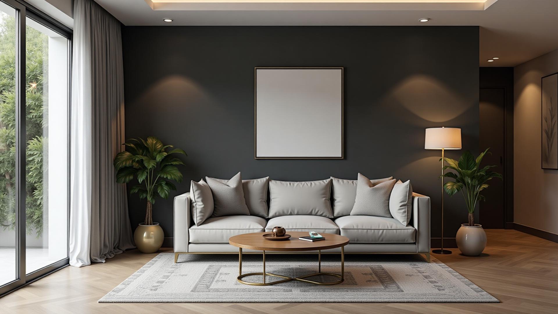
Here's why I went down this entire gray rabbit hole: kitchen cabinets.
Gray cabinets exploded in popularity around 2015 and they're still the #1 choice for kitchen renovations. Here's why:
Why Gray Dominates Kitchen Cabinets
1. Timelessness
White cabinets show every smudge. Wood cabinets go in and out of style. Gray cabinets? They've been popular for a decade and still look modern.
2. Versatility
Gray works with white quartz countertops, marble, butcher block, concrete—literally everything. You can pair gray cabinets with gold hardware, black hardware, or stainless steel.
3. Hide Imperfections
Light gray to medium gray hides fingerprints, water spots, and daily wear better than white.
4. Psychological Appeal
Gray cabinets make kitchens feel more expensive. There's something about gray that signals "this was a thoughtful choice" rather than "I chose the default."
Top Gray Cabinet Colors for 2025
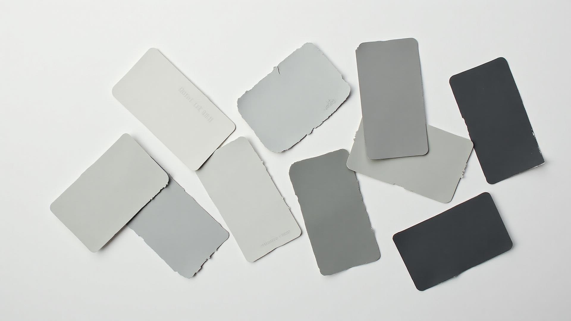
Based on designer recommendations, sales data, and my personal testing:
For Light Gray Cabinets:
- Classic Gray
(Benjamin Moore) - barely-there gray - Gray Owl
(Benjamin Moore) - cool-toned, modern
For Medium Gray Cabinets:
- Chelsea Gray
(Benjamin Moore) - versatile mid-tone - Dorian Gray
(Sherwin-Williams) - warm mid-tone - Agreeable Gray
(Sherwin-Williams) - the safe greige
For Dark Gray Cabinets:
- Kendall Charcoal
(Benjamin Moore) - charcoal with warmth - Iron Ore
(Sherwin-Williams) - dramatic black-gray - Cheating Heart
(Sherwin-Williams) - sophisticated dark gray
What to Pair with Gray Cabinets
Countertops that work with gray:
- White quartz or marble (crisp, timeless)
- Black or dark countertops (dramatic contrast)
- Butcher block or wood (adds warmth)
- Light beige or cream quartz (soft, neutral)
Hardware color choices:
- Gold or brass → Works best with warm grays and greiges (this is what I chose)
- Matte black → Works with any gray, ultra-modern
- Polished nickel or chrome → Best with cool grays
- Bronze or copper → Beautiful with charcoal and dark grays
Backsplash strategies:
- White subway tile (classic, lets gray cabinets be the star)
- Patterned tile with gray accents (adds visual interest)
- Natural stone with gray veining (sophisticated, cohesive)
Planning a kitchen renovation? Try our AI Website Designer to visualize different gray cabinet options and complementary colors before you commit to paint samples.
Gray Psychology: What This "Neutral" Color Really Says

Gray has a complicated psychological profile. It's the ultimate neutral, but it's not emotionally neutral at all.
Positive Associations with Gray
Sophistication & Elegance
Gray is the color of refined taste. It's why luxury brands love it—Tesla's signature gray, Apple's Space Gray, Mercedes-Benz silver. Gray says "I have discerning taste."
Balance & Neutrality
Gray is literally the middle ground between black and white, light and dark. In color psychology, it represents balance, compromise, and rationality.
Calm & Composure
Unlike bright colors that demand attention, gray creates a sense of calm. It's one reason gray is popular in bedrooms, offices, and meditation spaces.
Timelessness
Gray doesn't scream any particular era. A gray room from 2015 looks just as current in 2025. It's the color of "this will still look good in 10 years."
Negative Associations with Gray
Coldness & Lack of Emotion
Too much gray, especially cool gray, can feel sterile or uninviting. It's the color of overcast skies and institutional buildings.
Depression & Gloom
There's a reason we say "gray mood" or "gray day." Psychologically, gray is associated with lack of energy and emotional flatness.
Indecision & Conformity
Gray can signal "I didn't want to make a bold choice" or "I'm hiding in the crowd." It's the ultimate "safe" color.
The "50 Shades" Cultural Impact
Let's address it: the 2011 novel (and 2015 film) Fifty Shades of Grey legitimately changed how people think about gray as a color.
Before: Gray was "boring" or "safe"
After: Gray became associated with sophistication, mystery, and luxury
Whether you love or hate the cultural phenomenon, it made gray interesting to mainstream audiences in a way that beige or tan never achieved.
Gray in Emotional Design
When designing spaces or brands, gray's psychological impact depends entirely on:
- How much you use: Small doses = sophisticated. Entire space = potentially depressing.
- What you pair it with: Gray + gold = luxury. Gray + white = clinical. Gray + warm wood = cozy.
- The undertone: Warm gray = comforting. Cool gray = modern. True gray = professional.
Gray in Branding: Apple, Tesla, Nike & The Premium Signal

Gray has become the unofficial color of premium brands. Here's why these massive companies chose gray:
Apple's Space Gray: The Tech Aesthetic
Apple introduced Space Gray in 2013 with the iPhone 5S, and it became their signature premium color (alongside silver and gold).
What Space Gray communicates:
- Modern, not flashy
- Sophisticated technology
- Timeless design (won't look dated)
- Premium without being ostentatious
Space Gray
Tesla: Gray = The Future
Tesla's signature gray (they call it Midnight Silver Metallic) has become synonymous with electric vehicles and sustainable luxury.
Why Tesla chose gray:
- Futuristic without being sci-fi
- Sophisticated and serious (this is cutting-edge tech, not a toy)
- Versatile across different models
- Hides dirt better than white (practical for daily drivers)
Fun fact: Gray and white Teslas have higher resale values than bright colors. Buyers see gray as timeless.
Nike: Gray as Athletic Sophistication
Nike uses gray extensively in their performance lines, especially for premium athletic wear.
The Nike gray strategy:
- Gray = serious athleticism (not recreational sports)
- Heather gray
= technical fabric, moisture-wicking - Charcoal gray = premium pricing tier
- Works across all sports categories
Nike's gray is neither warm nor cool—it's a true neutral that lets their swoosh logo be the star.
Mercedes-Benz: Silver/Gray = Automotive Luxury
Mercedes has been using silver and gray as their signature colors since the 1930s.
The luxury car gray formula:
- Metallic silver/gray = premium materials
- Reflective quality = attention to detail
- Gray interior = sophisticated, not flashy
- Works across all vehicle types (sedan to SUV)
Mercedes' Iridium Silver
When NOT to Use Gray in Branding
Food brands should generally avoid gray. Color psychology research shows gray can suppress appetite because it's not associated with natural foods.
Notice how McDonald's, Coca-Cola, Starbucks, and major food brands avoid gray? There's a reason. Brown, green, red, yellow—yes. Gray—no.
Children's products rarely use gray for the same reason. Gray signals sophistication, which is antithetical to playfulness, imagination, and childhood energy.
Want to match your brand's gray to Pantone standards? Check out our Pantone Color Finder to find the exact Pantone match for any gray shade.
Creating Perfect Gray Palettes
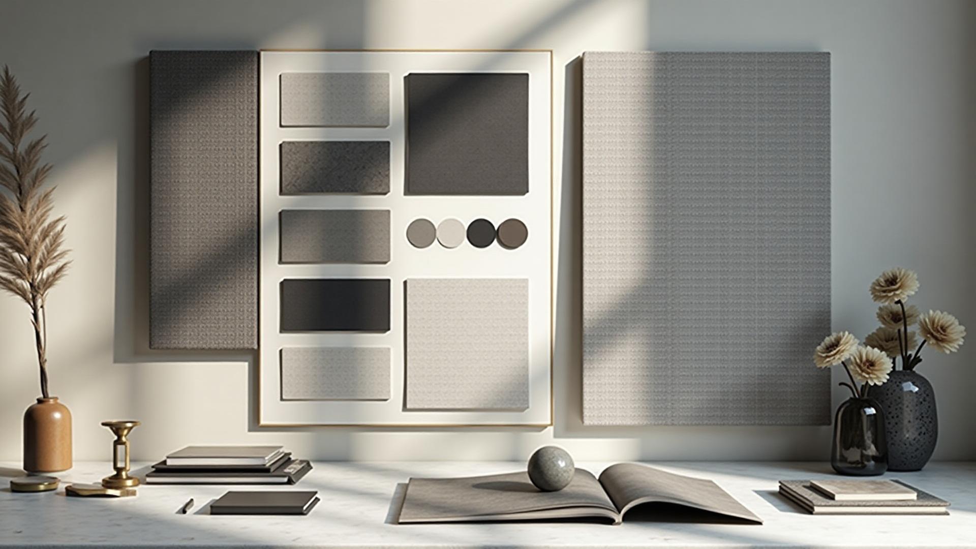
Here's what I learned about pairing grays with other colors after testing 50+ combinations:
Palette 1: Modern Minimal
Base: Charcoal
Accent 1: Pure White
Accent 2: Warm Brass
Supporting: Light Gray
Best for: Contemporary homes, tech offices, modern kitchens
Vibe: Clean, sophisticated, masculine-leaning
Palette 2: Warm & Inviting
Base: Agreeable Gray
Accent 1: Cream
Accent 2: Terracotta
Supporting: Soft White
Best for: Living rooms, bedrooms, farmhouse style
Vibe: Cozy, welcoming, family-friendly
Palette 3: Tech/Professional
Base: Slate Gray
Accent 1: Electric Blue
Accent 2: White
Supporting: Gunmetal
Best for: Tech companies, corporate offices, SaaS products
Vibe: Professional, trustworthy, cutting-edge
Palette 4: Sophisticated Neutrals
Base: Chelsea Gray
Accent 1: Black
Accent 2: Camel
Supporting: Linen White
Best for: High-end retail, hospitality, luxury residential
Vibe: Upscale, refined, expensive-feeling
Palette 5: Scandinavian Serenity
Base: Gray Owl
Accent 1: Sage Green
Accent 2: Natural Wood
Supporting: Warm White
Best for: Minimalist homes, bedrooms, Scandi-style spaces
Vibe: Calm, natural, hygge
Our Fibonacci Palette Generator can help you create mathematically balanced gray color schemes based on nature's golden ratio. It's become my secret weapon for palettes that just feel right.
Gray Accessibility: Getting It Right for Everyone
Here's something I didn't think about until I started this blog: gray is one of the trickiest colors for accessibility.
The Light Gray Text Problem
This is the #1 accessibility mistake I see everywhere:
Light gray text
The contrast ratio is only 2.85:1. You need 4.5:1 minimum for normal text and 3:1 for large text to meet basic accessibility standards.
Safe Gray Text Combinations
For normal body text (16px or smaller):
- Dark gray
on white → 12.6:1 ratio ✓ (excellent) - Charcoal
on white → 9.7:1 ratio ✓ (great) - Medium gray
on white → 5.7:1 ratio ✓ (passes AA)
For large text (18px+ or 14px+ bold):
- Light-medium gray
on white → 4.6:1 ratio ✓ (passes AA for large text)
NEVER do this:
- Light gray
on white → 2.3:1 ratio ✗ (fails all standards)
Gray Backgrounds and Contrast
If you're using a light gray background, you need darker text:
- Medium gray
text on light gray background → 7.1:1 ratio ✓ - Dark gray
text on light gray background → 13.4:1 ratio ✓
Colorblindness and Gray
Good news: Gray is one of the safest colors for colorblind users because it doesn't rely on red-green or blue-yellow distinctions that affect the most common types of colorblindness.
However, people with complete colorblindness (achromatopsia) rely entirely on contrast. Make sure your gray-on-gray combinations have sufficient luminosity difference.
Test your gray combinations:
- Use our Color Contrast Checker to verify WCAG compliance
- Try our Colorblind Simulator to see how your grays appear to colorblind users
- Test on multiple devices and lighting conditions
Dark Mode Gray Considerations
If you're designing for dark mode, the contrast rules flip:
- Light gray
on dark gray → 11.8:1 ratio ✓ - Medium gray
on dark gray → 9.1:1 ratio ✓
The key: maintain at least 4.5:1 contrast ratio for normal text regardless of whether you're doing light mode or dark mode.
The Future of Gray: Where This Color is Heading
After spending three weeks in the gray obsession tunnel, here's what I'm seeing for 2025-2027:
Trend 1: Warmer Grays Are Winning
The pendulum has swung from cool grays (2010-2018) to warm grays and greiges (2019-present). Interior designers I follow predict this warmth trend will continue through 2026.
What this means:
- Greige is here to stay (despite clickbait articles saying it's "out")
- Gray with brown/tan undertones > Gray with blue undertones
- Cozy beats minimalist in residential design
Trend 2: Greige Evolution—New Hybrids Emerging
Paint companies are creating new greige variations:
- "Grayliac" (gray + lilac undertones)
- "Greige-taupe" (more brown than traditional greige)
- "Warm stone gray" (gray with subtle pink undertones)
These new hybrids attempt to capture greige's versatility while feeling fresh.
Trend 3: Dark Grays in Digital Design
As dark mode becomes standard in apps and websites, sophisticated charcoal grays have replaced pure black as the preferred background color.
Why dark gray > pure black for screens:
- Reduces eye strain
- Creates depth with layered grays
- Allows for better color contrast
- Feels more sophisticated than stark black
Most apps use
Trend 4: Gray as "Sustainable" Color
Here's an unexpected trend: Gray is being positioned as the sustainable, timeless choice in the anti-fast-fashion and anti-overconsumption movements.
The logic:
- Gray doesn't go out of style → Less repainting, less waste
- Gray works with anything → Less need to replace furniture when you redecorate
- Gray is sophisticated → Less temptation to constantly update
Whether this is genuine or marketing spin, gray is being rebranded as the "conscious" color choice.
Will Gray Ever Go Out of Style?
My answer after all this research: No, but specific shades will.
- True grays and charcoals → Timeless, like black and white
- Greige → Will remain popular but may lose its "trendy" status
- Cool grays with blue undertones → Already feel dated from the 2010s
- Warm grays with yellow undertones → Currently peaking, will eventually feel of this era
Gray as a color family will never go out of style because it's fundamentally neutral. But the type of gray you choose will date your design to a specific era, just like the type of wood tone (golden oak vs. white oak) dates kitchens to specific decades.
Your Practical Gray Decision Guide
After all that information, how do you actually choose the right gray? Here's my flowchart approach based on everything I learned:
Step 1: Identify Your Room's Natural Light
North-facing room (cool, indirect light all day)
→ Choose warm gray or greige
→ Examples: Agreeable Gray, Revere Pewter, Accessible Beige
South-facing room (warm, direct sunlight most of the day)
→ Choose cool gray or true gray
→ Examples: Gray Owl, Stonington Gray, Classic Gray
East-facing room (warm morning light, cool afternoon light)
→ Choose balanced gray with minimal undertones
→ Examples: Chelsea Gray, Dorian Gray
West-facing room (cool morning light, warm afternoon light)
→ Choose gray that works in both conditions or decide which time of day matters most
→ Examples: Repose Gray, Worldly Gray
Step 2: Define Your Design Goal
"I want timeless and safe"
→ Mid-tone greige like Agreeable Gray
"I want modern and sophisticated"
→ Cool gray like Gray Owl
"I want cozy and inviting"
→ Warm gray or greige like Revere Pewter
"I want dramatic"
→ Dark charcoal like Iron Ore
Step 3: Consider Your Existing Elements
You have warm wood tones (oak, maple, honey-colored floors)
→ Use cool gray to balance the warmth
→ Avoid warm gray (it'll look muddy)
You have cool floors (gray tile, concrete, light maple)
→ Use warm gray to add coziness
→ Avoid cool gray (it'll feel sterile)
You have colorful furniture or art
→ Use true gray or light gray to let colors pop
→ Avoid grays with strong undertones (they'll clash)
Step 4: Sample Testing Protocol (Don't Skip This!)
- Buy samples of your top 3 grays (not just chips—actual paint samples)
- Paint large swatches (at least 2' x 2') on different walls that get different light
- Live with samples for 3-7 days, looking at them at different times:
- Morning light
- Midday light
- Afternoon/evening light
- Night with artificial lighting
- Do the white paper test: Hold pure white paper next to each sample
- Looks slightly tan/cream → Warm gray
- Looks slightly blue/green/purple → Cool gray
- Take photos with your phone (sometimes cameras reveal undertones your eye misses)
- Make a decision and don't second-guess yourself (seriously, at some point you have to commit)
Step 5: Test Before You Commit (The Digital Way)
If you want to see how different grays look in your actual space before buying a single paint sample:
- Upload a photo of your space to our AI Website Designer (yes, it works for physical spaces too!)
- Use our Image Color Extractor to pull exact gray tones from inspiration photos you love
- Try our Color Palette Generator to see how your chosen gray works with other colors in your space
This digital testing saved me from buying 10+ paint samples I didn't need.
The Gray Conclusion: It's Not Boring, It's Strategic
Here's what I know now that I didn't know before The Great Gray Paint Disaster of 2023:
Every gray has an undertone. Pure neutral gray is a myth in real-world application.
Warm vs cool matters more than light vs dark. Match your gray's undertone to your room's light direction.
Greige isn't going anywhere. Despite the clickbait articles, it's too versatile and well-loved to disappear.
Gray is strategic, not safe. The right gray elevates design. The wrong gray makes everything feel off.
Test in YOUR space. Paint samples that look perfect in the store will look different in your home's lighting.
Gray is complex because it's every other color in disguise. That's not a bug—it's what makes gray endlessly interesting.
My kitchen cabinets are now painted in Benjamin Moore Chelsea Gray
Was it worth the obsession? Absolutely. Every time I walk into my kitchen now, the color feels exactly right. Not too warm, not too cool, not boring, not purple—just perfectly, intentionally gray.
That's the thing about gray: when you get it right, it's magic.
Ready to Explore Gray?
Stop guessing and start designing with confidence:
- AI Website Designer - Visualize gray color schemes in realistic mockups
- Color Picker Tool - Explore 16 million colors including every shade of gray
- Pantone Finder - Match your gray to official Pantone colors
- Color Contrast Checker - Ensure your gray text is accessible
- Image Color Extractor - Pull exact gray tones from inspiration photos
Because choosing gray shouldn't require three weeks of obsessive research. Unless you want it to. (No judgment—I've been there.)