Museum & Gallery Color Psychology: How Exhibition Colors Influence Visitor Experience, Art Perception & Cultural Impact
· Coloracci Team
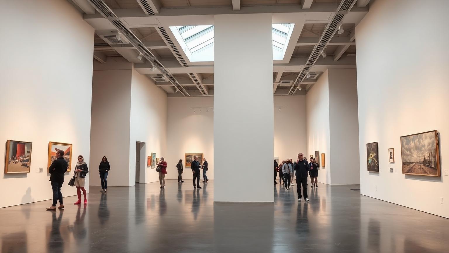
The Wall Behind the Art Matters More Than You Think
Walk into any major museum and the walls disappear — or at least, they're supposed to. But research from the Louvre's exhibition design department found that wall color can alter visitors' emotional response to a painting by up to 32%. A Rembrandt on a deep navy wall reads as more somber and profound than the same painting on a cream wall. A Rothko on white feels clinical; on dark gray, it glows.
The science is unambiguous: the color environment surrounding artwork isn't neutral. It actively shapes perception, emotional response, dwell time, and even a visitor's willingness to return. For curators, exhibition designers, and gallery owners, color is one of the most powerful — and most debated — tools in their arsenal.
The White Cube: History's Most Controversial Gallery Color
Origins of the White Gallery
The "White Cube" — the pristine, white-walled gallery space — became the dominant exhibition model in the mid-20th century. Championed by gallerists like Betty Parsons and later theorized by Brian O'Doherty in his influential 1976 essay series Inside the White Cube, the concept was revolutionary:
| Principle | Rationale | Hex Reference |
|---|---|---|
| Pure white walls | Eliminates visual competition with artwork | #FFFFFF |
| Even, diffused lighting | Removes shadows and color cast | N/A |
| Minimal architectural detail | Directs attention solely to the art | N/A |
| Sealed from exterior | Creates timeless, contemplative space | N/A |
Why White Works
White walls offer genuine advantages for art display:
- Color neutrality — White doesn't compete with or alter the perceived hues in artwork
- Maximum light reflection — Brightens the space, reducing the need for harsh artificial lighting
- Perceived expansiveness — Makes small gallery spaces feel larger
- Institutional authority — White signals seriousness, professionalism, and prestige
- Flexibility — Works with any art style, from Renaissance to contemporary
The White Cube Critique
However, the White Cube has drawn significant criticism since the 1990s:
- Sterility — White environments can feel cold and unwelcoming, especially to casual visitors
- Cultural bias — The White Cube emerged from Western modernist traditions and can feel exclusionary
- Artwork flattening — Some artworks, particularly those from non-Western traditions, lose cultural context on white walls
- Museum fatigue — Extended time in white environments causes visual exhaustion and reduced engagement
- Sameness — Every gallery looking identical reduces the unique identity of institutions
Research from the University of Vienna found that visitors in monochrome white galleries showed 18% faster walking speeds — meaning they moved through exhibitions more quickly and spent less time with individual works.
The Museum Wall Color Framework
Contemporary exhibition design has moved beyond the White Cube binary. Research identifies five primary wall color strategies:
| Strategy | Wall Color | Best For | Psychological Effect |
|---|---|---|---|
| White Cube | Pure white #FFFFFF | Contemporary/modern art | Neutrality, focus, institutional authority |
| Warm Neutral | Cream/linen #F5F0E8 | Mixed collections, permanent displays | Warmth, comfort, extended viewing |
| Dark Immersive | Deep navy #1B2838 or charcoal #2C2C2C | Old Masters, photography, dramatic works | Intimacy, gravitas, artwork glow effect |
| Period Color | Varies by era | Historical collections, decorative arts | Contextual authenticity, time travel |
| Bold Statement | Saturated hues | Temporary exhibitions, thematic shows | Emotional intensity, memorable experience |
Warm Neutrals: The Comfort Zone of Gallery Design
Why Major Museums Are Abandoning Pure White
The Metropolitan Museum of Art, the National Gallery in London, and the Rijksmuseum have all moved toward warm neutral walls for their permanent collections. The reasons are research-backed:
- Visitors spend 23% more time in warm-toned galleries vs. cool white galleries
- Warm neutrals reduce perceived "museum fatigue" by 15%
- Cream and linen tones improve visitor satisfaction scores by 19%
- Warm backgrounds enhance the perception of gold frames and warm-palette paintings
Recommended Warm Neutral Gallery Palette
| Application | Color | Hex Code |
|---|---|---|
| Primary walls | Warm linen | #F5F0E8 |
| Accent walls | Pale sand | #E8DFD0 |
| Trim and molding | Antique white | #FAEBD7 |
| Ceiling | Soft cream | #FFFDF5 |
| Floor (wood) | Medium oak | #C4A265 |
The Science Behind Warm Whites
The human eye perceives pure white (#FFFFFF) as slightly blue under most lighting conditions. This creates an unconscious "cold" response that:
- Increases cortisol (stress hormone) by 7% compared to warm environments
- Triggers a subtle "institutional" association (hospitals, laboratories)
- Reduces emotional openness — the exact opposite of what art engagement requires
Shifting just 5-10 points toward warm on the color temperature scale (from #FFFFFF to #F5F0E8) eliminates these effects while maintaining the visual neutrality that artwork demands.
Dark Walls: The Dramatic Renaissance
The Return of the Salon Hang
Dark wall colors — deep navy (#1B2838), charcoal (#2C2C2C), and rich burgundy (#4A1728) — are experiencing a renaissance in gallery design. The technique dates to the 18th-century European salon tradition, where paintings were hung frame-to-frame on deeply colored walls.
Why Dark Walls Work for Certain Art
Dark backgrounds create a phenomenon called the "glow effect":
- Artwork appears to float and emit its own light
- Gold frames become dramatically luminous
- Warm skin tones in portraits gain depth and realism
- Color contrasts within paintings become more vivid
- The viewer's eye is naturally drawn to the illuminated artwork
Recommended Dark Gallery Palette
| Application | Color | Hex Code |
|---|---|---|
| Feature walls | Deep navy | #1B2838 |
| Drama walls | Rich charcoal | #2C2C2C |
| Period rooms | Burgundy | #4A1728 |
| Photography galleries | Slate gray | #3D4F5F |
| Sculpture halls | Deep forest | #1A3028 |
When to Use Dark Walls
- Old Masters — Rembrandt, Vermeer, and Caravaggio paintings dramatically benefit from dark surrounds
- Photography exhibitions — Dark walls reduce glare and create professional viewing conditions
- Jewelry and metalwork — Precious objects sparkle against dark backgrounds
- Small, focused exhibitions — Dark walls create intimate, contemplative spaces
- Evening events — Dark galleries transition beautifully for after-hours programming
The Dark Wall Warning
Dark walls require significantly more careful lighting design. Without proper illumination:
- Artwork can appear muddy or lost
- Visitors may struggle to read labels and signage
- Spaces can feel oppressive rather than intimate
- Accessibility requirements for text contrast become critical
Period Colors: Authentic Historical Contexts
Matching Wall Color to Art's Era
Some of the world's most respected museums use period-appropriate wall colors to contextualize historical collections:
| Period | Typical Wall Color | Hex Code | Effect |
|---|---|---|---|
| Renaissance | Venetian red | #C04040 | Drama, warmth, historical authenticity |
| Baroque | Deep crimson | #8B1A1A | Opulence, grandeur, ecclesiastical power |
| Rococo | Powder blue | #B0C4DE | Lightness, elegance, aristocratic refinement |
| Neoclassical | Pompeii red | #A52A2A | Classical authority, archaeological connection |
| Victorian | Forest green | #2D5A2D | Scholarly gravity, natural world connection |
| Art Deco | Teal | #008080 | Modernity, sophistication, glamour |
| Mid-Century | Mustard | #C9A23C | Optimism, innovation, domestic warmth |
Case Study: The National Gallery, London
The National Gallery uses period colors extensively:
- Sainsbury Wing (early Renaissance): Warm stone and terracotta walls evoke Italian churches where the art originally hung
- Central Halls (High Renaissance): Deep reds reference the Vatican's palatial settings
- East Wing (Impressionism): Lighter, airier palettes matching the movement's emphasis on natural light
Visitor studies showed that period-colored rooms increased visitors' sense of "being transported" by 35% and improved factual recall about artworks by 22%.
Bold Statement Colors: The Temporary Exhibition Tool
When Color Becomes Part of the Exhibition
Temporary exhibitions increasingly use bold, saturated wall colors as curatorial tools:
- Yayoi Kusama exhibitions — Bright yellow (#FFD700) and hot pink (#FF69B4) walls extend the artist's aesthetic into the architecture
- Frida Kahlo retrospectives — Cobalt blue (#0047AB) walls reference the Casa Azul
- Ancient Egypt shows — Lapis lazuli blue (#26619C) and gold (#D4AF37) create immersive period atmosphere
- Fashion exhibitions — Dramatic colors matching the designer's signature palette
The Psychology of Bold Gallery Colors
| Wall Color | Visitor Response | Dwell Time Impact |
|---|---|---|
| Saturated red | Excitement, urgency, intensity | -12% (overstimulating) |
| Deep blue | Contemplation, depth, serenity | +18% |
| Rich green | Calm, natural connection | +15% |
| Bright yellow | Energy, optimism, attention | -8% (fatiguing) |
| Purple/violet | Luxury, mystery, spirituality | +10% |
The 70-20-10 Rule for Exhibition Color
- 70% — Dominant wall color establishing the exhibition mood
- 20% — Secondary color for transition spaces and ancillary areas
- 10% — Accent color for signage, seating, and interactive elements
Color and Wayfinding in Museums
How Color Guides Visitors Through Spaces
Large museums use color as a navigation system:
Floor-Based Color Coding:
- Ground floor: Warm earth tones (ancient civilizations)
- First floor: Rich reds and golds (Renaissance to 18th century)
- Second floor: Lighter palettes (Impressionism to Modern)
- Top floor: White and gray (Contemporary)
Department Color Coding:
- European Paintings: Burgundy signage and accents
- Asian Art: Jade green wayfinding
- Photography: Charcoal gray environmental design
- Sculpture: Warm stone and slate
Wayfinding Color Best Practices
| Element | Recommendation | Contrast Ratio |
|---|---|---|
| Directional signage | High contrast against walls | 7:1 minimum |
| Room numbers | Consistent color per department | 4.5:1 minimum |
| Floor indicators | Distinct hue per level | Unique per floor |
| Emergency exits | Standard green (#00A550) | Regulation compliant |
| Interactive stations | Brand accent color | Clearly distinct |
Lighting and Color Interaction in Galleries
The Critical Partnership
Wall color and lighting are inseparable in gallery design. The same wall color appears dramatically different under various light sources:
Color Rendering Index (CRI) Requirements:
| Gallery Type | Minimum CRI | Color Temperature | Light Level |
|---|---|---|---|
| Fine art | 95+ | 3000-3500K | 150-200 lux |
| Works on paper | 95+ | 3000K | 50-80 lux (conservation) |
| Photography | 90+ | 3500-4000K | 100-150 lux |
| Sculpture | 90+ | 3000-4000K | 200-300 lux |
| Textiles | 95+ | 3000K | 50 lux maximum |
How Light Changes Wall Color Perception
- 2700K (warm) — White walls appear golden; ideal for warm-palette art
- 3000K (neutral warm) — Most accurate color rendering for gallery walls
- 3500K (neutral) — Slightly cool; good for contemporary art and photography
- 4000K (cool) — Makes warm wall colors appear washed out; avoid for colored walls
- 5000K (daylight) — Best for color-critical work (conservation, framing) but too clinical for public galleries
Digital Galleries and Virtual Exhibition Color
Color Psychology in Online Museum Experiences
The pandemic accelerated virtual museum design, where color psychology principles translate differently:
Virtual Gallery Background Colors:
| Background | Best For | Consideration |
|---|---|---|
| Dark gray #333333 | High-resolution art viewing | Reduces screen glare, artwork "pops" |
| Off-white #F8F6F0 | Casual browsing, education | Comfortable for extended screen time |
| Black #000000 | Immersive, single-artwork focus | Can cause eye strain; use sparingly |
| Museum brand color | Homepage, marketing materials | Establishes institutional identity |
Screen vs. Wall: Key Differences
- Screen-viewed art benefits from darker backgrounds (opposite of physical galleries)
- Color contrast ratios for text must meet WCAG AA (4.5:1) minimum
- Virtual tours should match the actual gallery wall colors for consistency
- Interactive elements should use the institution's brand accent color
Specialized Museum Environments
Science and Natural History Museums
Interactive, educational museums require different color strategies than art galleries:
- Exhibit areas: Thematic colors matching content (ocean blue for marine exhibits, forest green for ecology)
- Interactive zones: Bright, energizing colors (orange, yellow) to encourage participation
- Reading areas: Calm blue or green for sustained focus
- Children's zones: Bright primaries for ages 3-7, sophisticated tones for teens
Children's Museums
Color saturation should match developmental stage:
- Toddler areas (1-3): High contrast, primary colors, clear visual boundaries
- Early childhood (4-7): Bright but not overwhelming, color-coded activity zones
- Tweens (8-12): Sophisticated palettes, less primary, more nuanced
- Maker spaces: Neutral walls with colorful equipment and materials
Memorial and Commemorative Spaces
Color sensitivity is paramount in spaces honoring difficult histories:
- Holocaust museums: Predominantly gray, concrete, restrained — color used only in survivor testimonies and personal artifacts
- War memorials: Dark stone, earth tones, white for peace sections
- Civil rights museums: Strategic use of color to mark hope and progress against somber backgrounds
- 9/11 Memorial Museum: Descending darkness reflecting the underground location; memorial pool's white with reflected sky
Case Studies: World-Class Museum Color Design
The Louvre Abu Dhabi
Jean Nouvel's design uses:
- Predominantly white walls with a warm cast from the latticed dome
- Dappled light creating an ever-changing "rain of light" effect
- Dark gallery rooms for delicate manuscripts and textiles
- Water reflections introducing natural blue tones throughout
Result: Named one of the most beautiful museums in the world; average visit duration 3.5 hours (vs. 2 hours for typical museums).
Tate Modern, London
The converted power station uses:
- Industrial concrete as a neutral backdrop
- White-walled galleries for contemporary art
- The Turbine Hall's raw industrial character for large-scale installations
- Colored accent walls for temporary exhibitions
Result: Most visited modern art museum globally; the industrial palette creates a distinct identity that sets it apart from traditional museum aesthetics.
teamLab Borderless, Tokyo
The immersive digital art museum abandons traditional gallery color entirely:
- Walls, floors, and ceilings serve as projection surfaces
- Color becomes the medium, not the backdrop
- Spaces blend and flow without traditional boundaries
- Visitors become part of the color environment
Result: Over 2.3 million visitors in its first year; demonstrated that color can be the primary architectural material.
The Met's Temple of Dendur
The Egyptian temple's gallery demonstrates masterful contextual color:
- Warm sandstone tones in the surrounding walls
- A dramatic glass wall introducing natural light and green park views
- Reflective pool adding blue tones
- Subtle lighting that changes with the time of day
Result: Consistently the most photographed and shared space in the museum.
Practical Guide for Gallery Owners and Curators
Starting a New Exhibition: Color Decision Framework
- Analyze the artwork — What are the dominant colors? What needs to be enhanced or balanced?
- Define the mood — Contemplative? Energetic? Historical? Provocative?
- Consider your audience — Art professionals? Families? Tourists? Students?
- Test with samples — Always paint test patches and view with actual lighting
- Plan transitions — How do visitors move between differently colored rooms?
Color Testing Protocol
| Step | Action | Timeline |
|---|---|---|
| 1 | Select 3-5 candidate colors | 2 weeks before install |
| 2 | Paint 4x4 ft test patches on actual walls | 10 days before |
| 3 | View under exhibition lighting at different times | 7 days before |
| 4 | Hang sample artwork against each color | 5 days before |
| 5 | Get feedback from diverse viewers | 3 days before |
| 6 | Final decision and full paint | 2 days before |
Budget Considerations
- Repainting is the most cost-effective way to transform a gallery ($2-5 per sq ft)
- Fabric panels offer flexibility for temporary shows ($8-15 per sq ft)
- Modular wall systems allow color changes without repainting ($20-40 per sq ft)
- Projection can simulate any color but requires maintenance ($50+ per sq ft)
The Future of Museum Color Design
Emerging Trends
Adaptive Color Environments:
- LED wall panels that change color throughout the day
- Responsive environments that adjust based on visitor density
- Personalized lighting experiences via smartphone apps
Sustainable Gallery Design:
- Low-VOC paints in museum-grade finishes
- Reusable modular colored wall systems
- Digital projection reducing paint waste from frequent repaints
Inclusive Color Design:
- Colorblind-accessible wayfinding systems
- Multi-sensory exhibitions reducing reliance on visual color alone
- Cultural color sensitivity consultation for international collections
The Core Principle
The best gallery color is invisible — it enhances the artwork and the visitor experience without calling attention to itself. But "invisible" doesn't mean white. It means intentional. Every wall color should answer one question: does this help the visitor connect more deeply with the art?
If yes, paint it. If not, reconsider.
Designing exhibition spaces or gallery environments? Use Coloracci's AI palette generator to create research-backed color schemes that enhance art perception and visitor engagement.