Gym Color Psychology: Best Colors for Fitness Spaces + Palettes
· Maya Richardson
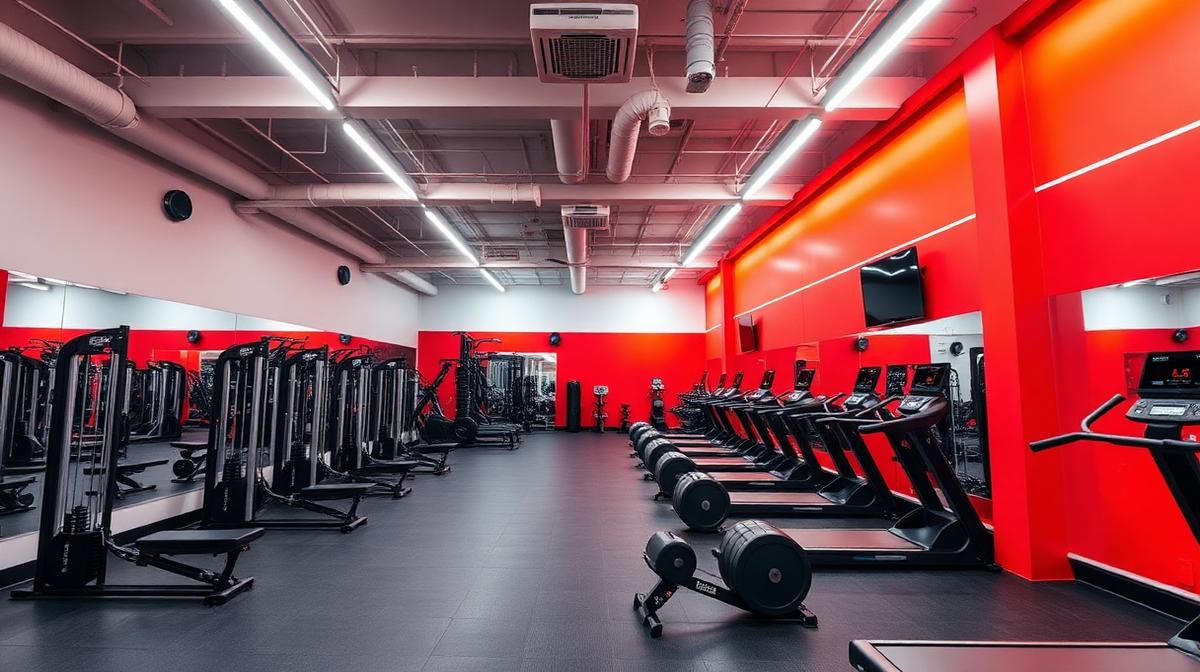
The best gym colors depend on the zone: energizing reds and oranges for weight and HIIT areas, focused blues for cardio, calming greens and neutrals for recovery and yoga. Color measurably shifts perceived exertion. Below: research-backed palettes with hex codes for each training zone.
Your Gym Walls Are Either Building Athletes or Losing Members
Here's a stat that should reshape how every fitness facility owner thinks about interior design: research from the Journal of Sports Sciences shows that gym color psychology can influence perceived exertion by up to 15% — meaning the right wall color literally makes a workout feel easier, while the wrong one makes members quit faster. In an industry where the average gym loses 50% of new members within the first six months, color is one of the most cost-effective retention tools available.
The global fitness industry generates over $96 billion annually, yet most gyms treat color as an afterthought — a coat of whatever was on sale at the hardware store. Meanwhile, the brands dominating the market — Equinox, Barry's Bootcamp, Peloton studios, SoulCycle — have engineered every square inch of their color environments to maximize performance, emotional engagement, and brand loyalty.
Color in a fitness environment isn't decoration. It's a performance-enhancing tool, a psychological motivator, and a silent membership retention system. In this guide, we'll decode the complete science of fitness center color psychology — mapping every major hue to its effect on workout intensity, recovery, and the member experience. Whether you're designing a boutique cycling studio or a full-service health club, the color palette you choose is training alongside your members.
The Exercise-Color Connection: What Science Tells Us
How Color Affects Physical Performance
The relationship between color and athletic performance is rooted in measurable physiological responses. When a person enters a color-saturated environment, three simultaneous processes occur:
- Sympathetic nervous system activation — Warm colors (red, orange, yellow) increase heart rate, blood pressure, and adrenaline production, priming the body for explosive, high-intensity effort
- Parasympathetic activation — Cool colors (blue, green, lavender) lower heart rate and cortisol, promoting controlled breathing, flexibility, and mind-body connection
- Perceived exertion modulation — Color environment directly affects how hard a workout feels. Blue environments reduce perceived effort, while red environments amplify the sense of intensity and power
The RPE Color Effect
Rate of Perceived Exertion (RPE) — how hard an exercise feels on a 1-10 scale — is measurably influenced by environmental color. Studies show:
- Red environments increase RPE by 10-15% — workouts feel harder and more intense
- Blue environments decrease RPE by 10-12% — the same workout feels easier and more sustainable
- Green environments reduce RPE while improving mood — ideal for endurance activities
- Neutral environments produce baseline RPE with no positive or negative psychological influence
This means the same 30-minute HIIT session can feel like a 25-minute session in a blue room or a 35-minute session in a red room. For gym owners, this has direct implications for member satisfaction, workout completion rates, and long-term retention.
High-Intensity Zone Colors: Power, Aggression & Peak Output
These colors belong in areas designed for maximum physical effort — weight rooms, HIIT studios, CrossFit boxes, and sprint cycling areas.
Red (#E63946) — The Performance Amplifier
Red is the most physiologically activating color in fitness design. It triggers the fight-or-flight response, floods the body with adrenaline, and creates a psychological state of dominance and power. There's a reason boxing gloves are red, and sports teams in red uniforms statistically win more often.
Physiological effects:
- Increases heart rate by 10-15 BPM upon prolonged exposure
- Elevates blood pressure and adrenaline output
- Heightens muscular reactivity and explosive power
- Triggers competitive mindset and aggression
Best fitness applications:
- Powerlifting and Olympic lifting platforms
- HIIT and bootcamp studio accent walls
- Boxing and martial arts training areas
- Sprint and interval cardio zones
- Competition and challenge areas
Strategic caution: Red increases perceived exertion — workouts feel harder. This is beneficial for short, intense sessions (30-45 minutes) but counterproductive for longer training sessions. Limit red to accent walls and equipment zones (20-30% of the space), not full-room coverage. Pair with dark neutrals (charcoal #36454F, matte black #1A1A2E) for the industrial intensity that hardcore athletes crave.
Real-world example: Barry's Bootcamp built its entire brand identity around red and black — the "Red Room" concept creates a tribal, immersive intensity that drives both performance and cult-like brand loyalty.
Orange (#FF6B35) — The Endurance Motivator
Orange combines red's energy with yellow's optimism, creating a color that motivates sustained effort without the aggressive edge. It's the color of encouragement, enthusiasm, and "you've got this" energy.
Physiological effects:
- Increases oxygen supply to the brain, enhancing focus and determination
- Creates feelings of warmth and social connection — ideal for group fitness
- Stimulates enthusiasm and motivation without anxiety
- Supports sustained effort over longer workout durations than red
Best fitness applications:
- Group fitness studios (spinning, aerobics, dance cardio)
- Functional training and circuit areas
- Reception and check-in areas (energizing welcome)
- Motivational signage and wayfinding
- Personal training zones
Designer tip: Burnt orange (#CC5803) and deep tangerine (#FF6B35) read as more sophisticated than pure orange, making them suitable for premium fitness facilities. Use orange for wayfinding elements to create an energetic flow through the space. Orangetheory Fitness literally built a $1.5 billion brand around this color — the psychological association between orange and "optimal effort zone" is now hardwired into fitness culture.
Yellow (#FFD166) — The Energy Spark
Yellow is the most visible color in the spectrum and the most psychologically stimulating of the warm tones. In fitness, it generates optimism, energy, and a "can-do" attitude that's particularly effective for morning workouts and beginner-friendly environments.
Physiological effects:
- Triggers serotonin release — the "happiness hormone"
- Increases mental alertness and reaction time
- Creates feelings of energy and optimism
- Enhances visibility of equipment and safety signage
Best fitness applications:
- Early morning and sunrise class studios
- Beginner-friendly zones and orientation areas
- Safety and directional signage
- Children's fitness and family areas
- Outdoor and rooftop workout spaces
Strategic caution: Yellow causes visual fatigue faster than any other color when used at full saturation on large surfaces. Limit to accents — 5-10% of the palette. Warm gold (#FFD700) and soft mustard (#E4B363) are more sustainable options for larger applications.
Recovery & Mind-Body Zone Colors: Calm, Focus & Restoration
These colors belong in areas designed for controlled movement, flexibility, mental focus, and post-workout recovery — yoga studios, Pilates rooms, stretching areas, meditation spaces, and recovery lounges.
Blue (#457B9D) — The Endurance Sustainer
Blue is the anti-red. Where red amplifies intensity and perceived exertion, blue reduces both — making the same workout feel easier and more sustainable. This makes it invaluable for endurance training, cardio zones, and any area where members need to sustain effort over extended periods.
Physiological effects:
- Lowers heart rate and blood pressure, supporting steady-state cardio
- Reduces perceived exertion by 10-12% — workouts feel less grueling
- Promotes deep, controlled breathing patterns
- Enhances focus and concentration for form-heavy exercises
- Creates feelings of trust and reliability — important for gym brand loyalty
Best fitness applications:
- Endurance cardio zones (treadmills, ellipticals, rowing machines)
- Swimming pools and aquatic fitness areas
- Recovery and cool-down spaces
- Member lounge and social areas
- Cryotherapy and cold-treatment rooms
Real-world insight: Equinox uses deep navy and steel blue throughout its premium facilities, signaling sophistication and control. The color communicates "elite performance through discipline" rather than "maximum aggression" — a positioning that resonates with their affluent, fitness-conscious demographic.
Green (#2D6A4F, #9DB5A0) — The Natural Performer
Green occupies a unique position in fitness color psychology: it simultaneously enhances endurance, reduces stress, and improves mood. Research shows that exercising in green environments — a phenomenon called the "green exercise effect" — produces measurably better outcomes than identical workouts in other color settings.
Physiological effects:
- Most restful color for the eye — supports long workout sessions without visual fatigue
- Reduces cortisol levels, lowering exercise-related stress hormones
- Improves mood more than any other exercise environment color
- Enhances endurance capacity through stress reduction
- Promotes connection to nature — biophilic design benefits
Best fitness applications:
- Yoga and meditation studios (sage green #9DB5A0)
- Outdoor and terrace workout areas
- Stretching and flexibility zones
- Cycling studios with nature-themed virtual courses
- Wellness and recovery lounges
Designer tip: Layer green tones for a biophilic effect — sage walls (#9DB5A0), eucalyptus accents (#728C73), and living plant walls. This creates an immersive natural environment that leverages both color psychology and biophilic design science. For more on green in branding, see our guide to green in brand design.
Lavender & Soft Purple (#D8C4E0, #B8A9C9) — The Recovery Catalyst
Lavender sits at the intersection of blue's calm and purple's creativity. In fitness environments, it's the ultimate recovery color — promoting relaxation, reducing muscle tension perception, and creating a meditative state.
Physiological effects:
- Lowers cortisol and adrenaline levels post-workout
- Reduces perceived muscle soreness and tension
- Promotes mental relaxation and mindfulness
- Creates a sense of luxury and self-care in recovery spaces
Best fitness applications:
- Pilates and barre studios
- Post-workout stretching and foam-rolling areas
- Massage and recovery treatment rooms
- Women's-focused fitness spaces and changing areas
- Meditation and breathwork rooms
Neutral & Foundation Colors: The Strategic Backbone
Charcoal & Matte Black (#36454F, #1A1A2E) — The Intensity Amplifier
Dark neutrals are the backbone of hardcore fitness environments. They absorb light, create visual drama, and make accent colors (red equipment, orange signage, green accents) pop with maximum impact.
Why they work in fitness:
- Create an immersive, "cave-like" training environment that enhances focus
- Make colored LED lighting and accent walls dramatically more effective
- Signal hardcore, serious training — appealing to dedicated athletes
- Hide wear, scuff marks, and equipment residue better than light colors
- Reduce visual distractions, keeping focus on the workout
Best for: CrossFit boxes, boxing gyms, powerlifting rooms, boutique HIIT studios, and high-performance training facilities.
Strategic caution: All-black environments without adequate lighting feel oppressive and claustrophobic. Always balance dark walls with high-quality artificial lighting (2500-3000 lux for training areas) and strategic accent colors.
Clean White (#F8F9FA) — The Premium Signal
White dominates premium fitness brands (Equinox, SoulCycle, Peloton) because it communicates cleanliness, modernity, and luxury — three qualities that justify premium membership pricing.
Why it works in fitness:
- Strongest visual signal of cleanliness — critical in shared sweat environments
- Creates perception of spaciousness in compact boutique studios
- Reflects light efficiently, reducing energy costs and improving visibility
- Photographs well for social media and marketing content
- Communicates premium positioning and design-forward thinking
Best for: Luxury boutique studios, wellness centers, spa areas within fitness clubs, premium locker rooms, and marketing photography areas.
Warm Gray (#9E9E9E, #6C757D) — The Universal Foundation
Warm gray is the chameleon of fitness design — it works as a foundation for any accent palette, never competes with brand colors, and creates a professional, equipment-focused environment.
Best for: Large commercial gyms where multiple zones coexist, franchise fitness brands maintaining consistency, and equipment-heavy training floors where machines are the visual focus.
Fitness Zone Color Mapping
The most effective fitness facilities use color zoning — applying different palettes to different areas based on the activity's psychological and physiological demands.
The Complete Gym Color Zone Framework
| Gym Zone | Recommended Colors | Hex Codes | Psychological Goal |
|---|---|---|---|
| Entrance & Reception | Orange, White, Brand color | #FF6B35, #F8F9FA | Energize, welcome, brand identity |
| Free Weights & Powerlifting | Red accents on dark neutral | #E63946, #36454F | Aggression, power, max output |
| HIIT & Bootcamp Studio | Red, Orange, Black | #E63946, #FF6B35, #1A1A2E | Intensity, urgency, tribal energy |
| Cardio Floor | Blue, Cool gray, White | #457B9D, #6C757D, #F8F9FA | Endurance, steady effort, comfort |
| Group Cycling | Orange, Dark teal, LED accents | #FF6B35, #1B4965 | Sustained energy, community, immersion |
| Yoga & Meditation | Sage green, Warm white | #9DB5A0, #FFF8E7 | Calm, flexibility, mindfulness |
| Pilates & Barre | Lavender, Soft pink, White | #D8C4E0, #FFB4A2, #F8F9FA | Control, grace, body awareness |
| Stretching & Recovery | Blue-green, Lavender | #88BDBC, #D8C4E0 | Cool-down, restoration, relaxation |
| Swimming Pool | Aqua, White, Natural stone | #88BDBC, #FFFFFF, #D4C5B2 | Water, freshness, serenity |
| Locker Rooms | Warm neutral, Clean white | #D4C5B2, #F8F9FA | Cleanliness, comfort, transition |
| Smoothie Bar / Café | Green, Orange, Warm wood | #2D6A4F, #FF6B35, #8B7355 | Health, energy, reward |
| Kids' Zone | Yellow, Green, Blue | #FFD166, #9DB5A0, #457B9D | Fun, safety, playfulness |
Fitness Brand Color Playbook
Hardcore / Performance Gyms
Primary palette: Black (#1A1A2E), Red (#E63946), Charcoal (#36454F) Accent: Chrome, industrial metal finishes
Think CrossFit affiliates, powerlifting gyms, and MMA training centers. The palette communicates raw intensity, seriousness, and a "no frills, just results" mentality. These environments are designed for athletes who see the gym as a battlefield, not a social club.
Premium Boutique Studios
Primary palette: White (#F8F9FA), Navy (#1D3557), Gold accent (#C9A84C) Accent: Warm wood, brass fixtures
Think Equinox, Barry's premium locations, and high-end Pilates studios. The palette communicates luxury, exclusivity, and design-forward thinking. These environments justify $200+/month memberships through aesthetic sophistication that rivals luxury hotels. For more on how luxury colors drive premium positioning, see our hotel & spa color psychology guide.
Community / Family Gyms
Primary palette: Blue (#457B9D), Orange (#FF6B35), White (#F8F9FA) Accent: Bright green (#2D6A4F), Warm gray (#9E9E9E)
Think Planet Fitness, YMCA, and community recreation centers. The palette communicates friendliness, inclusivity, and approachability. Blue builds trust; orange adds energy without intimidation; white keeps spaces feeling clean and safe.
Wellness & Mind-Body Studios
Primary palette: Sage green (#9DB5A0), Warm cream (#FFF8E7), Natural wood (#8B7355) Accent: Lavender (#D8C4E0), Soft gold (#D4A76A)
Think dedicated yoga studios, meditation centers, and wellness-first fitness concepts. The palette communicates calm, nature, and holistic health. These spaces are designed to feel like sanctuaries — the visual antithesis of a traditional gym.
Women-Focused Fitness
Primary palette: Soft coral (#FFB4A2), Dusty rose (#C9858F), White (#F8F9FA) Accent: Gold (#C9A84C), Sage (#9DB5A0)
Think boutique barre, women's-only facilities, and prenatal/postnatal fitness. The palette communicates strength through grace — empowering without aggressive, welcoming without condescending. Avoid stereotypical "pink" — opt for sophisticated rose and coral tones that feel modern and premium.
The Data: Color's Impact on Fitness KPIs
| Metric | Color Impact | Implication |
|---|---|---|
| Workout Duration | Blue/green environments increase avg. session by 12-18 min | Cool colors in cardio zones boost usage |
| Perceived Exertion | Red increases RPE by 10-15%; blue decreases by 10-12% | Match color intensity to workout intensity |
| Return Visit Rate | Environments rated "visually appealing" see 23% higher 90-day retention | Cohesive color design directly impacts membership retention |
| Social Media Sharing | High-contrast, photogenic environments generate 3x more UGC | Design Instagram-worthy corners to drive organic marketing |
| New Member Conversion | Facility tours in well-designed spaces convert 15-20% higher | Color is a competitive advantage during sales |
| Group Class Attendance | Studios with purpose-matched colors see 10-15% higher attendance | Color zoning improves class-specific engagement |
Common Gym Color Mistakes
Mistake 1: One Color Everywhere
A single palette across the entire facility ignores the fundamentally different psychological needs of each zone. HIIT studios and yoga rooms demand opposite color strategies.
Mistake 2: Fluorescent Lighting + Wrong Colors
Fluorescent lighting washes out warm colors and makes cool colors look clinical. Invest in tunable LED lighting (2700K-5000K) that can adapt to each zone's color palette. LED strip lighting in brand colors creates immersive environments inexpensively.
Mistake 3: Ignoring the Locker Room
Members start and end every visit in the locker room. Dingy, poorly-colored changing areas undermine the entire experience. Invest in warm neutrals, good lighting, and spa-like cleanliness signals (white, warm wood, brass fixtures).
Mistake 4: All-White Sterility
While white signals premium, an entirely white gym feels like a hospital — clinical, cold, and unwelcoming. Balance white foundations with warm accents and natural materials. Learn from the color proportions 60-30-10 rule.
Mistake 5: Trend-Chasing Over Strategy
Neon gradients and millennial pink may trend on Instagram, but they don't necessarily support workout performance. Prioritize function-driven color over aesthetic trends — then layer in trendy accents that can be updated without repainting.
Complete Gym Color Reference Table
| Color | Hex Code | Psychological Effect | Fitness Application | Best Zone |
|---|---|---|---|---|
| Red | #E63946 | Power, urgency, adrenaline | Strength training, HIIT | Weights, bootcamp studios |
| Orange | #FF6B35 | Motivation, endurance, fun | Group fitness, reception | Cycling, functional training |
| Yellow | #FFD166 | Optimism, energy, alertness | Signage, morning classes | Kids' zone, wayfinding |
| Blue | #457B9D | Endurance, calm, trust | Cardio, recovery, branding | Treadmills, member lounge |
| Green | #2D6A4F | Nature, balance, anti-stress | Yoga, outdoor training | Mind-body studios, café |
| Sage | #9DB5A0 | Calm, wellness, restoration | Yoga, stretching, meditation | Recovery, wellness zones |
| Lavender | #D8C4E0 | Recovery, gentleness, luxury | Pilates, post-workout | Stretch area, treatment rooms |
| Black | #1A1A2E | Intensity, focus, drama | Hardcore training, boxing | CrossFit, MMA, powerlifting |
| White | #F8F9FA | Clean, premium, spacious | Boutique studios, lockers | Premium facilities, marketing |
| Warm Gray | #9E9E9E | Neutral, professional, calm | Foundation, equipment floors | Large commercial gyms |
| Coral | #FFB4A2 | Warmth, empowerment, grace | Women's fitness, barre | Boutique, dance fitness |
| Teal | #1B4965 | Depth, immersion, focus | Cycling studios, pools | Aquatic, indoor cycling |
Designer Takeaways
Match color intensity to workout intensity. Red and orange for explosive effort; blue and green for sustained endurance; lavender and sage for recovery and mind-body work.
Zone your facility. Every area of the gym serves a different psychological and physiological purpose. Your color palette should reflect that differentiation.
Design for the journey. Members move from reception → training → recovery → departure. Each transition is an opportunity for color to support the next phase.
Invest in lighting. Color and light are inseparable. Tunable LED systems let you shift the mood by zone and time of day — energizing mornings, focused midday, calming evenings.
Make it photogenic. In 2026, member-generated social media content is the most effective gym marketing. Design at least one "Instagram wall" or visually striking zone that members want to photograph and share.
Color is retention. A visually cohesive, purpose-designed environment creates emotional attachment. Members don't just come for the equipment — they come for how the space makes them feel.
Conclusion: Color Is Your Silent Personal Trainer
In fitness design, color does what no personal trainer can: it works on every member simultaneously, silently amplifying their effort, sustaining their motivation, and shaping their emotional relationship with your facility. It's the cheapest performance-enhancing upgrade available — and the most underutilized.
The gyms winning the retention war in 2026 aren't just investing in better equipment or trendier classes. They're engineering every visual element of the member experience — from the energizing red of the HIIT studio to the calming sage of the yoga room to the premium white of the locker room.
Your walls are either building athletes or losing members. Choose their color accordingly.
Ready to build a fitness facility color palette backed by psychology? Use the Coloracci AI palette generator to create strategic color systems for any gym concept. Explore all our color and design tools to bring your fitness vision to life.
For more on how color psychology shapes commercial environments, explore our guides on retail store color psychology, restaurant interior colors, and the psychology of color in marketing.