Champions League Colors: The Psychology Behind Every Kit Color in Elite Football
· Coloracci Team
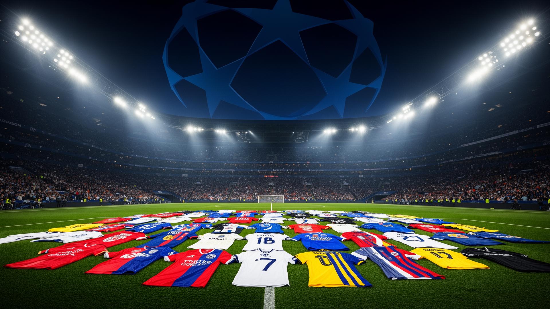
Watch: The Champions League Team Colors Song
Why Champions League Colors Matter Beyond the Pitch
The UEFA Champions League isn't just a showcase of the world's finest footballers — it's a masterclass in visual identity. Every time a club steps onto that immaculate pitch under the floodlights, their kit colors communicate decades of history, regional pride, and calculated psychological strategy to hundreds of millions of viewers.
Working on matchday print collateral? Our Pantone color finder maps any club color here to its closest Pantone swatch.
For designers, brand strategists, and color enthusiasts, Champions League team colors offer a goldmine of insight. These are palettes that have been refined over a century, tested in the most high-pressure environments imaginable, and recognized by billions. The Champions League colors you see on matchday aren't arbitrary — they're the result of deep cultural identity, color psychology, and strategic branding decisions that rival any Fortune 500 company.
Let's decode exactly what makes these palettes work, color by color, club by club.
The Exact Colors of Champions League Powerhouses
Here's the definitive color breakdown of four of the most decorated clubs in Champions League history. Every hex code, every RGB value, every strategic purpose.
Real Madrid — The Regal Triad
| Color Name | Hex Code | RGB | Primary Usage |
|---|---|---|---|
| Gold | #FEBE10 | 254, 190, 16 | Crest accents, premium branding, victory motifs |
| Royal Blue | #00529F | 0, 82, 159 | Away kits, crest elements, secondary branding |
| Red | #EE324E | 238, 50, 78 | Accent color, crest stripe, third kit elements |
Real Madrid's palette is a study in prestige. The dominant white of their home kit — so iconic they're called Los Blancos — isn't merely an absence of color. It's a statement of purity, supremacy, and royal heritage. The gold (#FEBE10) reinforces their self-image as football royalty, while Royal Blue (#00529F) and Red (#EE324E) appear as precisely measured accents in crest details and alternate kits.
From a color psychology perspective, gold communicates achievement, luxury, and timelessness — exactly the associations a 15-time Champions League winner wants to project.
FC Barcelona — Identity Through Color
| Color Name | Hex Code | RGB | Primary Usage |
|---|---|---|---|
| Gold | #EDBB00 | 237, 187, 0 | Crest, sponsor areas, accent highlights |
| Deep Blue | #004D98 | 0, 77, 152 | Primary kit stripe, crest background |
| Burgundy | #A50044 | 165, 0, 68 | Primary kit stripe, brand identity |
Barcelona's blaugrana (blue and garnet) is one of the most instantly recognizable color combinations in world sport. The vertical stripes of Deep Blue (#004D98) and Burgundy (#A50044) have remained fundamentally unchanged since 1899, making it a 127-year case study in brand consistency.
The burgundy isn't a standard red — it's deeper, more sophisticated, carrying connotations of wine regions, Catalan culture, and intellectual gravitas. Paired with the deep blue, it creates a complementary color scheme that balances passion with strategic composure. The Gold (#EDBB00) accents add warmth and championship pedigree.
Bayern Munich — Dominant Red
| Color Name | Hex Code | RGB | Primary Usage |
|---|---|---|---|
| Bayern Blue | #0066B2 | 0, 102, 178 | Bavarian diamond pattern, crest elements |
| Bayern Red | #DC052D | 220, 5, 45 | Primary kit, logo, dominant brand color |
| White | #FFFFFF | 255, 255, 255 | Kit trim, typography, negative space |
Bayern Munich's red (#DC052D) is aggressive, unapologetic, and dominant — exactly like their playing style. Research in sports psychology consistently shows that teams wearing red are perceived as more physically dominant and threatening by opponents. A landmark 2005 study published in Nature found that athletes wearing red won significantly more contests across multiple sports.
Bayern leans into this with conviction. Their red isn't warm or inviting — it's a high-saturation, cool-leaning crimson that communicates raw power. The Bayern Blue (#0066B2) nods to the Bavarian flag's diamond pattern, grounding the brand in regional identity while providing essential contrast.
Manchester City — The Modern Blueprint
| Color Name | Hex Code | RGB | Primary Usage |
|---|---|---|---|
| Sky Blue | #6CABDD | 108, 171, 221 | Primary kit, brand identity, digital presence |
| Navy Blue | #1C2C5B | 28, 44, 91 | Away kits, crest, secondary branding |
| Gold | #FFCE00 | 255, 206, 0 | Crest accents, trim, heritage elements |
Manchester City's Sky Blue (#6CABDD) is a fascinating outlier among elite clubs. While rivals opt for aggressive reds or authoritative dark blues, City's lighter palette communicates something entirely different: clarity, openness, and modern ambition.
In color psychology, lighter blues evoke trust, calm focus, and infinite possibility — appropriate for a club that has reimagined itself as a global brand in the modern era. The Navy (#1C2C5B) provides the gravitas and depth that sky blue alone might lack, while Gold (#FFCE00) connects to Manchester's industrial heritage and adds championship warmth.
Color Psychology Patterns Across Champions League Kits
The Dominance of Red
Red is the single most represented color across Champions League-winning squads. Bayern Munich, Liverpool, AC Milan, Manchester United, Benfica — the list of red-dominant champions reads like a who's who of European football aristocracy.
The science backs the superstition. Red triggers:
- Increased heart rate and adrenaline — physiological arousal that translates to perceived energy
- Appetite for competition — the same reason food brands gravitate toward red
- Intimidation signals — opponents subconsciously perceive red-wearing teams as more aggressive
- Higher confidence in the wearer, creating a self-reinforcing cycle of assertiveness
Blue as Strategic Calm
Blue appears across multiple Champions League palettes, but its function varies dramatically by shade:
- Sky Blue (#6CABDD) — openness, modern innovation, creative freedom (Man City)
- Deep Blue (#004D98) — tradition, intellectual depth, strategic thinking (Barcelona)
- Royal Blue (#00529F) — authority, heritage, aristocratic composure (Real Madrid)
- Bavarian Blue (#0066B2) — regional identity, loyalty, cultural pride (Bayern Munich)
This spectrum demonstrates a crucial lesson for designers: blue is not one color. The specific hue, saturation, and brightness dramatically alter the psychological message.
Gold as Championship Signifier
Every club in our analysis features gold in their palette. This isn't coincidence. Gold universally communicates:
- Victory and achievement — the color of trophies, medals, and championship moments
- Premium positioning — elevating the brand above competitors
- Historical weight — connecting present identity to past glory
- Aspiration — promising future success
Complete Champions League Color Reference Table
| Club | Primary Color | Hex Code | Color Name | Psychological Meaning |
|---|---|---|---|---|
| Real Madrid | Gold | #FEBE10 | Marigold Gold | Achievement, royalty, prestige |
| Real Madrid | Blue | #00529F | Royal Blue | Authority, heritage, composure |
| Real Madrid | Red | #EE324E | Crimson Red | Passion, energy, accent power |
| FC Barcelona | Gold | #EDBB00 | Championship Gold | Warmth, excellence, tradition |
| FC Barcelona | Blue | #004D98 | Deep Blue | Strategy, depth, Catalan identity |
| FC Barcelona | Burgundy | #A50044 | Blaugrana Burgundy | Sophistication, cultural pride |
| Bayern Munich | Red | #DC052D | Bayern Red | Dominance, aggression, power |
| Bayern Munich | Blue | #0066B2 | Bavarian Blue | Regional pride, loyalty, heritage |
| Bayern Munich | White | #FFFFFF | Pure White | Clarity, precision, clean contrast |
| Man City | Sky Blue | #6CABDD | Sky Blue | Openness, ambition, modernity |
| Man City | Navy | #1C2C5B | Midnight Navy | Authority, depth, stability |
| Man City | Gold | #FFCE00 | Cityzens Gold | Heritage, energy, championship |
What Designers Can Learn from Football's Color Masters
1. Consistency Builds Empires
Barcelona has used the same two-color stripe system for 127 years. Real Madrid has been in white for over a century. Bayern's red has been non-negotiable since the 1960s. The lesson is clear: pick your colors and commit. The most powerful brand palettes aren't the most creative — they're the most consistent.
Apply this to your projects: once you've validated a color palette, resist the temptation to constantly reinvent. Build equity through repetition.
2. One Bold Color Can Be Your Entire Identity
Bayern Munich proves you don't need a complex palette. One saturated, emotionally charged color — committed to fully and consistently — can become your entire visual identity. The same principle drives Coca-Cola (red), Spotify (green), and Ferrari (red).
3. Strategic Contrast Creates Hierarchy
Every successful kit uses a clear primary-secondary-accent structure. Barcelona's blue/burgundy split is roughly 50/50, but gold accents create visual hierarchy. Man City's sky blue dominates (~70%), with navy (~20%) and gold (~10%) providing depth and emphasis.
This mirrors the classic 60-30-10 color proportion rule used in interior design and digital interfaces.
4. Cultural Context Shapes Color Meaning
Bayern's blue only makes sense in the context of Bavaria's white-and-blue diamond flag. Barcelona's burgundy carries Catalan associations that pure red would not. When choosing brand colors, consider what cultural, regional, or community associations will amplify — or undermine — your message.
5. Shade Matters More Than Hue
The difference between Man City's Sky Blue (#6CABDD) and Barcelona's Deep Blue (#004D98) is not just aesthetic — it's psychological. The identical hue family communicates fundamentally different brand attributes depending on lightness, saturation, and warmth. Use a color picker to fine-tune your exact shade.
Beyond the Big Four: Color Patterns in European Football
The Champions League's broader color landscape reveals additional patterns worth noting:
- Liverpool (#C8102E) — Anfield Red, similar intensity to Bayern's, communicating working-class grit and relentless energy
- AC Milan (Red #FB090B / Black #000000) — The Rossoneri pairing is one of football's most elegant: passion meets authority
- Juventus (#000000 / #FFFFFF) — The ultimate in contrast-driven minimalism, projecting timeless sophistication
- Paris Saint-Germain (#004170 / #DA291C) — French tricolor influence creates a palette rooted in national identity
These secondary examples reinforce the core insight: elite football clubs treat color as seriously as any design agency treats a Fortune 500 rebrand.
How to Use These Palettes in Your Projects
Ready to bring Champions League-level color strategy to your own designs? Here's how to apply these insights:
- Extract and adapt — Use our Image Color Extractor to pull exact hex codes from any team's branding materials
- Test for accessibility — Run your favorite team colors through our Color Contrast Checker to ensure WCAG compliance in digital designs
- Build complete palettes — Start with one team's primary color and use our AI Palette Generator to create harmonious schemes for web, app, or brand projects
- Simulate perception — Check how your sports-inspired palette appears to colorblind users with our Colorblind Simulator
Conclusion: Color Is the First Language of Identity
Long before a footballer touches the ball, their kit has already spoken. It has communicated history, ambition, regional pride, and psychological intent — all through color. The Champions League's greatest clubs understand that color isn't decoration; it's strategy.
Whether you're designing a brand identity, a digital product, or a sports-inspired project, the principles remain the same: choose boldly, commit fully, and let your palette tell a story that transcends language.
Ready to create your own championship-worthy color palette? Try our AI-powered color generator at Coloracci and build palettes inspired by the world's most iconic teams.