Romantic Restaurant Design: Color Psychology for Hospitality & Boutique Hotels
· Coloracci Team
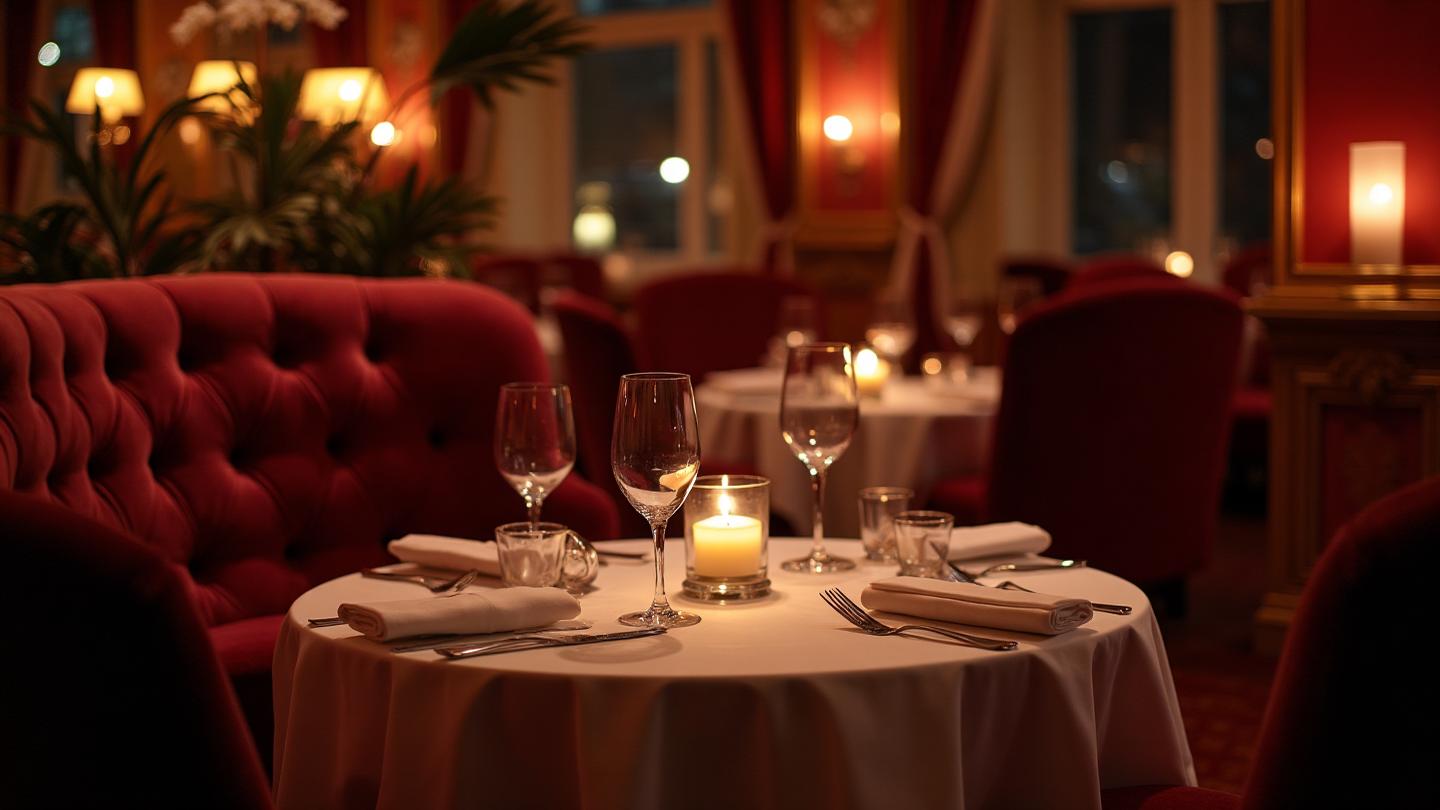
I still remember the moment I walked into that tiny Parisian bistro on Rue Saint-Honoré. Before I'd even seen the menu or tasted the wine, I felt something shift. The deep burgundy walls seemed to embrace me, the soft gold lighting made my skin glow, and suddenly, this simple dinner felt like an occasion. That's the invisible power of color in hospitality—it doesn't just decorate a space; it orchestrates an emotion.
After spending fifteen years consulting for restaurants and boutique hotels across three continents, I've learned that the difference between a forgettable meal and a transformative dining experience often comes down to decisions made long before the chef touches a single ingredient. It comes down to color.

Why Color Matters More in Restaurants Than Almost Anywhere Else
Think about it: we eat with our eyes first. But that's only the beginning. The colors surrounding us while we dine affect our perception of taste, our sense of time, our willingness to spend money, and—crucially for romantic venues—our emotional openness.
Research from the Colour Research & Application journal found that warm colors can increase appetite by up to 25%, while also making food appear more flavorful. But it goes deeper. In a romantic context, colors influence how attractive we find our dining companion, how special we feel, and whether we'll remember this evening years later.
This isn't just about painting walls. It's about understanding the psychology of color and using it to craft experiences that linger in memory long after the last bite.
The Intimate Color Palette: The Classic Romantic Foundation
Every legendary romantic restaurant starts with understanding three fundamental color relationships:
Deep Burgundy: The Color of Wine, Passion, and Indulgence
Burgundy (#722F37) isn't just a color—it's an invitation to slow down. Unlike aggressive reds that stimulate quick eating (hello, fast food chains), burgundy operates differently. It's red's sophisticated cousin, one that whispers instead of shouts.
In a romantic context, burgundy:
- Reduces perceived room size, creating intimacy
- Associates with wine culture and refined taste
- Triggers subconscious connections to luxury and indulgence
- Complements skin tones, making diners look healthier and more attractive
The psychology of passion and color runs deep here—burgundy captures the warmth of connection without the urgency of pure red.
Warm Gold: The Candlelight Effect
Gold (#D4AF37) does something magical in hospitality: it makes everything it touches look more expensive. But more than that, warm gold tones mimic candlelight, triggering ancestral associations with warmth, safety, and gathering.
When combined with burgundy, gold creates what designers call the "fine dining frequency"—a color temperature that signals occasion, celebration, and romance.
Soft Cream: The Breathing Room
Every intense palette needs relief. Cream (#F5F0E6) provides visual rest, reflects warm light beautifully, and creates the canvas that lets burgundy and gold tell their story. Without it, romantic spaces feel oppressive rather than intimate.
The Science of Romantic Lighting and Color
Here's something most restaurant owners get wrong: they choose their colors under showroom lighting, then wonder why their carefully selected burgundy looks purple at night.
Color and light are inseparable dance partners. The same wall paint will look completely different under:
- 2700K warm LED (romantic, golden)
- 3000K neutral LED (natural, slightly cool)
- 4000K cool LED (clinical, unflattering)
- Candlelight (warm, dynamic, flattering)

For romantic restaurants, I recommend a maximum of 2700K for ambient lighting, with 2400K or actual candlelight for table illumination. This warm color temperature:
- Makes burgundy look rich, not muddy
- Gives gold accents a living glow
- Flatters all skin tones
- Creates the "dimmer switch effect" that encourages intimacy
The dark mode design principles we use in digital spaces apply here too—darker environments with warm accent lighting create focus and intimacy.
Cultural Approaches to Romantic Dining
One of the most fascinating aspects of hospitality design is how different cultures interpret romance through color:
French: Intimacy Through Burgundy and Gold
The French approach is what most of us picture when we imagine romantic dining. Deep wine-inspired colors, velvet textures, and a palette that suggests centuries of refinement. Key colors:
- Burgundy (#722F37)
- Antique Gold (#D4AF37)
- Champagne Cream (#F5F0E6)
Italian: Warmth Through Terra Cotta
Italian romantic spaces feel like being embraced by a Tuscan villa. The palette is earthier, warmer, more approachable—passion without pretension:
- Terracotta Rose (#BC5D58)
- Olive Wood (#8B7355)
- Tuscan Cream (#E8DCC4)
These earth tones create an inviting atmosphere that encourages relaxation and lingering conversation.
Japanese: Romance Through Restraint
Japanese omakase restaurants prove that romance doesn't require excess. Their palette uses negative space and careful restraint:
- Sumi Black (#1C1C1C)
- Urushi Red (#8B0000)
- Natural Linen (#D4C4A8)
This minimalist approach creates a different kind of intimacy—one focused on attention, presence, and the drama of each course.

Boutique Hotel Design: Extending Romance Beyond the Restaurant
The principles that make restaurants romantic translate beautifully to boutique hotels. But hotels add new considerations: guests spend hours in these spaces, and the palette must work for both evening romance and morning light.
Hotel Lobby: The First Impression
Your lobby sets expectations for everything that follows. The most successful boutique hotel lobbies I've designed share these color characteristics:
- A dominant dark neutral (navy, charcoal, or dark teal) for sophistication
- Metallic accents (gold, brass, or copper) for luxury
- Warm white tones for brightness without coldness

The color hierarchy principles matter enormously here. Too much dark color feels oppressive in a space where people carry luggage and check in. The 60-30-10 rule typically shifts to 50-30-20 in hotel lobbies, allowing more light and neutral tones.
Hotel Rooms: The Intimate Sanctuary
This is where guests expect magic. Romantic hotel rooms succeed when they:
- Use deeper, more saturated versions of the lobby palette
- Incorporate texture through fabrics in analogous colors
- Create a "cocoon effect" with darker walls and ceiling
- Ensure the bed is the visual focal point through color contrast

I always recommend testing room colors at night with the actual lighting that will be used. A color that looks perfectly romantic at 7 PM might look tired and dated at 10 AM.
Practical Color Palettes for Different Venue Types
Let me share specific recommendations based on the thousands of hospitality projects I've analyzed:
Fine Dining (Tasting Menu)
Primary palette:
- Wall color: Charcoal (#2D2D2D) or Deep Navy (#1B365D)
- Accent: Antique Gold (#D4AF37)
- Linen/Napkins: Ivory (#F8F6F0)
Why it works: Dark backgrounds create a theater for the food, making each plate pop. Gold accents elevate perceived value. This approach borrows from tetradic color theory by creating subtle contrasts that feel harmonious.
Italian Trattoria
Primary palette:
- Wall color: Tuscan Cream (#E8DCC4)
- Wood tones: Olive (#8B7355) to Espresso (#5C4033)
- Accent: Terracotta (#BC5D58)
Why it works: Warmth dominates, creating an welcoming "grandmother's kitchen" feeling. The complementary relationship between cream and terracotta creates visual interest without competition.
Wine Bar/Speakeasy
Primary palette:
- Wall color: Deep Plum (#5C3A50) or Velvet Black (#2A2A2A)
- Accent: Art Deco Gold (#D4AF37) or Aged Brass (#8B7355)
- Lighting: Amber glass pendants
Why it works: Mystery and exclusivity require darkness. Monochromatic variations of plum or black create depth without chaos.
Rooftop Restaurant
Primary palette:
- Furniture: Deep charcoal or black
- Accents: Sunset tones (#9C4A6D, #E8A87C)
- Plants: Deep green foliage
Why it works: The view is the star—interior colors should frame without competing. The split-complementary approach of warm sunset tones against green plants creates harmony with most skylines.
Translating Romantic Ambiance to Digital Presence
Your restaurant's website must capture the feeling of being there. Too many beautiful restaurants have websites that feel cold and corporate.
For hospitality websites, I recommend:
Color Translation
- Use your actual interior colors in the design
- Feature photography taken in the actual space, properly color-corrected
- Apply landing page color psychology principles to booking pages
Typography and Texture
- Serif fonts for romantic establishments (they feel more classic)
- High-quality textures from your space as subtle backgrounds
- Warm color temperatures in all photography
Booking Flow
- Reserve buttons in your accent color (gold for most romantic venues)
- Dark mode option that mirrors your evening atmosphere
- Consider how your CTA button colors match your brand
The AI Website Designer can help translate your venue's palette into a cohesive digital experience.
Common Mistakes in Hospitality Color Design
After reviewing thousands of restaurant and hotel projects, these are the errors I see most often:
1. Ignoring the "Skin Tone Test"
Colors that clash with common skin tones make guests feel and look unwell. Always test your palette against multiple skin tones before committing.
2. Forgetting About Food Colors
A beautiful sage green wall might seem elegant until you realize it makes red meat look grey. Consider your menu's visual needs.
3. Uniform Lighting
Romantic spaces need layers. Different areas should have different light levels. A single lighting scheme feels corporate, not intimate.
4. Trendy Over Timeless
That millennial pink might be Instagram-perfect today, but will it still feel romantic in five years? Romantic palettes should lean toward classics that evolve slowly.
5. Ignoring Accessibility
Romance should be accessible to everyone. Ensure your color contrasts meet WCAG guidelines for menus, signage, and websites. The Color Contrast Checker can help verify accessibility.
Creating Your Romantic Venue Palette: A Step-by-Step Process
Ready to develop your own romantic hospitality palette? Here's my proven process:
Step 1: Define Your Romance Style
Is it French elegance? Italian warmth? Modern sophistication? Japanese restraint? Your cultural reference point shapes everything.
Step 2: Choose Your Dominant Dark
This will cover 50-60% of your space:
- Deep burgundy for classic romance
- Navy for sophisticated romance
- Charcoal for modern romance
- Dark wood tones for rustic romance
Step 3: Select Your Metallic Accent
This provides the "glow":
- Antique gold for traditional
- Brass for mid-century
- Copper for industrial-romantic
- Silver for contemporary
Step 4: Determine Your Light Neutral
This provides breathing room:
- Ivory for warmth
- White for crisp contrast
- Blush for femininity
- Stone for earthiness
Step 5: Test Under Real Conditions
Paint large samples. View them at night with your actual lighting. Bring in fabric samples. Take photos. Live with the palette before committing.
Use the Color Hierarchy tool to experiment with proportions before painting.

The ROI of Romantic Color Design
Let's talk business. Good color design isn't just about aesthetics—it's about revenue:
Increased Dwell Time
Romantic color palettes encourage guests to linger. Longer stays mean more courses ordered, more wine poured, more desserts considered.
Higher Check Averages
Spaces that feel special encourage special-occasion spending. Gold accents alone have been shown to increase perceived value and willingness to pay premium prices.
Improved Reviews
Guests struggle to articulate why an experience felt magical, but they know it did. Color-conscious venues consistently earn higher ratings for ambiance.
Social Media Impact
Beautiful spaces get photographed and shared. Your color palette becomes free marketing every time a guest posts their romantic evening.
Repeat Business
When you create an emotional memory, guests return. Not just for the food, but for how the space made them feel.
Future Trends in Romantic Hospitality Design
Based on current movements, here's where romantic hospitality color is heading:
Sustainable Luxury
Expect more earth-inspired palettes that suggest environmental consciousness without sacrificing luxury. Deep forest greens, clay tones, and natural materials.
Biophilic Integration
Living walls and natural elements are pushing palettes toward colors that harmonize with plants. The blue-green spectrum works particularly well here.
Experiential Lighting
LED technology allows color-changing environments. Expect more venues to shift their color temperature as evening progresses—warmer as night deepens.
Cultural Fusion
As diners become more globally aware, expect palettes that thoughtfully blend cultural references. Japanese minimalism meets French warmth, for example.
Tools for Hospitality Color Design
Whether you're designing a new venue or refreshing an existing space, these tools can help:
- AI Website Designer - Generate complete website color schemes from your venue's palette
- Fibonacci Generator - Create mathematically harmonious color relationships
- Color Hierarchy Tool - Perfect your palette proportions
- Gradient Maker - Design lighting transitions for feature walls
- Image Color Extractor - Extract palettes from inspiration images
- Colorblind Simulator - Test accessibility for all guests
The Last Word: Color as Hospitality
At its heart, hospitality is about making people feel something. Feel welcomed. Feel special. Feel romantic. Color is one of our most powerful tools for creating these feelings—invisible yet undeniable.
The next time you walk into a restaurant and feel your shoulders relax, or enter a hotel lobby and feel a flutter of excitement, pause. Look around. Notice the colors embracing you. They're working exactly as intended.
And if you're designing a space where love stories unfold, remember: you're not just choosing colors. You're choosing the emotional backdrop for countless first dates, anniversary dinners, and marriage proposals. Choose wisely. Choose romantically.
Ready to design a romantic hospitality space? Explore our complete color tools or try the AI Website Designer to translate your palette into a stunning digital presence.