CTA Button Colors That Actually Convert: The Psychology Behind Click-Worthy Buttons
· Lion Dada
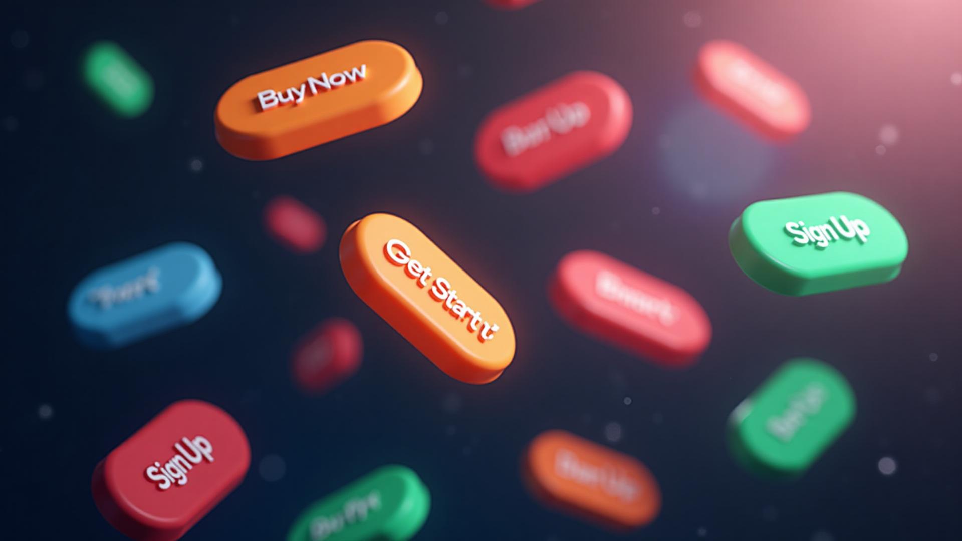
The $300 Million Button
In 2009, a single button color change generated $300 million in additional revenue for one company.
I'm not making this up. Jared Spool documented this case study, and it's become legendary in the conversion optimization world. The change? They turned a generic "Register" button into a simple "Continue" button with a different color.
That's when I realized: button colors aren't just design choices. They're business decisions worth millions.
But here's the thing—there's no "magic button color" that works for everyone. The internet is full of articles claiming "red buttons convert best!" or "green buttons always win!"
After analyzing hundreds of A/B tests and diving into the actual psychology research, I've found the truth is much more nuanced. And much more interesting.
The Science: What Happens When You See a Button
Before we talk about which colors work, let's understand WHY colors affect clicking behavior.
When your eye lands on a colored button, three things happen in rapid succession:
- Pre-attentive processing (under 200 milliseconds): Your brain registers the color before you're consciously aware of it
- Emotional response (200-500 milliseconds): The color triggers learned associations and emotional reactions
- Decision processing (500+ milliseconds): You decide whether to click based on accumulated signals

This is why button color matters so much. The color you choose affects all three stages—visibility, emotion, and decision.
Research from the Journal of Consumer Psychology shows that 90% of snap judgments about products are based on color alone. For buttons, that percentage is even higher because buttons are visual elements designed specifically to attract attention.
For a deeper dive into how colors affect psychology in marketing, see our comprehensive color psychology guide.
The "Contrast Wins" Truth
Here's the first real insight that separates conversion experts from amateurs:
The best button color is the one that contrasts most with your page.
This isn't about red vs. green vs. orange. It's about visual hierarchy and isolation effect.
The isolation effect (also called the Von Restorff effect) is a cognitive bias where items that stand out are more likely to be remembered—and clicked. If your entire page is blue, a blue button will disappear. An orange button will pop.
| Page Color Scheme | Best CTA Color Options |
|---|---|
| Blue dominant | Orange, yellow, coral |
| Green dominant | Red, purple, magenta |
| White/minimal | Any saturated color works |
| Dark/black | Bright green, orange, cyan |
| Earth tones | Electric blue, magenta |
This is why you'll see studies where green "wins" on one site and red "wins" on another. It's not about the color itself—it's about how much it stands out from everything else on the page.
The Big Four: Button Colors and Their Psychology
Let's break down the four most common button colors and when each works best.
Red Buttons: The Urgency Driver
Red buttons work through a simple psychological mechanism: they signal urgency and action.
Remember how red triggers physiological responses? Your pulse quickens, adrenaline spikes slightly. This is perfect for:
- Flash sales and limited-time offers
- Cart abandonment recovery
- "Buy Now" or "Shop Now" CTAs
- Countdown-based promotions
Best red hex codes for CTAs:
#E63946- Modern, slightly coral red (high energy without aggression)#DC2626- Pure action red (Tailwind's red-600)#B91C1C- Deeper red (more premium feel)
When NOT to use red:
- Healthcare or wellness sites (red = emergency/danger)
- Financial services (red = loss/negative numbers)
- Calming product categories
Green Buttons: The Permission Giver
Green is fascinating because it signals safety and permission to proceed.
Think about it: green lights mean "go." Checkmarks are green. "Accept" buttons are green. We've been conditioned our entire lives to associate green with positive confirmation.
Green buttons excel for:
- Form submissions
- Account creation
- Checkout completion
- Any action where users need reassurance
Best green hex codes for CTAs:
#22C55E- Bright, optimistic green#16A34A- Trustworthy, slightly deeper#059669- Teal-green (modern, tech-friendly)
For more on green's psychology in branding, see the science of green in branding.
Orange Buttons: The Friendly Pusher
Orange occupies a fascinating middle ground—it has red's energy but without the aggression. It's the "friendly urgency" color.
This is why Amazon's "Add to Cart" button is orange. It's encouraging action without feeling pushy or desperate.
Orange works brilliantly for:
- E-commerce add-to-cart buttons
- Free trial signups
- Download buttons
- Newsletter subscriptions
Best orange hex codes for CTAs:
#F97316- Bright, attention-grabbing orange#EA580C- Deeper, more sophisticated#FF6B35- Coral-orange (modern, less aggressive)
Learn more about orange's unique position in branding.
Blue Buttons: The Trust Builder
Blue is the world's favorite color for a reason—it triggers trust and calm. But for CTAs, it's a double-edged sword.
Blue buttons are safe but not exciting. They work best when:
- Trust is the primary concern (financial services, healthcare)
- The action requires confidence (submit payment, share data)
- Your page is already energetic and needs calm CTAs
Best blue hex codes for CTAs:
#2563EB- Classic, trustworthy blue#3B82F6- Slightly brighter, more modern#0EA5E9- Cyan-blue (tech, innovation feel)

Industry-Specific Button Color Strategies
Now let's get practical. Different industries have different color associations, and your button needs to work within those expectations.
E-commerce: Energy Over Trust
E-commerce is about action. You want people to buy, not think. The best performers:
- Amazon: Orange (#FF9900) - friendly urgency
- Target: Red (#CC0000) - bold action
- Shopify stores: Often green for "Add to Cart" → red for "Checkout"
Recommended approach: Use warm colors (orange, red) for shopping actions, but switch to green for checkout completion where reassurance matters.
SaaS & Tech: Modern and Clean
SaaS companies typically target users who make considered decisions. The approach differs:
- Slack: Purple primary, green for key actions
- Stripe: Blue trust + green confirmation
- Notion: Blue/black minimalism
Recommended approach: Blue for trust-building pages, green or orange for conversion moments.
Healthcare & Wellness: Calm and Safe
In healthcare, you cannot use aggressive colors. Patients need reassurance:
- Calm app: Blue throughout
- Headspace: Orange (friendly, not medical)
- Healthcare portals: Almost always blue or green
Recommended approach: Green for action, blue for information. Avoid red entirely.
Finance & Banking: Trust Above All
Money is emotional. Financial services need maximum trust signals:
- PayPal: Blue trust + gold highlights
- Chase: Blue everything
- Robinhood: Green (money = growth)
Recommended approach: Blue primary with green for positive actions (deposit, earn). Never use red except for warnings.

The A/B Testing Reality Check
Here's something the "conversion gurus" won't tell you: most color A/B tests don't produce statistically significant results.
Why? Because button color is just one variable. Button text, size, position, and surrounding context often matter more.
The tests that DO show significant results usually involve:
- Major contrast changes (not red vs. slightly-different-red)
- Completely new color schemes that affect emotional perception
- Color + copy combinations (orange "Get Started Free" vs. blue "Sign Up")
How to Run a Real Button Color Test
If you want to test button colors properly:
- Test opposites: Don't test green vs. teal. Test green vs. orange.
- Run long enough: You need thousands of impressions for statistical significance
- Test one thing at a time: Change color only, not text or size
- Consider context: A button that works on your homepage might fail on pricing page
Button Color Accessibility: The Non-Negotiable
Here's something that directly affects conversions: 15% of your visitors have some form of color vision deficiency.
If your button relies solely on color for visibility, you're losing those users.

Non-negotiable accessibility rules:
- Contrast ratio: 4.5:1 minimum for text on button (check with our color contrast checker)
- Don't rely on color alone: Use size, position, and whitespace too
- Test in grayscale: Your button should still be the most prominent element
Colorblind-Friendly Button Colors
If you want to reach everyone, avoid problematic combinations:
| Avoid | Why | Better Alternative |
|---|---|---|
| Red/Green together | Red-green colorblindness affects 8% of men | Use blue/orange instead |
| Pure green on white | Can appear washed out | Use darker green with border |
| Yellow text on white | Invisible to many | Never use yellow text |
Use our colorblind simulator to test your buttons across all types of color vision.
The Urgency Color Spectrum
Let's talk about urgency—one of the most powerful psychological triggers in conversion optimization.
Colors exist on an urgency spectrum:
LOW URGENCY ←————————————→ HIGH URGENCY
Blue → Green → Yellow → Orange → Red

Match your button color to your urgency message:
- Blue: "Learn more" / "Explore features"
- Green: "Start free trial" / "Create account"
- Yellow/Gold: "Limited time offer" / "Special pricing"
- Orange: "Add to cart" / "Get started now"
- Red: "Buy now - 2 hours left" / "Last chance"
Warning: If everything is urgent, nothing is. Use red sparingly or it loses its power.
The Dark Mode Consideration
With 81% of smartphone users preferring dark mode (according to Android data), your buttons need to work on both light and dark backgrounds.
Dark mode button adjustments:
- Increase saturation slightly
- Use brighter variants of your brand colors
- Test legibility with white text on colored buttons
- Consider outline variants for secondary actions
The same orange that pops on white might disappear on dark gray. Always test both contexts.
Button Color Psychology Cheat Sheet
Here's your quick reference for choosing button colors:
| Goal | Recommended Color | Hex Code |
|---|---|---|
| Create urgency | Red | #DC2626 |
| Encourage action | Orange | #F97316 |
| Build trust | Blue | #2563EB |
| Confirm/complete | Green | #22C55E |
| Premium/luxury | Purple | #9333EA |
| Warning/attention | Yellow | #EAB308 |
Common Button Color Mistakes
After reviewing hundreds of websites, here are the mistakes I see most often:
1. Ghost Buttons for Primary CTAs
Ghost buttons (outline only, no fill) look sleek but convert poorly for primary actions. Save them for secondary options.
2. Brand Color Obsession
Your brand is blue? Great. But if your entire page is blue, your blue CTA disappears. Conversion beats brand consistency.
3. Hover State Disasters
Your button is orange. It turns green on hover. That color change can signal "did I do something wrong?" Keep hover states in the same color family.
4. Mobile Thumb Zone Ignorance
This isn't strictly about color, but if your brightly colored button is in a hard-to-tap location, color won't save you.
5. Ignoring Cultural Context
Red means luck and prosperity in China but danger in Western contexts. If you have international traffic, consider cultural color meanings.
Test Your Button Colors
Ready to optimize your CTA colors? Here's what to do:
- Audit your current buttons: Use our website color analyzer to see your current palette
- Check contrast: Run your buttons through the color contrast checker
- Test for colorblindness: Use the colorblind simulator
- Generate alternatives: Try our color palette generator for complementary options
The Bottom Line
There's no universal "best button color." But there IS a best approach:
- Contrast first: Pick a color that stands out from your page
- Match the emotion: Use urgency colors for urgent actions, trust colors for sensitive actions
- Consider your industry: Healthcare ≠ E-commerce ≠ Finance
- Make it accessible: 4.5:1 contrast minimum, colorblind-friendly choices
- Test, don't assume: Real data beats color theory every time
The button that converts is the button that gets seen, feels right, and gives users confidence to click.
Now go change some buttons and measure what happens.
Related reading: Explore how specific colors affect brand perception in our guides on red in branding, green in branding, blue in design, orange in branding, and purple for luxury. For color harmony basics, see our complementary colors guide and analogous colors examples.