Dark Mode Design Colors: The Complete Psychology & Color Guide for 2026
· Lion Dada
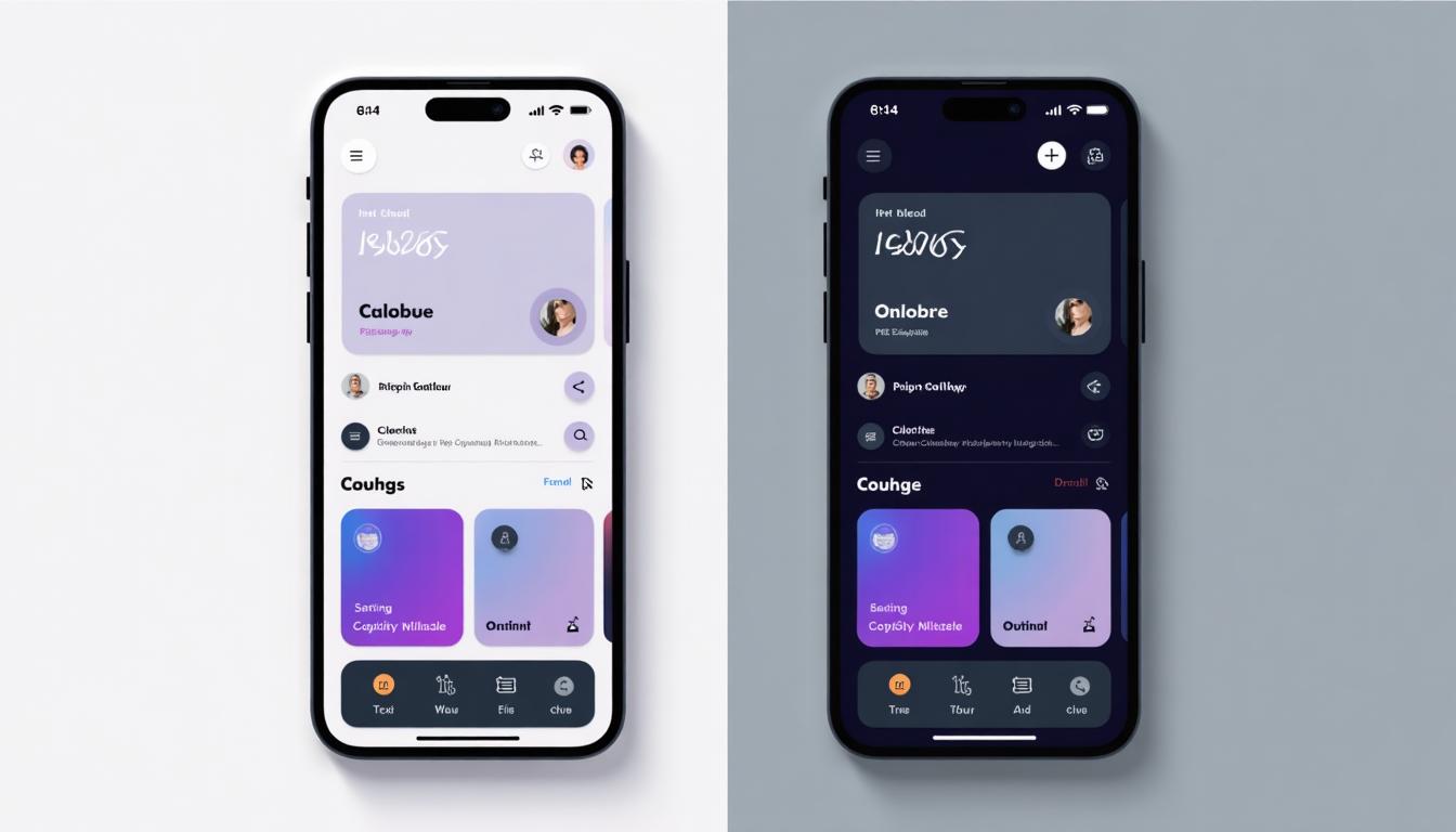
It was 11 PM, and I was staring at a design I'd spent three days perfecting. The client loved it. The light mode was gorgeous—soft whites, delicate shadows, carefully balanced contrast. Then they asked: "Can you add dark mode?"
I thought it would take an hour. It took three days.
Because here's what nobody tells you about dark mode: you can't just invert colors. You can't slap a black background on your beautiful design and call it a day. Dark mode is a completely different design language—and in 2026, it's no longer optional.
Why Dark Mode Became Mandatory (Not Just Trendy)
Let me hit you with some numbers that changed how I think about design:
- 81% of smartphone users now enable dark mode at least some of the time
- 64% of users keep dark mode on permanently
- Dark mode can reduce screen power consumption by up to 60% on OLED devices
But the real reason dark mode matters? Your users' eyes.
I used to dismiss this as design-world hype until I started tracking my own screen time. At 9 PM, staring at a bright white interface feels like looking into a flashlight. Dark mode isn't a preference—it's basic ergonomics.

The Psychology of Dark Mode: Why It Feels "Premium"
Here's something fascinating: dark mode doesn't just reduce eye strain—it changes how users perceive your product.
The "Premium Effect"
Think about luxury packaging. High-end electronics. Fancy restaurants. What color dominates? Black and dark surfaces.
Our brains associate dark environments with:
- Sophistication (theater curtains, concert halls)
- Focus (photographers' darkrooms, editing suites)
- Intimacy (candlelit dinners, evening events)
When you design a dark mode interface, you're tapping into these psychological associations. Spotify isn't dark because Spotify hates light—it's dark because music feels more immersive when the interface disappears.
The Calm Factor
Light mode interfaces are active. They demand attention. They say "LOOK AT ME."
Dark mode interfaces are receptive. They recede. They say "Focus on the content."
This is why reading apps, meditation apps, and creative tools often default to dark mode. The interface becomes a stage, not the performer.
Why Colors Behave Differently in Dark Mode
This is where most designers mess up—myself included, for years.
In light mode, your colors sit on top of a white background. The white acts as a light source behind them.
In dark mode, your colors become the light source. They're glowing against darkness.
This fundamental shift changes everything:

The Saturation Problem
A beautiful, saturated blue on white looks refined. The same blue on black looks like a nuclear warning sign.
The fix: Reduce saturation by 10-20% for dark mode. Your colors should feel like they're lit by candlelight, not stadium floodlights.
The "Neon Effect" Trap
I once shipped a fintech app with a bright green "success" color: #00FF00. In light mode, it was fine. In dark mode, users complained it was "giving them a headache."
Bright, saturated colors on dark backgrounds create visual vibration—that unpleasant shimmer effect that makes text hard to read and buttons feel aggressive.
The rule: If it would glow in the dark, it's too bright for dark mode.
Why Pure White Text Hurts
You might think #FFFFFF white text on #000000 black background is "maximum contrast." It is! And that's the problem.
This 21:1 contrast ratio creates halation—a halo effect where the white text bleeds into the dark background, making reading exhausting.
The solution: Use #E0E0E0 to #F0F0F0 for body text in dark mode. Your contrast will be around 15:1, which is still excellent while being much gentler on eyes.
6 Dark Mode Color Palettes for 2026
I've analyzed hundreds of successful dark mode implementations to create these six palettes. Each one is click-to-copy and battle-tested.
1. Classic Material Dark
The industry standard that started it all. Google's Material Design team spent years researching this, and it shows.
Key insight: The background isn't pure black (#000000) but #121212—a dark gray that feels softer and works better on LCD screens. The surface colors use overlay transparency to create elevation hierarchy.
Best for: Mobile apps, dashboard UIs, modern SaaS products
2. Warm & Cozy Dark
The 2025-2026 breakout trend. As dark mode became ubiquitous, users started craving warmth in their dark interfaces.
Key insight: The background uses a slight warm tint (#1A1A2E instead of pure gray). This subtle shift makes the interface feel inviting rather than cold and clinical.
Best for: Reading apps, wellness products, e-commerce
3. Cool Professional
For when you need to say "we're serious about your money" without putting users to sleep.
Key insight: Deep navy (#0D1B2A) as the background color conveys trust and stability—the same psychology that makes blue so dominant in tech branding. The bright blue accent provides energy without feeling unprofessional.
Best for: Fintech, B2B SaaS, enterprise tools
4. Neon Cyberpunk
For products that want to make a statement. Think gaming, creative tools, or any brand targeting younger audiences.
Key insight: This palette breaks the "no bright colors" rule—intentionally. When your brand is about energy and excitement, lean into the neon. Just be sure your users aren't reading long-form content.
Best for: Gaming platforms, creative tools, Gen-Z products
5. Soft OLED-Friendly
Optimized specifically for OLED and AMOLED screens where true black (#000000) actually turns pixels off, saving battery.
Key insight: While true black is great for power saving, pure black next to bright colors creates harsh contrast. This palette uses true black for the deepest background but introduces #0A0A0A surfaces to soften the transition.
Best for: Mobile apps, night reading modes, battery-conscious products
6. Warm Minimal
My personal favorite for 2026. This palette combines the earth tone trend with dark mode for something that feels both modern and timeless.
Key insight: The dark brown (#2D2424) background is unconventional but creates a unique premium feel. It works especially well for brands in lifestyle, home, and fashion spaces.
Best for: Lifestyle brands, interior design, premium products
The Science: #121212 and the Elevation System
Google didn't pick #121212 randomly. Let me explain the science.

Why Not Pure Black?
On LCD screens (still the majority of devices), pure black (#000000) creates what's called "smearing"—a visual artifact where dark areas seem to blur into each other during scrolling.
#121212 provides just enough luminosity to prevent this effect while still feeling decisively "dark."
The Elevation Overlay System
In light mode, we use shadows to show depth. In dark mode, shadows don't work—you can't make something darker than dark.
Material Design's solution: overlay brightness. Higher elevation = slightly lighter surface.
| Elevation | Overlay Opacity | Example Color |
|---|---|---|
| 0dp (base) | 0% | #121212 |
| 1dp | 5% | #1E1E1E |
| 2dp | 7% | #222222 |
| 4dp | 9% | #272727 |
| 8dp | 12% | #2E2E2E |
| 16dp | 15% | #333333 |
This creates a natural sense of depth without fighting against the darkness.
OLED vs LCD: When to Use True Black
The debate: Should you use #000000 (true black) or #121212 (near black)?
For OLED/AMOLED screens: True black turns off pixels completely, saving up to 60% battery on dark interfaces. This is why Twitter, Discord, and many mobile apps offer a "true dark" or "AMOLED dark" option.
For LCD screens: True black provides no battery benefit and can cause visual artifacts. Stick with #121212 or similar near-black colors.
My recommendation for 2026: Offer both. Let users choose. It's an easy win that shows you care about their experience.
Accessibility: Dark Mode Doesn't Mean Forgetting Contrast
Here's a mistake I see constantly: designers assume dark mode is automatically "accessible" because it's "easier on the eyes."
Wrong.
WCAG contrast requirements apply equally to dark mode. You still need:
- 4.5:1 minimum contrast for normal text (AA)
- 3:1 minimum for large text (18px+) and UI components
- 7:1 for enhanced accessibility (AAA)
Check your dark mode designs with our Color Contrast Checker—I guarantee you'll find surprises.
Dark Mode and Color Blindness
About 8% of men have some form of color blindness. In dark mode, some color combinations that work fine in light mode become problematic:
- Red on dark backgrounds can appear almost black to protanopia users
- Green accent colors may need boosting for deuteranopia users
- Blue-yellow color pairs work well for most color blindness types
Test your dark mode with our Colorblind Simulator before shipping.
Converting Your Light Mode Palette: The 3-Step Method

After years of painful trial and error, here's my systematic approach:
Step 1: Flip the Neutrals
Your light mode probably has:
- Background: White or near-white
- Text: Dark gray or black
- Surfaces: Light gray
For dark mode, flip these while adjusting:
- Background: #121212 or your brand's dark variant
- Text: #E0E0E0 (not pure white!)
- Surfaces: Lighter grays with 5-15% white overlay
Step 2: Desaturate and Lighten Brand Colors
Your brand colors need adjustment:
- Reduce saturation by 10-20%
- Increase lightness by 10-15%
- Test contrast against your new dark surfaces
A #6200EE purple becomes #BB86FC. A #1976D2 blue becomes #64B5F6.
Step 3: Adjust Semantic Colors
Error reds, success greens, and warning yellows need special attention:
- They must be visible without being aggressive
- Consider adding subtle background tints for states
- Test all combinations for accessibility
Or just use AI: Our Light/Dark Mode Generator handles all of this automatically, using perceptual color science to maintain your brand identity while optimizing for dark mode.
The 10 Most Common Dark Mode Mistakes
After reviewing hundreds of dark mode implementations, here are the mistakes I see most often:
1. Using Pure Black (#000000) Everywhere
Fix: Use #121212 or contextual dark colors.
2. Not Adjusting Shadows
Fix: Shadows don't work in dark mode. Use overlay elevation instead.
3. Keeping Light Mode Saturated Colors
Fix: Desaturate by 10-20% and lighten slightly.
4. Using Pure White (#FFFFFF) for Text
Fix: Use #E0E0E0 or #F0F0F0 for body text.
5. Forgetting About Images
Fix: Add subtle dark overlays or create dark mode image variants.
6. Inconsistent Surface Colors
Fix: Create a surface color system with 4-6 levels.
7. Ignoring State Changes
Fix: Hover, active, and disabled states need rethinking for dark mode.
8. Using the Same Border Colors
Fix: Borders need to be lighter in dark mode (around 10-15% opacity white).
9. Not Testing on Real Devices
Fix: OLED phones, LCD monitors, and tablets all render dark mode differently.
10. Making Dark Mode an Afterthought
Fix: Design dark and light mode simultaneously.
Real App Examples: Learning from the Best
Let's analyze how successful products handle dark mode:
Spotify
Approach: Dark-first design. The interface was born dark. Key decision: Bright green (#1DB954) accent works because it's used sparingly—only for key actions. Lesson: If your accent color is bold, use it as a surgical highlight, not a flood.
Discord
Approach: "Blurple" (#5865F2) on dark gray backgrounds. Key decision: Multiple dark themes (dark, darker, AMOLED) for user choice. Lesson: Power users appreciate customization.
Twitter/X
Approach: Three theme options—dim, lights out, and light. Key decision: "Dim" uses a soft dark blue (#15202B) that feels warmer than pure black. Lesson: One size doesn't fit all. Offering options builds loyalty.
Figma
Approach: Warm dark theme with subtle brown undertones. Key decision: The canvas remains flexible—your design colors, not Figma's, are the focus. Lesson: Tools should recede. Content should shine.
2026 Dark Mode Trends

Based on what I'm seeing in 2026 color trends, here's where dark mode is heading:
1. Warm Dark Mode Goes Mainstream
The cold, clinical dark mode is losing ground to warmer, more inviting variations. Expect to see more dark browns, warm charcoals, and purple-tinged blacks.
2. Adaptive Colors Based on Time
Interfaces that shift from bright midday colors to warmer, darker tones as evening approaches. iOS already does this with Night Shift—expect apps to follow.
3. OLED Optimization Becomes Standard
As OLED screens dominate mobile devices, true black optimizations become table stakes, not luxury features.
4. Dark Mode as Default
We're approaching a tipping point where dark mode becomes the default, with light mode as the alternative.
5. Textured Backgrounds
Flat, solid dark backgrounds are being replaced by subtle gradients, noise textures, and gradient meshes for visual interest.
Tools for Dark Mode Design
Ready to implement everything we've discussed? Here are your weapons:
Light/Dark Mode Generator
Our AI-powered tool converts any light mode palette to dark mode while maintaining brand identity and ensuring WCAG accessibility.
Color Contrast Checker
Essential for testing all your color combinations against both WCAG AA and AAA standards.
Colorblind Simulator
See how your dark mode looks to users with various forms of color blindness.
AI Website Designer
Generate complete website designs with perfectly balanced light and dark mode variants from a single prompt.
Making the Switch: Your Action Plan
- Audit your current design — Identify all unique colors in your light mode
- Create a dark color system — Background, surface levels, text, borders, and brand colors
- Test accessibility — Run every combination through contrast checkers
- Simulate color blindness — Catch problems before your users do
- Test on real devices — OLED phones, LCD monitors, tablets
- Get user feedback — What looks "right" in design files might feel off in production
Dark mode isn't just a feature anymore—it's an expectation. But done right, it's also an opportunity to make your product feel more premium, more focused, and more comfortable to use.
The 81% of users enabling dark mode? They're not going back. The question isn't whether to support dark mode—it's how well you'll do it.