Minimalist Color Palette: How to Design with Just 3-4 Colors (And Why Less Wins)
· Lion Dada
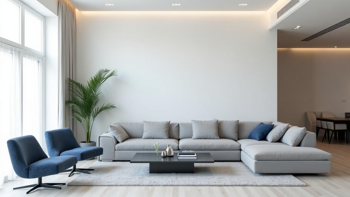
The 12-Color Disaster That Changed Everything
I still remember the project that taught me minimalism. A startup founder showed me their "brand guidelines"—a document with 12 different colors, 4 fonts, and gradients that would make a rainbow jealous.
"We want to convey that we're fun, professional, innovative, trustworthy, bold, AND approachable," she said.
The result? A visual identity that conveyed absolutely nothing. It was everywhere and nowhere at once.
Then we stripped it down to three colors: a warm white, a deep charcoal, and one striking teal accent. Suddenly, the brand had a voice. It felt expensive. It felt intentional.
That project taught me something I now tell every designer: the magic isn't in adding more colors—it's in knowing which ones to remove.
Why 3-4 Colors Is All You Need
There's a reason the world's most valuable brands use minimal color palettes. Apple uses white, black, and silver. Chanel uses black and white. Tesla uses red on black and white.
The Psychology of Restraint
When you limit your palette, something interesting happens in the viewer's brain:
Cognitive load decreases. With fewer colors to process, your audience focuses on what matters—your message, your product, your call to action.
Perception of quality increases. In a 2019 study by the Journal of Consumer Research, participants rated products with simpler color schemes as 27% more premium than identical products with complex palettes.
Recognition improves. Think about Tiffany's blue, Target's red, or Spotify's green. One dominant color becomes your signature.
The Math Behind Minimal
Here's the formula that works:
- Primary Color (60-70%): Your dominant background or brand color
- Secondary Color (20-25%): Your text, structure, or supporting elements
- Accent Color (5-10%): Your CTAs, highlights, and attention-grabbers
Optional fourth color? A neutral that bridges everything together.
This isn't random. It follows the same principles as the 60-30-10 rule that interior designers have used for decades—and it's rooted in how our brains process visual hierarchy.
The 6 Minimalist Palette Templates
Let me walk you through each palette and when to use it:
1. The Classic Trio
Off-white + Charcoal + Blue accent
This is the SaaS default for good reason. It's professional without being cold, modern without being trendy. Perfect for:
- Tech startups
- B2B services
- Professional portfolios
- Documentation sites
2. Warm Minimal
Cream + Walnut + Terracotta accent
When you want minimalism that hugs. This palette feels like a specialty coffee shop that actually knows what they're doing. Ideal for:
- Lifestyle brands
- Food and beverage
- Boutique hotels
- Artisan products
3. Cool Professional
Pure white + Navy + Silver accent
Banking, law, finance—this is the palette that says "we take your money seriously." It's the most traditional of the six but executed with contemporary restraint. Works for:
- Financial services
- Legal practices
- Corporate consulting
- Medical practices
4. Nature's Three
Sand + Forest green + Stone accent
Sustainability without cliché. This avoids the obvious "green for eco" approach by using earth tones that feel grounded and authentic. Perfect for earth-conscious brands that want sophistication.
5. Bold Minimal
White + Black + Yellow accent
Maximum contrast, maximum impact. This is for brands that aren't afraid to make a statement. Use sparingly—it's intense. Great for:
- Creative agencies
- Fashion brands
- Design portfolios
- Disruptor startups
6. Soft Modern
Light gray + Sage + Charcoal accent
The "quiet luxury" palette. It whispers instead of shouts but leaves a lasting impression. Trending heavily in 2025-2026 for:
- Wellness brands
- Skincare and beauty
- Meditation apps
- Luxury hospitality
How to Choose Your 3 Colors
Picking just three colors is harder than picking ten. Here's my process:
Step 1: Define Your Brand Personality
Before touching any color tool, answer this: If your brand were a person at a party, who would they be?
The confident leader in a tailored suit? Go with Bold Minimal. The thoughtful friend everyone trusts? Try Cool Professional. The creative who always has interesting stories? Warm Minimal might be your match.
Step 2: Choose Your Dominant Hue
Your primary color occupies 60-70% of your visual space. This isn't necessarily your "brand color"—it's usually a neutral that lets your actual brand color shine.
For most minimalist palettes, this means:
- Various shades of white (warm, cool, pure)
- Light grays
- Soft creams or beiges
Use our Fibonacci Generator to find mathematically harmonious variations of your base color.
Step 3: Select a Strong Secondary
This is your workhorse color—the one that carries text, defines structure, and creates hierarchy. It should:
- Have enough contrast with your primary for readability
- Feel related to your accent (either complementary or analogous)
- Work in both light and dark modes
Deep charcoals, navies, and forest greens are classics here. Check your combinations with our Color Contrast Checker to ensure WCAG compliance.
Step 4: Pick One Unforgettable Accent
Your accent color should make people remember you. It appears only 5-10% of the time, but that scarcity makes it powerful.
Ask yourself: What's the one color I want people to associate with my brand?
Then commit to it completely.
The Neutral Question
Should you use a fourth color? Here's when it makes sense:
Add a neutral when:
- You have complex UI that needs subtle differentiation
- Your primary and secondary create harsh contrast
- You need a "quiet" option for less important elements
- Your accent is very intense and needs buffering
Skip the fourth color when:
- Your brand is about bold simplicity (think Supreme)
- You want maximum recognition
- Your primary already functions as a subtle neutral
The best neutrals are rarely pure gray. Add a touch of your dominant hue:
- Warm palette? Try a greige or warm gray
- Cool palette? Go with blue-gray or silver
- Nature palette? Earth-toned taupe or stone
Minimalist Color Across Industries
Tech & SaaS
The minimalist movement in tech started with Apple and has become the default aesthetic for modern software. Companies like Linear, Notion, and Figma prove you can be feature-rich while remaining visually restrained.
Key patterns:
- White/light gray backgrounds
- Dark text for hierarchy
- Single accent for interactive elements
- Subtle secondary for hover states
Fashion & Luxury
Brands like Aesop, COS, and The Row have built empires on chromatic restraint. Their secret? Confidence in simplicity.
When Aesop uses brown glass bottles with simple typography, they're not being lazy—they're trusting that quality speaks for itself. You can explore similar approaches with our AI Website Designer to visualize minimalist brand identities.
Interior Design
Scandinavian design has dominated interiors for a reason. The minimalist palette of whites, natural woods, and occasional color accents creates spaces that feel both calm and curated.
This translates directly to digital: your website is a space people inhabit temporarily. Make it comfortable.
Minimalist vs. Monochromatic: What's the Difference?
I get this question a lot. They're related but distinct:
Monochromatic color schemes use variations of a single hue—different saturations and lightnesses of blue, for example.
Minimalist palettes use multiple hues but in extreme moderation—usually 2-3 distinct colors with careful proportion control.
A monochromatic blue palette might use five shades of blue. A minimalist palette might use white, charcoal, and a single blue accent.
Choose monochromatic when:
- You want cohesion above all else
- Your brand is strongly associated with one color
- You're creating a mood-focused experience
Choose minimalist when:
- You need clear visual hierarchy
- You want high contrast for readability
- You're building complex UIs that need differentiation
Common Minimalist Mistakes
After reviewing hundreds of "minimalist" designs, I see the same errors repeatedly:
Mistake 1: Colors That Are Too Similar
Your secondary and accent need to be distinctly different. If someone can't tell them apart at a glance, you don't have three colors—you have two.
Mistake 2: Accent That Doesn't Pop
Your 5% accent should be impossible to miss. If it blends into your palette, it's not doing its job. This is the one place to be bold.
Mistake 3: Ignoring Context
A minimalist palette on a pure white background looks different than on a textured paper background or a dark mode interface. Test your colors in context.
Mistake 4: Forgetting Accessibility
Minimalist doesn't mean inaccessible. Your beautiful low-contrast gray-on-white text might be impossible for 10% of your users to read. Always verify with our accessibility guide.
Dark Mode for Minimalist Palettes
Your 3-color palette needs a dark mode strategy. Here's the approach I recommend:
Don't just invert. White doesn't become black—it becomes very dark gray (#0D0D0D or similar). Black text doesn't become white—it becomes off-white (#E5E5E5).
Your accent might need adjustment. That bright blue that pops on white might be harsh on dark backgrounds. Slightly desaturated versions work better.
Use our Light/Dark Mode Generator to create proper dark mode translations of your minimalist palette. It uses AI to maintain brand identity while ensuring accessibility.
For deeper guidance, read our complete guide to dark mode colors.
Accessibility With Limited Colors
Having fewer colors actually makes accessibility easier—if you do it right.
The Contrast Imperative
With only 3-4 colors, every combination matters. Check every possible pairing:
- Text on primary background
- Text on secondary background
- Accent on primary
- Accent on secondary
All need to meet WCAG AA standards (4.5:1 for normal text, 3:1 for large text). No exceptions.
State Differentiation
With minimal colors, how do you show hover, focus, active, and disabled states? Techniques:
- Subtle lightness shifts (5-10% variation)
- Border additions
- Opacity changes
- Background transitions
You have less room for error, so plan states carefully from the beginning.
The 2026 Minimalist Trend: Warm Minimalism
The cold, sterile minimalism of early 2010s design is fading. 2026's color trends point toward something warmer:
Warm whites over pure white. #FFFBF5 feels more inviting than #FFFFFF.
Earth-adjacent neutrals. That charcoal has brown undertones now. That gray leans toward taupe.
Organic accents. Terracottas, sages, and burnt oranges are replacing the neon accents of previous years.
This evolution keeps minimalism relevant while making it more human. The restraint remains—it just has a heartbeat now.
Tools for Building Your Minimalist Palette
Ready to create your own 3-4 color system? Here's your toolkit:
Fibonacci Generator
Start with one color and generate mathematically harmonious variations. Perfect for finding that ideal primary-to-secondary relationship.
Color Hierarchy Tool
Define your color proportions visually. Drag sliders to see how 70-25-5 actually looks in practice, then export to CSS or Tailwind.
AI Website Designer
Upload an inspiration image and see a complete website design using your minimalist palette. Instant visualization of your colors in context.
Color Contrast Checker
Non-negotiable for minimalist palettes. Every combination must pass. This tool makes verification fast.
The Courage of Constraint
Minimalist color design isn't about what you lack—it's about what you choose. Every color in your palette should earn its place.
When Apple uses red for their (RED) campaign, that red means something precisely because it's surrounded by nothing. When Chanel uses gold, it's luxurious because it's rare.
Your restraint is your power.
Start with one of the templates above, customize it to your brand, and resist the urge to add "just one more color." Your design will thank you.
What's Next?
Want to dive deeper into color proportion theory? Read The Science Behind Color Proportions to understand why certain ratios work better than others.
Interested in a specific color direction? Explore our color psychology series:
- The Power of Blue in Design
- Why Green Works for Brands
- The Sophistication of Gray
- The Meaning of White
- Understanding Black
And if you're building a brand from scratch, our complete color harmony series covers every relationship type from complementary to tetradic.
Less really is more—now you have the tools to prove it.