Wine Colors in Design: From Burgundy to Rosé – A Complete Guide to Wine-Inspired Palettes
· Coloracci Team
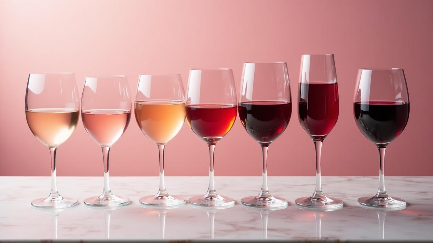
There's something almost magical about the way wine catches the light. I discovered this years ago, sitting at a small restaurant in Bordeaux, watching the evening sun filter through my glass of Margaux. The color wasn't just red—it was a symphony of ruby, garnet, and deep crimson that shifted with every movement. In that moment, I understood why wine colors have captivated artists and designers for centuries.
Wine colors represent one of the most sophisticated and emotionally rich color families in design. Unlike the bold primaries or trendy neons that come and go, wine tones possess an inherent elegance that transcends fleeting trends. They speak of history, craftsmanship, and refined taste—qualities that translate beautifully into interior design, fashion, and brand identity.
Whether you're designing a cozy reading nook, creating a luxury brand identity, or curating a capsule wardrobe, understanding the nuances of wine colors can elevate your work from ordinary to extraordinary.
Understanding the Wine Color Spectrum
Before we dive into specific palettes and applications, let's explore what makes wine colors unique. The wine spectrum encompasses far more than "red"—it's a complex family of hues influenced by grape varieties, aging processes, and regional terroir.

The Science Behind Wine Colors
Wine colors derive from anthocyanins, pigments found in grape skins. These compounds create everything from the pale salmon of a young rosé to the deep purple-black of aged port. Understanding this natural origin helps us appreciate why wine colors feel so inherently organic and harmonious.
The wine color spectrum includes:
- Rosé Tones (#F8E4E4 to #B85C5E): Pale blush to deep salmon, created from minimal skin contact
- Ruby/Pinot Shades (#C9A2A2 to #5C2F2F): Medium-bodied elegance with cherry undertones
- Burgundy/Merlot (#8B4A4A to #4A2424): Deep, velvety reds with plum and chocolate notes
- Port/Shiraz (#5C3A50 to #3D2535): Rich, sweet tones with purple undertones
Each of these color groups carries distinct emotional associations and design applications. Let's explore them through our interactive palette collection.
Wine Colors in Interior Design
Wine colors have been staples of interior design for centuries, from the burgundy velvet of Victorian parlors to the blush millennial pink of modern minimalism. Their enduring appeal lies in their versatility and emotional warmth.

Creating Warmth Without Overwhelming
One of the greatest challenges in interior design is creating warmth without making a space feel dark or claustrophobic. Wine colors solve this beautifully. A deep burgundy accent wall, for instance, adds depth and sophistication while remaining more approachable than black or navy.
The key is understanding undertones. Wine colors with more brown undertones (like Merlot) feel earthier and more grounded. Those with purple undertones (like Port) feel more luxurious and dramatic. Choose based on your desired mood:
Warm, Inviting Spaces:
- Merlot (#6B3636) paired with cream and warm wood
- Shiraz (#7A3A30) with terracotta and natural linen
- Sangria (#D4705A) with warm metallics and rattan
Sophisticated, Dramatic Spaces:
- Burgundy (#722F37) with charcoal and gold accents
- Port (#5C3A50) with deep teal and brass
- Cabernet (#7B3F3F) with black and copper
The 60-30-10 Rule with Wine Colors
When incorporating wine colors into interiors, the 60-30-10 color proportion rule becomes essential. For most spaces, wine should occupy the 10% accent position—think throw pillows, artwork, or a statement chair. In more dramatic schemes, bump it to 30% with upholstery or drapery.
For a burgundy-focused living room:
- 60% Neutral base: Warm cream or soft gray walls and large furnishings
- 30% Secondary: Deep charcoal or forest green for anchoring pieces
- 10% Accent: True burgundy in pillows, throws, or a statement chair
You can test these proportions with our Color Hierarchy Tool before committing to purchases.
Room-by-Room Applications
Living Rooms: Wine colors excel in spaces designed for conversation and relaxation. A burgundy velvet sofa becomes an instant focal point, while rosé-toned artwork adds softness to minimalist schemes.
Dining Rooms: There's a reason wine colors and dining go together. Deep merlot walls stimulate appetite and conversation (learn more about color psychology in food spaces), while softer rosé tones create an elegant backdrop for entertaining.
Bedrooms: Contrary to what you might think, wine colors can be wonderfully calming in bedrooms. The key is choosing dustier, more muted versions. Dusty rose (#C4847C) or faded plum (#9E6B6B) create romantic, restful atmospheres without the intensity of pure burgundy.
Home Offices: Need to project sophistication on video calls? A burgundy accent wall behind your desk conveys professionalism and creativity simultaneously.
Wine Colors in Fashion

Wine colors are perennial fashion favorites, transcending seasons and trends. From the runways of Milan to everyday wardrobes, these sophisticated hues offer endless styling possibilities.
Building a Wine-Inspired Capsule Wardrobe
The beauty of wine colors in fashion is their versatility. They work across seasons, pair beautifully with neutrals, and flatter a wide range of skin tones.
Core Pieces in Wine Tones:
- A burgundy blazer (works with everything from jeans to dresses)
- Merlot leather accessories (bags, belts, shoes)
- A rosé silk blouse (elegant for work or evening)
- Deep wine trousers (more interesting than black, equally professional)
Seasonal Applications:
Fall/Winter: This is wine's natural season. Layer burgundy cashmere over cream, pair merlot leather boots with charcoal wool, or make a statement in a full burgundy coat.
Spring/Summer: Rosé and blush tones shine here. Pale pink sundresses, dusty rose linen, and champagne-toned accessories feel fresh and romantic without veering into saccharine territory.
Color Combinations for Wine Tones in Fashion
Wine colors play beautifully with specific palettes. Here are foolproof combinations:
Wine + Neutrals: The safest, most elegant approach. Burgundy with camel, cream, or charcoal creates timeless sophistication.
Wine + Forest Green: A rich, autumnal combination that feels both natural and luxurious. Think burgundy knit with olive trousers.
Wine + Navy: A sophisticated alternative to black that feels more interesting and approachable.
Wine + Blush: Tonal dressing at its finest. Layer different wine intensities for a monochromatic moment.
Wine + Gold: For evening and special occasions. The warmth of gold amplifies burgundy's richness.
For more on combining colors effectively, explore our guide to complementary color schemes.
Wine Colors in Branding and Marketing

Wine colors carry powerful associations in branding: sophistication, tradition, quality, and warmth. They're particularly effective for brands wanting to convey heritage, craftsmanship, or luxury without the coldness of black or the flashiness of gold.
Industries Where Wine Colors Excel
Food and Beverage: Obviously wine brands, but also upscale restaurants, artisanal food producers, chocolate brands, and premium coffee companies. The psychology connecting red tones to appetite makes wine colors natural fits.
Hospitality: Luxury hotels, boutique accommodations, and fine dining establishments often employ burgundy and merlot tones. These colors suggest comfort, indulgence, and attention to detail.
Fashion and Beauty: Wine colors convey sophistication and timelessness—perfect for brands positioning themselves as elegant rather than trendy.
Professional Services: Law firms, financial advisors, and consultancies use wine tones to balance approachability with authority. Burgundy feels established without being stuffy.
Wedding and Events: The romance of rosé and the elegance of burgundy make wine colors perennial favorites for wedding branding, invitations, and décor.
Creating a Wine-Inspired Brand Palette
When building a brand identity around wine colors, consider the full ecosystem. Here's a framework:
Primary Brand Color: Choose your main wine tone based on desired positioning
- Rosé (#D4787B): Approachable, feminine, modern
- Burgundy (#722F37): Classic, sophisticated, established
- Merlot (#6B3636): Warm, inviting, premium
- Port (#5C3A50): Luxurious, mysterious, indulgent
Secondary Palette: Support your wine color with 2-3 neutrals
- Warm neutrals (cream, camel, warm gray) for approachable brands
- Cool neutrals (charcoal, slate, ivory) for premium positioning
Accent Colors: One or two accents for calls-to-action and highlights
- Gold (#D4A855) for luxury positioning
- Forest green (#2D4A3E) for natural/organic brands
- Soft blush (#F8E4E4) for feminine brands
Use our AI Website Designer to see how wine color palettes translate to digital experiences.
Digital Applications
Wine colors require careful handling in digital design. Deep burgundies can reduce readability if used as text colors, while bright rosés may appear washed out on certain screens.
Best practices for wine colors in web design:
- Use dark wine tones (burgundy, merlot) as accent colors, not backgrounds
- Ensure sufficient contrast with text (check with our Color Contrast Checker)
- Test rosé tones across multiple devices—they're particularly sensitive to screen variations
- Combine with plenty of white space to prevent visual heaviness
The Psychology of Wine Colors

Understanding color psychology helps explain why wine colors resonate so deeply. They combine the energy of red with the sophistication of deeper tones, creating emotional responses that are both stimulating and comforting.
Emotional Associations
Burgundy and Merlot: These deeper wine tones evoke feelings of:
- Warmth and comfort
- Sophistication and elegance
- Tradition and heritage
- Indulgence and pleasure
- Power and confidence (without aggression)
Rosé and Blush: Lighter wine tones create different associations:
- Romance and tenderness
- Approachability and warmth
- Optimism and freshness
- Femininity (when used carefully)
- Modern elegance
Cultural Considerations
Wine colors carry different meanings across cultures, which matters for global brands:
Western Cultures: Generally associated with luxury, celebration, romance, and sophistication. Burgundy suggests tradition and quality.
Asian Cultures: Red tones (including wine) symbolize luck, prosperity, and celebration in Chinese culture. However, very dark reds may have mourning associations in some contexts.
Mediterranean Cultures: Strong connections to wine culture, dining, and social gathering. These colors feel inherently convivial.
For more on color meanings across cultures, see our guide to color cultures around the world.
Practical Application: Creating Your Wine Palette
Ready to incorporate wine colors into your next project? Here's a step-by-step approach:
Step 1: Define Your Mood
Are you going for:
- Romantic and soft: Focus on rosé tones (Champagne Rosé, Provence Blush palettes)
- Classic and sophisticated: Center on burgundy (Burgundy Royale, Merlot Classic palettes)
- Bold and dramatic: Embrace deeper tones (Cabernet Sauvignon, Port Velvet palettes)
- Warm and inviting: Choose earthy undertones (Shiraz Spice, Sangria Sunset palettes)
Step 2: Select Your Hero Color
Choose one wine tone as your anchor. This becomes your "hero" color that sets the overall mood. Use the interactive palettes above to find yours.
Step 3: Build Supporting Colors
Add neutrals that complement your hero:
- Warm undertone wines (merlot, shiraz): Pair with cream, camel, warm grays
- Cool undertone wines (burgundy, port): Pair with charcoal, slate, cool whites
Step 4: Add Strategic Accents
One or two accent colors add interest:
- Metallics (gold, copper, brass) for luxury
- Greens (forest, sage, olive) for natural balance
- Blues (navy, teal) for sophisticated contrast
Step 5: Test and Refine
Before finalizing:
- Check accessibility with our Colorblind Simulator to ensure your palette works for all users
- Verify contrast ratios, especially for text
- Test across different materials/screens
- Create mood boards to see colors in context
You can generate and test wine-inspired palettes using our Fibonacci Color Generator or extract colors from wine imagery using our Image Color Extractor.
Wine Color Trends for 2025
While wine colors are timeless, their applications evolve. Here's what we're seeing in current design:
The Rise of "Wine Neutrals"
Dusty, muted wine tones are increasingly used as neutrals rather than accents. These sophisticated non-colors (dusty rose, mauve, faded burgundy) offer more interest than beige while remaining incredibly versatile.
Tonal Layering
Rather than pairing wine with contrasting colors, designers are layering multiple wine tones together. Think blush walls, rosé upholstery, and burgundy accessories in a single space—creating depth through variation rather than contrast. This relates to the principles of monochromatic color schemes.
Wine Meets Terracotta
The combination of wine tones with terracotta and rust is having a major moment. This earthy pairing feels simultaneously vintage and contemporary, working beautifully in both interior design and branding.
Digital Burgundy
In web and app design, deep burgundy is emerging as an alternative to ubiquitous blue. It conveys premium positioning while feeling warm and approachable—perfect for luxury brand websites and high-end e-commerce.
Common Mistakes to Avoid
Even these beautiful colors can go wrong. Watch out for:
Too Much, Too Dark
Covering large areas in deep burgundy or merlot without sufficient light colors creates oppressive spaces. Balance with plenty of cream, white, or light neutrals.
Ignoring Undertones
Mixing warm-undertone wines (merlot, shiraz) with cool-undertone wines (burgundy, port) creates discord. Stick to one undertone family per palette.
Poor Contrast in Digital
Wine colors on wine backgrounds = unreadable. Always ensure sufficient contrast, especially for text. Our Contrast Checker can help.
Forgetting Context
A color that looks sophisticated in low light can appear dull or muddy in bright daylight. Always test colors in the actual environment where they'll be used.
Dating Yourself
While wine colors are timeless, certain applications can feel dated. Burgundy paired with gold in certain combinations can read "1990s hotel lobby." Keep styling fresh and current.
Conclusion: The Enduring Appeal of Wine Colors
Wine colors endure because they tap into something fundamental about human experience—the pleasure of a shared meal, the romance of an evening well spent, the satisfaction of quality and craftsmanship. They're colors with stories.
Whether you're designing a cozy corner of your home, building a brand identity, or curating your wardrobe, wine colors offer a path to instant sophistication. They're forgiving of mistakes, complementary to most other colors, and never truly go out of style.
The key is intention. Choose your wine tones purposefully, understand their undertones and associations, and apply them with the same care a winemaker brings to their craft.
Ready to create your own wine-inspired palette? Start with our Fibonacci Color Generator to explore harmonious combinations, or use the AI Website Designer to see how wine colors translate to digital experiences.
For more color inspiration, explore our guides to analogous color schemes for creating tonal harmony, or dive into the psychology of passion colors to understand why wine tones move us so deeply.