Renaissance Color Techniques: From Lapis Lazuli to Sfumato Mastery
· Coloracci Team
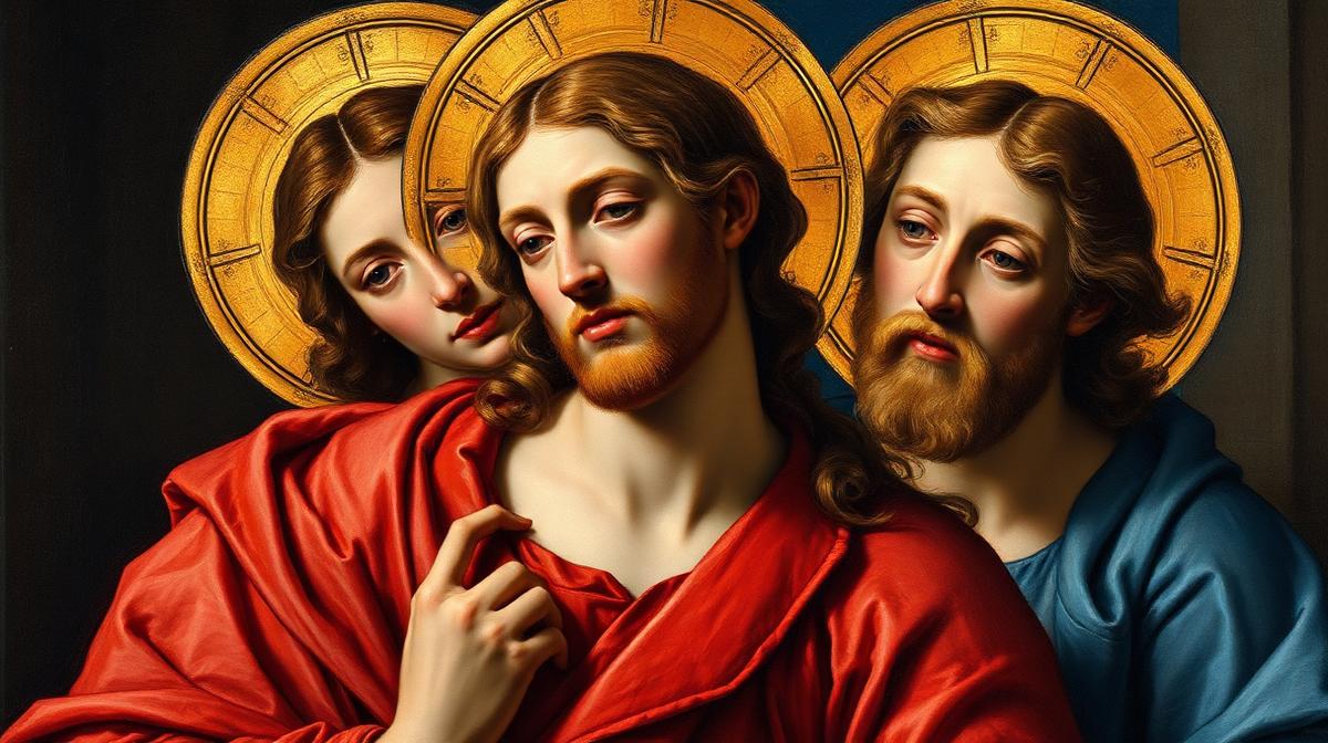
Renaissance Color Techniques: From Lapis Lazuli to Sfumato Mastery
The Renaissance (1400-1600) didn't just revolutionize art—it transformed humanity's relationship with color. Masters like Leonardo da Vinci, Raphael, and Titian developed techniques so sophisticated that they remain foundational to color theory, digital design, and visual storytelling today.
The Economics of Renaissance Color
Pigment as Currency
Renaissance color was inseparable from wealth. Pigments were traded like precious commodities, and their cost directly influenced artistic choices:
| Pigment | Source | Cost (relative) | Modern Hex | Status |
|---|---|---|---|---|
| Ultramarine | Lapis lazuli (Afghanistan) | More than gold | #1F3B8C | Reserved for the Virgin Mary |
| Vermillion | Mercury sulfide | Very expensive | #E34234 | Royal garments, sacred objects |
| Gold leaf | Pure gold | Extremely expensive | #FFD700 | Halos, divine light |
| Lead white | Lead carbonate | Moderate | #F0EDE5 | Flesh tones, highlights |
| Terre verte | Green earth | Inexpensive | #7E9B76 | Underpainting for flesh |
| Yellow ochre | Iron oxide | Inexpensive | #CC9933 | Common backgrounds, earth |
| Bone black | Charred bone | Very cheap | #1C1B18 | Shadows, outlines |
The Patron's Palette
Contracts between artists and patrons often specified exactly which pigments must be used—and who paid for them. A commission requiring extensive ultramarine blue was significantly more expensive than one using azurite (#3D5B8C), its cheaper substitute. This economic reality shaped the visual hierarchy of color that persists today: blue and purple still connote luxury and premium quality.
The Five Revolutionary Techniques
1. Sfumato: The Art of Invisible Color Transition
Leonardo da Vinci's signature technique—sfumato (from Italian "sfumare," to evaporate)—created imperceptibly soft transitions between colors and tones.
How it worked: Leonardo applied dozens of translucent glaze layers, each slightly different in tone, building up transitions so gradual that no hard edges existed. The Mona Lisa's smile appears to shift because the sfumato technique creates genuine optical ambiguity.
Modern application: Sfumato directly anticipates:
- CSS gradient techniques: Smooth transitions between colors
- Gaussian blur effects: Software replicating sfumato's soft edges
- UI shadow design: Subtle, multi-layered shadows in material design
- Brand gradient systems: Spotify, Instagram, and Apple's gradient approaches
2. Chiaroscuro: The Drama of Light and Dark
Developed most dramatically by Caravaggio, chiaroscuro (light-dark) used extreme contrast to create three-dimensional drama:
The Caravaggio palette:
- Deep shadow: Near-black (#0A0A0A) occupying 60-70% of the canvas
- Mid-tones: Warm ochre (#B8860B) and sienna (#A0522D)
- Highlights: Concentrated warm white (#FFF8E7) on focal points
- Accent color: Rich red (#8B0000) or gold (#DAA520) for narrative emphasis
Modern application:
- Dark mode design: High-contrast interfaces with focused light elements
- Hero image treatment: Dramatic lighting in product photography
- Card elevation: Shadow systems that create depth hierarchy
- Spotlight UI patterns: Drawing attention to CTAs against dark backgrounds
3. Cangiante: Color-Shifting Fabric
Michelangelo pioneered cangiante (changing color) in the Sistine Chapel—rendering fabric that shifts between completely different hues in light and shadow:
- A green robe becomes yellow in highlights (#4CAF50 → #FFD700)
- A blue cloak becomes pink in deepest shadows (#2196F3 → #E91E63)
- An orange drape shifts to crimson (#FF9800 → #B71C1C)
Modern application: This technique anticipates:
- Duotone design: Two-color image treatments popular in modern web design
- Gradient mesh: Complex color transitions in illustration software
- Iridescent design: Color-shifting effects in luxury packaging and UI
4. Unione: Raphael's Harmonious Color
Raphael developed unione—a technique of using warm and cool colors in careful balance to create harmonious, unified compositions. Unlike Caravaggio's dramatic contrasts, Raphael sought visual peace:
Raphael's harmony formula:
- Warm foreground figures (#E8B87D skin, #CC3333 robes)
- Cool atmospheric backgrounds (#87CEEB sky, #6B8E6B landscape)
- Transitional mid-tones (#B8A88A architecture) bridging warm and cool
- Complementary accents (#2E5D9F blue against #FFB300 gold)
Modern application:
- Color temperature balance: Warm CTAs on cool backgrounds
- Complementary color systems: Brand palettes that use warm-cool contrast
- UI harmony: Balancing energetic and calming elements in interfaces
5. Glazing: Building Color Depth
Venetian masters (Titian, Giorgione, Bellini) perfected glazing—applying thin, transparent layers of color over opaque bases to create luminous depth:
The glazing principle: Light passes through transparent color layers, reflects off the opaque base, and passes through the glazes again—doubling the color's perceived depth. A glazed red appears far more luminous than the same red applied opaquely.
Titian's glazing palette:
- Base layer: Lead white (#F0EDE5) or warm gray (#B0A89E)
- Glaze 1: Transparent yellow ochre (#CC9933 at 20% opacity)
- Glaze 2: Transparent red lake (#991133 at 15% opacity)
- Final glaze: Transparent ultramarine (#1F3B8C at 10% opacity) for cool shadows
Modern application:
- CSS layered transparency: Multiple semi-transparent layers creating depth
- Glass morphism: Frosted glass effects in modern UI design
- Photo editing: Layered color adjustments mimicking glazing
- Gradient overlays: Semi-transparent color washes over images
The Renaissance Color Hierarchy
Sacred Color Assignment
Renaissance art followed strict color conventions for religious subjects:
The Virgin Mary: Ultramarine blue (#1F3B8C) mantle over red (#CC0000) dress—divine heaven covering earthly sacrifice Christ: Red or white—sacrifice and purity Saints: Gold halos (#FFD700) with garments in their associated colors Angels: White and gold—celestial purity Judas: Yellow (#DAA520)—betrayal and shame (creating a lasting negative association with yellow in Western art) God the Father: Gold and purple (#6A0DAD)—ultimate authority
This color hierarchy created associations that persist in modern branding: blue for trust and reliability, red for passion and sacrifice, purple for royalty and authority, gold for premium quality.
Applying Renaissance Principles to Modern Design
The Master's Toolkit for Designers
Value before hue: Renaissance artists planned compositions in grayscale before adding color. Test your designs in grayscale first—if the hierarchy doesn't work without color, color won't fix it.
Limited palette, maximum impact: Most Renaissance paintings use only 5-7 pigments. Constraint breeds creativity—limit your palette to a primary, secondary, and 2-3 neutrals.
Color temperature as depth: Warm colors advance, cool colors recede. Use this to create visual hierarchy in flat designs.
Transparency creates richness: Semi-transparent overlays add depth that opaque colors cannot achieve.
Color has cost: In Renaissance terms, expensive colors earned attention. Apply the same principle: use your most distinctive brand color sparingly, at the points of highest importance.
Building Renaissance-Inspired Palettes
Use Coloracci's AI tools to extract color palettes from Renaissance masterworks, then adapt them for digital design. The warm earth tones, rich blues, and golden accents of Renaissance painting translate beautifully to modern luxury branding and premium web design.
Explore more art history color traditions: Bauhaus Color Theory, Art Deco Colors, Pop Art Colors, or Victorian Color Revival.